Do you have small children and think there’s no hope for your family room until they are grown? That doesn’t have to be the case . . .
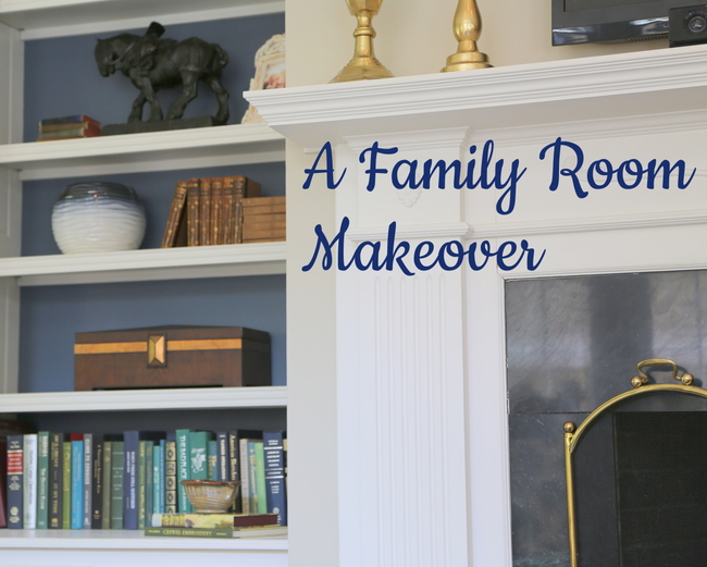
This family moved into a new home last year, and since that time I’ve helped them choose some paint colors, decorate their “formal” living room and dining room, and hang art throughout the house. The family room wasn’t a top priority – it seldom is, right? But over time, they found that THIS is where any entertaining would need to take place because it’s the largest room in the house!
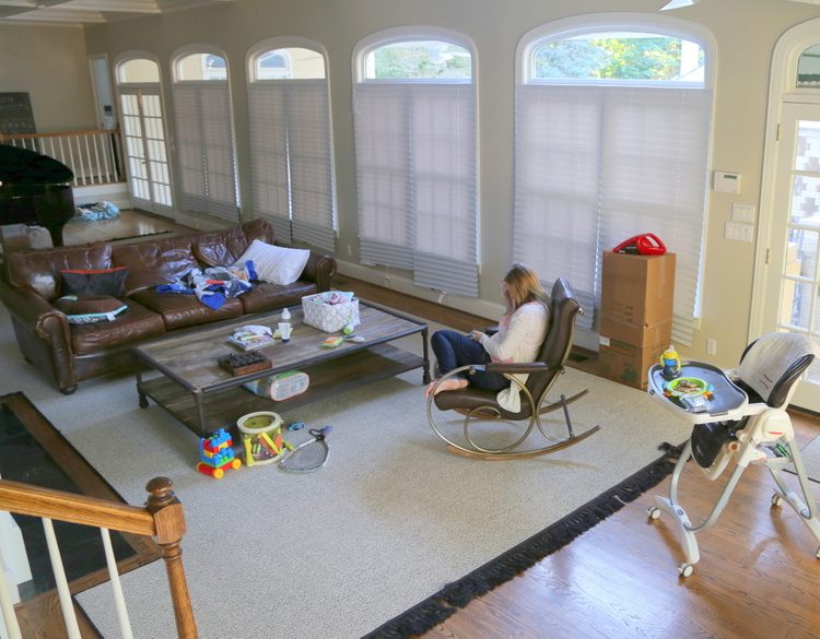
family room before
The best way to decorate when you have small children is to keep the decorative items on the walls and the bookcases, out of reach of tiny hands. There are bookcases on either side of the fireplace, so I knew we could capitalize on those! We needed additional seating here, of course. Because the rest of the room was so neutral, the colors of the new chairs would be our cue for decorative accessory colors.
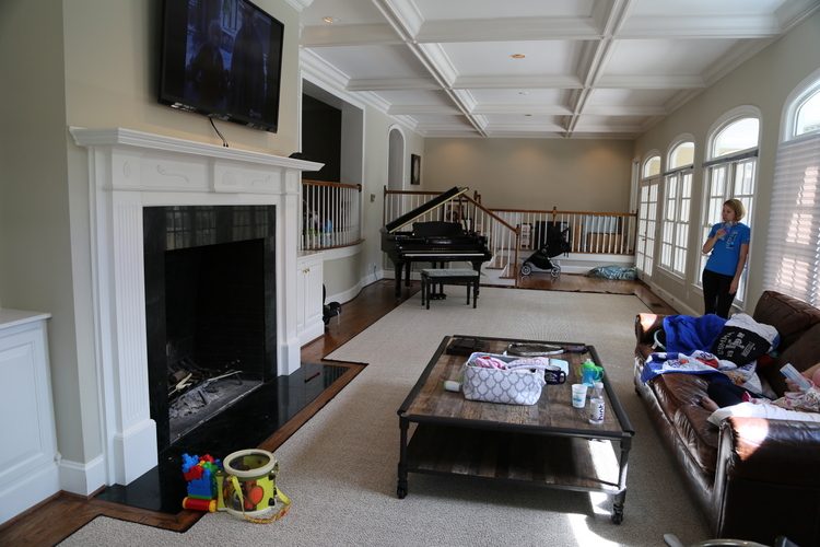
family room before
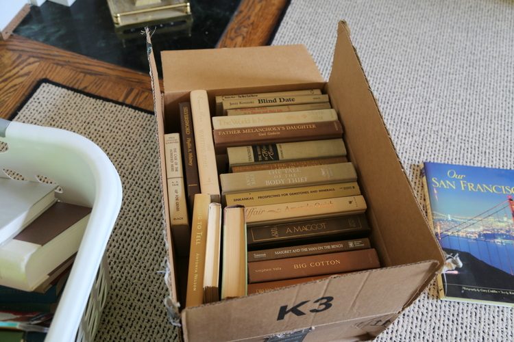
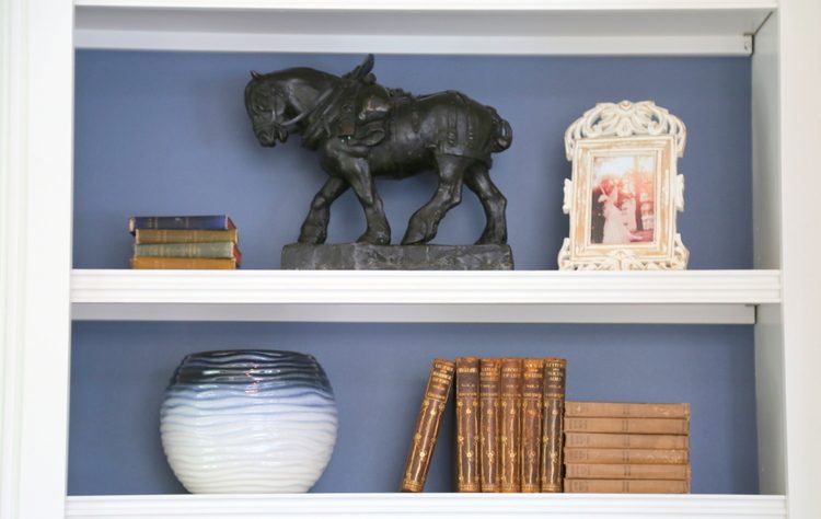
The homeowners’ parents had some antique books to donate to the cause:
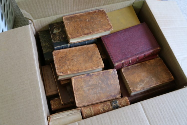
When you have bookcases, you typically need more books than you think. So I brought in a few boxes of hardback books to fill in the gaps.
Once the chairs that were ordered came in, my client and I spent the morning at HomeGoods gathering decorative items for the space. One trip took care of everything we needed for the family room – accessories in mainly blue and gold.
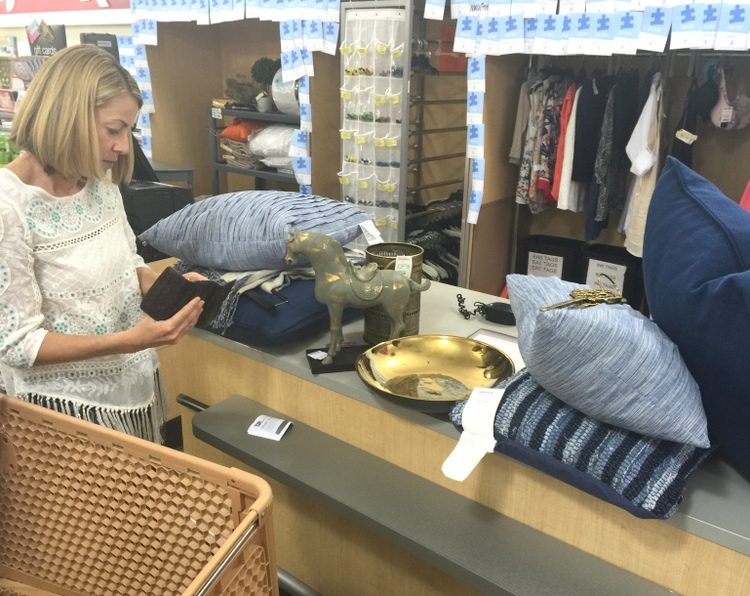
HomeGoods haul – see my tips for choosing pillows for leather sofas here
So here’s the fireplace wall and bookcases in the “before” state. I specified a dark blue for the backs of the bookcases, which creates a much more interesting backdrop for books and decor than trim white.
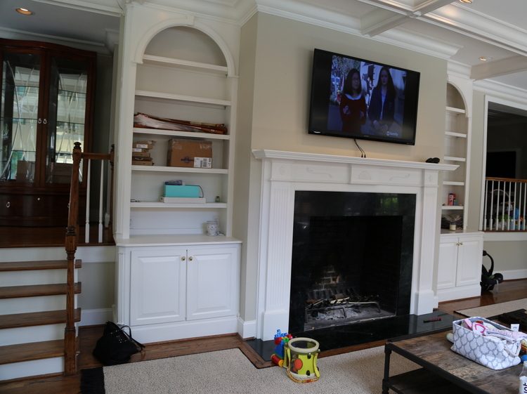
before
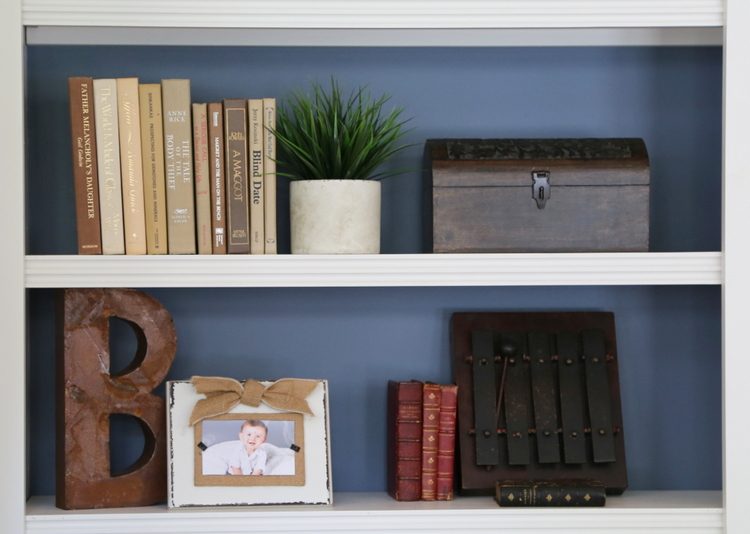
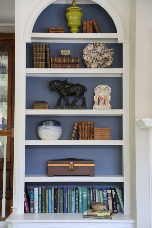
I like to populate bookcases without over-stuffing them. Most people nowadays put too many decorative accessories and not enough hardback books in their bookcases, which results in a messy and cluttered look overall. Here’s the after of the fireplace wall:
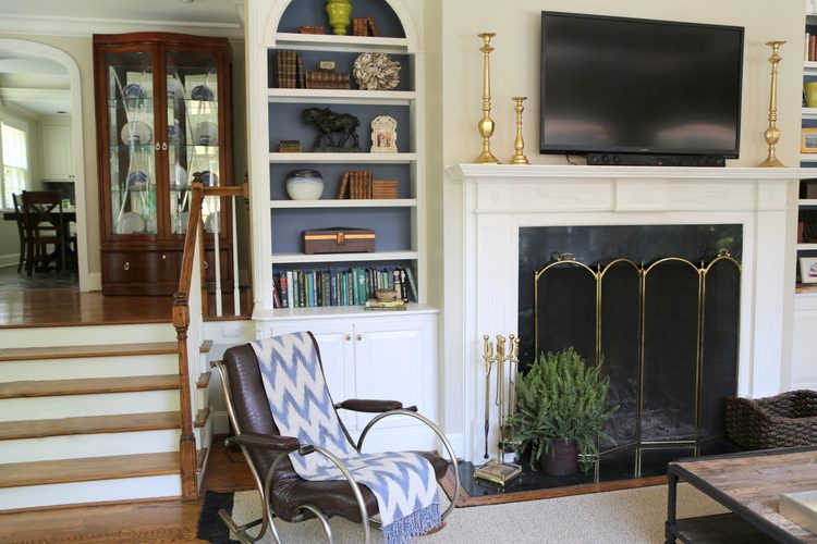
Some of the items belonged to the homeowner already, but new additions included the zig-zag throw, golden candlesticks, oystershell ball, and colored pottery from HomeGoods.
Here’s a “before” shot from another angle:
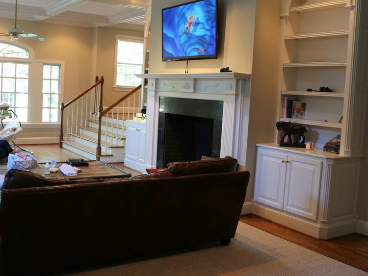
before
From this angle, you get a peek at the new chairs the homeowners purchased for the room. The fun pattern in the fabric will be very forgiving with young children scampering about.
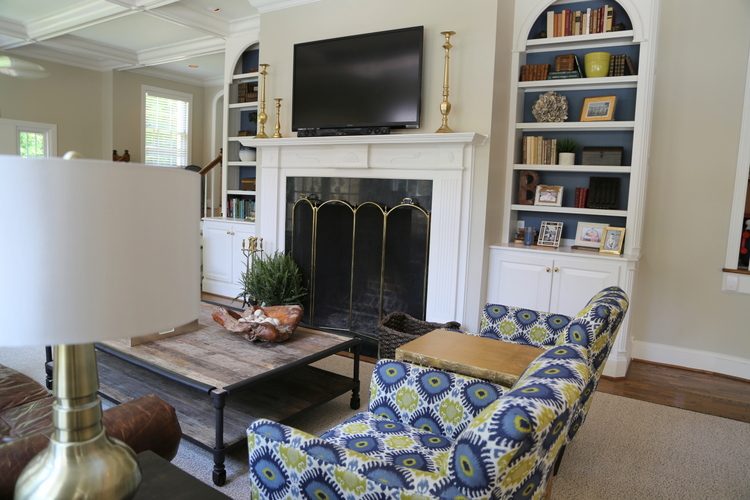
after
Here’s the back wall of this long room. The architecture is so great, with the coffered ceilings and a long wall of windows to the right of this shot. I thought this wall would be perfect to start a family photo gallery that could grow over time:
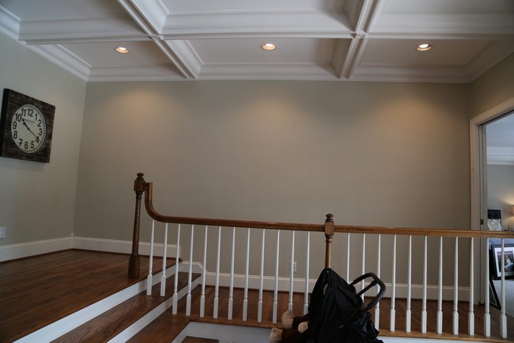
before
Here’s the resulting grouping that I hung for them – I used the baby grand piano in the foreground as the anchor for this arrangement.
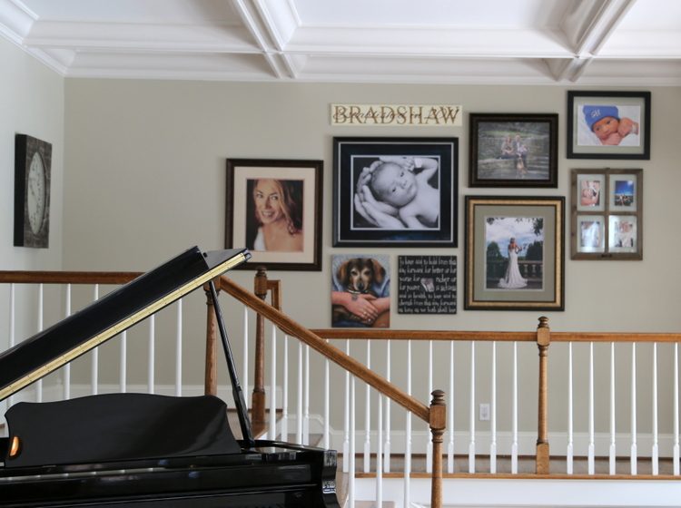
family photo gallery wall
I usually do more symmetrical groupings, but I like the effect of this from the entry of the room.
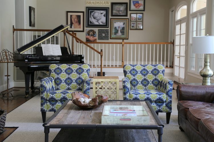
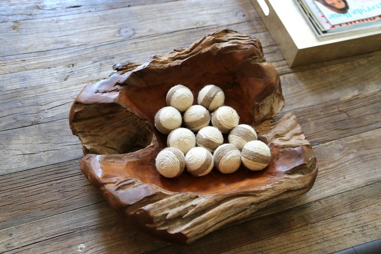
Any tabletop decor had to be child-friendly. I found this beautiful organic wood bowl at HomeGoods, and the filler balls will be fun for the kids to play with if they decide to! A bowl like this is also great for corralling television remotes.
Ok, so here’s where we started, after we reoriented the existing sofa, coffee table, and piano:

And here’s the breathtaking after! The gold lamps, sofa pillows, and table between the chairs are also from HomeGoods.
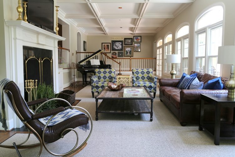
Yes, there will be toys strewn about this room on many, many days to come – but look how nicely it cleans up! In fact, the family is having a large party for friends and family this weekend. I’m invited, so I’ll get to see first-hand how the house and this room functions for entertaining guests!
What’s your favorite thing about this family room makeover?





Everything looks beautiful! My favorite is the way you positioned the pics on the gallery wall. I also love the painted back of book cases.
Thank you, Linda! I appreciate your comments 🙂
Love the makeover!!! What did you place on the mantle under the TV to hide the cord…makes it look so polished!
Denise,
The client moved the tv down a bit and added some kind of component there – maybe a cable box or something. Not seeing that wire hanging down really helps, doesn’t it? You could also place any long, thin box in that space between the television and the mantle to get a similar effect.
Great job as usual. Love the blue paint on the bookshelves and your styling. I agree that shelves look better with books and accessories.
Stunning job!! I’ll bet it’s their favorite room now.
I love that dark blue was added to the back of the bookshelves. It really makes everything cohesive.
Love the blue paint color inside the book shelves…what color of blue is it and also the neutral color on the walls?
Love the fabric chairs paired with the leather sofa.
Thank you, Nancy!
The chairs just wake up the room! Curious how you would have handled that room with no piano? Looks like it could be tricky, being so long and narrow. Do you do two seating areas? I have a similar predicament…long room, fireplace at one narrower end, with windows and front door along the wall, wide entrance into dining room and kitchen opposite that. A lot of space to fill!
Well, I was just glad for the piano, frankly!!! An alternative could have been a round game table with upholstered parsons chairs in the middle of the back space, or like you mentioned, an additional seating area that doesn’t address the television.
I like how the gallery photos follow the angle of the open lid of the piano. Very clever! I also love the new chairs. The space looked sterile before, now it is really inviting with all of the blue you added. A mother of young children will spend probably 99% of her waking moments in a family room… I think it should be the room people decorate first, not last! You have proven that “family friendly” can be beautiful. Great job!
Thank you so much, Jean! Yes, you should definitely decorate first the room/rooms you spend the MOST time in 🙂
I love the blue paint in the bookcases. For me it has huge effect. Beautiful room.
Such a great job, I love it! I’m hard-pressed to identify 1 single thing about it that I love, there are so many awesome elements. What I love in all the jobs you do is that you take something that the homeowner already has and make it modern and cheerful and sleek! It inspires me to see my own stuff in a new way.
I have a tall, wood bookcase that’s a honey oak color. It’s real hardwood, not MDF, so I’m loathe to paint the inside. I LOVE how you painted the inside of those shelves blue. Can you offer me some tips on how I could modify that tip for my own bookshelf? The 1st thing that comes to mind is to staple fabric on it because I don’t want to paint the natural wood. What would Kristie do?
Looks lovely! I have 2 questions:
1) How deep are the bookcases? The chimney breast looks like about 40 cm deep (except I got the proportions of the room terribly wrong). Then the open shelves would be not more than 20 cm deep, which is not that much if you want to put books on them. Did you have to select books with the right size for the shelves?
2) Is there any storage for the toys?
I love the bookshelves, most especially because you used real books! Next favorite: the gallery wall of photos. All is lovely.
Thank you, Sandy! Real books are a necessity, in my opinion!
Looks wonderful! Love the color you used in the back of the bookcases and you styled so pretty! Great job my friend!
Love the makeover Kristie! I noticed that there are no candles on the candle sticks. I used to have some candle sticks around my house without the candles and my friend thought it was “wrong”. Any thoughts or advice?
Love the makeover Kristie! I noticed that you didn’t put any candles in the candlesticks. I used to have a few candlesticks without candles around the house and my friend thought it was “wrong”. Any thoughts or advice?
Susie,
I think candlesticks can be sculptural decor, so I often leave them without candles. Frankly, very few people light skinny candles that would go in candlesticks, unless they are on a dining room table for a special occasion. Your friend is probably very traditional and has difficulty thinking outside the box in terms of decorating. There is no “wrong” if you like it! 😉
Beautiful fabrics and gold accents. Nice to see the accordion blinds gone as they distracted from the beautiful windows.
The room came together nicely !
Thank you, Mary! The family is really enjoying the finished space 🙂