You may remember my colorful post: Throwing Your Caution (and Your Floorplan) to the Wind. Today I’m going to show you the rest of what was accomplished in a home whose artsy homeowners were ready to shake things up a bit. This family had no desire to make their home look like everyone else’s – they wanted something more colorful, a bit more quirky.
Living A Colorful Life
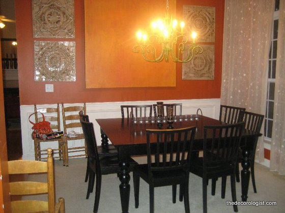
Upon entering the home, a living room/dining room combination runs to the right of a long open hallway. Here was the dilemma: the front “living” room had little purpose, except as a holding place for furniture that didn’t fit anywhere else. Because my clients love bold color, they had painted these front rooms dark orange. Problem was, the black furniture gave it a Halloween-all-year-round kind of feeling. And obviously, the pink and white dollhouse seemed a bit out of place. The only two chairs in the room didn’t exactly call you to sit down and sit a spell.
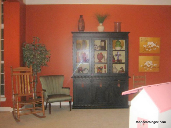
“Living” Room Before
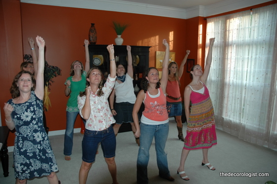
Did I mention this was the first room you saw when you entered the house? The most use it saw was when it was used for practicing dance routines, but that’s another story altogether . . .
Living Room/Dance Hall Before
Anywho, here was the task for The Decorologist: make this space a fun and inviting space for family and visitors to use for more than just dancing (not that there’s anything wrong with that).
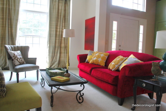
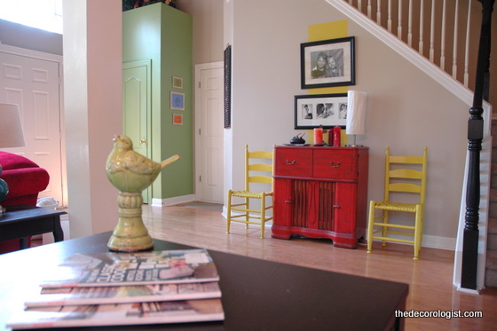
Living Room After
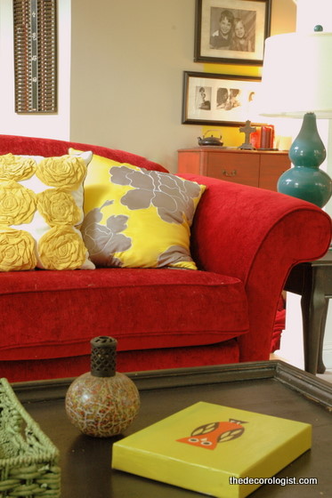
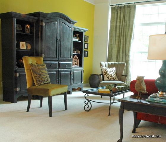
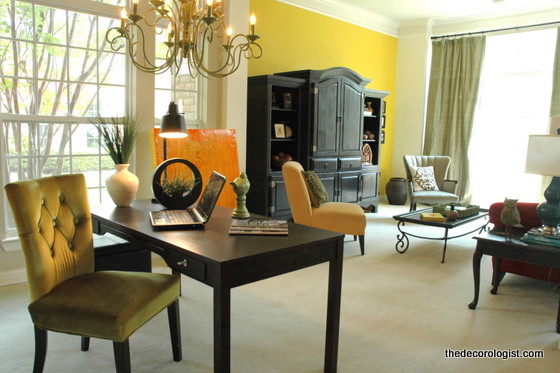
Obviously, a new paint scheme was introduced, furniture was furiously rearranged and repurposed, and a few new accessories were added to the colorful mix. The punchy yellow is Benjamin Moore’s Citrus Burst 364. It’s still fun and quirky like the homeowners, but now it’s functional and inviting as well.
Living Room After
This is a view from the other side of the room, before the makeover. You may remember this before-and-after of the former dining space . . .
Dining Room Before
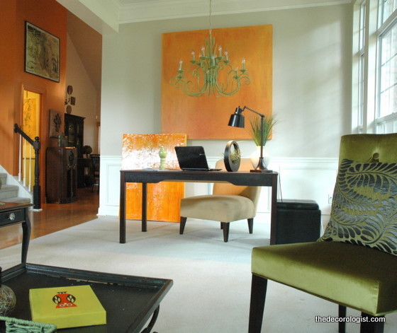
that was repurposed into an office area . . .
Office Space After
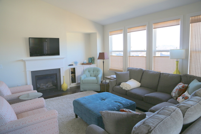
So now you can see how these spaces came together.
After The Decorologist
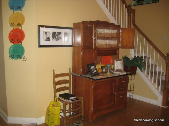
Even the entrance/hallway got a little sprucing up. It felt a little too country before:
Entrance Before
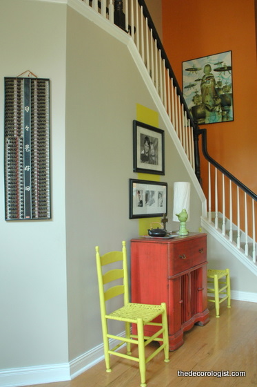
but now it’s a fresher, more contemporary space filled with the homeowner’s personal art and treasures.
Entry After
Did you notice how the bannister is now painted black and the country-style ladderback chairs are now a bold yellow? Both color moves served to make dated elements more modern.
Hallway/Entry After
I’m not saying that this design/color scheme is right for most people. But it was right for these homeowners, and my goal was to make their home feel like their own – full of their personality, but pulled together in a way that anyone can admire and appreciate. If you are looking for a Nashville decorator who can help you realize your dreams for your own home, contact The Decorologist to schedule an appointment.







Fabulous!! Kristie, you get better all the time!
thank you, michelle 🙂
You are just so amazing!!!
I love it!!
Great job! I love the details, like the stripe you painted in the entryway behind the black and white photographs!
what a difference…I for one would love to spend some time there. What a fun and happy looking house.
This looks so great! Love all the colors, and the fresh airy feel of the space. What is the Neutral color, is it Edgecomb Gray?
thank you, hannah – the neutral is grant beige 🙂
I love the way you changed this up! It really pops now with WOW 🙂
I have been following you for the last couple of weeks and I have to say you are so talented and entertaining. I have learned so much from your blog posts, but most of all I enjoy reading you. Thanks for sharing and inspiring. Wish I was in Nashville!
Thank you for your kind words, Brittany! So glad that you’re hanging out with me here 🙂
Kristie, I’m fairly new to your site and I’ll have to say you never fail to amaze me. I love this design. So nice not to see the same old beige walls, white ceilings and white painted furniture. You’re one of the best home stager/interior designer whose blog I regularly frequent. Thanks for showing us another design style.
Wow, thank you so much for your kind comments, Monique! So glad to have you following my blog 🙂
What an amazing makeover! I love your use of color and the arrangement and selection of accessories. Could you share the source for the beautiful yellow flower pillows? I’ve been searching high and low for them.
Thank you, Maria! The yellow and gray flower pillows are Dwell Studio for Target.
You are such a love for sharing your source. Looks like I may have missed the boat on the yellow rosette pillows, but really appreciate your reply. I need to keep target on my ‘go to’ list for cute decor.
Wow! Just beautiful and unique color placement. Gorgeous.
I have a red couch I have been struggling to decorate around, thank you for the inspiration!
Where is the couch from? I need that couch!