I typically begin Design Consultations by walking through the home and talking with my clients about how they use their space and how it functions for their family. And more times than not, I find that people let their home’s floorplan dictate how they live in it. Even when it really isn’t working for them! In this home, we actually switched around 3 rooms – today I’m going to share 2 of them.
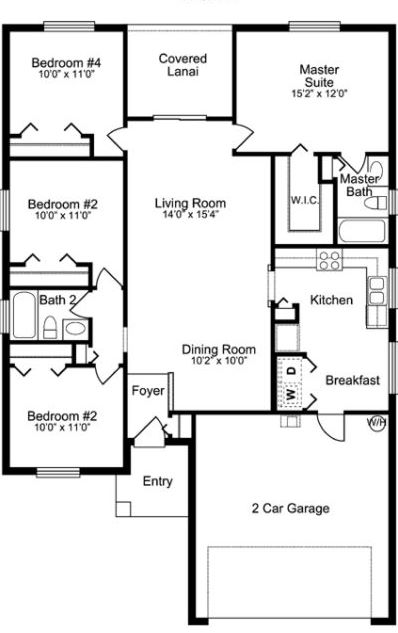
Random House Floorplan
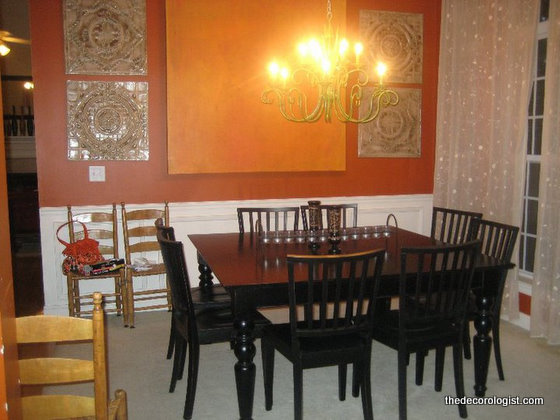
This is the dining room before I started switching everything around. This room is carpeted, which doesn’t make it ideal for a dining room – especially when there’s a space open to the kitchen that is hardwood (it was being used as a living room). The homeowners LOVE color, especially bold color. They favor modern design, but with a retro twist. They are artlovers, as well, and the husband is a gifted artist, so it just seemed as though their home should have the feeling of an art gallery. Art galleries typically have a neutral backdrop so that the art really stands out – so we decided to mute the background a bit and add bold punches of color.
The homeowner had a desk tucked back in a corner of her bedroom where she used her computer. As we talked, it became obvious that with two small children, it would make more sense to have her office area in a place where she could monitor family activity better as she worked. So, we started moving around the furniture . . .
New Office, Old Dining Room
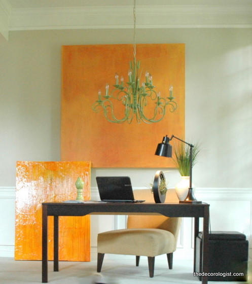
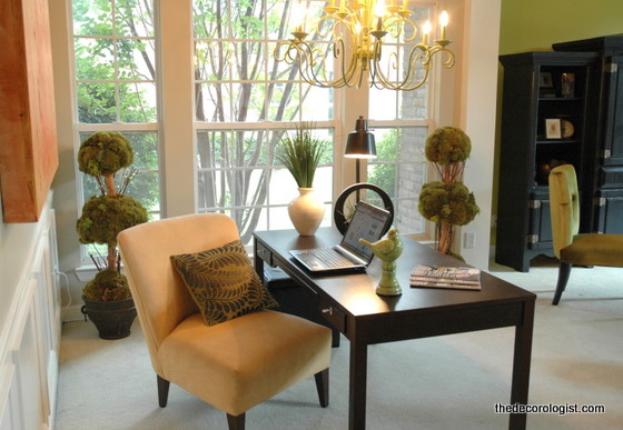
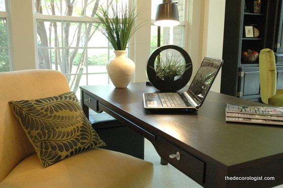
After some creative arranging, this former dining room is now a perfectly lovely office space. Can you believe this is the same room? Here it is from another angle:
The Decorologist
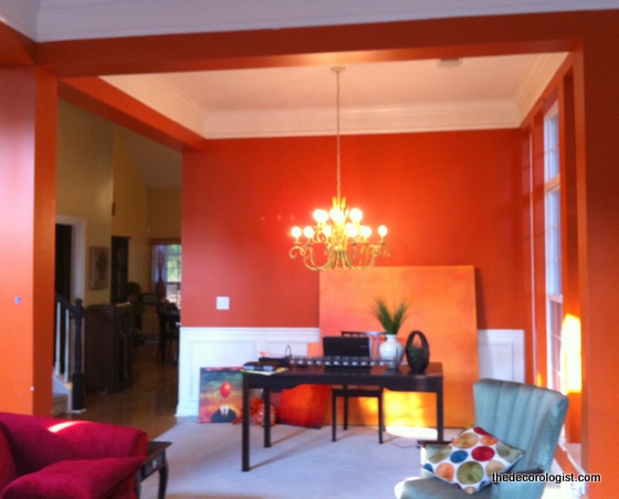
Ok, let’s look at the before of that room from further out. This shot was taken during the day, and you can see how very bold the color was. At this point, we had already moved the dining table out and started playing around with the office set-up. The sheers on the windows were dated and almost country. There is a large tree outside the beautiful windows here, so they really didn’t need the sheers for privacy. We just took them down completely.
Office Before
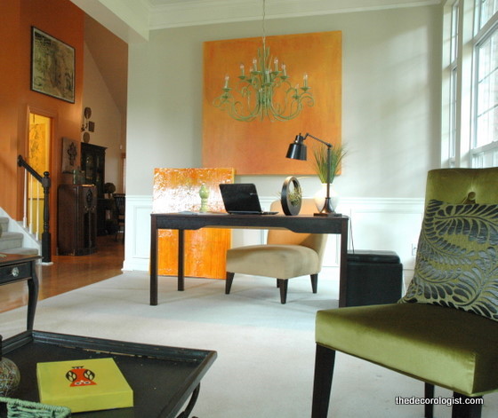
A new paint scheme began developing and some of the walls went neutral. I highlighted some of the more interesting architecture by selectively using a pumpkin color (Benjamin Moore’s Topaz 70) that worked well with their art, rather than the red-orange they had before. You can see it in the left portion of the photo below.
The Decorologist
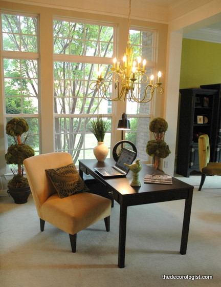
Aren’t these windows gorgeous? The tree is a perfect privacy screen, so why not just let the light flow in and bring the outdoors in?
The Decorologist
No more working in isolated dark corners! Now this busy mom has a beautiful place to work adjacent to the living space where she can keep an eye on the entire household.
New Office by The Decorologist
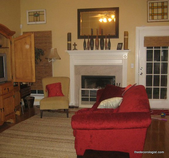
Now, if you are wondering where the dining room went: This is where the previous living room was. The space is open to the kitchen and has hardwood floors. You can see that the furniture is a bit off-balance from the natural focal point of the room, the fireplace, which made it feel a bit crowded. Although the homeowners wanted a modern look and feel, they weren’t achieving that with Porter’s Tobacco Road, a favorite wall color of every major builder in Franklin, TN in the mid-1990’s.
After replacing Tobacco Road with a more modern neutral, the fireplace was highlighted with Benjamin Moore’s Kiwi 544 with a rectangular block of color extending to the ceiling, which actually added an architectural element that didn’t previously exist.
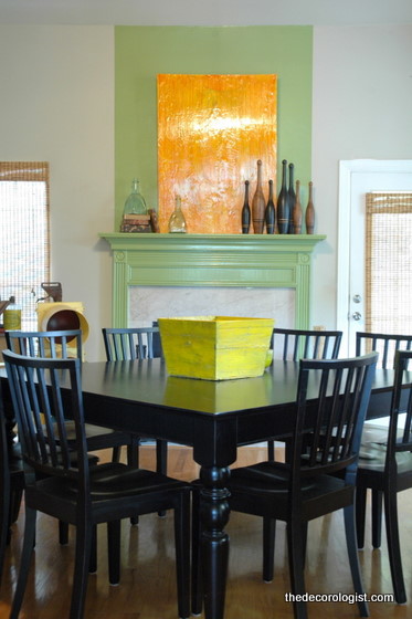
New Dining Room
With the square Pottery Barn dining table now on an angle, this new dining room lines up perfectly with the fireplace and is the favorite place for family meals, homework, and craft projects.
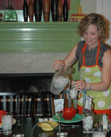
Cutey-Pie Homeowner
The homeowners are enjoying entertaining friends and family even more than ever since they threw caution, and their floorplan, to the wind. If you’d like to see more of this space, click here and “like” The Decorologist on FaceBook so you can check out additional photos from this makeover. Stay tuned to find out where their living room went . . .
If you need a Greater Nashville interior decorator and color expert, contact The Decorologist to schedule an appointment!







Great job. I’m loving that office area especially. You’re right–it doesn’t even look like the same room. So pretty!
Warmly, Michelle
These pics are great, but seeing this all in person took my breath away! KB, amazing job, as always. Funky, stunning, cool, surprising, fresh…I could go on and on! I know Ms. Cutie Pie Homeowner and her Cutie Pie family love it. I certainly do!!!
thank you jen, that means A LOT coming from you!!! i appreciate your encouragement more than you know 🙂
you are amazing and it’s absolutely beautiful! This is indeed unusual — having a dining set in the family room adjacent to the kitchen.. but who says we can’t do that — whatever works best for our own life! thank you for sharing..
Love the new office! I love how the orange art looks against the new wall color.
From the room drawing shown above, I wonder where the windows for the dining room are located as it’s in the inside of the house….a bit confused…
oops, i can see why – i wanted to have a floor plan as the first photo of the post, as i am discussing flipping around your home’s floorplan. but this ISN’T the homeowner’s floorplan – i didn’t have that, which is why i labelled it “random floor plan.” sorry for the confusion!
Great job Kristie. It’s amazing how much a home can change with some good space planning and colors!! The new office looks fantastic. Just finished installing a job all day -just moving things around makes all the difference. People often don’t know what gems they live in until they get a makeover.
LOVE the changes!
Look on the horizon. Do you see that object jumping up and down? That’s me jumping up and down because I’m so excited. This is just AWESOME!!!! I continue to be awed, excited and inspired by you!
LaJuana
all the way from atlanta??!!! you are too funny – and very, very generous with your compliments and encouragement! thank you 🙂
Your vision amazes me! This is really beautiful, Kristie!
Kristie, this is FABULOUS!! And fascinating! I especially love the inspired fireplace color and addition. Congratulations, and thanks for the inspiration!
thanks so much, annie! i know it’s pretty bossy, huh?
Also love that you kept those cool orange art pieces incorporated! Love those.
wow! the whole place just seems more alive – the before pictures weren’t bad, very bright and colorful, but the after pictures gave breath and life to the rooms. I don’t know how you do it! btw love that little round planter on the desk. I want one with a mini-Boston ivy curling around it 🙂
Changing the colouring from that red orange that really crowded in the room to neutral and a bit of spicy orange really made the room much easier on the eye! Those two spaces really work better now.
UNBELIEVABLE! Well actually very believable coming from you Kristie! I am so glad the homeowners now have a home as fun, stylish and groovy as they are!!
The room looks amazing! Love the colors and the chandelier! Thanks for sharing that at my link party!
Hey Kristie, As you know, I’m crazy about this post. Thanks for linking it up! I’d love to feature it in the coming week. Feel free to grab an “I was featured” button if you wish. AND thanks for noticing the changes in my blog. I’ve been meaning to do it for a long time so that I could use BIGGER photos.
Warmly, Michelle
Great room transformations. Can’t wait to see a few more of what you have done with this house.
Wow! Really – WOW!
I linked this to my offices post too today, for inspiration!
I’d just like to say that I’m an evangelist to Carey Tomlinson for The Decorologist. Your work rocks, and I can’t wait to hire you for my backyard office! Meanwhile, I’m staying calm as I carry on. LOL
Why thank you, Daniel! Rock on – I mean, stay calm as you carry on!
Kristie,
Your blog is so inspiring and I really took this article to heart. I decided to move locations of some rooms but I want to ask you, is it too wierd to put the kitchen in the front of the house where the entry is. It’s a big open room, entry/kitchen. My husband is afraid it would be bad for resale value in the future. Is a front kitchen ever done?
Wow, Ruth – are you talking about relocating your plumbing, appliance hook-ups, and cabinetry? That’s quite an endeavor! Front kitchens are fine, but how “front” are we talking about? If it’s in a room off the front entry, I think that would be perfectly fine. I’m not sure, however, how it would impact resale if it were literally in the front entry. What part of the country are you in?
The front door is off to one side of the room in a little entry area and the staircase is on this side of the room also. So it’s not like the front door will open into the middle of the room. The plumbing and such isn’t a problem because we hate the current location of the kitchen and will be moving it somewhere regardless. We are located in small town southern Indiana. Thanks for your input. I really love your style.
Love this! I love the change in colors. Painting strong colors on the wall is nice at times, but neutral is the way to go if you have colorful furnishings. Beautiful home, and even more beautiful after your redecorating.
I came upon your site looking for furniture arrangement ideas and stayed to poke around for more tips & tricks. I’m not a stager or even a designer by trade, but I sure love what you’ve done here. You’re absolutely right…the floor plan usually does dictate what the room is used for when that is not always the best option> Thanks for reminding us to think outside the box – or the dining room – once in a while. Amazing results!