If you’ve been reading this blog for a while, you know I am big on before and after photos. But you may not realize the surprising reason WHY taking these photos of your interior is so important!
 The Decorologist
Obviously, taking before and after photos gives you a basis of comparison when you’ve made some improvements in a room. Here’s the “before” of the living room attached to the recent kitchen remodel we posted about here.
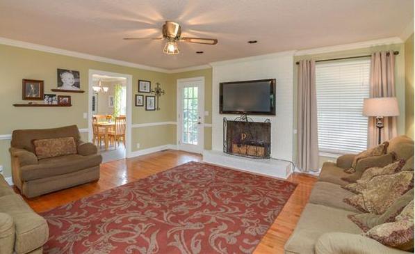 before
Viewing the before and after photos of a room from the same angle helps you better see the improvement after your design is executed. Here’s the “after” from the same angle:
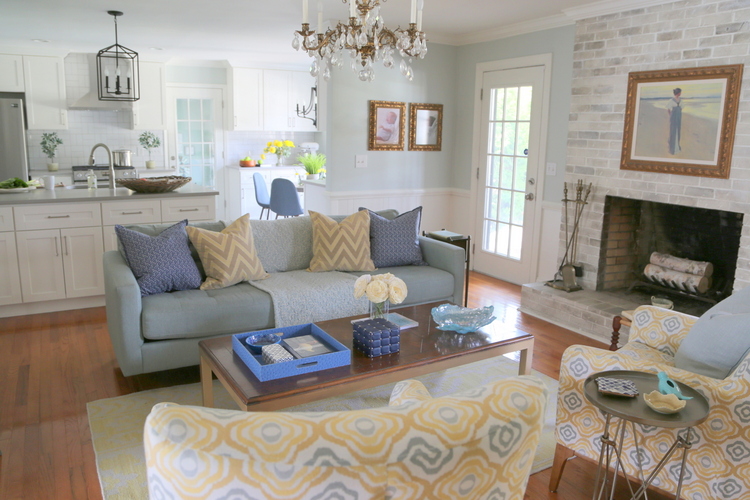 after
after
But there’s more to it than that – viewing before and after photos of your room enables for you to look at it in 2D, rather than 3D. And that’s when you can see issues you may not recognize when standing or walking through the space.
You know that feeling when you know there’s something wrong with the room, but you just can’t put your finger on it? Many of my clients say just that: “I just can’t figure out what’s wrong with the space. Something’s off, it doesn’t feel right, but I have no idea why it isn’t working!” Taking photos (especially when facing the focal point of the room) can reveal an imbalance of decor or color, and can help you see what may need correction.
After the completion of this project, I took this photo facing the fireplace. When I got home and uploaded the photos to my computer, what was WRONG hit me in the face. Are you seeing it???
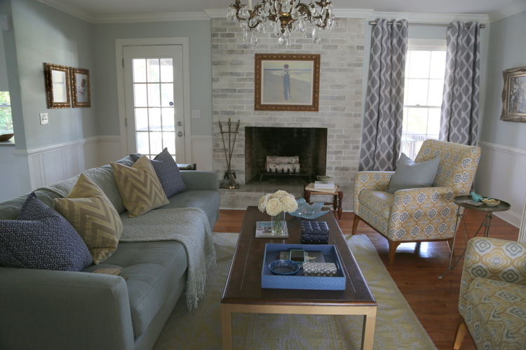
First, let’s talk about what is right with the room. The seating arrangement is centered on the fireplace, the pair of chairs counterbalance the sofa, and the blues and yellows are well dispersed. We selected the furnishings several years ago when the homeowner lived in a previous home. Oh, and are you noticing how fabulous that fireplace looks?? I had an artist selectively darken pieces of the painted fireplace brick to give it back some dimension. You can do something similar with this product!
However, it is immediately obvious to me that the curtains on the window create a lopsidedness when compared to the french door on the right, which looks bare in comparison. I immediately texted my client and suggested she hang an additional pair of curtains over the door. Yes, you can hang curtains on either side of a french door! Just push them out to where they sit over the trim and the wall space outside the door, and they won’t impede passage out the door. Here’s the result:
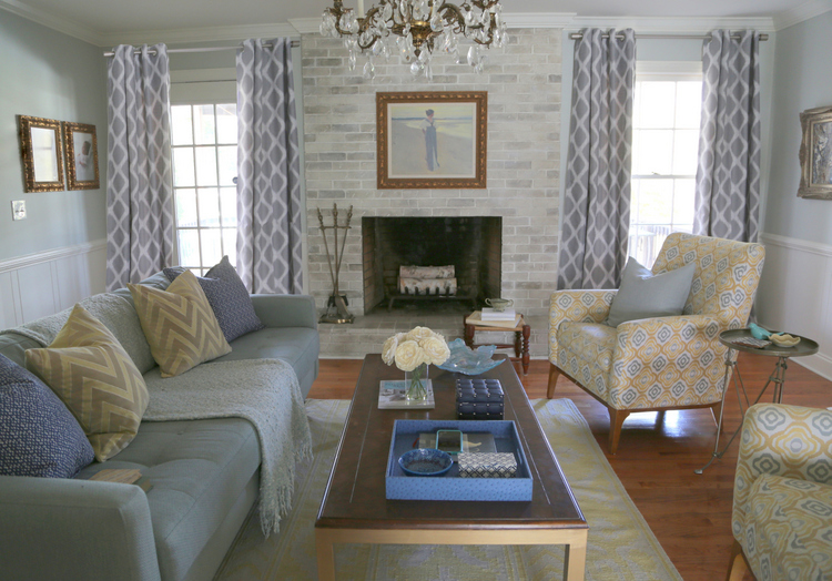
Nothing’s ever perfect, and there are always things to improve – like getting a larger rug and moving the curtain rod up a bit on the left. But the additional pair of curtains really do make the room appear more balanced and welcoming. The before and after photos prove it!
Next time you are trying to figure out how to improve your own rooms, take a few photos. The most important shots to take are facing the focal point of the room (in this case, the fireplace) and from the entry of the room. Analyzing the rooms in 2D may be exactly what you need to figure out what improvements need to be made!
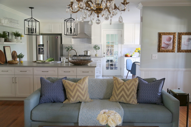
Here’s a shot from the kitchen where you can see the placement of the television:
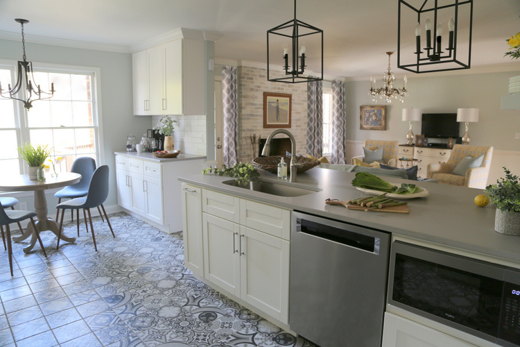
Has taking photos ever helped you figure out what’s needed to solve your design dilemmas? Leave a comment if you always take before/after photos when decorating or designing a space. If you missed the amazing kitchen remodel that’s adjacent to this living room, you can check it out here!
Don’t miss out on my LAST, IN-PERSON Expert Psychological Stager Course, March 5-7!
Click here to learn more!







Where is the TV in the after? That’s a real problem in the real world.
Deb,
The flatscreen tv is on the wall directly opposite the sofa! I may go back and add a photo that shows that, thanks!
Deb,
I just added in a photo so you can see where the television is placed!
Another technique to discover the “something” that’s not working in a room, wall grouping, flower arrangement, etc. is to look at the mirror image. Works every time.
Interesting, Nancy! How does that work exactly?
I’ll jump in on this one. I call it my Alice in Wonderland view… Seeing the room as a mirror image – exactly the same but opposite helps me to see my room with a different perspective… I can see more critically anything that is out of harmony . This helps me often in my small home, where I have looked at the rooms for too long and require a different viewpoint. What was a tired image becomes just new enough for discovery.
Very interesting, Sandy! I love that idea!
yes, my answer was the curtain on right side. I would prefer to not use curtain at all or a simple plain white one so they dont compete with the beautiful fireplace, cuz there are plenty of color and pattern in this space. of course everyone has their own preference :). thanks for sharing
Thank you for sharing your thoughts! I think you are correct – simpler curtains would be better in this room. My client purchased these on her own and they certainly work, but I agree with your point! 🙂
You know when a room just doesn’t feel right. During my last staging, I noticed I should have hung something on an opposite wall but not another a piece of wall art. I returned later that day and hung a starburst mirror from my inventory that was just what was needed. I can then sleep at night.
I feel your pain, Gina! Many times I have cringed to see professional real estate photos come in and wish I could run back and change something. Sometimes I’ve had to make a phone call . . .
Kristie — Just curious as to why you wouldn’t flip the couch and the chairs? I was always taught that the sofa (being the widest thing in most rooms) was best associated/balanced with the “longest wall” of a room (even though it is not sitting immediately against the wall). I would think that a reversed arrangement would not “block” the view to the kitchen and dining area as much. Fung shui so to speak. To my eye, the sofa would then add more weight to that side of the room because now looks a little unbalanced. Just a thought — I would try flipping them and then looking at it again to see if it was a positive change. But yes, the addition of the second curtain absolutely makes a world of difference. So, your suggestion about taking a picture is well made!
Hi Penny,
Thank you for sharing your ideas! Your points are well taken. But actually, the television sits on the wall directly across from the sofa and behind the chairs. The chairs can be turned to see the television. The sofa actually acts to block the view of the transition between the wood flooring in this space and the new encaustic tile in the kitchen.
Penny,
I just added in a photo so you can see where the television is placed!
Thanks Kristie – it all makes sense with the added photo of the TV and credenza, it all makes sense. Previous photo’s just made it looking more “floating”. Looks great!
This is a fun blog. I’d like to add another suggestion. Many years ago my parents did oil painting and became quite good. One way they could tell if a painting was balanced in shapes and color tone was to turn the painting upside down. By looking at it that way, colors and shapes didn’t look as familiar to the eye. You would then focus more on just the colors and shapes and balance, etc.. Mistakes would often jump right out. I have found this to be true in decorating as well. Take a picture of a room, turn it upside down, and often something that’s not quite right will be more apparent, since you are focusing more on color and shapes, rather than this sofa or that curtain panel, etc.
Wow, that is so interesting, Cherie! I’ll have to experiment with that idea and flip some photos over to see if that would help me!
This suggestion is also interesting because that’s how the earliest photographers (or modern enthusiasts with vintage cameras) composed – with the image upside down on the view screen on back of a large-format view camera.
The room does look so much better with the curtains but little confused about your French Door comment since that doesn’t appear to be a French Door. (?) But no matter – the result of this room is much improved by the curtains on that side. I personally like the curtains and don’t think they compete with the fireplace. Fireplace treatment is beautiful. So many great ideas in this room.
A French door is just a door with paneled glass throughout its length. Thank you for commenting and sharing your thoughts!
I noticed the curtain issue immediately, and I love colorful curtains. These are so pretty. I cannot seem to get my own living room right. I have a window on either side of the fireplace that would look lovely with matching curtains but the left window is right up next to the built in bookcase leaving no room for a curtain to hang without blocking light or the bookcase. The wall looks bare on the right hand window. Maybe I will order this fireplace treatment to spruce it up a bit. Right now it’s all shiny white painted brick. Any ideas on the curtain problem? Curtains on one window & not the other will look unbalanced, no?
Jennifer,
How about white bamboo blinds instead of curtains? That could add texture and light control, but you wouldn’t have to worry about the lack of space on either side of the windows.
I have a sliding patio door that currently has vertical blinds. I want to update it. Kristie, would you hang the white bamboo blinds with an interior mount or exterior? I am assuming that an interior mount would not make the opening tall enough to walk through without bumping one’s head, but I really don’t know.. Would it be one large blind or two halves? I am stumped on what to do and haven’t seen many options for sliding patio doors. (I also do not have space on each side of the slider for curtains.)
Love this idea! We were actually going to do plantation shutters in some other rooms so could do that at the same time. OR I could use Roman Shades…. just occurred to me when you mentioned the blinds. Fabric with some color. I’m sure I would need a professional for that too. Thank you 🙂
I don’t know why I didn’t think of this before! I always encourage those I am teaching to quilt to view their fabric choices together in person and in a picture. Same thing! Awesome!
Yes! I suppose you could use this tip for lots of different applications, right?
Looks great. Love the soothing colors. And the furniture and tv placement is spot on.
I saw the imbalance of the curtain/non-curtain immediately – balance and repetition are so important to any room. I agree also with your thoughts on the size of the area rug – it is too small. I think what you accomplished with the kitchen, opening it up to the family room, is incredible – what a difference.
Also, when looking at before and after pictures, you realize the homeowners had positioned their furniture in such a way as to make the family room just one big walkway into the kitchen – not cohesive or welcoming in any way. By opening up the kitchen to the family room, you managed to effectively make the seating area cozy and useful and easier to arrange.
Hi Kristie ~
I noticed the windows right away, as well. They look so much better now with matching curtains. And thanks for the great tip about taking photos from the focal point of the room. That’s a really good idea.
Thank you so much, Leslie!
Hi Kristie,
Beautiful job! Yes, I immediately saw the curtain issue 🙂 Rooms usually appear more cluttered in pictures than in person since everything is presented to the eye at once, but it’s a great tool to check the balance of weight and color! Excellent tips!
You are so right – rooms do appear more cluttered in photos. Thanks for taking the time to comment, Janet!
This is such great advice that I never thought of. Thank you for walking us through this.
I’m glad it was helpful, Sheri!
This is such a great tip/advice. Thank you for sharing this tip!
Excellent article. I often take photos when doing home staging consultations for the very reason of seeing in 2D what the problems might be that you are not noticing and how to stage a room to get great photos for a listing.
I agree that a picture can tell a thousand words!
Great point to take photos! In a way it’s like having another set of eyes to view the space. Sometimes walking away for a day helps me too, so that I can look at it again with a fresh perspective.
This is spot on! People are always sending me pictures of their room or grouping and asking what is wrong. The most common mistake is my pet peeve, hanging their artwork or photo collections to high! Especially with tall or angled ceilings . For some reason they want to fill the space at the top of the room and have what seems like 3’ of blank space between the couch and the art or grouping. In the picture it is so obvious what is wrong but they can’t see it! Why… because they are still living in the space 3D instead of looking at it 2d!