My online e-design client, Jennifer, recently sent me an “after” of the family room we worked on together. Jennifer wanted to update the space to make it more inviting and fun for her growing family, without throwing the baby out with the bath water (i.e, making the most of what she already had). Here’s the “before” of the space we focused on:
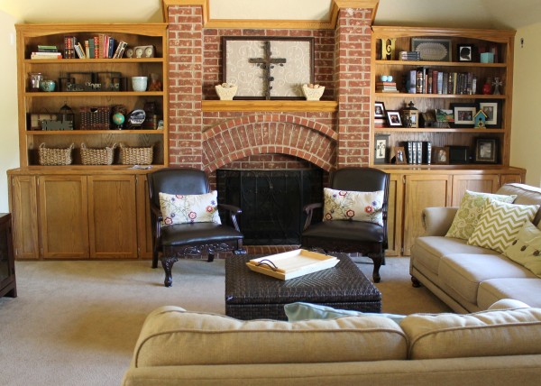
family room bookcase before
It’s exciting that I can help people that aren’t in my immediate area with long distance e-design. Here is a photo Jennifer sent me of the family room bookcase after:
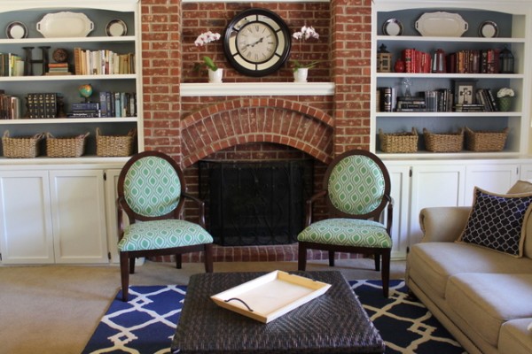
family room bookcase after online consultation
Online consultations require some faith and follow-through on the client’s end. I think Jennifer did a great job following through with my recommendations. After seeing the after, I had one additional suggestion for her. I’m curious to see if you agree – I think the mantel should go a soft black color so that the fireplace isn’t bisected by the white mantel piece, like this:
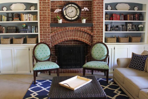
family room bookcase after, with black mantel
Please let me (and Jennifer) know which version you prefer in the comment section of this post! Now, let’s talk WINNERS of my book giveaway, shall we?

Lisa Grubb wins a copy of Handmade Walls:

get your copy by clicking here
Sat H., Cheryl R., and Samantha L. win a copy of one of these art-filled books:
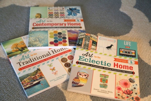
get these art-filled books by clicking here
And finally, Teresa with 2 granddaughters wins a copy of DIY Chalkboard Crafts:
get any of these art-filled books by clicking here
I know you will all enjoy these books! Thanks so much to Adams Media for offering these to my readers and for giving me copies, as well. I will share before and afters of my gallery art grouping that I will be creating for my stairway wall this spring. If you won, Allison (my assistant) will be contacting you for your address.
Even if you didn’t win one of these books, I encourage you to get one or more of them here. With 40 pieces of art in each of the art compilation books, you can’t beat the price (50 cents each??). And if you want a few new DIY projects, Handmade Walls will teach you how to create fabulous frames and DIY Chalkboard Crafts will give you great inspiration for using chalkboard paint creatively.
Don’t forget to cast your vote for white mantel or black mantel in comments!


Yes, Kristy, I agree that a charcoal gray or soft black is better for the mantle. If I’d been painting in my own home, I would have painted the mantle white just like your client did because I don’t think outside the box or have the vision to know how it would look differently. In my mind, I would have thought that bringing in a different color for the mantle would look disjointed, but when you show the image of the mantle in the darker color, I totally love it. You just have that gift:)
Thank you for your input, MK! 🙂
Definitely black!!
Definitely the black!
Hmm, I think I like white better.
I know it’s a big commitment, but I think painting the entire brick surface the same white as the shelving would be much more cohesive and contemporary without being too “modern.” That would really freshen up the room. Otherwise, I like the white shelving and I agree, the charcoal colored mantle is better than the white.
Yes, I vote for the softer black mantle, too and it gives me inspiration for painting my mantle.
I definitely think the mantle should be soft black. Otherwise I feel like I’m looking at a bright white line over the fireplace. The bookcases look great!
What an amazing transformation! It looks fantastic! I actually like the white mantel piece. I feel like it connects the brick area with the rest of the room, like the light border on the throw pillow and the white lines in the rug. Either way is a win!
I actually think she needs to paint the brick fireplace the color of the back of the bookcases, and then paint the mantle black.
I think both the white and soft black colour work for the mantel so this really just boils down to personal preference. I prefer the darker tone. If the fire is real (I was unsure) this might prove easier to keep clean too).
Thank you so much for the book! What a treat to wake up to this morning!! My eyes are now peeled for the next Michaels’s discount so I can run out and buy frames. Forgive me for asking this next thing. How exactly do I get the book? The link takes me to Amazon for purchase. Can you up help me see what I am missing?
As for today’s blog, I like the darker mantle. I think it balances the room by fading away, keeping the vertical lines tidy, and it ties in with the coffee table. Also love the fabric on the chairs and varying shades of that blue are in my new living room design that is slowly coming together. Very pretty!
Thanks again, you made my day!
Sat,
Allison will contact you to get your home address, and Adams Media will send you the book!
I love the soft black mantle. It softens the wall and ties in nicely with the clock above the mantle. The white mantle draws the eye immediately too much. Good job.
I like the subtle black.
I agree it should be black–this way the white line is the first thing you see instead of the whole area.
I also think that painting the brick white would look great–it would unify the whole area -but maybe someone at her house –like her husband 😉 – likes the natural brick
Absolutely terrific! I think the black mantel is the better way to go; it enhances the brick and accessories instead of competing with them as well as being more sophisticated. The blue painted on the back wall of the bookshelves takes the everyday white from ho-hum to really special. The dark blue rug makes everything else pop–would never thought to introduce that color but it is fabulous. Great work both of you!!!
I think the black looks better, but I’m with Cat above, and I would paint all the brick white.
I agree with Beth that it may be just a matter of taste. The darker mantel looks out of place to me. But, having stated that, I must say that I am in the process of hiring someone to help me with my family room … my lack of taste is just appalling :o))
The transformation is beautiful! I really like the soft black mantel – it makes the bookcases stand out more.
I’m actually a little torn between the two. The white pulls the strong white of the bookshelves & ties them together……as does the darker color. To me it is personal preference – if she likes the strong mantle statement, then keep it white. If she prefers to have it fade away, then paint it darker.
Black mantle, for sure!!
I agree about panting the brick white. The mantle is so thin that it just feels like an interruption in the wall no matter what color you paint it.
I agree with painting the white, although black seems harsh to me. Painted the same color as the interior of the shelves could tie all that together. Either way, paint the white. Looks fabulous; love the rug and chairs, and everything about it. Nice job
Love the bookcases painted white! Looks great! I also love the black mantel! I think if it were me, I would consider painting the brick white or maybe a white wash. Its a beautiful fireplace and would Awesome in white! Maybe with a reclaimed wood mantel 🙂
Changing the mantel color to a soft black was a subtle change that has a big impact. It is a finishing touch that takes the bookcase update from great to excellent!
Black is the better option here – I did have my doubts about that white line even before I read your text. Contrasts emphasize, and emphasizing the single mantle shelf didn’t really work here – in my eyes at least. It’s a lovely room!!
I really like your blog, by the way! After having read a few of your entries, I finally took the step to go bolder with colours on my walls! Our house was a renovating object with crazy colours when we bought it (let me just mention the grass green kitchen cabinets against dusty pink walls…), so my immidiate reaction was to renovate it all in soothing neutrals. But now, at least one room is updated with watery blues, white and mahogany 🙂
Thank you for inspiring me!
Sounds lovely, Anette! Thank you for reading and for your input 🙂
I’d have to agree with Beth. I’m torn and think both looks have their own merit. Great transformation though!
I agree with the others who’ve suggested painting the whole entire brick white or white wash. It would update the room even more. That said, it looks so much better than before, and the soft black mantel is my preference.
I would love to know what paint you recommended for the bookshelves. I’m thinking of doing something similar in my family room.
Thanks, Kristie!
Funny, my first thought was paint the fireplace brick to match the white bookshelves, just like Cat said. I think it would really update the room.
Going with black!
Subtle black – love the shelves!!!
I would have painted all brick a soft white, then distressed
Black! The bookshelves look great — and I am slightly obsessed with your blog :-)! You have wonderful taste. I may have to contact you about paint colors for my cottage as our renovation progresses; I love it hat you’re in Nashville; I’m in the midstate too.
Sounds great, Kim – I’d love to help you find the right paint colors for your cottage!
I am voting for white. Not liking the black.
I like the black better. Heck, I’d have some fun with it, and do it in chalkboard paint! 🙂
I like the black much better!
I thought the white looked good… but have to agree the black looks even better!
I’m amazed at the transformation that resulted from painting the bookshelves! The white trays and accessories look beautiful, and I like the symmetry of the baskets on both sides. I vote for the black mantle. I am looking forward to getting onto your schedule Kristie!
I like a dark grey/black option for the mantle with the brick as it is. If the brick was painted or washed, I’d say the same color as the paint with a wash or distressing. The dark definitely doesn’t stand out and create a strong horizontal line! Love the new look, great job!
The very first thing that I thought when I saw the after photo was “WOW that mantel really pops and makes a huge difference.” I like it better that way than black. It looks fantastic. I just knew that you were going to paint the bricks (and I probably would have liked it like that too) but I like them like you left them. Good job!
I like the black version or even the same color as the backs of the shelves. It makes the mantel more subtle rather than popping out from the brick. I totally see why she painted it white but think a darker color would be better. Of course if she lived in Nashville, I think your questions would include whether to do some brick faux painting magic. 🙂
I have a brick fireplace that we painted white with a dark gray/black mantle, per Kristie’s suggestion, and it looks FANTASTIC!! It was a big leap, but my living room is so much fresher and brighter.
I vote black also. The white mantel stood out too loud. Love the painted bookshelves and backs! So pretty!
Prefer the black for an elegant touch!
That brick arch over the firebox is really special. To that end, I’d go with the black mantel since it allows the arch to be the star of that area.
Black. It follows the darkness of the fireplace opening and seems to blend better.
I was torn as well, because the white mantel seems to pop too much but the charcoal black, although softer, looks a bit off paired with the dark black clock and makes me wonder IF it will look as cohesive with a blazing fire, since it ties in mostly to the dark firebox??? Perhaps just changing the accessories on the shelf below the mantle clock…using shades of blues from the book shelves and drawing in even some of the darker more textural decorative elements also from the shelves…just thinking out loud…either way it is a lovely room and a great update!
I love the beauty and the warmth of the natural brick color. I think the mantel would love stunning stained (or painted) in a dark wood color to match the furniture and better blend with the brick. A stunning makeover either way.
I see I’m in the minority here, but I just love the way the white mantel looks. It brightens and lightens the entire look of the fireplace, making the mortar stand out more than the reddish brick. Also, it makes the fireplace look like it’s an artsy middle section of the bookshelves–very unique. Not sure why, but the black/dark grey just looks drab and out-of-place. Love your blog, Kristie!
I just found your blog and I am hooked. I think you have an incredible eye for color and you are amazing at staging! When I saw this photo of the fireplace, I did a double take. It looks exactly like my family room. We have been debating what to do with the bookcases and now we are def going to paint white. It transforms the room and bring it more up to date. Did client have to sand or strip before painting? Thanks!!
Hi Cindy! I think she had a professional paint the bookcase, but I would suggest something like Benjamin Moore’s Advance line of paint. It’s a latex/oil hybrid and is ideal for painting cabinetry and bookcases. Definitely, I would sand – but not strip the wood bookcases. Good luck and let us know how it turns out!
Thank you so much! I sure will.
I like the white. I think it brightens up the room. The black looks out of place to me.
Great job on the makeover Jennifer!