Whether you’re a design professional or simply a lover of home and decor, there’s nothing quite like a designer home tour to get your mind churning and creative juices flowing. This weekend I attended such a tour in the King’s Chapel area of Arrington, TN. This was my favorite home exterior – I just loved the European, old-world vibe of the dark trim and white painted brick, as well as the storybook shutters and the half-timbering.
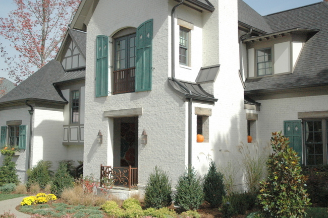
King’s Chapel, Arrington, TN
I noticed several design trends that were apparent throughout this parade of homes that I thought you’d be interested in hearing about. It was no surprise to me that the kitchens featured painted kitchen cabinets, typically with a bit of a glaze over the finish. I saw both light and dark painted cabinets, almost always paired with a contrasting island color – which has been trending for some time. Several of the kitchens featured vertically-oriented glass tile as a backsplash, which I think may be a bit too trendy for most. It’s one of those expensive upgrades that will look “so 2010” in about 3 years from now.
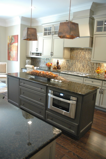 Painted Kitchen Cabinets Paired with Dark Island
Here is a kitchen where the island was the same finish as the cabinetry. You’ll notice the cabinets and island bear an “x” detailing and the backsplash tile over the stove area is quite decorative. If you have multiple decorative features in your kitchen, it might be a good idea to keep the island the same as the cabinetry so things don’t get too busy.
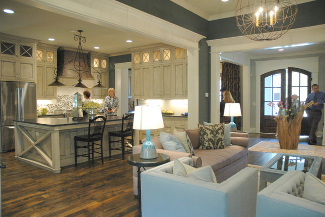
Open Floorplan Concept in King’s Chapel Parade of Homes, SW Homberg Gray walls
Another trend was a definite focus on ceilings. Barrel ceilings, painted ceilings, and wood on the ceiling were effects that brought the eye up and made the rooms appear larger.
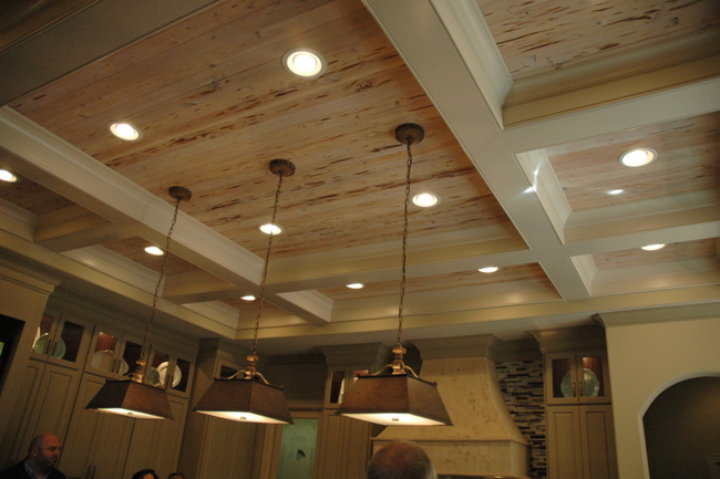
Bleached Wood on Ceiling
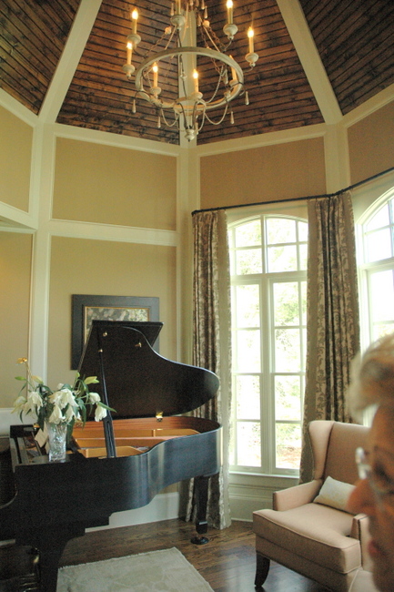
Ceiling Detail
Light fixtures were very important in setting the style in each of the homes featured on the tour. Iron, wood, wire, and glass were popular – no crystal chandeliers here!
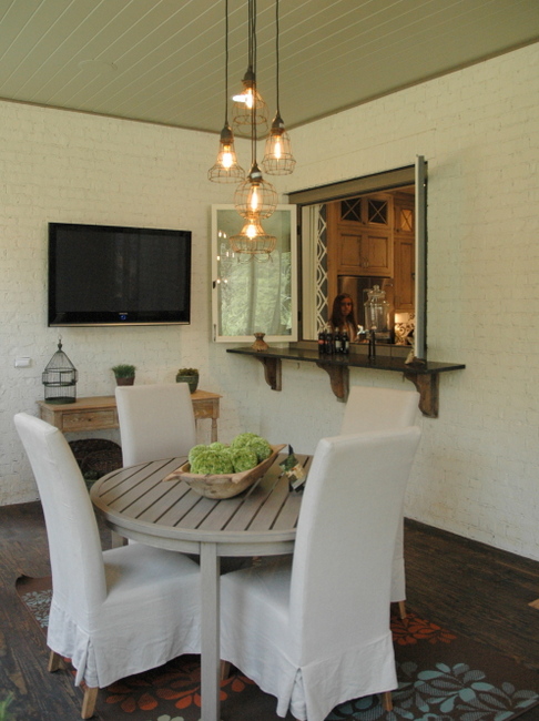
Sunporch in King’s Chapel Parade of Homes
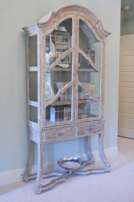
If you haven’t noticed already, all the rooms had a mix of finishes in the wood pieces – bleached, limed, painted, mirrored, and rustic dark wood finishes. The look was high-end, but not overly formal.
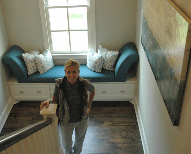
In regards to color, there were lots of brown and gray neutral tones through the main spaces, with all shades of blues as accent colors. I loved this stairwell with it’s darker greeny-blue accents:
Most of the bedrooms were either light greeny-blue:
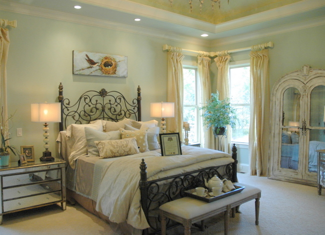
Wall Color – SW Contented, Designer – Dana Deshiell
Or tone-on-tone neutrals:
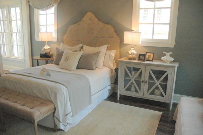
Benjamin Moore’s Cos Cob Stonewall walls, Designer Marie Joe Bouffard
This light pink guest room was the exception, and I loved it!
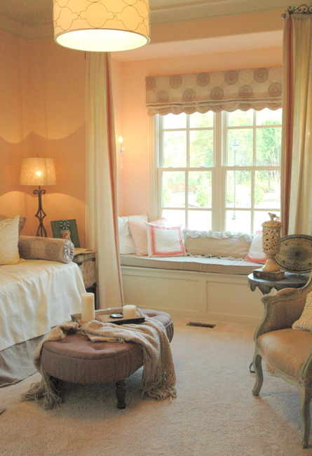
SW Romance – Wall Color, Designer Dana Deshiell
I spotted this beautiful credenza, which is currently one of the most functional and flexible pieces of furniture you can own (as I blogged about here).
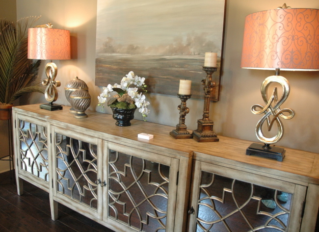
LOVE this credenza!
A couple of weeks ago I was invited to attend the VIP Awards Party to kick off the 2-week Parade of Homes. Bryan Edwards, president of Hughes-Edwards Builders, was one of the judges of the homebuilding showcase. Make sure you check out his recap of the Parade of Homes. Also check out Williamson A.M. reporter, Nancy Mueller’s take on things.

Hughes-Edwards president, Bryan Edwards, Me, and reporter Nancy Mueller
It was also fun to meet Dancing with the Stars’ Julianne Hough and her lovely sisters. Julianne recently sold her home in King’s Chapel and moved back to L.A., but her sisters are Realtors in the Nashville area.

The Decorologist Hobnobbing with the Houghs – Julianne Hough is far right
So what did you think about the homes on this tour? Did you notice anything you’d like to incorporate into your own home?







Thanks for sharing the photos. All the rooms are great! My favorite is the tone on tone bedroom. I am loving the pinted ceilings and cabinets that are in now.
Dying to paint my cabinets!
We’re loving that tone on tone bedroom too!
Great pictures! I am really noticing a lot of the wood ceilings being whitewashed. I recently suggested that idea to my daughter for her beamed ceilings. I really like the look, do you? That credenza is so beautiful!! Love!
I do like it, Kelly. It’s a lighter, more airy look than the dark wood ceilings. It really brings your eye up – urban farmhouse is so hot in this area of the country!
me too, liked that tone on tone bedroom. Also really liked that first outside shot – especially the potager’s garden look of the front landscaping! Very old world 🙂
I love the earthy natural tones and the wooden beams!
Kristie – did you see any painted wood plank floors on the tour?
No Jodi,
Most of the wood floors were fairly dark and rustic. Are you considering painting some wood floors?
I love both of the kitchens with the painted finishes. What do you think is the future of dark wood cabinets? I like my dark cabinets but are they completely dated?
If you like them, don’t work about it! Painted cabinets are definitely an on-trend look, but it’s your house and it may not be the look for you.
Hi Kristie-Love that Credenza!! Do you know who makes it?
The credenza is from a local furniture store, J.J. Ashley’s.
I too love the tone on tone bedroom and plan on using that as my guide.
I am surprised that you didn’t see any stained floors. Here in Texas, stained concrete floors are really big and I LOVE them!!! There is a good and bad: good that you can just vac/mop, and the bad: it is a lot of prep and hard work along with being hard on your back(:. (I don’t have any)
I want to know if the painted brick looked plastic up close? I have a brick home that has been added to three times but so similar and with the landscaping, it is hard to tell, THANK HEAVENS FOR THE TREES!!
I too want to paint my cabinets since they are dated(70’s) but with the options of doing just cabinet refacing, I can’t decide. The cost is lower to do the painting but time consuming and hard work since they have the plastic type front, what is your opinion? I do have a dark wood island and I will use a contrast for the cabinets. Your opinion counts, Ms. Kristie:)
No, the painted brick didn’t look plastic. Have you had that effect before? Maybe it’s because you used a gloss paint, rather than a flat or eggshell? If you want to take on painting thermafoil cabinets (I’m assuming that’s what you mean), I have good news! Annie Sloan Chalk Paint or Benjamin Moore Advance are the paints to use – very little prep work is needed, and both will adhere much, much better than other paints. I suggest you go in to your local Ben Moore dealer and get their advice for your project – their Advance line is a hybrid of latex and oil-based paints, and is recommended for cabinetry.
Ms. Kristie,
I am a little jealous that you were lucky enough to meet the HOUGH girls! I do enjoy watching Julie dance and perform but to see them face to face and talk with them, what an exciting time for you.
You have a great job and your great at what you do.
Thanks for all the inspiration you share, keep it coming!! I have really enjoyed the information and pictures to give me encouragement to tackle the projects.
Cheers!!
Do you know the name of the paint color used on the storybook shutters for the show home?
I love a good home tour! Thanks for letting me enjoy this one vicariously.
Warmly, Michelle
I am desperately searching on where I can purchase the flooring shown in the kitchen, that has the “X” cabinetry in off white (cream)
I read your latest Nolensville Parade of Homes Post and came across this old King’s Chapel Post. So glad to see our design featured in your first photo! I had the pleasure of being part of the architecture team for the Tradition Homes house. The shutters were made to look like a faux oxidized copper, although I’m unsure of the process to achieve the look. I still love the outdoor living room on the front of the home!
Very cool, Michelle! What a beautiful home!
This is indeed a lovely home, however, I am absolutely not a fan of the (trendy) open concept. Especially if it includes a kitchen. My kitchen is a very busy place with cooking, canning, baking and visiting. It is not always fit for viewing by guest or even family. I am a neat freak but I also know that a used kitchen can put out a lot of unseen debris, grease smoke, sticky stuff, etc. These modern kitchens are completely impractical and if people ever start living at home again I believe the trend will change.
Although open-concept has its appeal, I’m with you, Faye! Too much open can be a whole lotta messy 😉