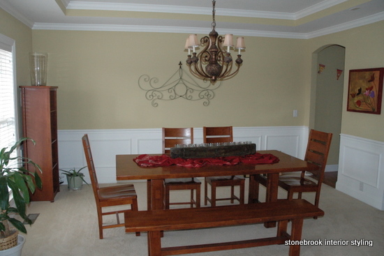
This makeover began with a very nice dining room – great architectural details and furniture. Nice, but nothing special.
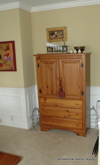 |
A large pine armoire sat in the cubby to the right of the table, and two matching cabinets flanked the front window. The yellow undertones of the armoire provide little contrast to the builder’s basic wall color. |
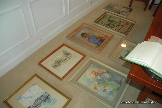
We started with a whole new wall color, Benjamin Moore’s Aganthus Green, to create a better backdrop for the client’s art. No need to buy a thing – I shopped for art around the house. Playing around with art on the floor is a good way to create just the right layout.
Before, my client felt that her dining room looked like they had just moved in (they hadn’t). A new paint job and a couple of hours of restyling later, here is the final result of this dining room makeover.
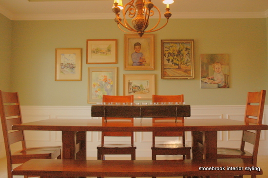
| We moved the pine armoire to another room and replaced it with the matching cabinets from the other side of the room. Rather than using them separately, I grouped them and treated them as one piece. Original art and family heirlooms are showcased in a sophisticated way. My client says now she feels like her house feels like a home. I think it looks elegant, arty, and very special. Just like her! | 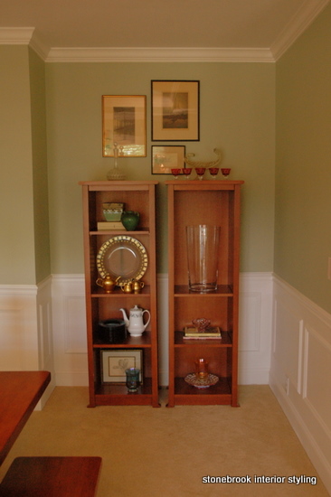 |
Photo Credits: The Decorologist (formerly StoneBrook).






great ideas…
These are my favorite types of posts! Great job.
yes. yes. i love this!! im still working on this particular challenge for myself. do you think it takes time to collect similar enough images that work together in a collection?? plus i have a husband who loves music posters and im trying to work with that….. anyway.. with time.
Heather, it does take a little time to collect images to do a gallery – but sometimes I think people have all they need, they just don’t realize it. This client has had this (and lots more) art for years, but didn’t think about putting it together in this way. She thought all the frames had to match, or that the theme had to be really cohesive. It just doesn’t – sometimes the sheer act of grouping them makes seemingly dissimilar images work together. All these frames were light-colored, but not the same. The colors in the art varied, but from a distance they blend.