I see it all the time: rooms that lack balance. When your furniture is not balanced, the whole room feels off-kilter.
Here’s a good example off an off-kilter room I worked in last week. From this angle it didn’t look so bad, in regard to furniture placement. There wasn’t a lot of color in the room, obviously. First of all, I suggested we move away from the paint color that looked a bit like a band-aid. Sorry, but pinky-beige is not your friend. Just ask Color Expert Maria Killam how she feels about pinky-beige!
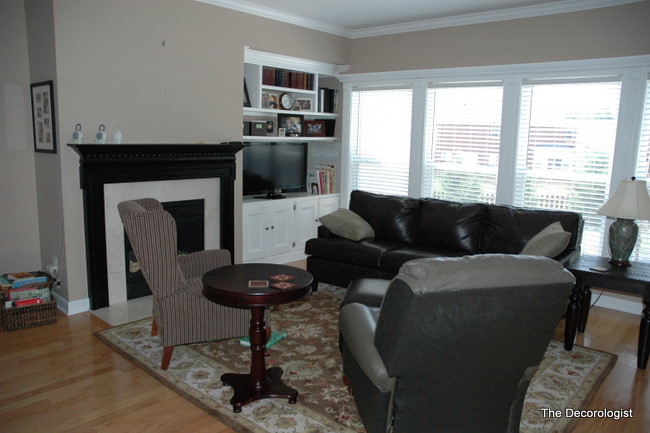
Before
Ok, now let’s look at the room from another angle. This is how it looks from the kitchen. This is a tricky room – you have to have enough room to walk through on the left to get to the master bedroom. The bookcase to one side of the fireplace sure doesn’t help with the balance issue. My client tried to even things up by placing a console with a mirror on the left side of the room.
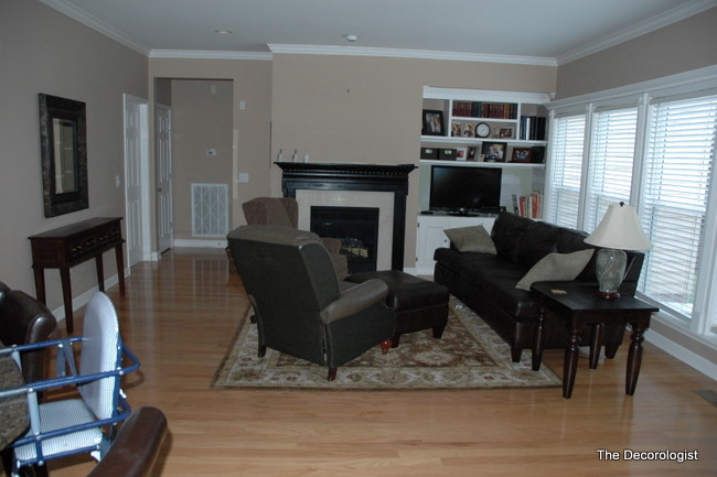
Off-Kilter Furniture Placement
First things first – the paint changed to a more current neutral – no more pinky beige! Then we evened things up a bit. The fireplace is now the focal point and one of the chairs was changed out with one from the bedroom.
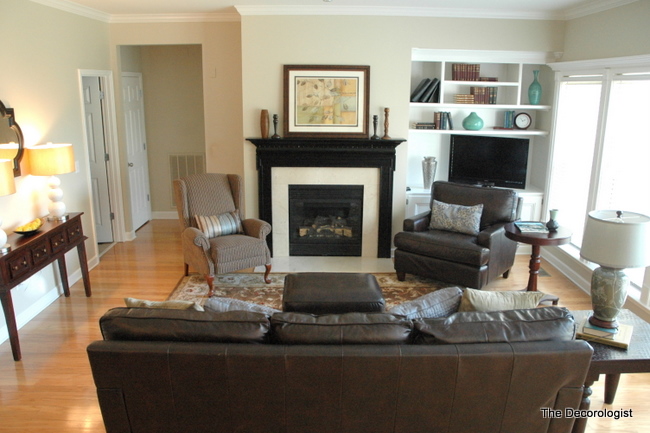
Living Room After Paint and Rearranging
Even though the sofa now floats in the room, this arrangement opens things up and makes the conversation area more welcoming.
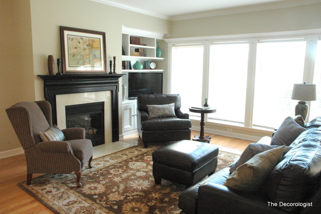
Living Room After The Decorologist
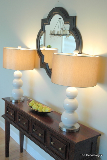
Adding visual weight and interest with a pair of lamps and quatrefoil mirror on the left side of the room helps even out the bookcase, which is also styled up a bit.
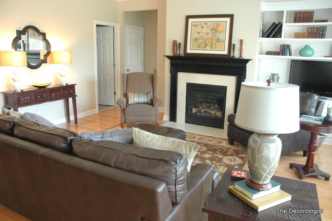
Living Room After
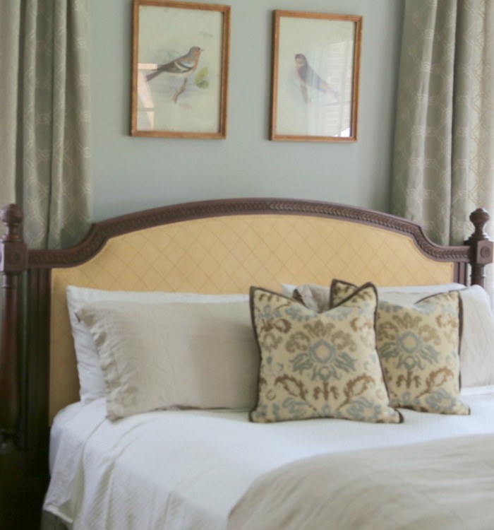
This room is part of the finished product of my latest home staging project. I’ll be posting the entire house on The Decorologist Facebook page later this week, if you’d like to see more.
Home Staging is all about psychology and perception. Do you think that potential buyers will feel as though they could move right in and make this house a home? I’d love to hear what you think.






Kristie, you continue to amaze me with your work. In that first photo, the furniture looks all bunched up and a little claustrophobic looking, but the new layout really opens it up (and you brought that couch away from the windows/wall – yay!). And I also love that you brought in some much needed color to those built-in shelves too. I think it looks great and would be intrigued to visit this house if I were a potential buyer.
Wonderful transformation and I love the paint colour you chose!
THanks for the mention!
x
Maria
thanks, dear!
Big improvement!! I love your blog Kristie~always great presentation with easy to implement ideas. You are a great decorator and the folks in the south are lucky to have you~!!
awww, thank you so much amy!
I like the way you opened up the space. You can tell that the emphasis was built around being able to view the television (one of the things that drives many home owners to adopt poorly-planned layouts). I abhor that brown-pink color…so many people use it thinking it’s a better neutral choice than beige, white or khaki. Adding those little pops of blue around the room livens things up a bit, too. Well done!
We recently moved to Boston, and our apartment’s living room is similarly wonky. There are three windows on three angled walls on the exterior wall, a built in bookcase that’s off center to the left if you’re looking at the central window, a large entry way to the right of that window, and we need enough space to pass through to the kitchen and bedroom. There are two smaller arched entry ways opposite if the windows. I put our TV in front of the central window with side chairs on either side, and a coffee table and our couch facing the TV. Since the flow is from the front of the house to the back, I think it works even though the couch is smack dab in front of the larger, less used entry way.
At least I have color 🙂
The room looks much, much larger in the “after” photos! Furniture placement is something I really struggle with, so I hope you’ll write more awesome posts on this topic.
I’ve been learning about balance in my interior design course so I tried to figure out the best placement before moving to your solution. I actually thought about the couch being moved across from the fireplace. I didn’t think about adding those lamps which makes such a difference. My only concern for a family who was acutally living there is that they wouldn’t be able to see the TV with the other chair in front of it. What would you recommend if this was your client? Maybe they would be a TV over the mantle kind of family which would solve the problem. Thanks for a great post. I learn so much from you.
Lisa,
I’d encourage a chair that has a low enough back to see the television over, then the television doesn’t feel like it’s the focal point of the whole room. You could always move the chair more to the side and turn it around a bit if everyone wants to be watching tv at the same time. I’m not a big fan of the tv hanging over the fireplace, but it works well for some. Thanks for the feedback, as always!
You’ve done it again! Great demonstration of the importance of furniture placement to the feel of a room! Thanks for your simple helpful advice – it’s invaluable!
I would be ready to move right in. However, I have a question. What if you have two large focal points in a relatively small living room that is long and narrow?. A fireplace with mantel in the center of the largest wall and a 55″ tv that lives on an entertainment center of the wall that is perpenciular and also serves as the entrance to the living room. What is the “priority”? I believe I have one of the most unbalanced living rooms in my town….lol. I’m loving the new neutrals wall colors., I have swatches of paint colors taped to several walls in my home. Ummm…my beloved can’t believe my indecision. Why can’t men understand the importance that the color of the wall makes? Why ask why? lol. Thank you.
Beautifully done, Kristie. I can’t stress balance enough with my clients. Whether it’s furniture, color, texture, shape, size – balance is the key to good design.
Wow! Great job, Kristie–even the rotating of the carpet made a difference.
Also, that you had the A/C return painted out–that was a real distraction, back in that hallway.
Would artwork on that hall wall have made a difference in the balance thing, do you think?
I’ve been in contact with HSR training for staging. They seem to have a wonderful online course. Have you heard of them? My husband & I love to do it together. I thought the best place to start tho, will be Maria’s Color Workshop. Your blog is a great example of the right ways to achieve balance & beautiful!
Any advice appreciated. Thanks, Kristie.
Paula,
I always have my painters paint out any registers/returns in wall color – makes a huge difference. Would have loved to hang a piece of art in that hallway, but the a/c control thingee made it difficult – would have had to hang something over it, where it would have been too high. i wish architects and builders would consider these details a bit more!!!
I am honesty unfamiliar with HSR – CSP bought out the company that I trained with (PSC). Maria’s course is a lot of fun – I’m sure you will love it!
PS: Who draws these kinds of floor plans, anyway??
Can we find him and arrest him???
I’m pretty sure it wasn’t a woman. 🙂
Great job Kristie! You really opened the room and made it welcoming also. The Decorologist did it again! As Kelly mentioned above, balance of the room is so important in good design.
You worked your magic on this one! And what a difference it made. Another home run for home staging by the one and only… The Decorologist!
Thank you, Sheila – you are, as always, too kind!!!
There’s a big chair in front of the tv. This would never work in our home. It does look nice. I’ll keep poking around your site to see if there’s something that we can do with a tiny living room with fireplace & tv.
I just love your site Kristie! My living room is similar to the above design but without a fireplace or bookcase! Just a big, blank, wall! I’ve been combing your site looking for a solution to a room without a focal point and solutions for that but haven’t found any yet! Was wondering if perhaps an electric fireplace as a means of creating a focal point would work? I’d love to see a blog on this topic, Thanks!!
Julie,
Thanks for reading! Here’s a post where we added an electric fireplace – see what you think!
https://thedecorologist.com/interior-design-for-a-nashville-living-room-and-a-few-insider-secrets