How on earth can you design a room when you and your decorator are in a long-distance relationship? Let me share a little about how I am able to help clients long-distance through the magic of this little laptop computer!
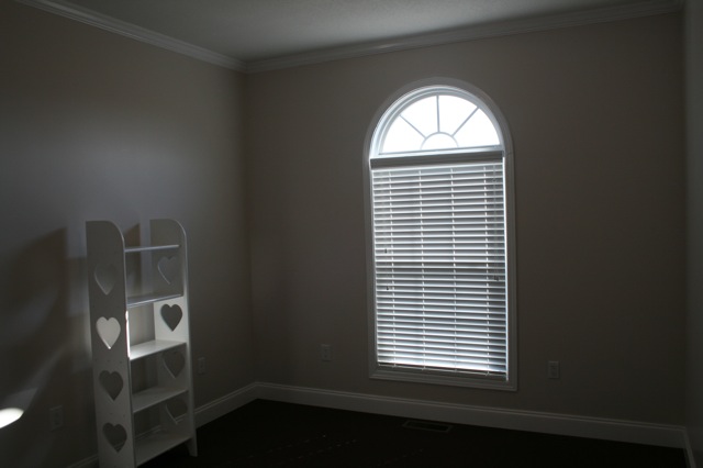
Here are photographs of the nursery in one of my on-line client’s home. The “new” room had to include the white shelf you see here, as well as a blonde crib, dresser, and a sadly-dated upholstered glider rocker that were used by previous babies. But my client wanted her new baby to have a “new” space all her own.
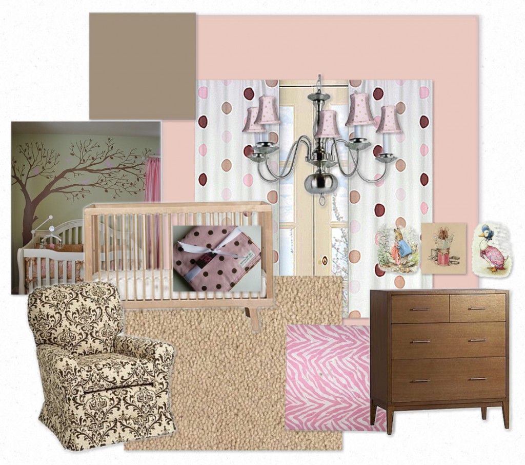
My challenge was to cast a vision for this room without actually being on-hand to make it happen. We talked about what she wanted for this room, as well as what she didn’t want (which is equally important). I suggested a ballet pink for the walls and a chocolate brown for the ceiling. After that decision was made, I put together an inspiration board to help my client visualize what I was beginning to envision for this room. The inspiration board included what she already had and new items to purchase, including a light fixture from Lowe’s, polka dot curtains, and a fun tree decal that can be purchased on-line. I also suggested she paint the blonde dresser in the chocolate brown from the ceiling, and invest in a custom slipcover for her dated glider. This is what I sent her, along with specific written suggestions:
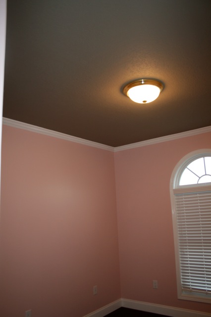
Excited to get started, my client scheduled painting and ordered the curtains and lighting. My seamstress will be slipcovering the glider with the fabric you see on the inspiration chair above. This is the photo I received this week of the freshly-painted nursery:
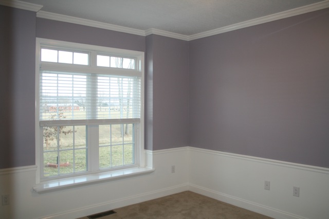
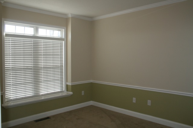
The older daughter’s room had to include the existing basic furniture, but she wanted new paint colors, bedding, curtains, and a theme to pull it all together. It also needed to double as a guest room for family and out-of-town guests. Here is a photo of the room in its “before” state.
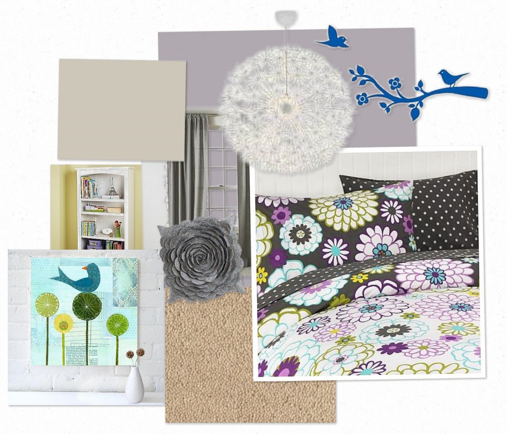
I suggested painting the upper walls in a dusky lavender, while painting the walls below the chair rail in the same white as the chair rail – creating a wainscotting effect. I also suggested that an existing wicker chair be painted in Benjamin Moore’s Revere Pewter. This is the inspiration board that included some fun Pottery Barn bedding, gray window panels, an IKEA light fixture, and some fun bird accessories.
So now that room is painted, and this is where we are now:
It’s really helpful when you can “see” a designer’s vision rather than following her suggestions blindly, don’t you think? I can’t wait until I can share the finished rooms, but for now the client will be finishing up the shopping based on the roadmap I gave her.
If you need help casting a vision for your space, learn more about how The Decorologist can create an inspiration board tailored just for your space, style, and budget!







So pretty! These remind me a lot of what we did with my girls’ rooms. I’m digging the wall decals and thinking that would be cool in kiki’s room. I know you’ve posted about those before, but do you have a website you prefer/recommend for those?
Gosh, there are so many companies putting out wall decals now: RoomMates, Blik, Dali, Wallies, Target, Modern Wall Graphics, Pottery Barn Teen, etc. Just google what you want – like, “dots wall decals” or “tree wall decals.”
Can’t wait to see the finished rooms…
I love these color choices and it’s so fun to follow along and see how they develop! Thanks for sharing with us. I love those Beatrix Potter images in the nursery and that chair fabric is beautiful. What program do you use to make your mood boards?
this is really nice. I have a question for the second room: is that you think the original color combination is not very suitable for guest room? Because I’m sure there are pieces that can be found that go with that color combination… thanks
Yes, Joy – the green was not unattractive and would work nicely for a guest room. It’s just that she wanted something different and something that her young daughter would like. Little girls love purple – I wanted to choose something in that color family that felt sophisticated enough for a guest room but still fun and young for a little girl, which is why I went for that grayed-down shade of purple.
My mom was skeptical when she heard the ceiling was to be brown but once she saw it on the finished room she agreed it definitely works. I had to chuckle about the slipcover fabric for the glider – it reminds me a LOT of the aprons Amy and I wear on the Breads DVD!
http://www.wellfedfamily.net/aboutus.html you can see the aprons (although not very well) in this picture. I remember we searched long and hard for those aprons! Did you have any input on that too? I can’t remember now.
Anyhow, you have beautiful ideas! I envy your talent!!
lee, that is too funny – i actually do think your sister asked for advice on those aprons way back when, but i don’t remember the specifics! the brown ceiling will look even better when the dresser is painted that color and the glider is slipcovered with that fabric, plus all the brown polka dots in the room. i always appreciate your comments, lee! we really must meet in person someday 🙂
What a fun treat to see these rooms featured here today! 🙂
It is ironic that you chose this topic because I have had someone commenting to me that they would like your input on a room, but didn’t think you could do it because you had never been in to see the entire house. I said that probably you would just need some photographs (which you would specify – from what angle, specifically what rooms or objects, etc). It would be great for you to explain that you don’t have to have visited a house at all, or to have even met the client in person, to do this long-distance decorating. She struggles to see how it would work because even though you have REALLY helped me long-distance, you have actually been inside my house.
It is really worth it to me to get your help because it saves me SO MUCH TIME in the long run. And I am very busy!! No more anxiety – just immediate answers and ta-da! A BEAUTIFUL finished room!
thanks amy! i can’t wait to see the finished rooms, of course!
So nice Kristie. Great job! Helping people visual where you are headed in your design helps so much. Really impressed girlfriend!
thanks, kelly 🙂
you are so super fabulous! love to see this idea at work!
Love the polka dot curtains, hope she sends an after photo! So great what you put together!
xo
maria
Good Morning Kristie… You are so very talented!!! Can’t wait to see the finished results…
Hi Kristie- Maybe I missed it somewhere in the post, but how much do you typically charge per room for ideas? The ideas look great. Thanks!
Misty, you can check my rates by clicking the “services” tab at the top of the blog. Typically I charge by the hour, but for a Virtual Design Board the cost is $150 per room. This includes initial on-line consultation about what you already have to work with and what your needs/wants are, specific instructions for furniture and art arrangement, and recommendations for specific products (furniture, bedding, flooring, curtains, lighting, etc.).
Thank you!
Hi decorologist!
While decorating my office I’m trying to incorporate as many natural pieces (real wood, wicker, etc) as I can and avoid the typical black office chair and computer cords look. My issue is that I have a lot of pieces that don’t follow my theme and I’m having a difficult time with it. Is this something you could help with?
I love your work! could you tell me the brand of the dusky lavender, I would like to paint my youngest daughters room that color,
thanks
Donna
Donna,
Try Ben Moore’s Pebble Creek 1453 or Dusk to Dawn 1446 – I think it was one of those.
Hi Kristie ,
Just came across ur blog,ts really wonderful…..we jst started buildin a house,the family room and kitchen is really small…size of the kitchen is 14’8″X9’8″,and attached is the family room of 14’6″X19’4″….so how can i make mu kitchen and family room looks big.what colour of coutertops and cabinets shd i use to make them look bigger and popout.attached is the link of our floorplan.Can u plz help me out…how shd i furnish the house to make them more bright,simple and welcome….hope to c ur rply
http://www.centerlinehomes.com/real-estate-new-homes-for-sale/41/eagle-creek/155/castello/
Thanks,
Manisha