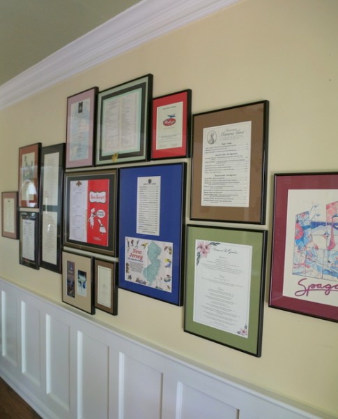
I hope you enjoyed the dining room to living room transformation I shared at the end of last week. What I didn’t show you is the “new” dining area. What I wanted to share today is the art grouping I made with the menus the couple have been collecting throughout their relationship.
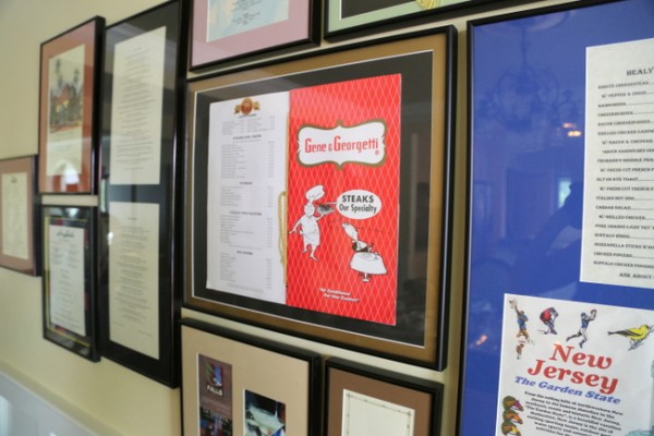
restaurant menus
Apparently, many high-end restaurants will let you have a menu to keep and frame if you only ask! Whenever they travel or go to a special restaurant, this couple asks if they can have a menu to add to their collection. They had grouped their menu collection on the long wall of the previous dining room, but now they needed to be moved into the new dining space. This is how the shorter wall in the breakfast room area looked before:
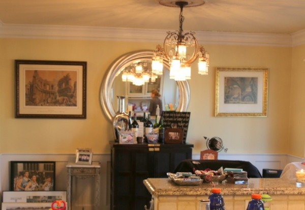
breakfast room area before
When I’m creating a new art grouping on a wall, I first lay it out on the floor and play around with it until I feel like it’s “right.” This arrangement fell together amazingly quickly! After I got it together and measured the length and width of it, I photographed it so I could replicate it step-by-step.
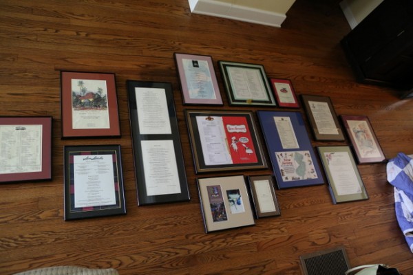 planning the wall art grouping out on the floor
Are you ready to see it up on the wall? I love it when a plan comes together! Here’s the finished wall:
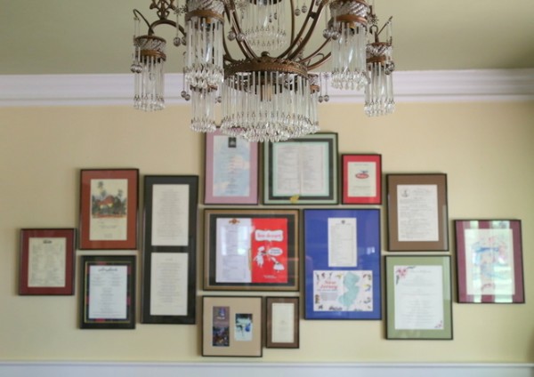
restaurant menu grouping
I grouped the menus so that there is room to add a few more over time. The trick to making this look good? Keep the interior spacing consistent.
I think this is a fantastic and really special way to create a wall of memories! Would you do a wall of restaurant menus?







What an adorable idea. So many memories. Do they date the menus as they collect them?
Love this idea! My hubby and I actually talked about doing this once and even started collecting but that was many years and 5 moves (and 2 children) ago. Oh how I regret that we didn’t continue. So many great memories are tied into the wonderful restaurants we loved in each city we experienced.
I have been packing and unpacking a menu from the Andrea Doria for years. My grandparents were on the last successful voyage. The cover has a pretty watercolor and their names and date printed on it and inside is the menu. I always knew I wanted to display it so that both sides were viewable, but couldn’t quite figure out what to do. When we bought a house on Cape Cod and started renovating the kitchen, I knew that now was the time to figure this out. I found a two sided frame that I mounted it in. Then, I put up a little painted iron display rack so that it sits on the rack, but you can pick up the frame and flip it around to view each side. It makes quite a conversation piece in the kitchen.
Well, here I thought we were the only ones! Well, we only have two – but they were from two VERY special meals, and they are both in our kitchen for cooking and food-memory inspiration. So I guess it’s a thing!
We have about 30 menus that we have collected over 15 years together…from 5-star restaurants to meals from international travel to the Chuckwagon. We like what we like.
Awesome, Michelle – do you display them? How?
Love this look and what a great way to enjoy those memories. Sorry – I’m not sure what you mean by “keeping the interior space consistent”
Toni,
I said keep the interior SPACING consistent. Meaning, the spaces between the pieces of art should be the same – whether that’s an inch or 2 inches apart. Does that help?
Great! I’ll have to try that with my photos. Thank You.
I have all but about five displayed in inexpensive, matching frames from Hobby Lobby that they keep in stock. I did that so that I can continue to add menus with the same look. It takes up a good portion of the wall in our rec room, and it is a really personal, sentimental display.
Haha, I have close to a thousand menu’s collected from around the world in the past 30+ years – anyone with an idea what to do with them let me know [email protected] thanks John
How about applying them like wallpaper to create a feature wall? Or having them framed and hung in a fabulous grouping?