I’ve often heard said that art doesn’t have to match your sofa (or your room, for that matter). The thought is that the la-tee-dah art is so much more important that your furnishings and other decor that making sure it matches is an insult. I believe it’s an insult not to consider the size, shape, and colors of the art when choosing it for a space. Don’t you want the art (and room) to look as good as possible?
This is a story about using art as inspiration for an entire color palette, but it’s also about repurposing a dining room to create the grown-up living room these tired parents needed to entertain and feel, well, grown-up. Here’s the dining room before: 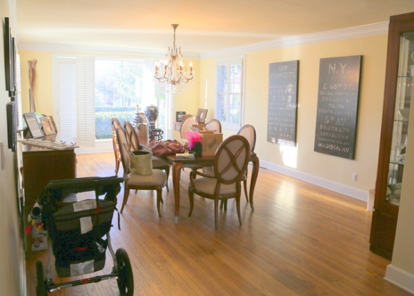
dining room before
This huge room was rarely used, and my clients were considering changing the space into a play area for their children. There is an adjoining breakfast room that is large enough to accommodate the existing dining room table, minus a leaf. They already had an informal den in the home where they hang out and keep toys. After discussing ideas for awhile, I talked them into creating a grown-up living room and using the less-attractive den as the dedicated play area for children. Are y’all ready for this? 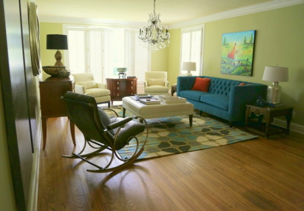
living room after
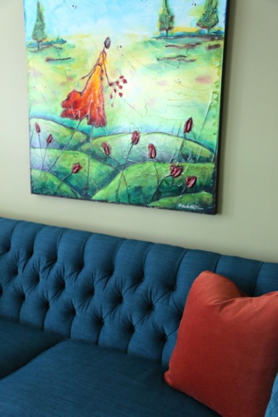
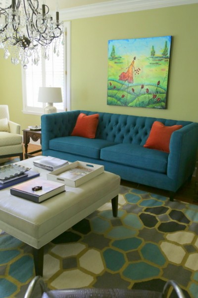
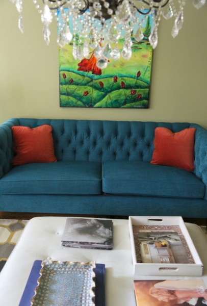
Let’s talk about the choices we made in this space – first, there was a special piece of artwork hanging in the home that we decided we wanted to use above a new sofa. The colors in it were vivid and fun. In order to make that piece of art sing, we developed the color palette to complement the art. Art is highly personal. I rarely choose art for clients, except to tell them what size, shape, and colors I recommend they look for in a given space or on a given wall. When they already own a special piece that they definitely want to use in a space, I take it under consideration when choosing paint colors and fabric for the space.
The first thing I chose was a wall color that would blend with adjoining areas and be the right backdrop for the art. The room and adjoining areas were initially a butter yellow. We left the breakfast room, kitchen, and hallways yellow and chose a muted yellow-green for the new living room. We could have defaulted to a neutral, but this choice made for a sophisticated yet just-a-bit funky space. The ceiling stayed butter yellow as well, and worked out beautifully. 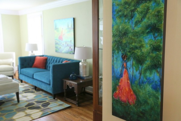
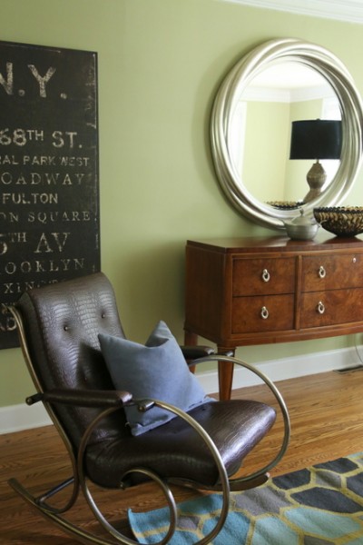
This second piece of art by the same artist furthers the cohesion of colors in the space – it’s hung on an adjoining wall with the original butter yellow wall color.
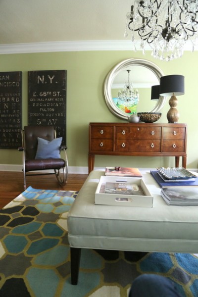
I love how the new rug pulls it all together – the wall color, sofa color, the creamy leather ottoman color, and a few more colors to punch it up. It all works together, without being too matchy. We repurposed the dining room buffet as a console in this room – eventually, a flat screen television will replace the mirror above it.
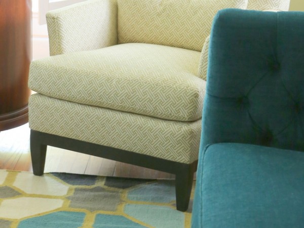
new green and cream arm chairs
Although the new pair of chairs look creamy from a distance, the fabric is cream with a small pattern of green links. It looks like a lighter version of the wall color. The slim arms give an updated profile to a super-comfortable arm chair. 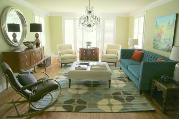
living room by The Decorologist
The room is perfectly balanced and arranged in a way that looks as though this is exactly where each piece of furniture and art should be. Here’s an overview of where we found everything: we got the tufted sofa, armchairs, and rug from Merridian Home Furnishings, the mercury glass lamps from Home Goods, and the sofa side tables and a few decor items from a yard sale. The buffet and chest between chairs were in the previous dining room, leather ottoman/table was pulled from the homeowner’s rec room, and the metal and leather chair was in the baby’s nursery. The beautiful art is by Marabeth Quin.
Did I mention that my client is having another baby next week? We got this room installed just in time for the new arrival and visiting family, whew! I think the baby will enjoy being rocked in this beautiful space . . .
find out more about this art here
What else do we need? I recommended some large gold trays from West Elm for the leather ottoman/table and an additional pair of patterned pillows for the sofa. And a light speckling of orange decor items. And can I say I LOVE the look of this glamorous dining room chandelier hanging in the middle of this gorgeous living room!!!
Maybe art doesn’t have to match your sofa. But if it does, the results can be phenomenal. Do you agree or no?


I absolutely adore this space~ bravo! When I visit homes on color consultations where art is very important to the client I generally pick tertiary shades from the painting and it just makes the art stand out and become all the more interesting.
Thanks, Laura! If we hadn’t paid attention to the colors in this art when choosing wall color and upholstery, I think this room would have never turned out this good.
There are many “art snobs” out there who feel that “lah-de-dah” art should speak for itself. This room is beautiful and I totally agree with you. Great job…as usual!
Thank you, Susan!
Oh this is beautiful. Love the art! Love the furnishings around it! Love the colors you did with it. (And I really wish they wouldn’t ruin the wall by putting a flat screen tv there. My #1 rule is HIDE THE TV! (unless it’s in the basement!) 🙂
What a nice way to prove your point! Pictures say so much more than words! Thanks for sharing! xoxo
Love this room Kristie! I have that green wall color in my kitchen and it acts as a neutral color for my art. I am a folk artist and use a lot of bold colors in my paintings. A lot of my buyers buy a piece they love and then find a place to display it in their home. Some buy it after they decorate. Either way works. I don’t think the style of art even matters for the style of your home. I think the key is to just buy what you love. Great job! I love your blog.
Love it.
No tv, please.
Margaret,
If they do put a tv in here, it’ll be hung over the buffet with a pair of lamps on either end – it will not be the obvious focal point of the room 🙂
Beautiful room! In a related question….I have over 30 art prints by Don Ensor, a deceased KY artist that I have collected since the late 70s. They are all framed and hung, but very country and nostalgic. I still love them, but have tried to move away from a totally country look. What to do if you love the art and the sentiment, but not really the way it works in your space? Especially if you can’t bear to part with it??
Sometimes it’s best to group such a collection very tightly on one wall so it reads as a whole – maybe you do that in a room with eclectic, modern elements so it doesn’t appear like you are living in that “country” look but appreciate the art. Make sure to check out my post on Monday, when I show how I grouped some “special art” for this couple in an adjoining space!
I love the look of the room today . . . and the piece of art is lovely too.
BUT, if I was fortunate enough to own a Picasso, a Degas or a Monet I do not think I would be worried if the paintings matched my decorating. They would be hung because I love them and they are a very valuable investment. Art should be appreciated by everyone and if a piece is worth millions . . . even better!
i LOVE that rug
It’s great, right? But it’s a flatweave – works well on hardwood, but not on carpet.
Love what you’ve helped this young couple do with their home. Fabulous! And thanks for introducing me to this artist. Her work is so alive!
Love what you’ve helped this young couple do with their home. Fabulous! And thanks for introducing me to this artist. Her work is so alive!
Kristie, loved this piece and feel honored to have my work featured. You did an amazing job; it just looks absolutely wonderful! Many thanks!
What a beautiful room!
What a beautiful room; elegant but comfortable. The wall color is perfect and makes a huge, but subtle impact. Can you tell us the brand and color?
Your timing could not have been better to post this redesign! We removed a fireplace on our back wall of our living room and put in a bank of windows. We were talking today on how to place the furniture and possibly adding TV. We also have a large square ottoman in front of our couch. Your design is exactly how we were thinking to do it. I was also planning to replace a large oil painting we have above our couch. We love the painting and does match our color scheme. I was thinking that it isn’t a popular choice to hang a large picture over the couch. Voila! I open up your article and there it all is. Thank you so much for sharing ideas with us.
This is a vert nice article, and I love how the room turned out. I also like that it isn’t matchy matchy but all coordinates so well and highlights the art. One of my favorite art/sofa pictures is a photo of Artist Rene Magritte’s apartment (google it, from 1986).
Love this space. Any idea where the rug is from? Love it!
Love this room. Any idea where the rug is from? Thank you!
Love this room. Any idea where the rug is from?
This is a knock-out! Outside the park. Congratulations.
The art was already in the home. Colors and style that
were already embraced. I think you have beautifully
demonstrated how art you love and rooms we love
are the same thing when orchestrated by an expert.
Hi, found your page with the words: wall art match,
was a pleasue
I always enjoy your tips, thanks so much. This will come in very handy because I often run across young families that have no interest in using a formal dining room, especially when they already have an eat in kitchen. The light fixture over the ottoman/coffee table is a perfect solution to the layout.
“The thought is that the la-tee-dah art is so much more important that your furnishings and other decor that making sure it matches is an insult.”
No, that’s not the thought at all. The thought is that you should buy artwork you like, and not because it matches your sofa. “La-tee-dah art” is insulting to artists, like me. What if I referred to your decorating as “something she threw together” or “la-tee-dah decorating”? It’s not that I think my artwork is so important — it’s that I encourage buyers to buy my art because they like the art, not because it matches their current couch or wall color. What happens to the art when you replace the sofa, or repaint the living room, or move? I am an artist, and just had someone ask me about commissioning a landscape to match her living room. I can certainly pull colors from her palette of personal taste to incorporate into the painting, or use colors that compliment the current color scheme, but not if the colors don’t make sense for the panting.
Remember, a lot can be done with the framing to tie a painting in with the rest of the room. In the examples above, the simple lines of the unframed canvas works with the clean lines of some of the elements in the room — the couch, coffee table and white chairs. But, those paintings would look out of place in an early-century setting, even if the colors were present in the room, because the style of the artwork is contemporary. A Picasso would not work in my grandmother’s living room, no matter what the colors were in the piece, because the style are incompatible. So, my recommendation, as an artist, (especially if you’re spending a lot of money on a painting) is to buy a painting that you like, no matter where it’s going to hang, and THEN incorporate it into your decor. Chances are, if you like a painting, it will already match your decor, because it fits in your personal taste profile.
As an end note… I don’t paint on an assembly line. Each painting I do is thoughtfully executed, and is the only one like it, and that is true for most artists. Even if I paint the same scene a number of times, each painting is a separate interpretation of that scene, and no two paintings will be exactly alike, so people who buy my paintings are buying a one-of-a-kind original piece. So, yeah, in that respect, I would hope that one of my pantings deserves a little more consideration than a throw pillow.