| Many of you know I recently spent over a week in London, England. The one souvenir I really wanted to bring back with me was a “Keep Calm and Carry On” sign or print. During World War II, the British government commissioned this poster to be posted as an encouragement for the Brits to keep a stiff upper lip during the harsh wartime period. I’ve seen this a lot in decorating magazines lately – probably a retro revival due to the current economic recession. Of course, I thought it would be easy to find there – but NO! I only found a single coffee cup bearing this saying, and I really wanted something to hang on the wall. | 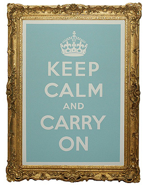 |
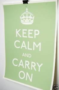
Google and Ebay to the rescue. I’m just gonna have to break down and order one on-line, even though I’d much prefer to say I got it while I was in London! Now I just have to choose between the duck-egg blue, mossy green, and bright pink. Help me decide!!!
a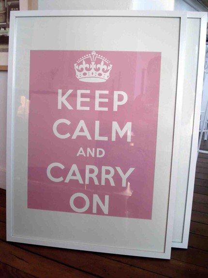
Please let me know which color you think I should get in the comments section below – I will likely hang it in my living room, sunroom, or dining room. I would really appreciate your help!





the duck-egg blue seems like it’s perfect for you…but then again I may just be remembering those amazing cookies 🙂 I also love the green!
if it were me, pink or blue. but im just really in love with that massive gilded frame around the blue one. i like the blend of styles there. a white frame is nice but somewhat predictable. what do you think?
I like the mossy green. But I think it is because I don’t like the frames with the other too. Ok, frame or no frame I like the mossy green.:)
OOH, I want one! Love the blue for me and for you. (Although the name “duck-egg blue” sounds icky for some reason.)
I personally like the green, but somehow I see the blue one in your house…especially with that frame!
Though green is always my favorite and you love pink – I just love the blue! – Mitzi Leigh
Kristie, the blue is you! Beautiful!
I think blue’s a good choice, will go great in you’re house…blue with an old picture frame. I love it!
The green is my personal favorite–as you might guess from my living room decor. However, you are much more creative that I so you can probably come up with a great idea for any of the colors. F
My first choice would be the blue, with green as my second.
I say green. But then, I will ALWAYS say green when given the choice! Honestly, I do think the green would look good in your living room.
Duck-egg Blue is my vote.
Bright pink too girly & moss green doesn’t have enough punch!
I’m leaning towards the duck-egg blue at this point – and I’m with Heather: I adore the gilt gold frame with it. Definitely elevates it from poster status. But the hot pink would be fun with that frame, too. Still not sure . . .
Green!
The duck egg blue seems the most calming, as it is a message of calming! The pink is fun but counter intuitive to the message. Hot pink says have fun! It’s time to party!
Duck-egg blue is definately Barnett style. That frame is the way you roll.
green–with the gilt frame. (of course, you know it would be blue for my house!) 😉
the white mat is too close to the lettering on the pink one — it would be pretty cute sans matting.
Love the duck egg blue but the extra pick-me-up is the fancy frame. Green would be my second favorite. I don’t see them having pink signs duing WWII but I could be wrong! 😉
Allison, my understanding is that the original posters were done in red lettering. Definitely no pastels or bright pinks! But red just doesn’t go in my house! 🙂
Blue would be beautiful or the green. What do the girls think?
Blue gets my vote, although the green is a close second. The pink is a little too bright.
I love the blue…love the gold frame too
I like the blue but love the green… classic and clean looking. And a nice blend with most interiors. The choice in frame will make all the difference in both.