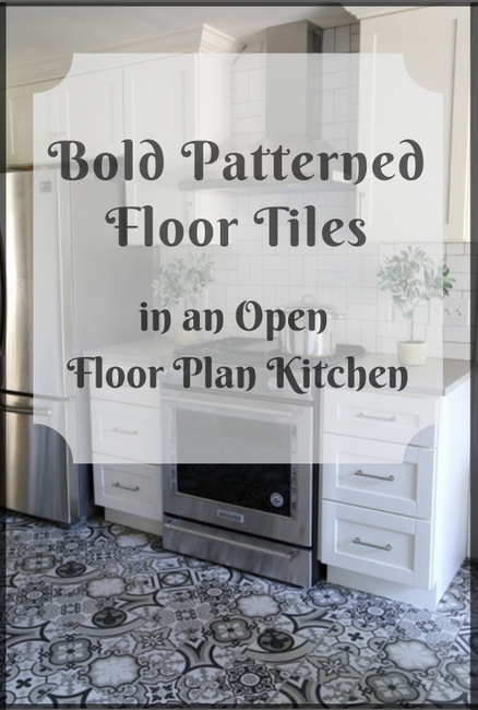
Many homeowners are embracing the patterned floor tiles (often referred to as encaustic tiles) that are becoming mainstream this year. Most of us want to make a personal statement in their kitchens, and installing patterned floor tiles are certainly one way to do that.
Last week I photostyled and photographed the final results of the kitchen in the home of a client, who is also my dear friend and former office manager! Allison and her husband decided to take out the wall between the kitchen and the living room in order to open up the space and make it more functional for their family.
Here is the before photo of the kitchen:
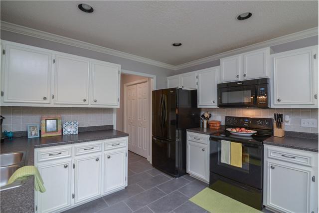 before
Allison wanted new white cabinetry, a large island or peninsula, and plenty of storage. I consulted on the cabinetry layout, flooring, lighting, countertops, backsplash, breakfast room furnishings, and (of course) the colors.
Here’s the tricky part: her house already had hardwood throughout, with the exception of the kitchen (which had vinyl). The old hardwood could not be matched, and replacing it all wasn’t in the budget.
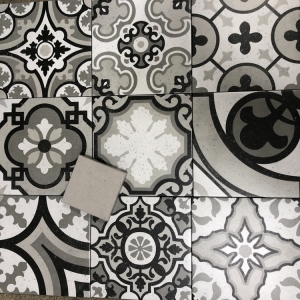
Allison saw a patterned tile floor I had done in another project and was interested in doing something similar. We both liked this crazy-quilt patterned tile that was within her budget. Rather than go with white or black quartz for the countertops, I found a warm gray quartz that worked great with the encaustic-look tile. Here’s the quartz sample on the floor tile:
With the wall between the kitchen and living room coming down, the transition point between flooring was a conundrum. My suggestion was to keep up a partial wall (for a couple of reasons) and to do a double-wide peninsula (rather than an island). That way, there would be only a small place where the flooring would visibly change from hardwood to tile.
The double-wide peninsula creates a half wall of separation from the living room (and its hardwood flooring), plus provides lots of extra storage and countertop space. We decided to do a few open shelves to make it feel a little less kitchen-y. Here’s the after shot from the same angle as the before photo:
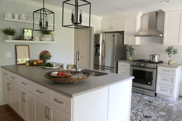 design and color by The Decorologist
Take a look: the sofa hides the shift in flooring when anyone is in the living room anyway!
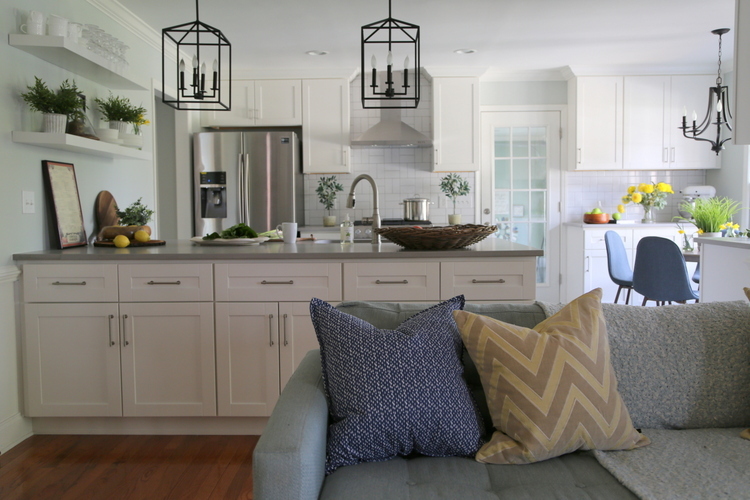 design and color by The Decorologist
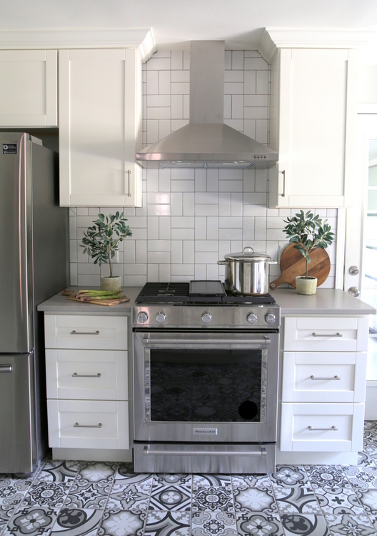
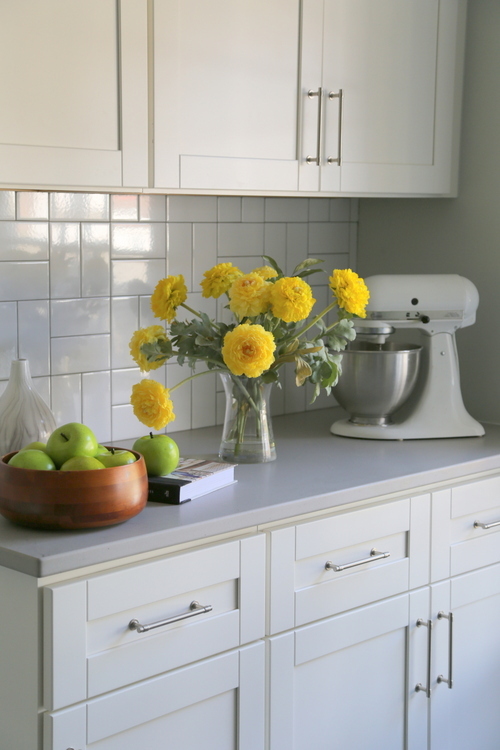
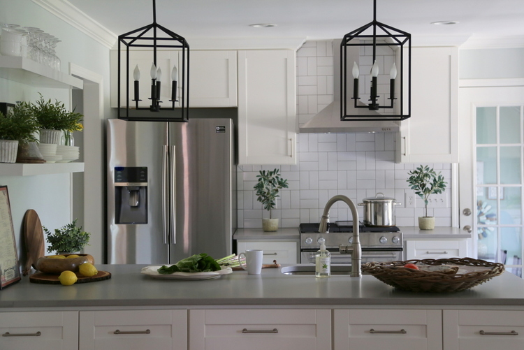
Rather than the standard subway tile layout, I had them install the inexpensive backsplash tile in a crosshatch manner:
 The Decorologist
A crosshatch layout for the backsplash tile reads like squares, which ties in well with the patterned floor tiles. I love, love this tile layout!
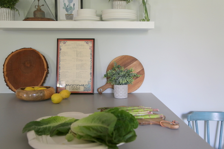
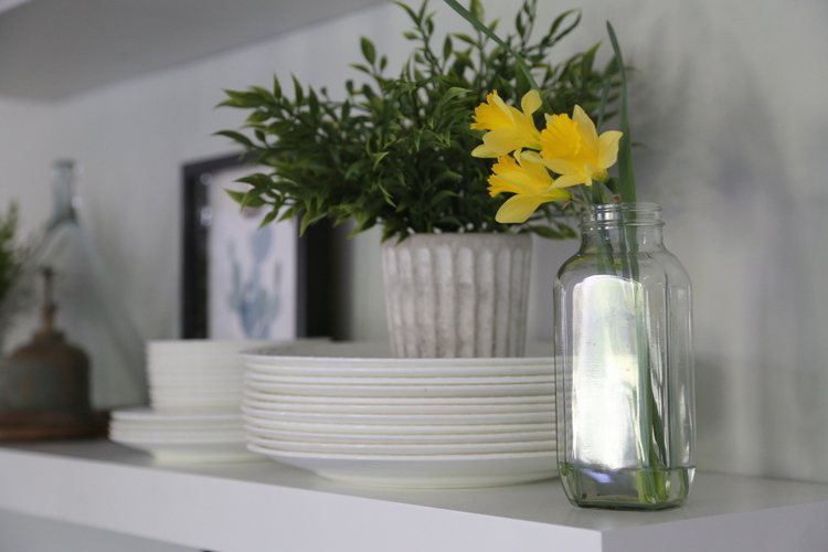
You know, I used to think I’d never be a fan of open shelving. However, I’ve become a convert for partial open shelving in a kitchen. It really opens things up!
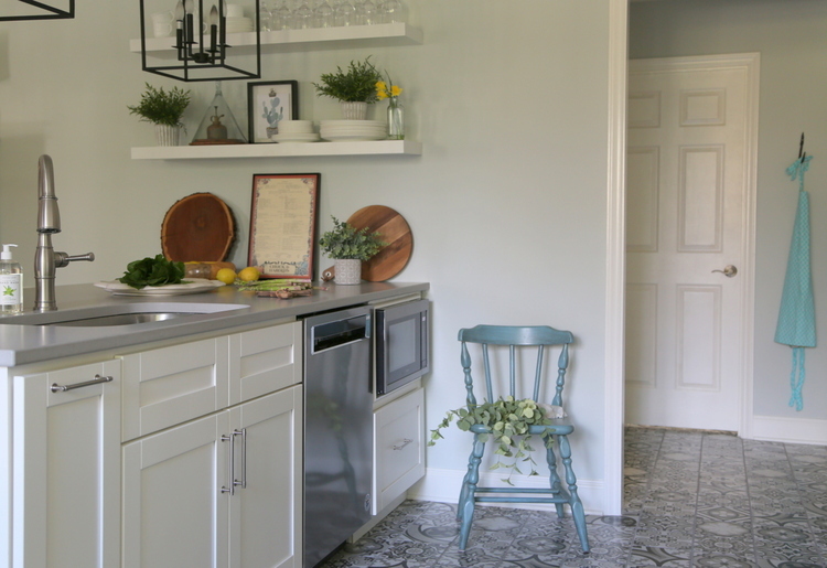
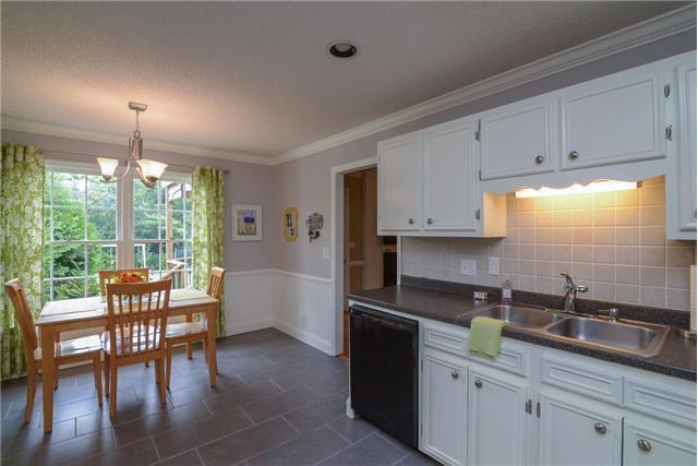
Take a look at the before of the kitchen from a different angle before the wall came down:
 before
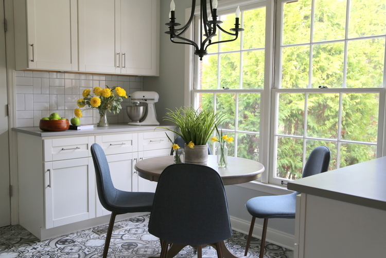
Additional cabinetry was added on either side of the breakfast nook, so there is more than enough storage to make up for the upper cabinets that were removed.
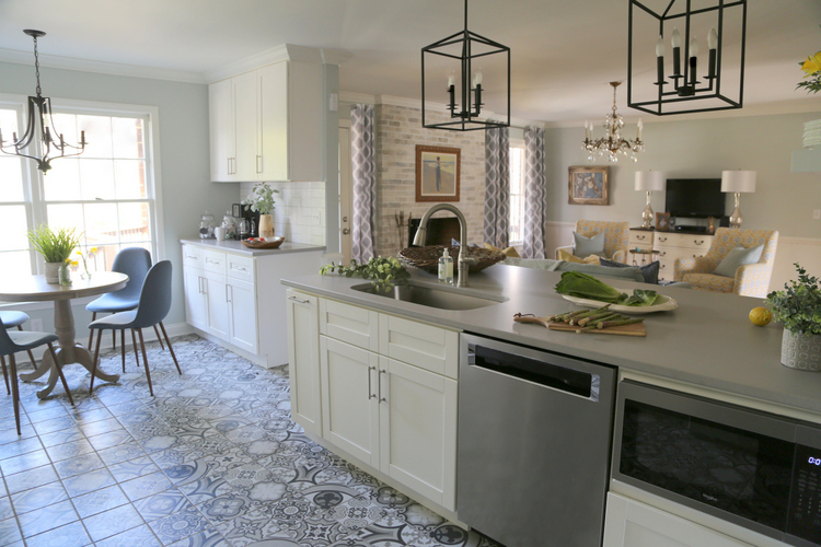 The Decorologist
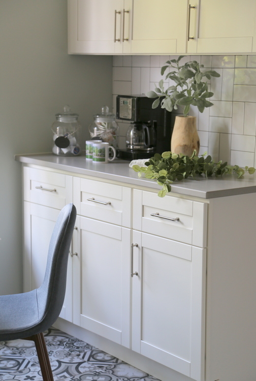
I cannot explain how very good it feels to be in this room. Photos don’t even do it justice. It’s so open but cozy at the same time. It’s a beautiful but not formal. And so functional! Here’s the coffee bar area:
 The Decorologist
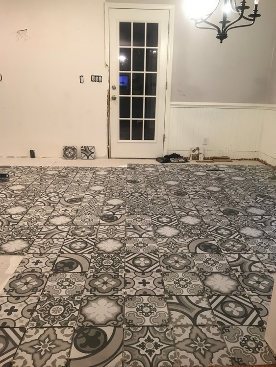
Now let me show you how the flooring looked when it first went in:
Would you have been terrified? Thankfully, Allison was not. She’s seen enough of projects that look crazy at first, but turn out just right when everything else comes together.
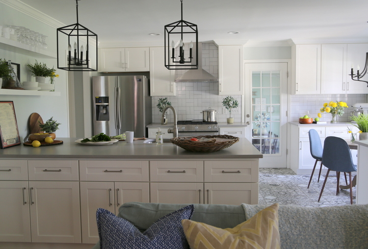
Are you surprised at how the seemingly bold flooring is not-so-bold once everything is in place? Allison says that the flooring is her favorite thing about the kitchen – what about you?






This is FRICKEN’ FABULOUS!!! Simple, yet really well done! Perfect layout and amazing amount of storage. Really, really great!
Thank you so much, Chris! 🙂
This is my kind of kitchen. I like color and pattern and I kind of get tired of how neutral everything has become. I like the personality that bold flooring brings. I will admit, I would’ve been very scared when it went in. Ha ha!
Thank you, Georgianna! It really is a happy kitchen. Every room deserves some personality, I think! 😉
Nice! Where are the fixtures above the peninsula from?
I will add in a link tomorrow if I can find it, Jennifer!
Here’s the link, Jennifer! https://www.houzz.com/ideabooks/116197251/list/lynch-kitchen
Thanks, Kristie!!
You are so welcome, Jennifer!
This is so beautiful Kristie! I do love how the floor doesn’t look busy when everything else was installed. Beautiful work!
Thank you, Sheri! I’m so happy with how it turned out.
Love this. Great choices. Would you consider adding a shot of where the tile meets the wood? I’m a sucker for details.
Yes, Darla – I wish I had taken that shot, but didn’t think about it at the time. I will ask Allison to send one that I can include!
I love, love, LOVE Allison’s kitchen!
the floors are amazing, and the back splash pattern is perfect!
and are those your buttercups that you planted a couple of years ago?
Her new kitchen is light, bright, and totally fresh- I know she is in love with it:)
another picture- perfect reno my friend!
Thank you, Elizabeth. And yes, those buttercups are the ones Kelta and I planted fall before last! I’m glad you like the backsplash, too. 😉 I wanted to just stay in Allison’s kitchen all day!
I got to say that when I saw the first photo I thought the floor was rather busy and trendy, but when I saw the rest, I can see that it looks great with everything else.
I think it works because it is the star of the kitchen and everything else is rather simple. I like the backsplash as well. Although pennisulas have gone out of style, I think they can be great and it works really well here. It is one of the few I have seen recently without bar stools and I like that. I was a bit doubtful that it work with open concept, but the space is well defined so it does.
Did you design the living room as well? It all works well together without being boring.
Hi Kathy,
Thank you for sharing your thoughts on this kitchen. You are right about the floor being the star of this kitchen. That is why we kept the countertops quite plain, although we had considered a marbled quartz in the beginning. Allison was more concerned about good storage than she was about having barstools – there is a large family table in an adjoining room where they eat most of their meals – and I think it looks really smart without the overhang of a countertop. I did design the living room, as well – the furniture in that space was from the design we did in her previous home. I may write a post about that space next, so you’ll see better how the two spaces tie together.
Please show a picture of where the tile and hardwood do meet!
Lori – I failed to take a shot that shows the transition well, but I will ask Allison to send me one to share!
Absolutely beautiful, Kristie. The cabinetry layout is terrific so there was no loss of storage space when the wall was eliminated. Really outstanding!
Thank you so much, Joanne! She really ended up with a lot of great storage. 🙂
This is just the most stylish, happiest, welcoming kitchen. I really like the cabinets on both sides of the nook. Great addition of storage. And I really like the crosshatch layout. And I love the light fixtures. Find that link!
Ok, Michelle, I just added in the link to the iron lantern fixtures and the breakfast room furniture. Also, here: https://www.houzz.com/ideabooks/116197251/list/lynch-kitchen
Wondering what size are the backsplash tiles?
I’m redoing a bathroom and have picked out a lovely patterned tile for the floor, but have been a little stuck on what to do with the bath surround. I love the idea of the crosshatch with subway tiles. Thanks for the idea!
Great – glad to help! I’m sure your bathroom remodel will be lovely!
So many awesome decisions made in this kitchen. I’m getting ready to use this tile layout in an upcoming kitchen. I love it too!! Also, the double wide peninsula is an awesome choice. Great job!!
Thank you so much – that’s such a complement coming from the kitchen queen!!! xo
When you first showed the tile in small picture, I thought it was awful, but WOW, when you see the whole kitchen it really does work and is beautiful. Thanks for sharing.
Simply Gorgeous !
Awww, thanks Mary! Have a great weekend. xo
I love that she has tile in the kitchen instead of continuing the hardwood. So much more practical and beautiful to look at too! This kitchen is absolutely lovely. Excellent job pulling the two areas together.
Thank you so much, Jean!
this is very nice. I initially was worried seeing a busy pattern like that. Interesting, how come it does not appear busy any more after things go into place?
Thanks! It doesn’t look as busy because now there are lots of other light and calming things to look at. The floor is the star of this kitchen, and everything is in a supporting role – if other elements had been screaming for attention, it definitely could have ended up too busy in there!
So beautiful! Although the floor is busy, the classic cabinets, counters and simple design keep it grounded. Another plus, I bet this floor doesn’t show crumbs, hair and dust like most plain floors.
Yes Jill! You are so right – this floor doesn’t show much of anything!
This is FABULOUS Kristie! It looks so great, Allison must be thrilled! The bold floor choice works beautifully and I adore your tile pattern design with it – enough pizzaz to stand up to the floor but not compete with it.
Love the patterned floors and really all the design ideas in this lovely kitchen renovation!
Kristie:
What a stellar example of *trusting your designer’s vision.* Had I just seen the tile, and this been my own kitchen, I would have said, “No.* But, seeing how it works as part of your finished vision? It’s perfection. It adds such a happy vibe! I also love how you used the budget friendly backsplash tile in such a surprising, fresh way.
I can only imagine how happy your client and former office manager really is with her new kitchen!
Beautiful job..and thank you for taking before/after pics from exactly the same angles. It really helped me to see the possibilities in tearing down a wall between two spaces.
Thank you so much, Leslie. I sure try to get “after” photos that line up with whatever “before” photos I have. It’s so much easier to compare and contrast that way. Who doesn’t love a good before/after, right?
Love the kitchen! I just stayed in a remolded hotel room in Las Vegas. The bathroom was encaustic tile and the bedroom was hardwood (vinyl plank probably). They connected at a large open doorway. Looked great together.
I love to see the energy these patterned floors introduce. Personally I have yet to embrace this trend but I am loving seeing it on Instagram etc. Thank you for sharing these lively examples.
I truly enjoyed the bold floor tiles, and pattern of subway tile behind the stove! A great example where the right patterns and styles, can make a black and white kitchen as rewarding as a colorful kitchen!
Thanks for sharing such a great information, it is really helpful. Keep up the work.
Hi Kristie, I absolutely love love love this look. Can you tell me a source I can get the tile from? If it is a wholesaler, I can generally purchase from them. Many thanks for your help!
Pam
This rocks!!!! The flooring is spunky and fun.
Thank you so much, Veronica!
I think this is one of my favorite projects of yours! I love the layout. It’s making rethink my upcoming remodel….