So, you can’t change the layout of your boring kitchen. You can’t replace the too-short cabinets. Is there a way to dramatically transform a kitchen so that it looks fresh, updated, and new (without breaking the bank)? According to the Houzz 2018 Kitchen Trends Survey, Americans spend an average of $42,000 on kitchen remodels. About 10% spend over $100,000! This recent project will give you ideas for how to dramatically transform a kitchen for under $10,000 and STILL get a high-end look.
![]()
I’m excited to share with you this redesign of an existing kitchen in the beach vacation rental I worked on over the winter. The whole house has been completed and has been renting for about six weeks now. I’ll share all the info at the end of this post in case you’d like to vacation there yourself!
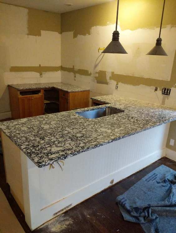
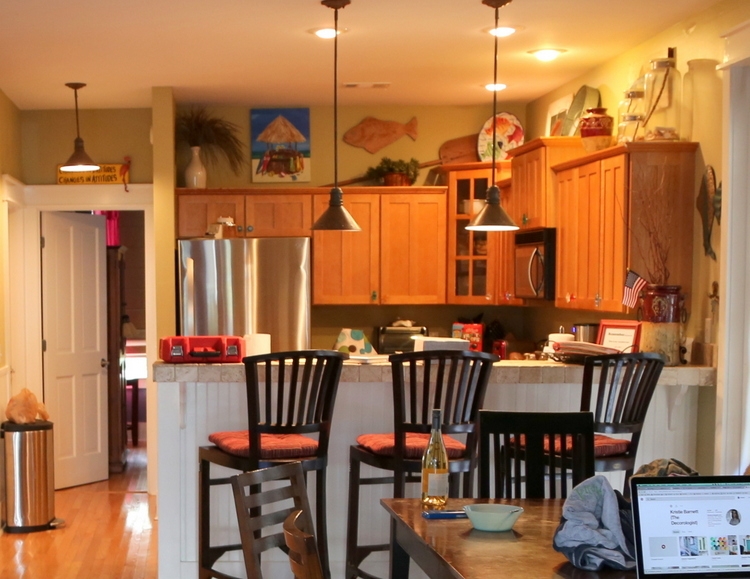
Let’s start at the very beginning (a very good place to start). Here is the “before” of the kitchen that was installed 15 years ago:
 before
The first thing I do when taking on a redesign project is to help define the goals the owner has for the space. The goals for this kitchen included making the space feel larger, brighter, updated, and more integrated with the adjoining dining and living area. Retaining function and keeping costs down were also important considerations!
You may remember the Inspiration Board I created a couple of months ago?
The existing cabinets were in great shape, but the short upper cabinets read “dated” and created that dreaded above-the-cabinets dead space that ends up getting filled with dusty ivy and decor. If the cabinets had gone to the ceiling, I would have simply had them painted. However, removing the cabinets gave us the opportunity to open up the space a bit. The raised counter bar (also a dated feature) blocked the kitchen and made it feel even more separated from the rest of the open space. Bringing that area down to regular cabinet level was definitely the way to go since we were replacing the tile countertop anyway.
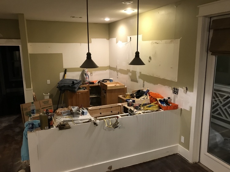
So, off came the upper cabinets and countertops:
 before
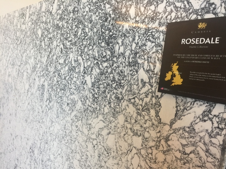
I had the contractor retain but cut down the beadboard to regular counter height. I knew I wanted to use black and white quartz, but I wanted something a bit more interesting for this fun vacation spot than the classic marble look. I waffled between Cambria Rosedale and Rose Bay. Rosedale has “patinaed” areas that remind me of a favorite pair of faded jeans:
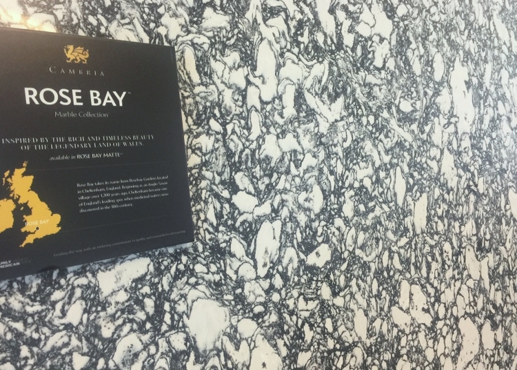
Rose Bay is bolder and more consistent in pattern, and that’s the one we chose:
The great thing about a pattern like this – it doesn’t show seams the way a lighter, more solid piece of quartz (or granite) can. I’ll give you a prize if you can find the seam:
The quartz countertops took up almost half the budget, but it was worth it!
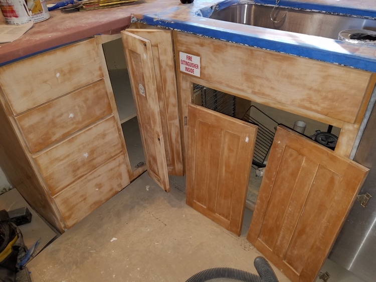
It’s always a little shocking to see the ugly part of the process, especially when you haven’t been on site for several weeks! Here’s the lower cabinets being prepared for paint:
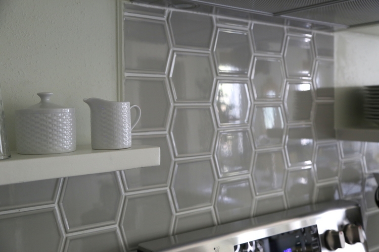
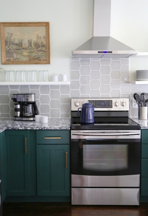
Here’s the backsplash tile I ultimately chose. I went with the moss color, thinking it would look moss green (naturally).
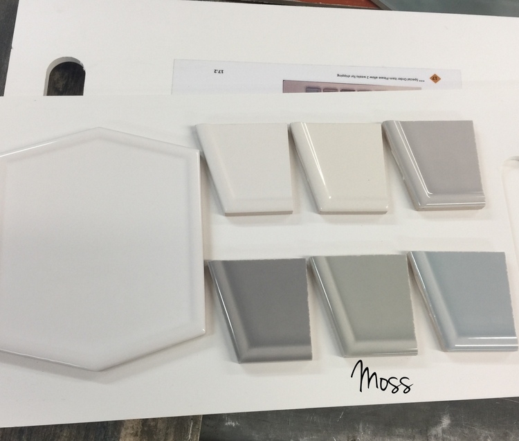
But it didn’t. It actually looks more light gray in place. I double-checked the box to make sure they installed the right one. It’s possible the batch was off in color, but it was too late to make the change once I actually saw it finished. I think it looks fine, but I really intended it to be a medium green . . .
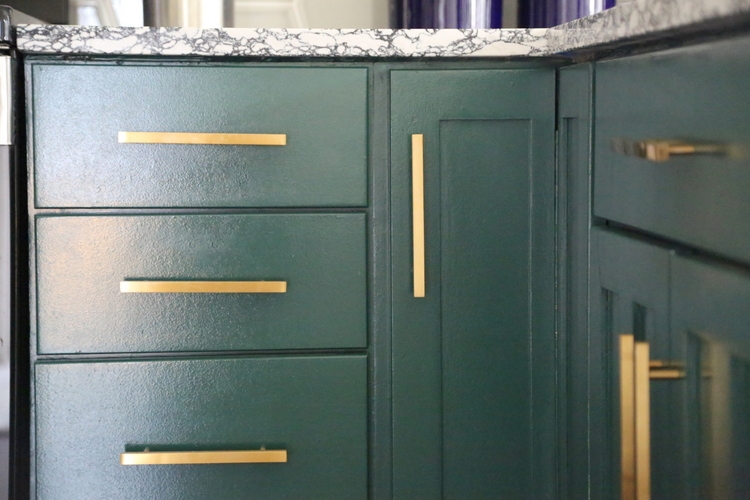
Although we were able to keep most of the appliances, I chose a new range hood since the cabinets were gone. Notice the baseboard? The painters went white like the trim there, even though I specified the dark green like the lower cabinets. Ugh. Painters always default to what they typically do, even when you specify otherwise. I had them fix it, of course.
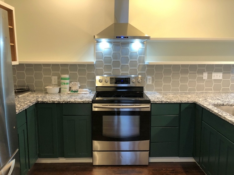
See how much better it looks without that white stripe?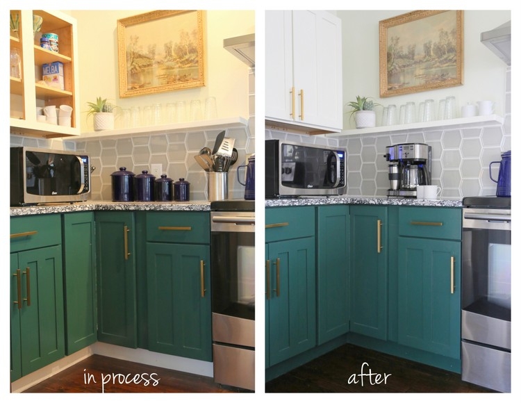
Ok, I won’t make you wait any longer. Ready for some dramatic before/afters? Remember where we started:
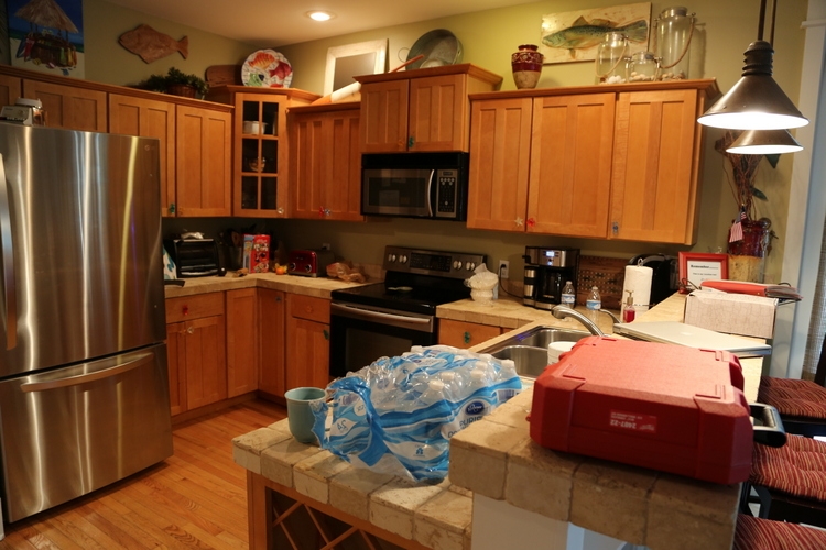
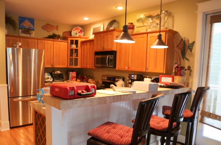
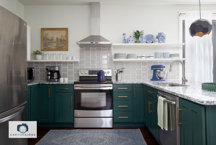
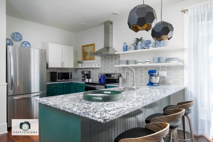
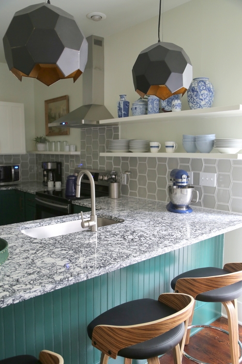
A dark and dreary kitchen is now light and happy:
From heavy upper cabinets and dated tile countertop:

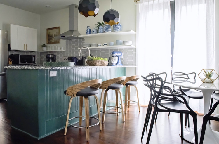
to open shelving and a wider quartz peninsula:
Bar height chairs and small triangular pendants:
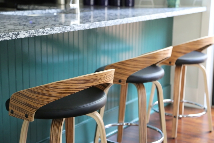
were traded in for counter height stools with character and larger geometric statement pendants:
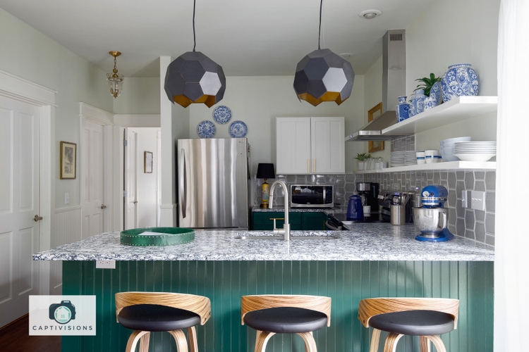
We didn’t sacrifice as much storage as you might think. The open shelves provide space for both dishes and decor, while the reinstalled double cabinet stores less attractive pieces. There is a large food pantry to the left of the peninsula, with plenty of room for extra appliances, too.
These counter stools are some of my favorite finds for the space! You can find them here. They are gorgeous, comfy, and they swivel.
Oh, and the pendants! They remind me of cracked eggs – the insides are gold and give off a beautiful glow when turned on:
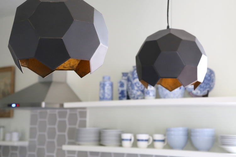
I’d provide the link, but I believe they are discontinued. I can’t find them anywhere!
 Benjamin Moore Garden Cucumber 644
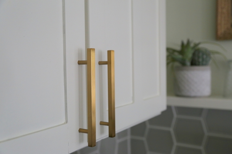 gold cabinet handles from here
 cobalt blue stand mixer here
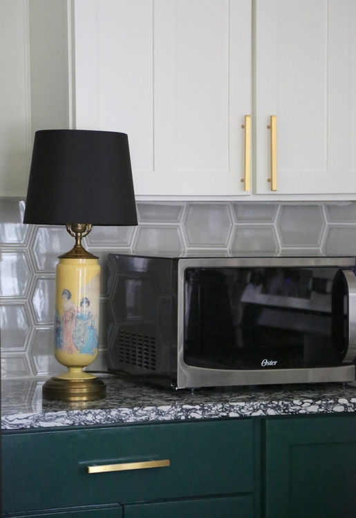
Yes, I put a vintage Asian lamp on a kitchen countertop. With its black shade, it’s the perfect night light when a guest needs a midnight snack.
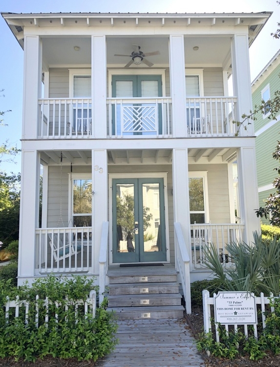
If you need a vacation (and who doesn’t), maybe you can stay at this lovely beach house designed by yours truly! It’s 200 steps to the beach and 20 steps to a beautiful community pool on beautiful 30A between Seaside and Rosemary Beach, Florida. You can find out more about 33 Palms here!!!


Beautiful work ! What a lovely difference. I really like the dark green base cabinets with the light airy shelving. I have one question though about the eating area part of the counter…I notice you no longer seem to have the supports under that overhanging part of the countertop. As someone who always whacks their knees against those supports, what determines whether you need those supports or not? Would love to get rid of mine when we remodel our kitchen. Thanks!
Jean,
Good question! Because the countertop was extended out over the stools, I thought we’d have to have supports there. But the countertop vendor and installers insured me that it wasn’t necessary if the overhang is less than 14 inches for quartz. It depends on the weight of your countertop material, for sure.
Hello Jean,
There is a product that can be used with granite or quartz. It is a flat steel support that goes under the countertop all the way across. It’s nearly invisible and very strong. It can even be used with granite which is much more brittle than quartz.
Thank you for that info, Susie!
Beautiful, Kristie! I love the green cabinets and the mix of gold and stainless. I can see that lowering the bar to counter height really does add more surface area. (I can’t wait to see more of this vacation remodel!)
Thank you so much, Joanne!
2 questions – where did you get the floor color and what is it called? And what is the name of the light wall paint color? This is exactly what I want to do to our kitchen. We even have the orange floors that need replacing! Your work is gorgeous! Wish you lived here!
Kerry,
We had the oak hardwoods restained. They were supposed to be stained in Minwax Provencial, but they turned out much darker than expected. Actually, there were issues with the guy doing the work, and I’m not sure what color he actually used. 🙁
But I’m glad you like it! The wall color is Benjamin Moore Silken Pine in an eggshell finish.
Thanks for taking the time to comment and ask questions!
Kristie!!! It looks AMAZING! Love this, it’s so refreshingly unique! And I LOVE the placement and styling of the kitchen shelves. And the pendants, how they emulate the backsplash. Beautiful job!
Thank you so much, Steph! Open shelving isn’t for everyone, but it really does make a small kitchen appear larger and more open. In this situation, I think it was a good solution and will work well for a vacation rental 🙂
I actually think the splash color was a happy accident! I like the lighter look, especially for a beach house. Looks so much better. So nice to see a job that most people could afford. Bet the owners are beyond thrilled.
Thank you so much, Amy! I appreciate you taking the time to comment 🙂
Beautiful job Kristie! Getting rid of the uppers helped to kitchen to feel much more spacious that the before photo. Love the repeat of the tile shape as seen on the pendant lights too!
Thanks, Erika! This is the first project where I’ve removed cabinets, but I really felt like it was the only work-around to update these short cabinets.
Oh my gosh – I love everything about this! Two things stand out to me – the art to the left of the hood – totes love it in the space and the fact that you went ahead with the tile that wasn’t what you expected. I love it because it looks fabulous and it’s typical of ‘real world’ renovations – where there’s generally not $ or more importantly the TIME to work around hiccups. Two thumbs up!
Jeri,
Thank you so much! I was so excited to find that vintage landscape in a second-hand shop – I had been searching for just the right thing for that area, and it just seemed right 🙂 I’m glad you like the tile – it’s not a good feeling to walk into the room and think the wrong thing was installed!! I appreciate you reading and commenting 🙂
I like the backsplash (grey) the green would of thrown the eye off. It takes you from one area of the kitchen stove, faucet, list goes on and travels around. The cabinets has the bold color for the wow factor. Great job
What a beautiful transformation!
That looks so good Kristie! I would be so afraid to use such a bold color on cabinets, but you did it and it looks great!!! Hope to be that confident in my selections soon 🙂
Awesome work as usual!
Dramatic and beautiful! Love the whole room. I’m sure the clients are so happy with the new changes. Hard to believe it is the same room!
Thank you, Kelly! The owners love the new look for the kitchen and feel as though it extended the living space (which is does). We hope the vacation renters will like it, too 🙂
That looks like a forest color green on my screen. Is that what you’d call it in real life? Just curious.
Bob,
Yeah, I might call it a forest green or the color of a cucumber!
This was a great transformation! Do you mind a couple of questions?
Is your fee included in the whole amount you bid? in this case under $10 K?
How do you calculate your fee? Do you let your clients know what your fee is going to be? I get confused when it comes to suggesting changes like in this case.
Jovita,
I charge an initial consultation fee (2 hours), then charge hourly beyond that. If a client wants to use me for more than the initial consult, I require a retainer upfront for a minimum of 10 hours of my service. I hope that helps!
This is similar to my kitchen. I just cannot give up all my upper cabinets so I plan to just do it on one side of my kitchen. Also, the microwave on the counter seems to take up a lot of space. Love the removal of the high bar.
Hi Pam,
Yes – you are right about the microwave taking up a lot of space on the counter. Thankfully, we were able to gain more usable counter space when we got that peninsula down to one level! Hopefully it’s worth the sacrifice of the space the microwave takes up. In my personal kitchen, I couldn’t give up most of my upper cabinetry since I store all the nonperishable food there – I don’t have a pantry!
What is the color of the bead board? In 1 picture it looks entirely different. Love to counter height food bar!
Mark,
The beadboard and cabinet color is Benjamin Moore Garden Cucumber 644. The difference you may see is due to light from different directions and light reflection because the paint is high gloss, but it’s the same color!
Great work! I am looking for the idea of my DIY kitchen project. I love the green cabinets and the mix of gold and stainless. I can see that lowering the bar to counter height really does add more surface area. Thanks!
Beautiful work! We have a beach home under contract in the Orange Beach Alabama area. The exterior paint colors of this home are exactly what I am wanting to do with ours. Can you tell me the name of the white and gray exterior paint color as well as the blue color?