Last week I had the honor of training a group of incredible women who are now certified Expert Psychological Stagers™. They came from as far away as Arizona and Minnesota to spend three very intense days in Nashville learning the ropes of home staging, culminating in a hands-on staging of a home about to go on the market.

When staging (and even decorating) people’s homes, I often have to think outside the box to come up with solutions for working with pieces that just aren’t going to be replaced anytime soon. It’s just reality. Most homeowners don’t have unlimited budgets. Actually, I’ve NEVER met anyone who has one! Sure, it’d be great if we could replace the sofa, but sometimes it’s just not gonna happen. So here’s a great example from Saturday’s real estate staging of how you can put a fresh face on a dated sofa.
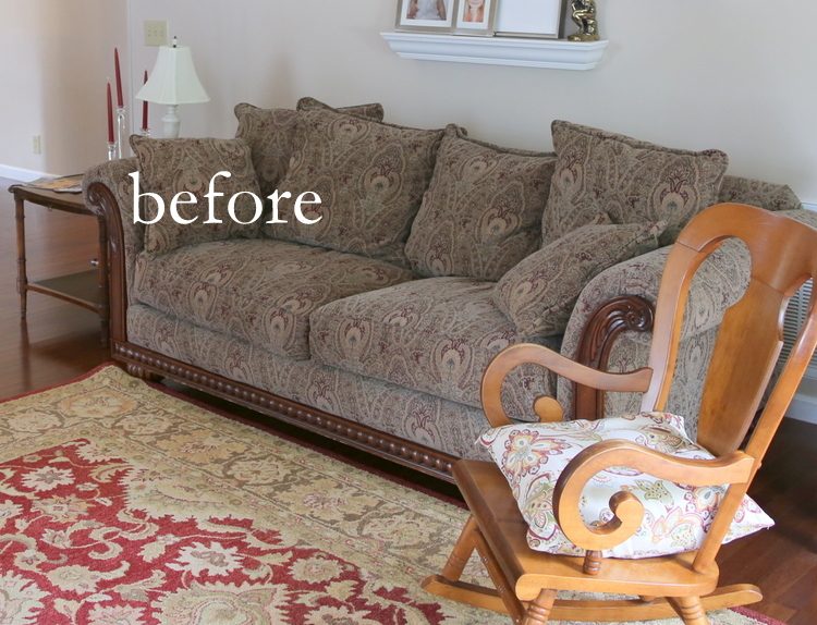
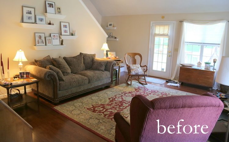
Here’s the sofa and the living room my Expert Psychological Stagers™ were tasked with staging:

This style of sofa is dated, and the mossy green makes it look dark and drab. However, the sofa is in good shape with no stains or visible wear.
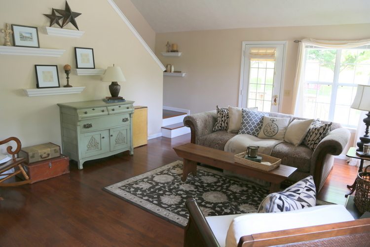
This is what our staging team did to this sofa to make it look more current and stylish. First, we removed all the loose back pillows. Next, we scoured the house for pillows and throws/blankets. One of my stagers found this beige throw in a bedroom, and we folded it long-ways and draped it across the “crack” of the sofa cushions – vertically down the back, tucked into the seat cushion, then smoothed over the seat and down the front of the sofa.
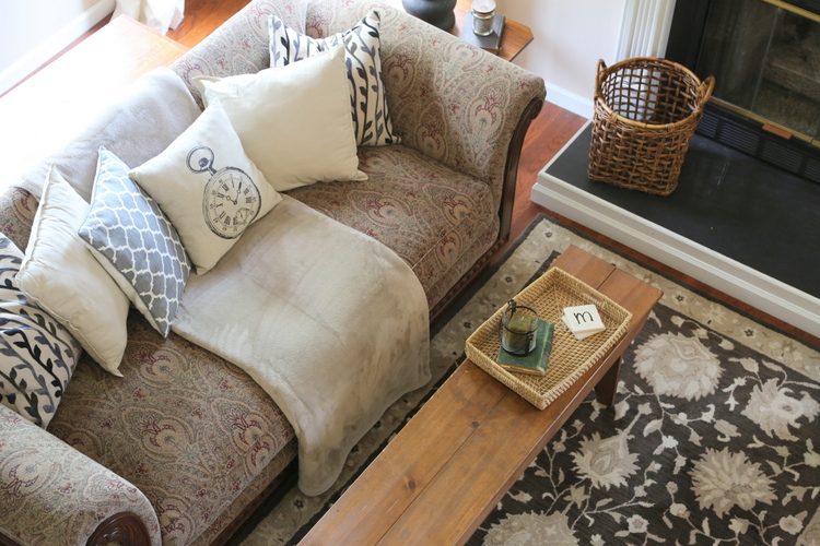
Note we didn’t just drape it over the arm of the sofa (like you often see). Instead we used it to cover and lighten the upholstery, while eliminating the “crack” between the sofa cushions. Even though the pillows don’t exactly “match” the sofa, they work nicely in combination and downplay the burgundy bits in the sofa.
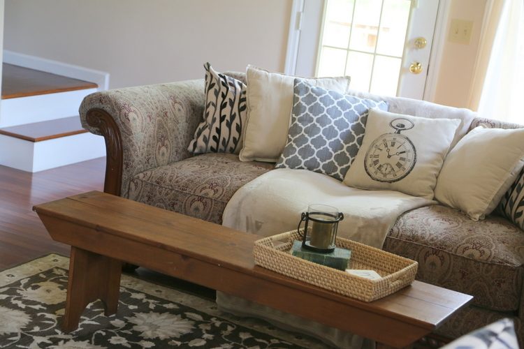
By replacing the large burgundy rug with a smaller one from the dining room, and by replacing the burgundy wingback with a more neutral chair from the master bedroom, we essentially removed that accent color from the space so that we could create a more updated neutral scheme in the room.
Rather than bringing in green or burgundy pillows that would reinforce the dated color scheme of the sofa, we used pillows in cream, gray, and dark blue. It’s the mixing, NOT matching that works here! As your eye takes in the whole room, it all reads like varying neutral tones.
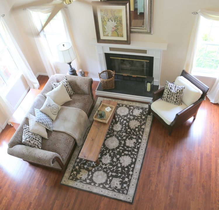
So now let’s take a look at the before and after of this sofa and living room:
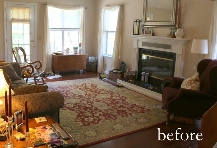
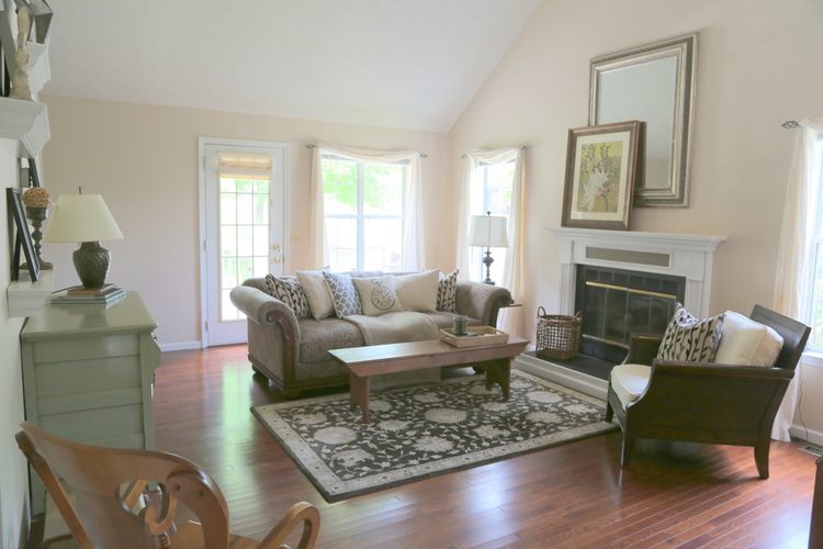
Here’s from another angle:
It’s all about knowing how to work with what you have! I’ll be sharing more of this home staging transformation soon, but in the meantime I thought you’d enjoy this short clip of the homeowner’s reaction upon seeing this living room!
LOVED her reaction! She told us later that she thought we had actually brought in a new sofa for the room. I hope this trick can help you update the sofa in your own home.
If you are interested in becoming an Expert Psychological Stager™, our next course is March 5-7, 2020.









What an incredible difference! Good job, everyone. One question though…when you have a fireplace as the focal point I always thought the sofa/seating area should face it. Is there an exception to that? Thanks Kristie!
Cathy,
Thanks, Cathy! They were a great group of stagers! The seating arrangement should address the fireplace, but that doesn’t necessarily mean facing it. There are many factors to consider when placing the sofa in relation to the sofa, but it depends on the other architectural features of the space. In this case, placing the sofa at a 90 degree angle to the fireplace, open to the entry of the room was the best placement for drawing attention to the fireplace and creating a better flow in the room. Now you don’t have to cut in front of the sofa to get to the stairs beyond. If you are interested in specifics of staging a living room and my method of doing so, you may want to check out my webinar called Psychological Staging for Living Rooms. https://thedecorologist.com/product/psychological-staging-living-rooms-video/
Thank you so much!
Great job on this staging! The framed print in front of the mirror seems distracting to me though. I like symmetry and having something that big in front of a mirror and off to the side? ? Looks great otherwise!
Interesting that you brought up the art in front of the mirror – the mirror was unable to be taken down and moved for the staging, but it reflected what many mirrors above fireplaces reflect: unattractive ceilings and ceiling fans. So the art was placed there to draw the eye to the fireplace and up, but without reflecting the things we didn’t want to see in the mirror’s reflection. I realize it’s a bit quirky in the photos, but it actually looks better in person. Sometimes it’s about working with what you’ve got – lesser of two evils and all of that!
I just looked at a house with a very similar sofa and I wouldn’t have thought of removing those back pillows. Thanks!!
No problem, I hope it helps!
This is great Kristie – great job by everyone! What a huge difference on the sofa – and I love the idea of the blanket over the crack. I’ll have to keep that one in mind. I was wondering about the art in front of the mirror too but isn’t it funny how things do actually work better in person than in photos.
What a difference! Looks really nice all together and the sofa now is not so ‘obvious’. Great job!
That’s amazing! The sofa has completely different lines without all those oversized loose cushions! I’m impressed. 🙂