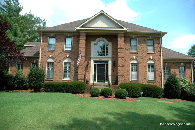
I have found that when I do Exterior Color Consultations with a client, they have a great deal of difficulty envisioning the final outcome and are terrified to commit to a new color scheme! When you are plunking down $10,000 – $20,000 on having the exterior of your home painted, you want to KNOW you are making the right decision. I can give you the visual assurance you need with the Custom Exterior Mock Ups. I now provide along with my Exterior Color Consultations. Here is an example of what you can expect when you work with me: this client had an orangey-red brick home in an upscale neighborhood.
Current Exterior of House
My client loved the interior of the home, but HATED the dated brick color. She thought she might want black shutters, and couldn’t decide whether she wanted light trim with a dark body color or dark trim with a light body. She knew she wanted the new colors to be neutral, but she hated the dated neutrals with bad undertones that she has seen on similar houses (pinky-beige, anyone?). After a thorough consultation, I worked up 3 possible color palettes for the exterior, with 3 variations.
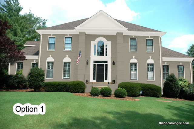
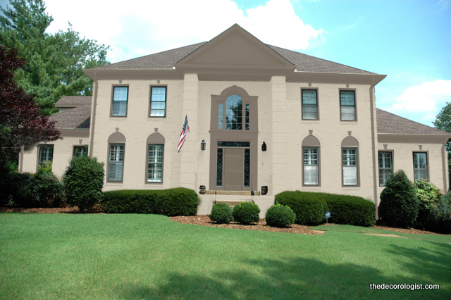
Option 1 – Medium Body Color, Off-White Trim
After I develop a few possible exterior color palettes, I pass off photos and specific instructions to a talented graphic designer who generates life-like renderings. We can even alter some architectural details if you like, such as windows, shutters, and other changes you may be considering for your home. This client wasn’t sure she liked the half-circle detailing in the brick above the windows, so in this modification we painted them out in the body color in order to downplay them.
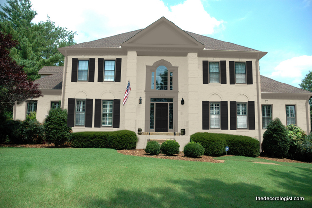
Option 2 – Medium Color Body, Off-White Trim, Black Shutters
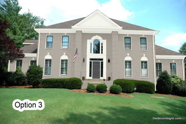
The next option featured white trim (which my client felt she really wanted) paired with a slightly lighter body color.
Option 3 – Light Body Color, White Trim
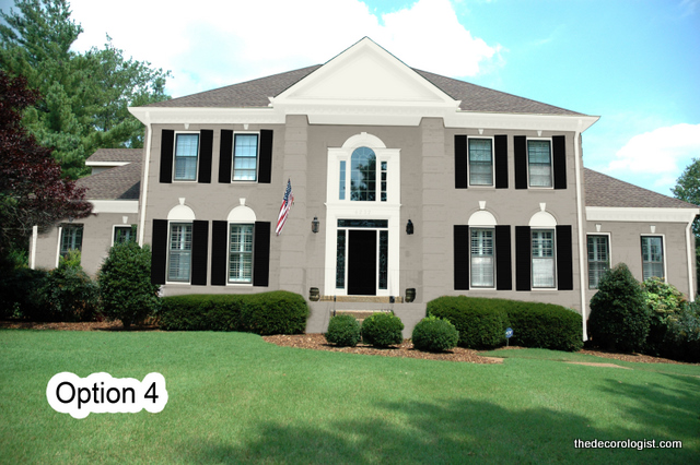
Option 4 includes shutters and again downplays the half-circles above the windows.
Option 4 – Light Body Color, White Trim, Black Shutters & Door
The final two options explored a different potential application of color – dark trim paired with light body.
Option 5 – Light Color Body, Dark Trim
Option 6 – Light Color Body + Dark Trim
Are you the kind of person who knows what you want/like when you see it? These renderings helped my client get the look she was going for and wasn’t sure of until she actually saw it! Once she decided on the option she liked best, her painters were able to put up large samples of the colors I specified so that she could be certain in making such a house-altering decision.
So which one is your favorite? I’ll let you know tomorrow which option she chose. Need help from a Color Expert? Whether you are local (Greater Nashville area) or long-distance, The Decorologist can help you choose exterior paint colors with confidence. Schedule your consultation by contacting kristie@thedecorologist.com.







I like option 6 the best… I really like the weight the shutters bring to the look and feel of the exterior, and I prefer the half circles to be downplayed. Option 2 was my 2nd choice, but I’m not personally keen on the pop the white brings to the overall look. Option 6 fits in nicely with the landscape as if it’s always been there… Can’t wait to see what your client went with!
Pls what is the name of colour
I like #2 or #6….down playing the arches. I can’t wait to see what the client chose. This is such a smart idea Kristie! Thanks for sharing this new process that you offer your clients…..I love it!!
Thanks, Jennifer – It really seems to be helping my clients gain the confidence they need to take the plunge with their new colors!
My favorite is option 2. Option 6 is my next favorite. I’ve always loved painted brick.
Most people seem to either really love it or really hate it. I’m a lover, too!
I miss brick houses! Everything down here (FL) is painted so it made me gasp to even consider painting brick when you were fortunate enough to have it. But I really like your technology – being able to see things virtually is such a helpful tool for those like me who are mental-image challenged. :0
I like the dark trim light brick color. I seem to be wanting the gable (if that is the right term) to be the same color as the brick instead of the trim or for there to be something different. It seems to jump out too much. Although in the last pic it does kind blend in with the roof. It is a beautiful home and will probably look fab either way. So fun that they get to choose from looking at real pictures! I would love for our brick to be painted some day. Our brick color leaves a lot to be desired and I am a fan of pale creamy yellow. 🙂
what a fabulous idea! I know this would help me make a decision for sure.
I feel the same as Lee. I could not paint over that brick. I think I’d go with the classic forest green or burgandy color for shudders and keep some cream for another smaller accent. I’d add window boxes and get a prettier door. Paint the door the color of the shudders. She needs flowers and topiaries. I know, I know, she’s sick of it and wants change. We don’t seem much brick where I live so it is hard to see it being painted over. I like your technique for showing what could be done and I like your ideas. Kathi
I would probably feel the same way if I lived in an area with little brick. There’s A LOT of brick around here, and a lot of orangey brick that was used in the 1970s and 80s. Thanks for your input and ideas, Kathi!
I liked the Option#2 background color with the Option#4 playing up the details!! I think it’s so glamorous. And I LOVE that she decided to paint the brick. My husband would NEVER consider painting ours. I can’t WAIT to show him these photos!!
This is great site being able to view different selections. I chose #6 because my home is beige brick. Love the advice and pictures. Thanks.
4!
Option 1. Medium color gives some stature. Windows with subtle black are just right to give an historical feel to this house, calling attention to the good bones architecture, instead of the brick.
The shutter versions, IMO, detract from the pure architecture.
I absolutely love how you break down the decision-making process for exterior colors with these Custom Exterior Mock Ups! It’s such a brilliant way to help clients visualize the final outcome—especially when the stakes are so high, and making the right decision is crucial. I can only imagine how much easier it must be for clients to commit once they see their potential new look in a realistic mock-up. The way you explored different combinations of body, trim, and shutter colors really shows how every little detail matters. This approach gives so much peace of mind and ensures that the final result will match the vision. Amazing work, as always!