Time and again, I’ve seen people use neutral paint colors for historic homes. With very few exceptions, it doesn’t work.
Why not?
Beige and gray paint colors have been all the rage for go-to interior colors since the 1990’s. Not so much prior to that. Your grandparents and grandparents’ grandparents were looking to brighten up their dark interiors before electricity was invented, and beige and gray just don’t have that power. Brighter, bolder colors do, and that’s why historic homes were more often painted in vivid hues, including blues, greens, yellows, ochres, and reds. Older homes sported lots of stained wood trim, as well, and grays and beiges simply DIE next to lots of wood tones. Neutral paint colors for historic homes results in a lackluster effect, at best.
Last week, I certified the latest group of Expert Psychological Stagers™ in my three-day intensive home staging course. What an honor that they came from Arizona, Colorado, Florida, Minnesota, Texas, Kentucky, Florida, and Washington, D.C. to train with me! I loved being with this amazing group of women who are following their passion for staging and design!

June 2017 EPS™ Graduates
As part of their hands-on training, they actually stage an occupied property that is about to go on the market. It’s an invaluable way to make the training come alive and put into practice all the things they’ve learned! The house we staged this time is an historic bed-and-breakfast with tons of character. When staging historic homes, do you “update” the interior colors with today’s trendy grays, greiges, and beiges?
That’s a big NO. However there are certain colors that may need freshening up a bit. Like the dark gold color on the living room walls of this home:
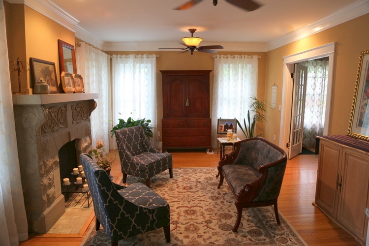 before
The yellow-gold paint color was too dark for the first impression of this beautiful home, don’t you agree? What color would you choose if you were staging this house to sell? Let’s take a peek in the adjoining dining room to see if that might guide our choice:
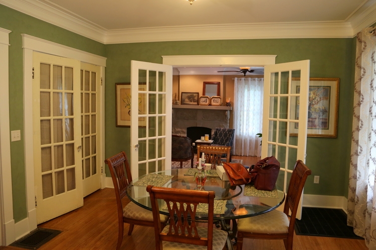 before
When staging a home to sell, you can’t always expect the homeowner to be able to repaint EVERY room in the house. The goal is to make the most impact with the least amount of money, and painting rooms costs money. I recommended that these homeowners paint the living room (which you see upon entry to the home) a color that would flow nicely into the adjoining space (the dining room) prior to the day of staging.
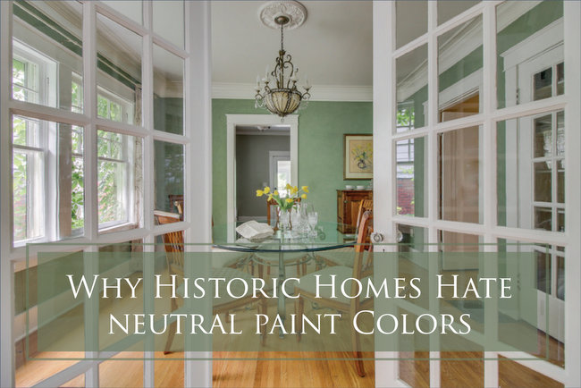
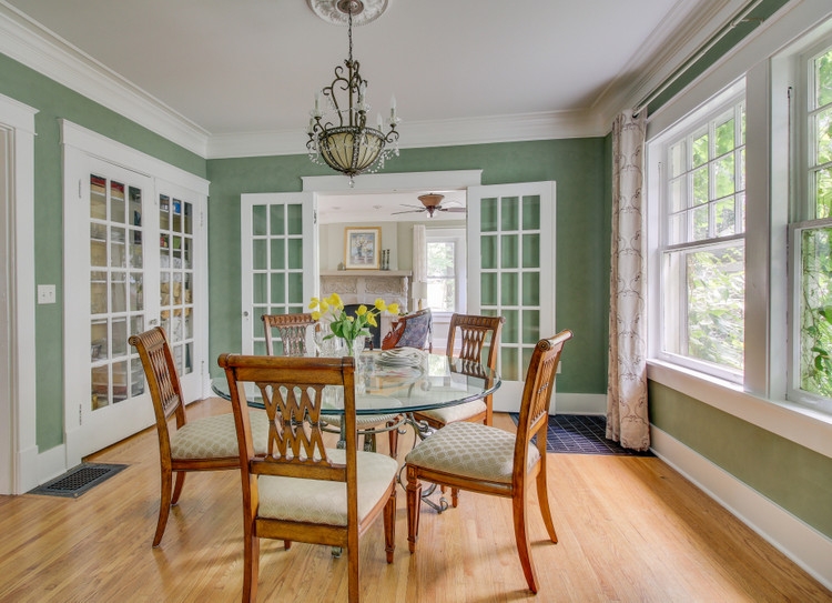
Neutral paint colors for historic homes shouldn’t be as neutral as those we find in modern homes – instead, it’s better to choose lighter, muted version of colors that are more often characteristic of historic homes. That’s what I chose based on the more vivid green paint color in the dining room:
 after
after
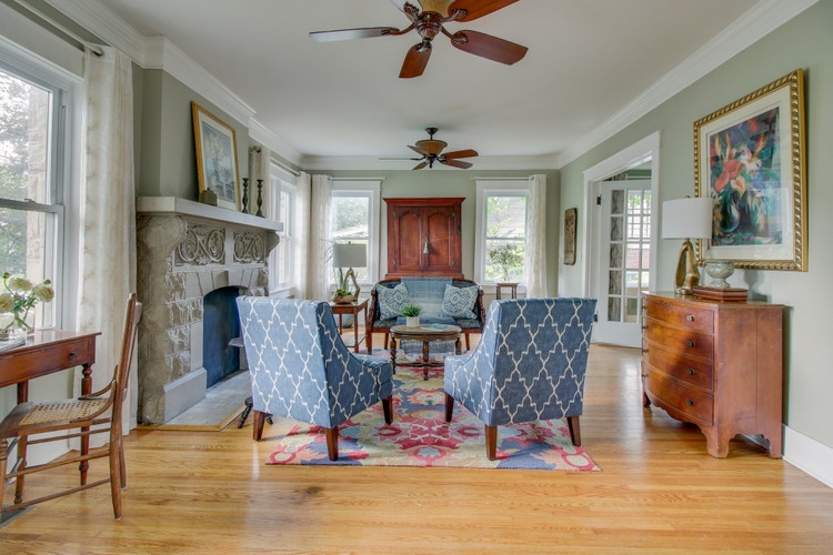
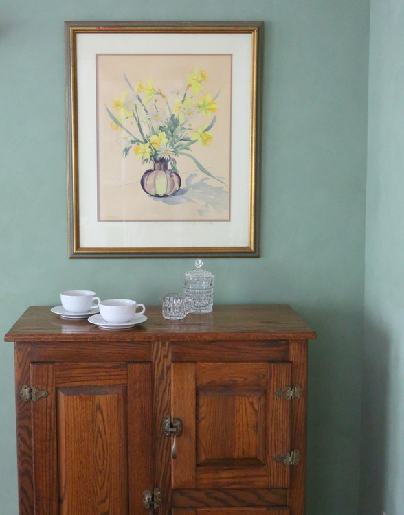
It’s not a true neutral, but instead a grayed-green that will act as this home’s “neutral.” A true gray or beige would not have the freshening effect that this color does. We used most of the homeowner’s furnishings, simply bringing in the rug, some pillows, lamps, and some florals. Here’s another shot of the living room prior to our staging:
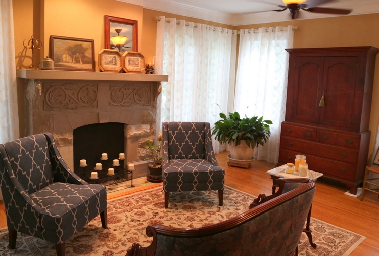 before
The gray-green color I chose for this room is from the Psychological Staging Paint Color Toolkit, which my graduates understand exactly how to use when staging homes to sell.
 after
after
The new color puts the emphasis on the beautiful architecture of the room: the fireplace, the trim mouldings, the original hardwood flooring . . .
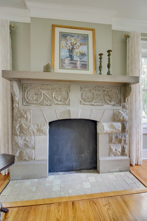
I’m SO IN LOVE with that fireplace, and I believe buyers will be, too! They don’t make them like this anymore . . .
 after
after
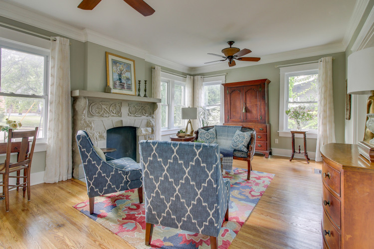
Let’s see how much better this color flows into the adjoining dining room:
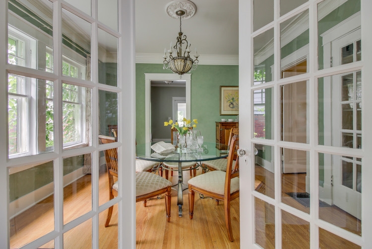 after
after
Backdrops of greens and blues always enrich wood tones:
 after
after
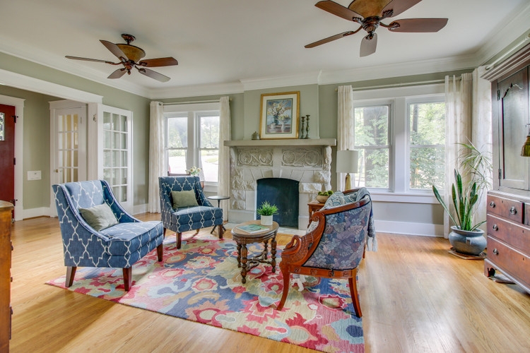
Stay tuned to see more befores/afters of this fabulous home! We had a blast staging this one, as you can see:

Wanna join in on the fun and start making money doing what you LOVE? To find out more about upcoming EPS™ certification courses and see reviews from some of our recent graduates, click here. If you need to hire an Expert Psychological Stager for your listing, find one in your area here.


The before and after photographs of this home are STUNNING- What a difference a complete and professional EPS staging makes in a property- and one that they will take all the way to the bank when they close!
Thank you, Elizabeth! It was wonderful to have you as an EPS™ graduate assistant last week as we worked on this amazing home!!!
It is interesting to note the psychological presentation of the before and after images. If you look again, you will note that the Before images are photographed tight and lit with lamps and ceiling lights, the curtains are closed and there is no perspective control. The After images are wider angles showing more of the room, the curtains are opens lighting the room with a softer daylight and the perspective has all the vertical lines straightened. I hate when designers thing we are too stupid to notice the obvious.
Of course I don’t think you are too stupid to notice. The before photos were taken by the real estate agent or the home owner, neither of which were professional photographers. The after photos were taken by me with a better camera with a wider angle. I’m not a professional photographer, but the afters are definitely higher quality. Hopefully, you aren’t too stupid to notice the other positive changes in the after photos, as well.
😂 Great answer!
Thank you, thank you, thank you! Every time I see a historic home done over in white, beige, and plain gray, I cringe internally. That and getting rid of all of the architectural elements that make these homes unique and charming. For the life of me I will never understand why someone would buy a historic home and then eliminate the very things about it that make it special.
You hit the nail squarely on the head with this, Kristie! Also that gray-green was a fabulous choice.
Thanks, Molly! I’m glad to hear I’m not the only one who cringes when I see a very neutral beige or gray historic home. Honestly, I feel like it’s offensive to the home! It literally offends the architecture and history. A little color goes a long way in this kind of home 🙂
Dear Christie,Thank you so much for this post. What is the paint that you used for I am ready to paint the main room in an 1840’s home and of all things was considering gray. We have antique sofas, one pink and one yellow and white wood work and mantle. Love each post
Fabulous color choice! I’m actually recommending that some clients of mine paint the living room of their 1790 cape a similar blue/green (Ben Moore Wythe Blue) to bring out the reds in their Oriental rug while still freshening up their space.
I love it, Amy! Wythe Blue is a fabulous and fresh historic color!
Wow, what a difference a paint color can make on a wall! It is so beautiful now! The “cooler” tone of the new blue-green living room paint color also seems to visually expand the size of the room! I had always heard the mantra about cool colors “receding” and warm colors “advancing” towards you; these before and after photos could be text book illustrations of that concept!
Kristi, do you think the opposite is true, that a definite color, such as this one, isn’t the best choice when staging a typical newer home ( such as the typical 1980’s “colonial”, for instance) with 8′ ceilings and more modest architectural features? I am just wondering as I am about to paint over the golden yellow in MY living room as we get it ready to sell. I wish you were still doing online consultations, but glad for your sake that your business is keeping you so busy!Thanks!
I’m in love with that fireplace too! Makes me wonder about the colors i my own house.
Though it’s fairly new-ish (2008), I specified historic windows and moldings to make it look historical.
I did have my LR painted same color astrim (Linen White, BM), but have noticed now that the character of the moldings has , in a way, disappeared. Thinkinking if I sell to go back to a light green/gray to compliment the fireplace rocks.
Husband says, I better start earning some $$ so I can hire the painter again!
Looks like you gals had sooo much fun! That new LR color choice is 5 *****!!!!!
You are a Star, Kristie!
Love, Paula
Paula,
Thank you!!! Although it’s all the rage right now, I think that painting the walls and trim the same color really downplays the architectural moldings. Color contrast is what makes the trim stand out. Let me know if you end up changing the colors – I’d love to know what you choose! Have a great weekend!
I live in a 1963 two-story colonial style home. I have white moulding and doors everywhere! My fireplace is white (with red brick), and my walls are all neutral. I can’t imagine green, but I’d like to explore a new look for sure.
Hi Kristie,
I love the gray-green you used on this home. Can you please tell me what brand/color it is? My husband and I just bought our first place and I would love to use this color on my living accent wall. Thank you!
Hi Kristie, Why would you write a whole post on this grey/green color but not tell us what it is? Looks great, btw.
What is the color of the blue exterior in this pic?
The exterior color of the house (with the 227 address) is stunning. What exact color is it?
I know this is a very old post, Kristie, but in the hopes that you’ll still respond …. My husband, and I live in a charming brick home (circa 1890s) with great bones. While I was away visiting family, my husband arranged a huge surprise for me. He replaced our kitchen sink, and faucet, and his choices for those are absolutely perfect. Unfortunately, he also had very dark granite countertops installed, and the granite extends up the walls (backsplashes) . The granite is black, with a lot of beige veining. I know it was very expensive, and he thought I’d be thrilled with his gift, but I hate it. I find the granite far too jarringly modern for our historic home. What colours should I paint the walls, and cupboards to detract from, or complement the dark granite? The kitchen flooring still needs to be replaced, too, and I’d like wood flooring. Do you think that’s a good idea, and if so, what type of wood would you choose? The rest of the house still has its original fir flooring. Thank you.