I’ve been trapped inside this week because Nashville was pummeled with an ice storm and snow, so all I’ve seen lately is a whole lotta WHITE. So let’s share some beautiful paint colors that are featured in the Ballard Design catalog from Benjamin Moore paints! I love this feminine living room with its coral accents. The wall color is an off-white called Going to the Chapel, which is going to read more like what you see on the ceiling here than the wall. In this photo, the wall color reads darker than that – more like Nimbus 1465 or Silver Chain 1472 (I know this because I do this for a living).
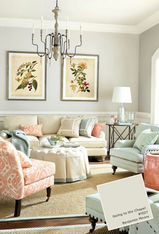
Benjamin Moore Going to the Chapel 1527
This is one of my favorite dark blues in the Benjamin Moore Collection. It needs a lot of crisp white trim to really set it off, and the white bedding helps, too. Newburyport Blue is also a great pick-me-up choice to paint a wood dresser or other piece of dated furniture. I’ve had many clients think they want this color because they’ve seen it in magazines. But when they actually see my SmallWall sample of it, they are scared of how dark it is. Stillwater 1650 is a lighter alternative to this dark blue, and still reads strong without making you feel like you’re drowning.
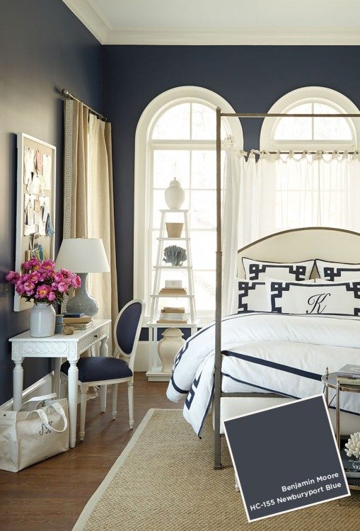
Benjamin Moore Newburyport Blue HC-155
Oatmeal paired with spa blues and wood tones will give your room a sand-and-surf feel. This room could as easily be found in a beachfront property as in a suburban neighborhood. In my experience, Oatmeal reads lighter and a bit more yellow than what you see in this photo. If you wanted this look, I’d suggest trying Carrington Beige HC-93 instead.
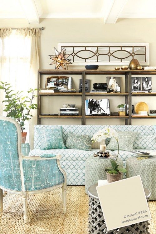
Benjamin Moore Oatmeal 268
If you’re looking for a warm gray paint color, Amherst Gray is a good one to consider. It’s a browned gray with a drop of green, so it doesn’t go cold. If that one is too dark for you, Chelsea Gray HC168 is a bit lighter. I once had a client paint her yellow-gold bedroom and bath in this color. During the process of painting, she called me a couple of times, saying the color was brown. It wasn’t until the gold was completely gone and two coats of it were up that she finally saw that it was going to read gray!
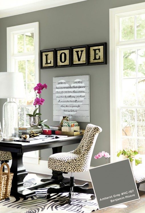
Benjamin Moore Amherst Gray HC-167
Here’s another warm gray. Notice how light wood and mirrors are used in this room to keep it from going to dark in here. I’ve never actually tried this one, but it looks like it has a bit of green in it. But I can’t be sure about the accuracy of the colors represented in photos, so don’t hold me to that.
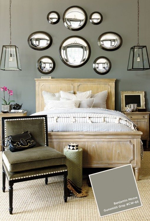
Gunsmith Gray CW-65
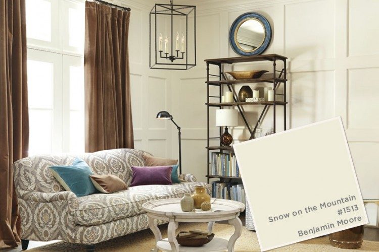
And I’ll leave you with a warm off-white on this snowy day in Nashville. Snow on the Mountain looks perfectly lovely on these board and batten walls featured in Ballard Design‘s catalog.
I hope you enjoyed this guided tour through Ballard Design catalog paint colors. Be careful about trusting the accuracy of paint colors in magazines or Pinterest (you can follow me on Pinterest here). Lots of professional lighting and manipulation of colors are needed to make rooms look magazine-worthy, but it can give you the wrong idea of how a specific paint color may actually work in your home. Use photos as inspiration, but make sure you test the colors before committing to them in your home. Have you used any of these colors? Which is your favorite?


Great Post – I have been so disappointed in the past after using a colour from a magazine article or online. Even testing is tricky ( for me anyway!) I have repainted a room, although I tested with a sample and was pretty sure it was the “right” colour. On another note, I wish we had Ballard Designs in Canada!
Great post Kristie, I am bookmarking this one to refer back too. Nashville’s weather was on Canada’s national news this morning! I am feeling your pain here in the Toronto area about the cold!
Thanks, Caroline! I know it’s so much worse up north. We aren’t used to this, haha!
Great post. When it comes to Benjamin Moore paints
, hold your judgment on the color until the end. Always remember…………..Benjamin Moore Lies ’til it Dries!
Believe it or not, Nora, that is a new one on me. Love it – “lies ’til it dries”
That is so true. When I was painting our dining room Palladian Blue, I was convinced it was going to look too green until the day after I finished painting!
Thank you for this post! SO true! This is something we’ve been dealing with lately as we’re redoing our kitchen. In an inspiration photo we’re trying to replicate, the cabinets had all been done in Benjamin Moore’s Duxbury Gray at 75%. I painted one section of our cabinets (which are being replaced) and it looked completely different than how it looked in the magazine. COMPLETELY! Anyway, I’ve become a big believer in not just going by what you see in the magazine or on the computer!
Don’t get me started on using percentages when choosing paint colors!!! If the color isn’t right, find another specific color that is – using percentages (50% or 30%) screws up colors, and you really are just playing a guessing game at that point. I spoke with a client the other day that did 120% of a given color to make it darker???? That’s NOT a good idea . . .
Love this post Kristie!
Thank you, Diane!
Another great post, Kristie. Actually being called in to do lots of “color corrections” of grays gone wrong. As you know, there are so many variables that make or break a neutral or white paint color on walls. Attempting to copy colors gleaned from Houzz, Pinterest, blogs… is risky. I always tell clients it is helpful use these photos to convey the atmosphere they want — I then always choose, test and tweak colors on site. Always!
Yes, Jean – photos are great inspiration, but getting assistance from someone like you (or I) who work with paint colors daily can get someone the look they are after. Otherwise, one has to do lots and lots of paint sampling – which takes a lot of time/money, and even then they may still get it wrong if they don’t have the experience with a particular color.
Another great post, Kristie! I’m actually being called in to do a lot of color corrections
Thank you for the advice, Kristie! So maybe with the percentages, I really was looking at a different color! You’ve inspired me to go get a sample of straight Duxbury Gray and paint the cabinet again. AND I changed the lights to Cree lights too! I’m trying to give these paint samples every opportunity to shine!
Kristie, you always have great advice, thank you so much. Love your blog! Would you please tell me where you got that beautiful bed. I’ve been looking for one like it for such a long time!
Lisa, the photos are from BallardDesigns.com – you can find the bed there!
I’m just south of Nashville and I’m with you Kristie- tired of being stuck inside! Even though it’s a rainy, slushy mess this afternoon, I’ll take it over the ice any day. To answer your question on color choice, I think I’d go with Going to the Chapel. All the rooms you’ve showcased have design elements I love!
Hi Kristie, I love you blog! Thank you for such great advice and insight. Would you please let me know where to find the beautiful bed in the photo. I love it! Thank you!
Thank you so much, Kristie! Sorry to post again. I just saw your answer. You are so kind to help!! Have a great weekend!
Hi Kristie, Great Post, but hmmm… I think it’s very quite likely ;] that we were separated at birth! We saw eye to eye on Marsala and same thing here. [from your comment] I always roll my eyes about the mixing at 50%, 75%, 2%, LOL. Percent of WHAT? And what IS the other 50%? The base? The base is a color too! I never even heard of that until I started reading blogs a few years ago. And I do this for a living too! xo, Laurel
Thank you, Laurel – We just may be soul sisters! I just read a great post on your blog about color palettes and loved it (that one had to have taken many hours to write!). Your blog is just beautiful 🙂
I think Newburyport Blue would look amazing on the chest of drawers I plan to put in our refinished basement when it is done. Thanks for this article, Kristie, it’s a very good reminder to be careful of photos of colors.
You’re welcome, Judy! Good luck on your chest of drawers, I’m sure they’ll look great 🙂