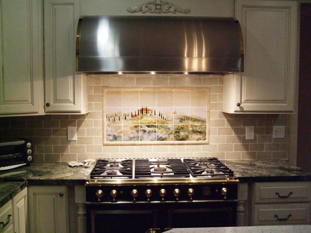
I recently had a conversation with a client about the kitchen tile she had chosen before I arrived on the scene. I was there for a paint color consultation and she was simply sharing what she had recently chosen to install (she had not had it installed yet, thankfully). Her granite countertops were busy with browns, creams, and oranges. The tile she chose was equally busy with similar colors in a size and shape that was very on-trend in the late 1990s. We had a discussion about the fact that although that while they technically “matched”, the combination was way too busy and would not be good for resale. In the end, she decided to use a more classic tile shape (subway) in more subdued sandy tones that would complement the granite, but not compete for attention.
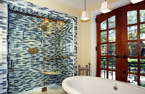
Then I the other day I read a great post by Barbara Meglis about over-doing the current bathroom tile trends (mosaic tile in mega-watt colors). That totally got me thinking about how often people make dramatic choices in kitchens and baths based on trends that date themselves quickly.
| Maria Killam is a huge proponent of the all-white kitchen for this very reason. | 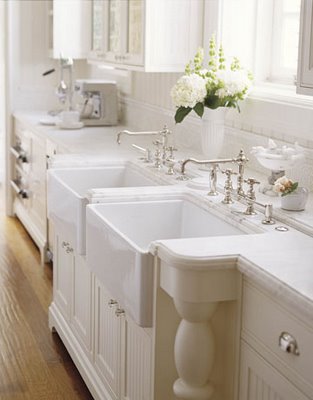 |
As a Home Stager, I very well recognize that doing something “risky” can be dangerous for resale. On the other hand, I believe you should decorate your home to live in it in a way that reflects your personality – so where’s the balance if you don’t intend on living in a given house forever? (Some of us intend to do that, but we are few and far between!) So what, does that mean we should only make “safe” choices without personality for our homes? Of course not.
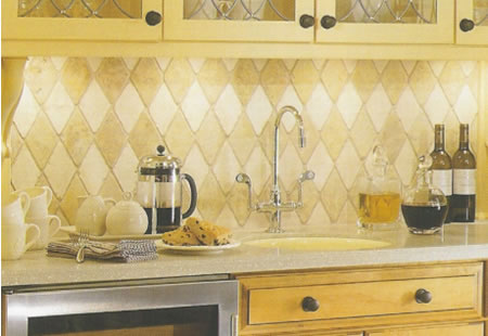
As a rule, I recommend that expensive fixed elements that require installation should be current, but not trendy. That includes countertops, tile, carpet, and large architectural features. These things should be on-trend, but not trendy. There are certain things that may be on-trend in tile – such as a certain size, shape, or placement options (like on the diagonal or vertically-oriented).
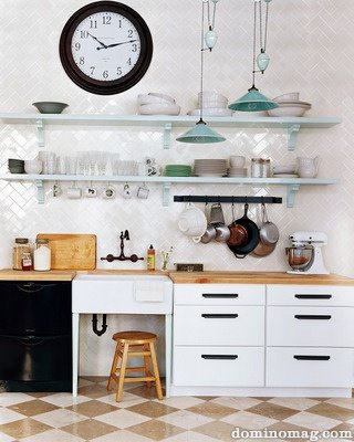
But if you use a classic, timeless material like white subway tile the overall look and appeal will be more enduring than if you choose a trendy colorful mosaic tile. Or, you could choose a more subdued mosaic tile but apply it in a more classic fashion.
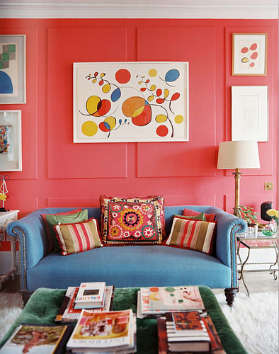
The bottom line and The Decorologist’s best advice: incorporate trends in things that can be more easily moved or replaced like colorful accessories and throw pillows. Even lighting and minor pieces of furniture can easily be changed out when something begins to look dated. Go for the trends in things that aren’t going to destroy your sanity someday (like ripping out floor to ceiling mosaic bathroom tiles). Also, consider the versatility of paint – walls can always be repainted, and really should be repainted every 5-10 years anyway. Why not have fun with paint color, like this homeowner did?
Just repainting this room in a nice neutral would “settle down” the look of this room. Other places you can go more “trendy” – children’s rooms, personal offices, and play/rec rooms. Just don’t go too crazy in the kitchens and baths, people!
How do you feel about on-trend vs. trendy? Is it hard for you to tell the difference? If you need help making the hard choices in your kitchen or bathrooms, schedule a consultation with The Decorologist today.







Hi Kristie… I do think sometimes that we can get so conservative that we don’t allow our own tastes to feature. When white kitchens were the only ones to have in the eighties I got mine done in a light avocado green with a linen {beige} bench top. When we left in 2004 these colours were really trendy and far from not being able to sell it because of the colours they were an asset to us…lol…and I had not stopped loving those colours in my kitchen. Now I have tasmanian ash benchtops (wood) and cabinets..recycled wood with stainless steel appliances and a white…haha!..splashback with a small line of stainless steel mosaic tiles which I am also loving now. I like those long flat tiles and bricks …but only in neutral colours not in multicoloured contrasting tiles and bricks. There are some done in the sixties that still look great and a multitude that were trendy at the time and have long since gone ‘cos they became an eyesore.
Carol – your kitchen sounds beautiful, I’d love to see it! I feel as though I am really lucky to live in an old house – despite its quirks, it’s really pretty easy to make decisions about kitchens/baths. If I’m true to the era of the home, it just works – no worries about things going out of style! Not quite the same in the newer homes I mainly do my work in!
I agree with you Kristie. Trend colors should be left for pillows, vases and other accessories. I always suggest neutral with large expensive flooring or tile. I love that last picture. So fun. One of your photos was from domino magazine- I just found out yesterday they stopped the magazine last month. Did you know that? That is sad.
Kelly,
Domino shut its doors a couple of years ago! Been mourning that for a long time 🙁 I still LOVE the old issues, though – it all still feels very current.
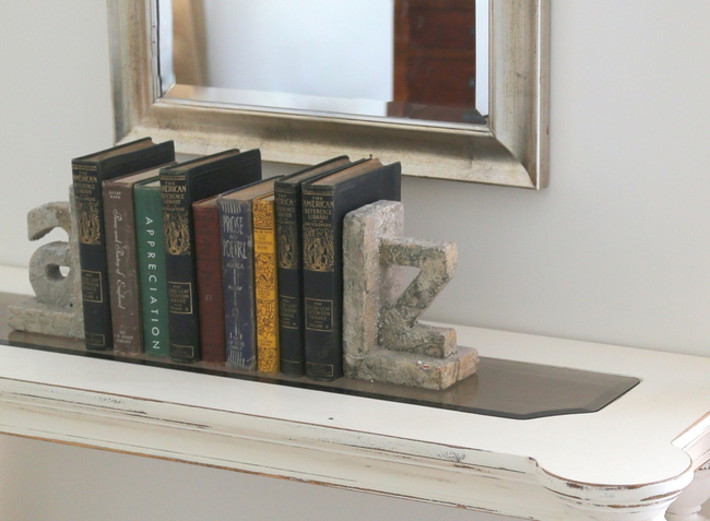
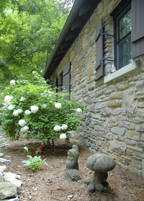
Who was the designer for the last image?? I cant find it in the Lonny Mag, but it looks so much like a Joe Nye
i got it through chinasheperdess and it was labeled from lonny – i feel sure i remember seeing it in one of the last couple of issues of lonny, though. you might check the previous issue 🙂
Couldn’t an all-white kitchen be equally susceptible to being seen as out-of-date someday? I remember a lot of streaky, pale whitewashed kitchen cabinets in the 90’s – they look totally dated now, right?
Well, with white cabinets you can change hardware and some appliances and look up to date pretty quickly – easier than changing out cabinets and tile.
You summed that up great! That makes so much sense. And sometimes you think you are staying somewhere for awhile and then God takes you somewhere else. 🙂
Awesome post, and love your examples!! Wow that blue and white contemporary tile. . . sooooo busy!!
xo
Maria
Great advice. Incorporating trends in the larger interior design areas is great as long as you don’t mind spending the money and time to change it in the near future.
very true, ragan! if you are ok with spending the $ and time to change something out eventually, then definitely choose something you love, love, love 🙂
I am looking for a similar subway tile to go with my granite counter & antique glazed creme cabinets. What is the tile – materIl & color -of the tile you used in the above pictured kitchen backsplash?
I also like the look of the top backsplash too. Tile info would be great.
Hi Kristie,
We are looking into remodeling our white kitchen as the cabinets need replacing – and are thinking of going with white cabinets again, with a dark granite counter top. What do you think of maple cabinets that are stained a pearl white color, as opposed to a painted white cabinet? Also, thinking of choosing porcelain floors that look like hardwood. Any suggestions will be appreciated. Thank you.
Good day, I am stuck in a dilema. I need to purchase wall tiles for my kitchen backsplash (I just built a new home), but have no idea which colour tiles to go for. My floor tiles are a off white / cream and my cabinates are cherry wood with black granite look formica tops. Should I be using a Dark brown tile as the backsplash or a lighter beige? Any advice would be welcome. I can certainly email you a photo of my kitchen for your reference. My email: [email protected] Thanks.