The “it” color of 2013 is Monaco Blue, according to color giant Pantone. As a Nashville Color Consultant, I think this color is a great pick. I heard from two sources that this color was announced at High Point Market as Pantone’s Color of the Year over the weekend, but others are saying that it is simply the top color in the fashion forecast for 2013. Regardless, I love this color and am sure it’s gonna be hot-hot-hot!
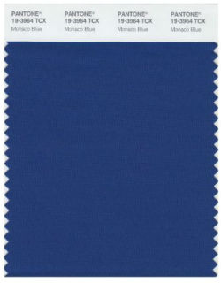
2013 Top Fashion Color of the Year, Monaco Blue
Monaco Blue: Royal + Navy + Cobalt = a delicious inky blue that is classic and modern at the same time. You’ll get no complaints from me – I was not a fan of Pantone’s 2012 Color of the Year, Tangerine Tango. Last week I shared my own Color Forecast, which is right in line with Pantone’s recent top picks for spring:
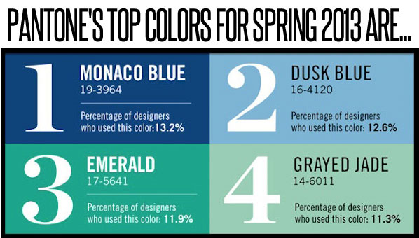
If you use Monaco Blue as a wall color, consider it the main “neutral” color in the room. It pairs well with practically any other color. Here are a few Benjamin Moore colors that are similar to Monaco Blue:
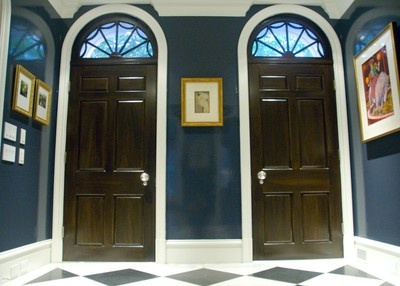
Hale Navy in high gloss via Pinterest
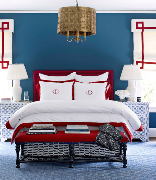 Van Deusen Blue via Hirshfields
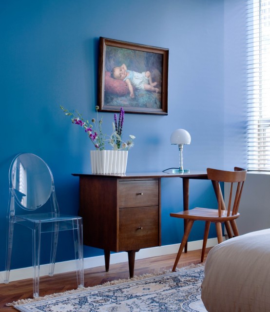
Benjamin Moore’s Lucerne via Pinterest
So what do you think? Is Pantone’s Monaco Blue a winner?




What a pretty blue! One of my daughters has a similar color in their bedroom, by Ralph Lauren…XoXo
Beautiful choice by Pantone. I love all the blues you have shown, especially the Hale Navy in that dark hall. It looks so glamorous.
Ever since your color forecast post I’ve been dreaming up new color schemes and contemplating the colors of my youth returning. Although I sure hope we can do better than the navy, hunter, burgundy combo of yesteryear.
Anyway, I was watching the PBS Masterpiece Theatre drama, Upstairs/Downstairs tonight and admiring the luscious emerald, gold and navy walls in the 1930[s London townhouse. I love how colors repeat themselves historically.
Looking forward to seeing the new palette unfold and how you use it in 2013!
I just started watching Upstairs/Downstairs, too! Art Deco and definitely those brilliant blues/emeralds!! I feel like the current color trends are being heavily influenced by all things British – Downton Abbey, Upstairs/Downstairs, Kate Middleton, the Olympics – hey, I’m all for it. I really want an emerald-colored sofa now . . .
Yippee! I’ve always been the last to jump on board trends, but I beat this one! I just completed my office and painted the ceiling and a wall treatment with a color very similar…Martha Stewart Wrought Iron. Sometimes it looks navy, sometimes slate blue and sometimes charcoal. Loving it!
http://dimplesandtangles.blogspot.com/2012/09/the-office-close-ups-details.html
Hurray for Monaco Blue 🙂 I know its considered a cool tone but I think all us jeans lovin’ folks see this as a cozy, comfortable, and comforting color, even though it can be sharp and formal too (think the dress blues of the Marine Corp). And for anyone who has lots of brown wood or furniture, this shade is great for cooling down that palette. I already have a fair amount of navy tones in my house so for once I’m on trend. Yippee.
Hi Kristie. I love these beautiful deep color saturated blues. My question is how do they work in small rooms? If they do work in small rooms, but only have 750 total sq ft of living space, how can produce a nice flow when the house is not an open concept. I feel like it would cut the house and make it feel smaller. Must like in fashion, monochomatic creates a longer leaner look as does a dress vs. some skirt and blouse combos that may give you the illusion of cutting you in half. Thank you!
In a small space, you may choose to use colors like these in your art, lamps, and other accessories rather than thinking of it only as a possible wall color. For such a small space, you likely would need to have a more neutral background and utilize pops of brighter or darker colors throughout – even through upholstery, like on chairs.
Thank you Kristie for taking the time to answer my questions. I had a very strong feeling that in my situation a neutral background will always be the way to go. Actually, that’s just fine, because it will be easier to update and embrace certain trends, including color, because pops and accessories are so much more economical.
Definite winner! I can’t wait to see where it goes 🙂
I LOVE blue – any color of blue – but light blue the best. I would like to see Monaco Blue as the major accent color in an all white room.
I thought Emerald would be a darker, clearer green.
I’m just not a blue girl for my home, but I love the greyed jade. Is there a similar color that B.M. has?
Oh, YES! Prescott Green or Paris Rain (more grayed).
How exciting. I’ve been waiting to hear about this! I love this color.{And I did love the tangerine as well.} I can’t wait to see it in clothing especially.
Warmly, Michelle
We continue to be on the same page! I just changed one of my paint splats on my Twitter avatar to this lovely blue. I saw a lot of tweets coming in from High Point with this color and purple. I’m not a fan of blue but this I really like 🙂
I’ll be interested to see how Monaco Blue takes off in 2013. I feel as though we’ve started to see it in accessories. It brings out feelings of patriotism for me which I really like. I will say I do not like Dusk Blue that is forecasted above.