For the very first time, Pantone has announced a duo of colors as Pantone 2016 Color of the Year.
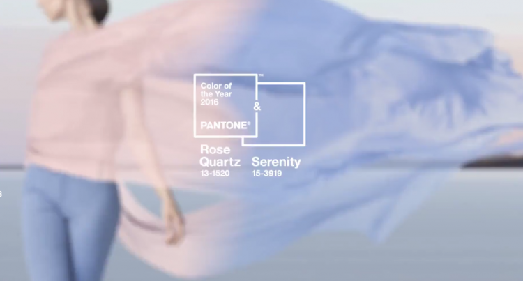
Pantone 2016 Color of the Year – Rose Quartz & Serenity
I like the idea of a color combination of the year. I am always telling my clients: color is RELATIVE. Relative to other colors around it, and impacted by lighting conditions, as well. That’s why the lovely wall color you see in the magazines may not be the perfect color for your own living room.
In addition, I don’t consider too many colors as “dated” in isolation. It’s COLOR COMBINATIONS that are dated. Remember how avocado green was trending so hard a few years ago? My clients who grew up in the 1960s-1970s were appalled at the trend, because all they could imagine was the avocado green and harvest gold kitchen appliances from their childhood – definitely a “dated” color combination!
![avocado and gold_thumb[1]](https://thedecorologist.com/wp-content/uploads/2015/12/avocado-and-gold_thumb1.jpg)
BUT – the new, trendy avocado color was now being paired with an on-trend favorite: turquoise. And the result was a fresh, updated color combination:
I must tell you, I’m not sure this idea of color combos for Pantone 2016 Color of the Year has ANYTHING to do with what I just described. The pink and blue combo chosen appears to be a specific choice aimed at picking up the social and political climate, having to do with gender fluidity and blurred lines between the two.
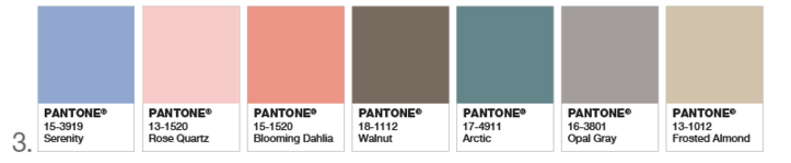
I also must tell you that I don’t particularly like Rose Quartz and Serenity as a color combination – at least not in isolation of other colors. Pantone does offer several suggested color palettes including those two colors on their website, this being the most current and appealing, in my humble opinion:
The closest thing to Serenity I have specified in any paint color or even fabric or decor over the last few years is this little girl’s room:
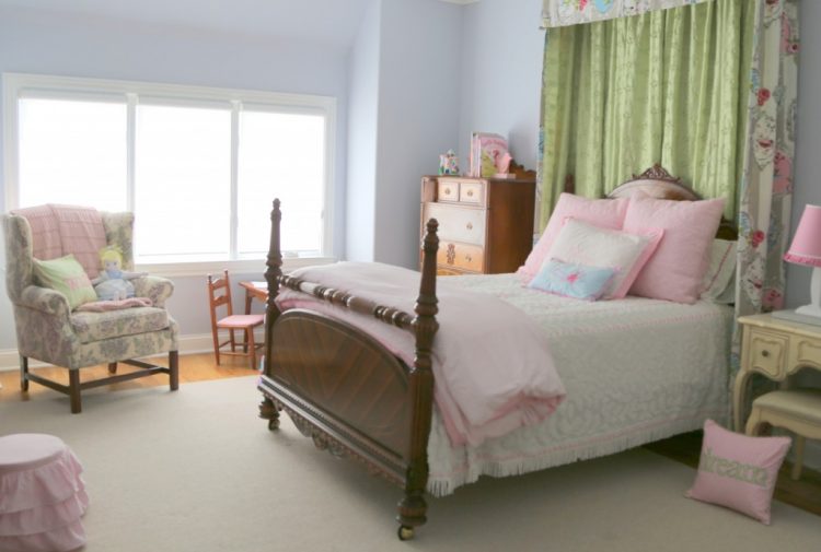
see the befores and afters of this room here
The wall color is Benjamin Moore Violet Mist, which is a blue with a bit of purple in it. Obviously lighter than Serenity, but in the same family. You can see that the pink and blue are a sweet combo for a little girl’s room. But not so much for a grown up space.
However, I LOVE that Rose Quartz is part of the Pantone 2016 Color of the Year, although I would have much preferred it to have been THE Color of the Year. Blush pinks are definitely trending – I actually was expecting it to be the 2015 Pantone Color of the Year. I have specified a version of this color several times in the last few months!
But, instead we were served up the organ meat color of Marsala, the 2015 Pantone Color of the Year.
To sum it up, I love the Rose Quartz. But not so much the Serenity. I still think blues are hot, just more so when they are in the slightly green direction, vs. purple like Pantone’s choice. If you go with a blush pink paint color like Rose Quartz, make sure it’s muted and fleshy (on the peach side) so that it doesn’t end up looking like a 4-year-old girl’s room. Or Pepto-Bismol. Pair your blush pink with grays, whites, blacks, spa blues, yellows, and gold, and you should be on the cutting edge of decorating trends.


I think you’d have to be a very savvy decorator or just plain bold to make pink work in a living space. I’m neither of those, so, the color(s) of the year are a no go for me.
Yes, you are correct! It’s not a choice most people would be willing to take. Pink is such a taste-specific color, and more people hate it than love it! Thank you for reading and commenting 🙂
Love it! Have used blush pillows paired with spa blue on linen colored sofa for a year now.
I personally really like rose quartz color. I’ve seen that blue done nicely, but it takes a special decorating touch to make either work without looking too “gamine”. At least it’s not another tone of white…!
Wow, I had to look “gamine” up . . . 😉
I’m not sure what the folks at Pantone have been smoking, but 2015 and 2016 picks are waaaaaaaaay too 1987 for me. I just can’t do it. Why?!?!?!?!!!!!?????!!!!?
Yep, Paige – it is a dated COLOR COMBO. They should have mixed the blush pink with something else, if they wanted to do a pair of colors. That is, if they were solely interested in fashion and home decor colors. They wanted to be socially relevant in the year of Caitlyn Jenner, so that’s why the pink/blue combo.
I totally agree with you Kristie. I too am confused by the “twins ” Love your headline ? I too thought the blush pink that has been creeping back onto the decor and fashion scene for a couple of years now would be a possibility. I have never seen such a write up from Pantone explaining their choice before. It’s definitely more of a social statement.
I love pink, but I don’t think many people do. It’s definitely a shabby chic color or for a little girls room. I love pink roses!
Looks like the pink and mauve of the 80s. I forgot to add.
Carol, again, it’s about context – with gold metallics and some of the colors I mentioned, it could look fresh and updated. Just not with periwinkle blue (very 80s).
Hi Kristie – I’m glad we’re talking about pinks! I’m in the UK and was in the Farrow & Ball shop the other day, looking for a colour for to compliment their “blue grey” – in an adjacent room. I remember you writing once that certain types of pinks (esp from the 80s) look like a ‘band aid’ and I was trying to avoid that – and so was unsure what kind of F&B pink would work for me. Not sure if you know their range at all (?) but I was thinking something like their Calamine might be an easy pink to work with (or is it too ‘band aid’ !!?) I’d love to know! Their ‘nancy’s blushes’ – is too ‘lolly pink’ for me (or is that the trend?) PS: At least they didn’t choose two whites!
Maybe Farrow & Ball’s Pink Ground? Calamine is too vivid, I think. Band-Aid colors are beiges with a pink undertone.
Nancy’s Blushes is too pink for me!
I am with you Kristie, I like the blush pink and the “baby” blue in certain applications but NOT together. It would be difficult to paint a whole room Serenity (too baby blue in my opinion) but I can certainly see the blush pink on walls. That color combo brings me back to my mid 80s living room which had pink sponged walls and baby blue upholstered furniture (in my defense, it was my first home and that was the favored color scheme of the day lol!)
Ah, yes, the sponge painting of the 1980s. I remember sponge painting a wall in my apartment in 1990 . . . it was a horrible green color :/
I wouldn’t want to use either color in my home. I am not a fan of most blues, but periwinkle blue I love.
Oh no!!! I just can’t do pastels, neither in decor nor fashion. It is just too pale for me. I’m a ” red” girl, versus a “pink” one.
Thankfully, there are billions of other colors to choose from, right? I find that most “red” girls don’t care for “pink,” and vice versa! Go with what you love 🙂
Ugh. It’s like two people picked the colors and upper level management said, “I’m not going back to argue with either of them…so whatever…we have a winner…er…winners!” There are worse colors but to choose these as colors of the year? Beats white, though.
I wish a color company would put out a true blue, a true gray, true yellow, etc. so I can figure out which way all the other colors lean (pink? blue? violet? green?). Having spent way too much time picking out a wall color for a small bathroom and then having to punt when it wasn’t going to work (the accent tile leaned green once on the wall), I was so frustrated and was ready to go with white but even that was tricky. Would love to figure out what the “true” colors are (or close to it) and go from there.
Tara,
That’s a tricky one – not only do colors lean either one way or another (for blue: green or purple), there’s also a matter of light/dark versions, and fresh/muted versions of any given color. So I’m not sure there can be one “true” blue. And you will perceive colors differently depending on what they are paired with. So a blue that leans green may look fairly true blue next to green, but pretty green when paired with purple!
Ok…I think my head just exploded.
Terrific report Kristie! As for my opinion? Parents: Is it a boy or girl? Well… we’re not sure, said the doctor, I would decorate for both until we figure it out. Oh, how I wished that they’d just have picked one or the other. Actually, that was my bedroom in the sixties! My mom got this hombre fabric that when from blue, lavender into pink and made our curtains out of it. I didn’t like it then either.
However, if one uses them separately, and pairs them with what I was hoping to see which was a deep rich blue which makes so much sense since we have two white paint colors from our paint companies. It appears that they don’t communicate and I’m sure that all of this is decided possibly even a year in advance!
However, the even larger problem is that this color combo does not exist in today’s market. Not the furniture market, at any rate. And it’s not going to either. No way! It’s not barfy, just woosy.
Did you hear that thud? ;]
Laurel,
Glad to hear your opinion, I knew it would be an honest and interesting one!! But what does the term “woosy” mean??? DARK blue and blush pink are gorgeous together, so I’m with ya on that!!! 🙂
Hi Kristie,
Oh, woosy is like wimpy. must be a northern word. lol My Pantone post is linked to my name. I’m trying very hard to be a nice person. lol But this is war! And I feel it my duty to protect the citizens of the world who might be deleteriously affected by bizarre choices coming from those supposedly in the know? Did you see their pairings? Some of the individual colors are okay (some aren’t. Like mustard and pink? blech!) but they put them in palettes and together, oh meo myo!
I have concluded that they are purposely trying to provoke us. :] That is the only logical reasoning I can come up with. xo
OH!!! I was reading “woosy” like “woozy,” and you meant “wussy!” Maybe my spelling is wrong, not sure. It’s not northern – you hear that down south, too. My bad, haha!!! Ok, gonna go read your post! And yes, I do believe they are provoking us 😉
I was bracing myself for it to be white, and for you to literally go stark raving mad.
Jessica, it’s nice to know folks are so concerned about my mental stability 😉 Yeah, I just might’ve LOST IT . . .
Eh. It takes me a while to warm up to new trends, so maybe I’ll love these colors in two to three years. I’m doubtful, though. The only colors of the year I’ve been excited about were turquoise (2010) and Emerald (2013). I’ve always loved greens and blues, though. Oh, well… at least I know what I like! 😉
Jenny, I also loved Turquoise and Emerald! And even the Honeysuckle Pink (although it never took off). I have added lots of emerald green to my home over the last year, and it adds drama and warmth to my pastels.
Ick on the duo. As for the blue, I painted my daughter’s room that color about 10 years ago, although it was darker. I am not sure that shade of pink is fresh enough for me, so this year is another dud.
Wayyyy to ’80’s for me lol. My china is actually in again hehe. I’m sure I won’t be painting any rooms with that dynamic duo, but it’ll be interesting to see how they spin this combo to give it a new twist.
Robin, I think I’ve seen some china those colors – can you post a photo??? Who knew the 80’s were so retro cool? (not)
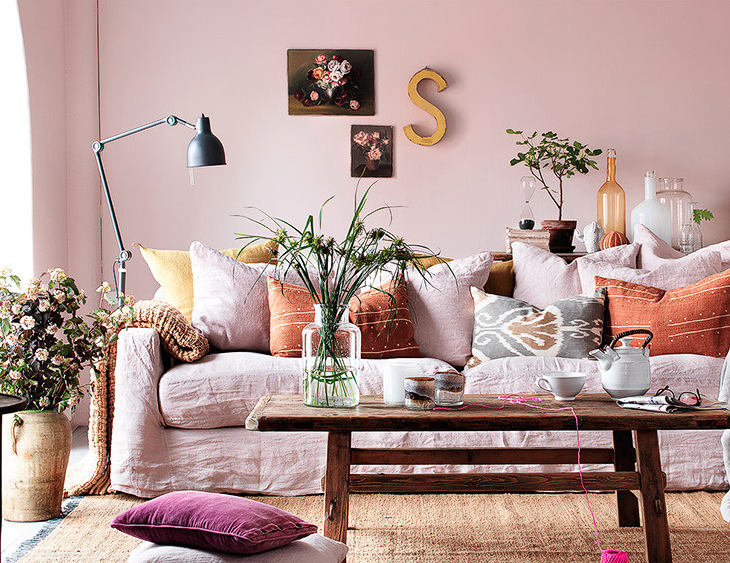
I do like the Rose Quartz and the image of that living room! I could live there (I don’t know if my husband haha)
I love that room – I stumbled upon that image, looking for a color similar to Rose Quartz that looked good. It isn’t actually that color, but it’s an effective version of it. Yeah, then there’s the husband thing . . .
Yes haha! But I have to say that the room is so well put together and it feels relaxing without being boring that I am starting to think that my husband could enjoy it too, even if it’s almost all pink 😉
Thanks for your reply Kristie!!
I always understood trends reoccur about every 40 years. This holds true . . . as I’m mentally preparing for a large scale mauve and colonial blue striped wallpaper removal.
Yes, Theresa, you are right, but there’s always a TWIST to the previous trend. And for colors, it’s a different color combination or color pairing. Too many people still remember the 1980’s . . .
Introducing Pantone’s 2016 Color(s) of the Year
Oh, Paige. Thank you for that image. The wall color is good, but all else must go! Especially the ficus in the corner. And the triangular lampshade. And those pillows. BUT – I would work with the floor lamp, and also I’d paint the iron table gold!
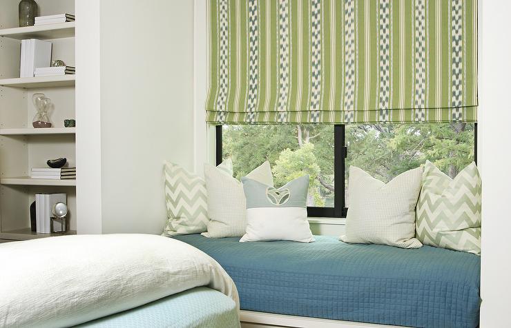
Haha! I thought you’d like that! I do however like this next pic. It has some gold in it like you mentioned before, and just a hint of the Serenity blue.
YES! That is lovely. Do you know who the designer of this room is?
Kelly I Designs
I hate it! Period. I am in stride with your critique Kristie, but I honestly have no room for this duo. Really??? UG, double UG-UG. 😐
Sheila, can you tell us what you REALLY feel? 😉
NO! “No” to pink. “No” to blue. And “No” to pink with blue. What in the world was Pantone thinking when they selected two colors? However, I love everything else in the “Rose Quartz” room, especially the “squooshy” sofa.
Thanks for the great information. useful information about house painting. Especially about the colours!
Wow, so much hate for these colors >:( It may scare away some people, thinking it’s too soft, too girly, too childish, too 80s, too whatever for them.. but I think they can be incorporated in almost any room without being overpowering if you pick the right items. The rooms in the photos that Paige picked were horrifying for me (partly because they weren’t even the right colors), but you could mix it with some neutrals (white, grey, wood) to tone it down.
Here I tried making a moodboard/interior set with these colors as dominant for a living room, which I believe could work if paired with a grey sofa and a full gallery wall.