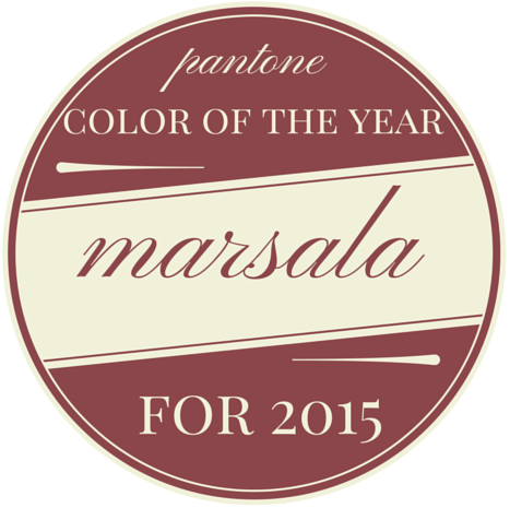
You may have heard the big announcement last week. You know the one. Pantone’s 2015 Color of the Year. My first inclination was to NOT write about it because it doesn’t deserve the attention because it is a hot mess. Yes, that’s my professional opinion.
even the graphic looks dated via
Then I watched as all the reactions came in – designers, color consultants, bloggers, journalists, homeowners, etc. Marsala drew strong reactions – either strongly negative or strongly positive. The negative reactions were nothing short of side-splitting hilarious, so I spent some time compiling my favorites for you:
“It belongs on a drywall accent wall in a low rent mattress store with particle board nightstands scattered about. It belongs in an eye doctor’s office waiting room circa 1992. It belongs nowhere.”
“Reminds me of pair of Toughskins pants I sported as a kid growing up in the 1970s.”
“Looks like the interior color of an eighties pizza parlor- I keep expecting to see paintings of grape vine leaves and bottles of chianti.”
“It looks like the ugly inside of a commercial building or the outside color for a cheap 1990s townhouse.”
“I love Marsala… In a pot with chicken or in my wine glass. Short of that I wouldn’t use it.”
“Looks like dried menstrual blood.”
“Hey, the 1990’s called. They want their color back.”
“They renamed “mauve”. That’s one heck of a marketing campaign…”
“Well, they certainly did dig deep, but if I were them I’d fill that hole in again.”
“It is depressing and a hot, muddy mess.”
“My guess is the pantone people spent too much time playing candy crush while on the clock….realized one day they were not gonna make the deadline and picked THIS out of a hat containing many colors.”
“It looks like someone poured milk in a glass of red wine…..just before it curdles.”
If red wine had anemia this would be the color.
“This is one of the ugliest colors that even exists. Is this choice a joke?”
It’s a color that makes you want to go to Olive Garden or order Tampax in bulk.
“It does make you wonder if they all sit around some late afternoon, drink a whole lot, then get the hysterical giggles as they try to top each other in the ‘let’s see if they’ll buy this one’ contest.”
“Nice, looks like disemboweled intestines.”
“If you had painted something in the 80s mauve (also ick) and let it sit and get dirty for 30 years, you would have Marsala.”
“I can appreciate it, being a former OR nurse. CREEPY.”
“This is my maroon graduation gown after being accidentally Cloroxed.”
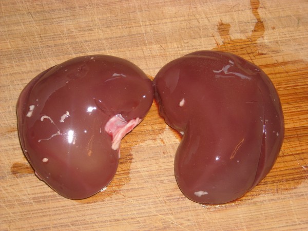
“Oh lovely, the color of kidneys is HOT this year.”
The positive ones were interesting, too. It seemed like some people were doing everything they could to bend over backwards and figure out a way to MAKE Marsala work. Many of those people may be trying to justify the choice they made 10-25 years ago, and now they want to believe they were 20 years AHEAD of the trends and have no need to change it now. It’s fine, of course, if you love that color, keep it! But just because you love a color, that doesn’t make it on-trend.
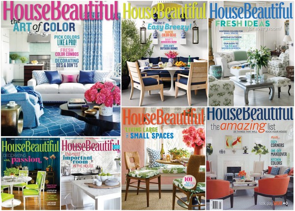
Look – in my opinion, the “Color of the Year” should be so good that no one has to bend over backwards to make it fit in. There should be beautiful images already in the design world that show how fabulous it is, without having to come up with far-fetched ideas as to force it into on-trend decor. It should already be there. House Beautiful is one of my favorite magazines, and it features some of the most on-trend designers and has increasingly become more focused on residential paint color. Here is a collage of some of this year’s covers, filled with on-trend colors:
no body organ color to be found
Every room I’ve seen posted since the announcement with Marsala in it either looks like it was designed in the 1990s or else there is a smidge of some reddish brown in a corner and the writer is like, “see, look, in the far corner, there’s a teeny-tiny piece of Marsala! Don’t you just love what it does for this room??!” Uh, NO. Google it – you’ll see what I mean.
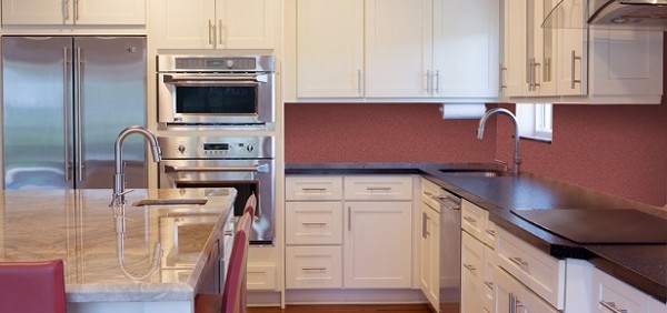
Below is a “modern” kitchen painted in Marsala. Does it read cutting-edge, on-trend?
source
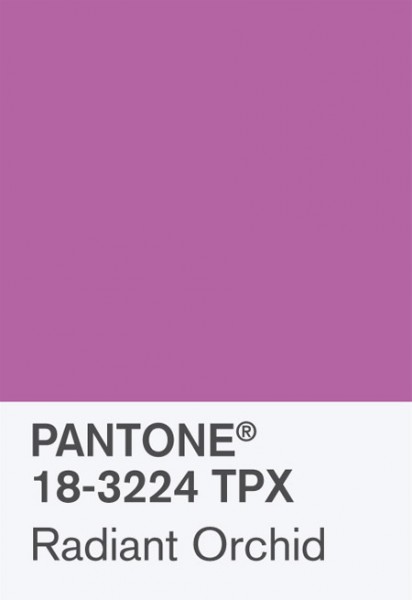
I’m just not seeing it. A bonafide “Color of the Year” shouldn’t be chosen just because it’s a color that NO ONE would ever guess prior to the announcement. And I’m starting to think that’s what Pantone is doing now – just picking a color they don’t think anyone would guess, because they so badly want it to be a surprise. Just like last year’s Radiant Orchid. Have you seen that color in bedding, pillows, fabrics, ANYTHING home decor-related? I haven’t either, and that was 2014 Color of the Year.
I’ve been digging burgundy since last fall for nail polish and clothes, but you are not going to catch me specifying it for wall colors anytime soon. And Marsala is not even burgundy or oxblood. It’s a faded pinked-out red.
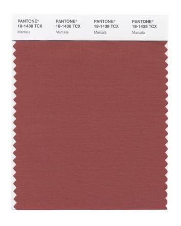
I spend a good deal of my professional time choosing colors to cover over Marsala with something that looks NEW. Everyday Home magazine asked me to write an article about 2015 Color Trends for their spring edition, which I should be finishing up by week’s end. I’ll let you know when that hits the stands, of course.
Here are some interesting posts about Marsala if you want to hear what others are saying:
http://www.houzz.com/ideabooks/34725093/list/how-to-use-marsala-pantones-2015-color-of-the-year
http://nymag.com/thecut/2014/12/pantones-color-of-the-year-is-icky-marsala.html
http://www.lindaholtinteriors.com/2014/12/pantones-color-year-barry-dixon/
http://www.mariakillam.com/marsala/
http://hadleycourt.com/how-to-use-pantone-color-of-the-year-2015-marsala-in-interiors/


Totally agree, it’s not good and I won’t be using it in my home! Can’t wait to see what you picked for 2015! You go girl! Great article today!
You summed up what I was thinking Kristie and made me laugh! I am going to share this on my design facebook page.
Thanks so much for sharing, Caroline!
I think the kidney picture says it all. At least if they weren’t going to pick a great color, they managed to pick a bad enough one that’s it’s fun to hate!
So funny Kristie! I guess many designers feel the same way as you do. Also, thank you so much for lining to my blog post about it as well…unfortunately the link takes you to the NY Magazine article not my blog. Here is the correct link if you get a chance to correct it. THANKS!!!!
http://www.lindaholtinteriors.com/2014/12/pantones-color-year-barry-dixon/
So sorry, Linda!! I’ll change it as soon as I get home from work !
It’s awful! What are they thinking? I even like a little dash of burgundy sometimes (although it’s very 80’s), but this is mauve red. Blahhhh.
Oh my gosh… it’s so horrible! I feel like things have just moved further and further away from colors like that (thank goodness). How about all the colors people are using right now? A lot of people in the DC area are still doing gray but really looking to make it the background adding color over and with it. Many of these colors are bordering on pastels but a little richer. And I think we’ll see them on the walls soon, too. And DC is majority conservative and classic!
Not to mention all the beautiful blues the last few years. Can you imagine swapping this out for all the navy and dark blues we’re seeing? It’d be cruel.
Hilarious and thoughtful post. I’m glad you didn’t skip it!
I totally agree. When I first saw the announcement a week or so ago, my first reaction was that it looks tired and outdated. Reminds me of a color that would go with that brief time period when people were texturing their walls to look rough as if they were in some aging villa—you know when they were adding touches of brick to make it look as if the plaster is wearing away to reveal a brick wall beneath. I think the Marsala color would be good if that is the look you are going for!
YUCK! I didn’t love that color in 2000, but it’s all there was, so I decorated my house with it. For the past couple of years, stores have been full of bright colors that I love, and I’ve had a lot of fun redecorating my home. If this color is a sign of what’s to come, I feel like I need to run out and buy everything I love before it’s all gone (which, of course, is not realistic). 🙁 I hope all the designers and manufacturers ignore Pantone and keep making lovely happy-colored things.
Jenny,
Oh, it’ll show up plenty in fashion, but I just don’t think the home decor industry is ready for this one. Our trends tend to be more long-lasting since redecorating your house is much more expensive than buying a new outfit!
I love, love, love radiant orchid! I found it in the fabric store and made pillows with it. it is in fashion in abundance. It looks great on nearly everyone!
I know it would never fit into you pastel blue and yellow scheme, but open up your mind! It is fantastic with charcoal and other grays! Looks fantastic with black and white!
I put it in a very tall cylinder vase in my bathroom, too! One placemat in the middle of my kitchen table…it was not difficult. It is a fantastic, happy, color! Stop hating!
Jane,
You know, my bedroom is lavender – I love a good grayed lavender, but I’m still not seeing much decor or fabric in that bold of a color (Radiant Orchid). Send a photo of your fabric – I’d love to see it.
I feel like it’s a color I’ve been trying to get clients to change and my efforts have now taken 2 steps back
HORRIBLE…… I will NOT be using it or selecting it for my clients I can tell you that!
Oh you make me laugh! First there was Jil’s graphic description, and now this compilation of ‘the buzz’. I am not a fan… but my way to bend over backwards to make it work is to go the vintage route by way of Baribocraft woodenware. That’s it. No other way to make it work for me!
That woodenware is awesome, of course! I almost spit out my Coke Zero when I read what Jil wrote . . .
It makes me think of a plate of red beans and rice. Not what I would want on the walls.
After this past 2 years, why should we bother paying any further attention to Pantone? This is beyond ridiculous. This color is dirty and depressing. Surely it was a joke.
Sadly, not a joke. They definitely jumped the shark on this one!
At first glance I thought the same thing. Yuck. MAJOR yuck. But then I looked around my house – newly built and decorated – white walls, black accents, medium tone brown floors, and no shortage of flat weave kilim rugs sporting – you guessed it – Marsala. In my own home. And not obscure eBay purchases, either. Pottery Barn, IKEA and the like. This style is no doubt very ‘California cool’ and certainly not east coast or southern, but trending none the like. Just a realization that sometimes they know what we like before we know what we like….
Send me a photo, Katie!!!
I’m going to be honest in that I really don’t mind it. But I’m also thinking of it like this – Marsala doesn’t have to be the star of the show, right? This color could be brought into a room in very small doses in pillows or accessories. I think it would look beautiful next to some dark blue or forest green – I’m embracing it.
I’ve heard a lot of people say that, Holly – that it doesn’t have to be the star of the show. I know I sound like a hater, it’s just I think that if you’re going to name something THE Color of the Year, it WOULD be the star of the show – not just a tad or a small dose here and there. That’s a second fiddle, NOT the star of the show, right? So they should have named it “Supporting Role Color of the Year” or “Add a Smattering of This in the Corner Somewhere Color of the Year.” Anything, just not THE Color of the Year.
Haha, Best.Post.About.This.Dumb.Colour yet 🙂
I would still LOVE to know how this happened?? It’s beyond me!
and thanks for the mention Kristie!
x
Maria
I agree, if you’re going to name a color “COLOR OF THE YEAR”, then by George, it should be no holds barred, take charge fantastic. Marsala is insipid at best, downright disgusting at worst. The kidney pic is the best descriptor yet. I polled my FB page for opinions, and got “dirty bandage”, “old pencil eraser”, “meh”. No one I know is excited about it.
What were they thinking???
So sad especially coming from you Kristie – I thought at of all the Designers struggling with this color, you would have come out with a gorgeous post proving them wrong. Guess not everyone can “see”. Hopefully you’ll love the next colors in line 🙂
It’s quite a divisive color, obviously!
I definitely agree with you on the Marsala….it’s just yuck personified. I do kind of like the radiant orchid though and I think it would probably go really well with that green that some other company had picked as their color, but I won’t be running out to buy any paint for my walls in any of the above colors….maybe for an accent piece or pillow, or jewelry, but they are all a bit much for whole room, in my opinion, if you are beyond your early 20’s.
What? You haven’t heard that offal is in?
Oh Maureen,
I totally had to google that to realize how brilliant you are!!!
As I said on my face book page, I think the color board drank too much Marsala at lunch when they chose this color. Color me truly disappointed!
YES!
It’s ugly. I will not be putting it on my walls or sporting clothing in this color!
I agree completely with your assessments about marsala. I wrote a post about it a few days ago which is in the link.
Great article, Laurel – I think we just might be sisters from another mother!!!
haha! Thanks Kristie!
I don’t agree 100% that it doesn’t work in the home. Now, don’t get me wrong, I don’t have Marsala in my own home BUT I love the look of “vintage rugs” in modern spaces and their key color is Marsala. I really do believe vintage rugs mixed with modern pieces and contemporary design is a trend right now and coming back stronger. I think we were all use to big pops of color and impact color for the last few years that we are just shocked by Marsala. Yet, if we take a minute and get the “stereotype” of the 90’s out of our head we would see its beauty for the home too. This blogger nailed it in her pics of home trends we are seeing. http://www.chrislovesjulia.com/2014/12/pantones-color-of-the-year-marsala-for-your-interior-im-a-fan.html
Cecilia,
Thank you for the link – that is the ONLY post I’ve seen with some really beautiful images using Marsala! I still think it’s going to be a hard one for most people to pull off and make it look current. I often say: colors aren’t dated, it’s just that color combinations that can be. We shall see if homeowners can create the beautiful look of some of those images from the blog you sent. Thanks again for the link and the comment!
So funny! Yes, it’s not an obvious choice that’s for sure! I had a hard time picking out fabrics that had shades of marsala in it…but I found a few 🙂 http://www.onlinefabricstore.net/blog/12-fabrics-featuring-pantones-2015-color-of-the-year/
Ick…What is wrong with these people? I wouldn’t paint my dog house with either of these colors! Can’t wait to see your picks; I bet they’ll be beautiful and livable.
My laundry room is painted in a color very similar to Marsala and I like it a lot. I agree that it’s not an ultra modern color, but it definitely is well suited for those of us that like earth tones. I have been considering painting my front door a terracotta color for quite sometime. I personally dislike the cold feeling I get from all the pale gray I see everywhere right now. I love blues and greens and plan to use them in our coastal home when we move from Clarksville, TN.
My mother taught me that if you had nothing kind to say, it was better to say nothing at all!!!
(But I’ve pulled out chicken innards that look better than this!)
You are cracking me up, Peggy!!!! I thought sure you were about to scold me 😉
I have tried to like it. Really. I am a florist so I don’t have to worry about anything as permanent as decorating! But I just can’t.
What is worse for me is seeing all the incorrect ‘interpretations’ of Marsala celebrating it as Colour of the Year 2015 – Dark red roses are not Marsala. Those beautiful burgandy gowns that are swinging round Pinterest are NOT Marsala. Pictures of plums and grapes? Nope.
Marsala is precisely has you have proven – the shade of an internal organ.
I know this is an older post, but I wanted to say that I completely agree. When we moved into our current house six years ago, one room was painted in what I could only call Anemic Eggplant. Now I know its true name…Marsala. Guess which was the first room that got repainted?