For every design, you need inspiration. Maybe it’s a piece of art, a beautiful rug, or your grandmother’s china. Or maybe it’s a specific color that makes you smile when you enter the room. In the case of the design I’m sharing today, it’s Benjamin Moore Turquoise Mist 695.
Benjamin Moore’s Turquoise Mist 695
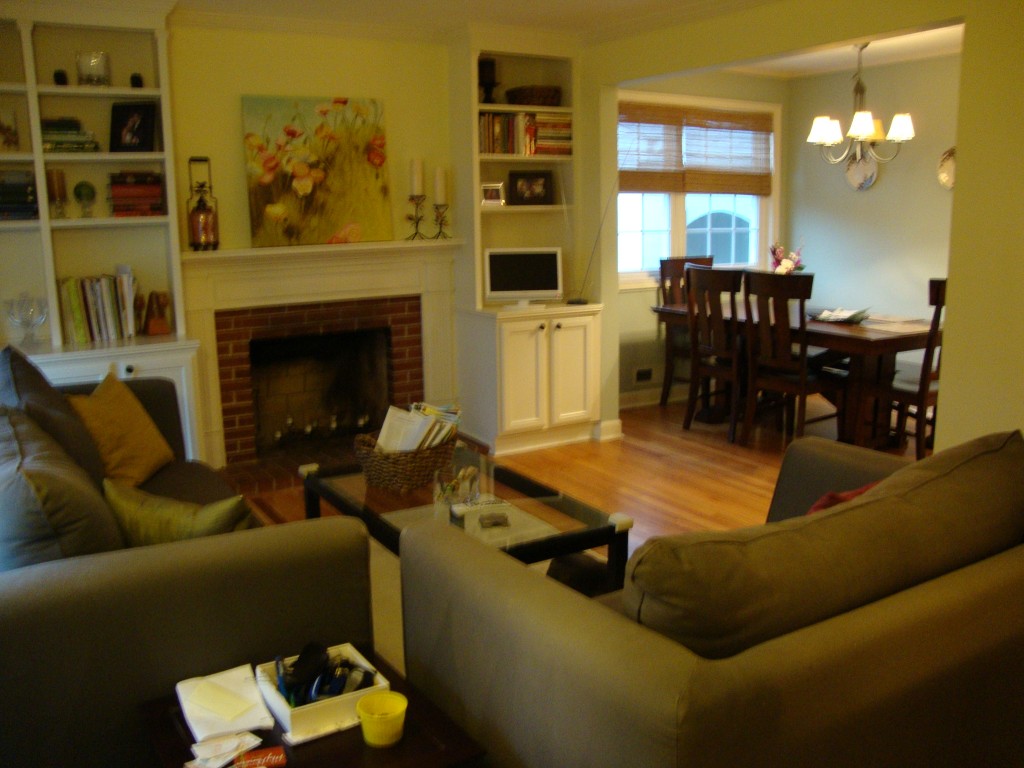
A reader recently contacted me about a Virtual Design for her living room and dining room. She and her husband had lived in their home for a couple of years and were ready to create a “grown-up” space. She asked for me to cast a vision for her space based on her style preferences, spatial limitations, and budget. This is where we started:
Living Room Before
My client wanted all new living room furniture, new lighting, an area rug, and new accessories. We started with determining what colors would bring everything together. The dining room (that’s open to the kitchen) was painted in a color she loved already – Benjamin Moore’s Turquoise Mist – and she wanted to keep it the same. I suggested we use that color throughout the whole space to unite the rooms and create flow – that would also make the whole space appear larger. To make the space more interesting and give it depth, I suggested she paint the ceiling of the dining room, the back panels of the built-in bookcases, and the wallspace above the fireplace in Benjamin Moore’s Stratton Blue HC-142.

Benjamin Moore’s Stratton Blue HC-142
Once we established a palette of the Turquoise Mist + Stratton Blue + butter yellow + grass green + medium brown, I sent my client some rug options to consider to help establish the overall style and feel of the room: 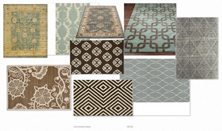
Rug Options
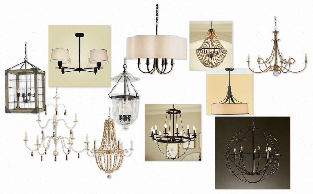
Then I sent her some lighting options to consider:
Lighting Options
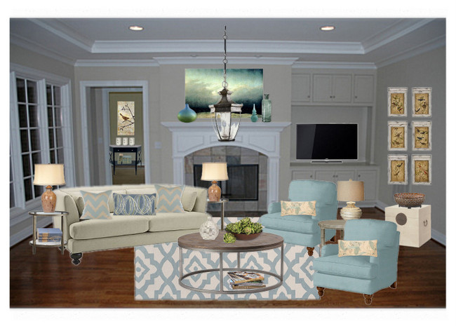
In the final design, I made sure I addressed the lighting in both rooms, the window treatments, the seating fabric/style, storage, the entry area, and accessories. Here is the final Inspiration Board I created for the living room and dining room:
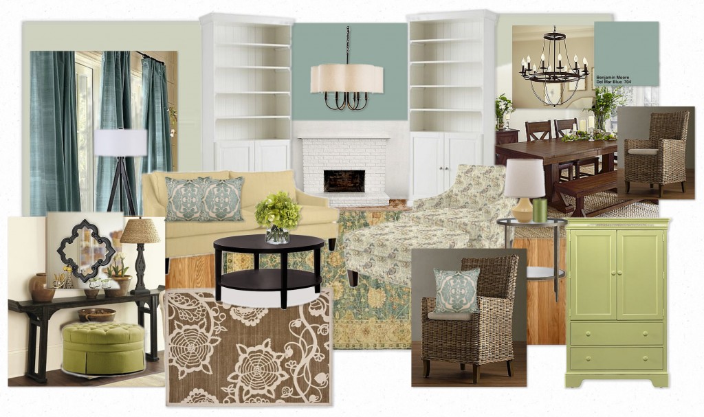
Living Room Inspiration Board by The Decorologist
Along with the Inspiration Board, I gave my client specifics in regard to furniture and accessory placement. In addition, I provided specific prices and retailers of the furniture and accessories that I suggested. My client now has a complete roadmap, within her specific budget, to complete her design project in her own time.
(Check out where I share the “after” photos of this Virtual Design sent to me by my client!)
Do you need help with your interior design project? Contact The Decorologist to schedule your appointment and leave the details to me!





These are some of your best posts – it is great to see before and “in progress” photos/ideas. Can’t wait to see the afters! I love the lighting and especially like the rug with the yellow in it. She has a great space to work with.
Thanks, Amy! I’m listening to my readers and trying to show some more before and afters 🙂
Beautiful colour. I find it interesting that a definite trend in home accessories seems to be developing from the humble mid-century doily. There is a laciness to the patterns on the rugs and in the shapes of the light fittings. Lovely!
good eye, carol! you are so right – the doily, lacy thing is showing up in all kinds of accessories here in the u.s. my client really liked that rug, not sure which one she will choose . . .
yes, really like that rug on the upper left with the yellow. It reminds me of ones I’ve seen in travels to Turkey, Italy, etc in historical places. What do you call that kind of pattern/rug?
That delicious color and color scheme will rescue that space right up!! can’t wait to see some pics!!
Can’t wait to see the afters. love all the things on your board. especially that old-looking rug…of course you know I love the paint color…
So peaceful & beautiful. I love the color and clean lines. Great job!
It’s beautiful. It looks like a more polished version of the style she seems to favor, relaxed, yet elegant. I hope she’ll let you share the room once it is complete.
thanks, karen – that’s exactly what we were going for. a more grown-up, polished version of the couple’s style. i hope she lets me share, too!
Excellent way!! I love it! Love it love it!
I knew it was possible to do something like that on line.
Congratulations!!
Kristie,
I’m working with a friend right now who wants brown on her walls, but she wants cool aquas and greens as accents. When choosing the paint for the walls, should she lean toward a cooler brown? She just tested a brown that has a lot of red in it and I don’t think it looks right because of that. What are your thoughts?
Holly,
I’d lead her toward a gray-brown rather than a true brown. It will look more current and pair better with those other colors. If she wants darker, look at Ben Moore’s Chelsea Gray HC 168. If she wants a medium color, look at Rockport Gray HC 105 or Ashley Gray HC 87.
Beautiful job! I prefer the hands-on design myself, but I love looking at what you do with the Inspiration Boards. How are you creating them? Is there a template/program you use? I’d love to use them as a communication tool with my in person clients. Much faster than hand rendering! How do you do it????