Home Depot’s most popular line of paint, Behr, has introduced several new palettes in their 2011 Color Trend Forecast. One that caught my attention is called “Boudoir Goth.” I never would have guessed the Twilight Saga and vampire craze would have spawned it’s own paint palette, but it appears to have! And I’m definitely picking up on hints of Steampunk. Here’s the brooding description by Behr:
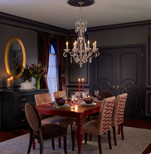 |
“A deconstruction of the ethereal conception of beauty has brought about the creation of a style all about dark elegance. Shadow and mystery draw you in, while deep colors and exotic ornamentation keep you guessing about what comes next. While the defining features of architectural luxury remain, the overall style is open and accessible. |
Elements of glamorous Victorian decor have been updated with modern renditions. Chandeliers lose their brass plating in favor of a platinum finish. Chairs, dressed with pearls and eyelet lacing, have sleek contemporary lines. Silver flatware is replaced with golden brilliance. Detail embellishments take on a notion of fantasy when rendered in mirrored surfaces and crystal sparkle.
Hues are cast with shadow and mystery. Navy sinks deep into the obscure depths between blue and black. Luscious raspberry and deep grape are the berry-colored forces that bring this palette to the edge of gothic glamour. The traditional wooden dining table takes on a surprising new dimension when painted with a coat of vivid magenta. Medium and dark gray are the balancing acts in the scheme, acting as a replacement for black to support the rich, deep accents.”
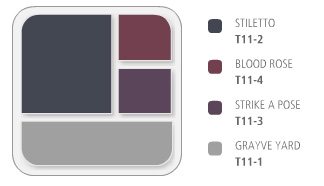
Check out those color names! “Grayve Yard” – can you say that with a straight face? If you want to know more about Behr’s Boudoir Goth and other new collections, click here. Just in time for Halloween . . .
Photo Credits: Behr.









“shadow and mystery” VS. “open and accessible”
brass goes platinum but then silver goes gold – ?
it all just seems a bit over-hyped and not well thought out….
the colors on the color card really remind me of my eyeshadow back in the eighth grade. (late 70s)
Lee,
You are totally right – they do seem to be a bit inconsistent in their description! And you are, like, totally right about the, like, totally junior high eyeshadow. But I’m thinking more like the early 80’s. Thanks for the perceptive comments – you always make me smile!
I actually do like the Stiletto and Grayve Yard colors, particularly together.
Me, too! I would switch out the mirror, and put those GORGEOUS Louis Ghost Chairs around the table instead of those “corset” chairs.
ooh, yes!!! ghost chairs would be PERFECT! what about a venetian style mirror rather than that boring brass-ish one?
Ooohhhhhh!!!! Perfect!
Those chairs really don’t fit what I always thought “gothic revival” or “steampunk”, or whatever you want to call Goth, was. I think the colour palette works rather well without the Modern silhouette and textures of the chairs (that tan suede mixed with the leopardprint against a backdrop like that is just too much).
It did give me an idea for some cutesy-goth chairs for a different room, though: simple black wood caned chairs (armless or not), probably Shaker style, with the caning in the back replaced by corset-laced ribbon in a suitably sombre tone like navy or a dark purple (or, y’know, just black).
Wow, I had no idea about these new paint colors. Thanks for enlightening me! I’m just stopping by here & there until I read everything in your wonderful blog!
Warmly, Michelle
“Grayveyard” is ridiculous. This color scheme has got to be one of the worst ideas I’ve seen in a long time. I’m sure some brooding teenagers out there will love it, though.
Some angsty adults like them, too!
These colors, along with the Steampunk post, seem very futuristic. It all reminds me of a look I’ve seen in the movies that was used to portray a certain feeling of darkness, foreboding, etc. I can see the appeal this would have for the 20’s age set and I agree with Kelley that brooding teens will love this. For me, I have to have light and lots of it or I would definitely need medication! 🙂
I want to know where to get the dining set, I love the look. Any help would be greatly appreciated.
I am in the process of painting my bedroom in these colors. I’m keeping the walls/trim the same color as the photo suggestion, and am now looking for bedding to replicate the beautiful colors in the dining set. Any help or ideas?!
aimee, i would keep my eye out for bedding in gray, grayish purples, and grayish lavenders. check out stores like HomeGoods, TJ Maxx, Marshalls, etc.
I actually just finished painting my dining room Stiletto and it is absolutely wonderful! I have been searching for the perfect navy for my walls to contrast the pure white trim and molding. Even the Ralph Lauren navy blues could not compare. So excited – it is a room in progress but could not be happier with the color!
tracy – i’d love to see photos of your room!
hello!,I like your writing so a lot! percentage we keep up a correspondence more about your post on AOL? I require an expert in this space to resolve my problem. May be that’s you! Having a look ahead to look you.