| I’ve been pondering turquoise and red as a pairing. Together, they are a brave duo that livens up any boring space. |  |
 |
It’s beach meets Manhattan, casual meets chic. |
| It’s got a mildly retro vibe, but is decidedly current. This outdoor space is so fresh and inviting. |  |
 |
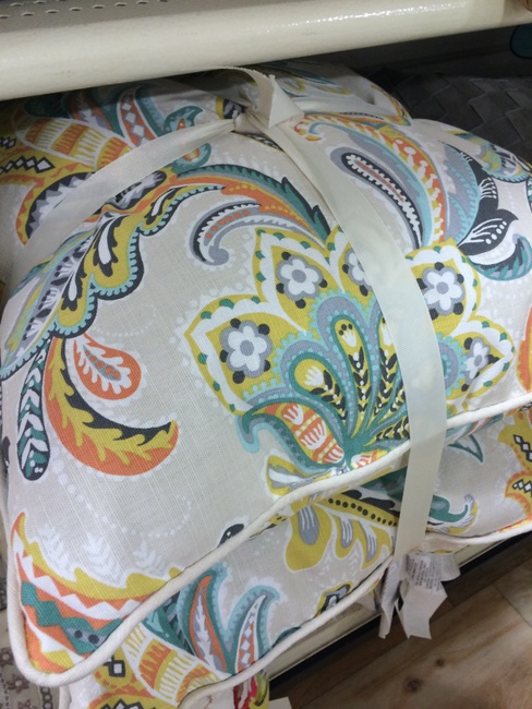
You can find this beautiful bedding in Serena and Lily‘s catalogue. |
| Turquoise in high gloss creates a whole different feel. This is nothing less than high-end glamour. |  |
 |
A lighter version on the walls lets the red take center stage in this guest room. |
| Love, love this image. I heart the retro feel of the wallpaper and the low, linear sofa. It’s glamorous and bohemian at the same time. |  |
What do you think? Do you heart red and turquoise?
Photo Credits: Architect Design, Twolia, House of Turquoise (3,6), Odietamo, In The Thick of It, Living Etc.


I am a huge fan of red, but I have never been a big fan of turquoise. However, I love the combination in several of those pictures. Thanks for opening my eyes to turquoise.
as you know my kitchen is tourquoise with touches of red and black..so I love this
Wow! Two colors that I would never have had the courage to put together. Then again, I am not very daring with paint colors…. yet. Hoping to change that and expand the colors in my little world.
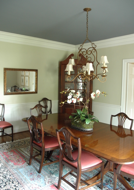
I love it! I like how the turquoise softens up the red. And I love that chandelier in the dining room picture.
I love the turquoise with red accents. I noticed a headboard that looks very similar to the white tufted one at the Bellevue Antique Mall last week.
Karina, I love your attitude. The more you expose yourself to new color ideas, especially by looking at photographs, the more you will have the courage to try something new!
I love all those pictures you posted! I never realized how good those colors actually look together. Very fresh and inviting. Um, guess I’m not so cool after re-painting my kitchen walls to match the ashley gray everywhere else. At least I was cool for a couple of years. . .
We have no room for more paint cans in the basement! Maybe we can turn my office into a paint storage closet!
Love you!!!!
I’m loving that combo!
Really like the colors together! Would not have thought about doing that myself, but do like it a lot.
This is one of my favorite new color combos! Thanks for posting. I do interior decorating and have retail space in SC and used red and turquoise for my Christmas displays last year; it was a big hit and I sold everything!
Misty, how fun! I think the red and turquoise combo for Christmas decorating in general would be so fabulous!
LOVED this blog posting! So excited about you helping me to integrate these two awesome colors into my decor!
Jill, I’m excited about that, too! I think with all your textural neutrals as a base, those two colors are really going to be fun. Can’t wait to see how the painted furniture turns out!
Fabulous combination and inspiration! Can you list the paint colors in the following pictures you posted: room with the wallpaper; room that uses gloss paint; room that says a lighter version of turquoise; and the red on the wall behind the shelves with the lovely bedding. It is always difficult to find just the right paint colors. thanks
LOVE the red headboard guestroom!!
ok…now i’m rethinking some of my decor. that combo is awesome!
Love this look. Our house is by the water and I feel I want a coastal vibe, but not with a totally cool palette. Introducing some red is the ideal combo!
The chaise in the first picture is my favorite.
Hi, love your pictures, red and aqua are amazing together ! To me the aqua is a cool, soaking it up, thoughtful colour and it is the red that shouts “lighten up and have some serious fun”. I think you have to get the aqua/red proportions right, there has to be a lot more aqua than red and nothing cluttering up the aqua. I don’t think i could do that in my house with daily living, but love it anyway.
So true, Carol. I’m working with a client who wanted to use this color combo. It is working out great for a couple of reasons: her former palette was completely neutral, with no colors to compete with the new combo; we are using more turquoise than red proportionately; and we picked the RIGHT turquoise. Thanks for your comment!
Especially LOVE that last image…agree with you.
Fresh combo! (Also used often in Native American, Mexican, and new Mexican visuals…)
I want to do soemthing like this in my living room, however I want to go lighter on the teal color on the wall. Any advice on what paint color to get (names would be awesome)? We have a lot of light in the living room and my couch is a dark brown…would this still work?
Angela,
You are wise to choose something more muted for the walls in your living room. You’ll notice that’s what they did in several of these rooms. That can serve as a backdrop for punchier turquoise accents in the room. A few that come to mind are Ben Moore’s Catalina Blue 703, Bali 702, Wythe Blue HC-143, and Beach Glass 1564. Good luck!
that’s always been a favorite color combo of mine. the current iteration of my website is decked out in it and my wedding invitations used it. was that really 5 years ago? how does time fly by so quickly?
I have fallen in love with turquoise and red as accent colors in my decorating. I live in a 1927 Craftsman Bungalow and I have been trying to find what really works in it. I think I have found it in this combination. My walls are a butter yellow, but I don’t use any yellow to speak of in decorating, I mainly ignore it. I would love for you to come and visit my blog some time and tell me what you think. Cindy
I will certainly check it out!
I loved all .it is one of the best combine of colors.