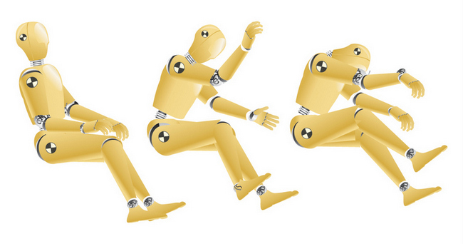
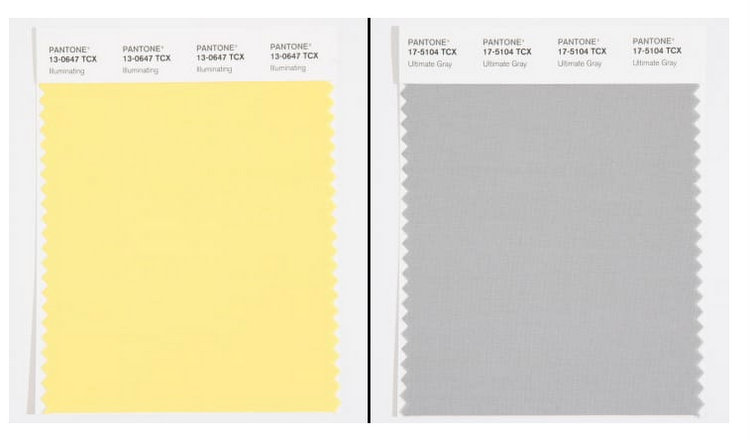
The only good thing I can say about Pantone 2021 Color of the Year is that it motivated me to actually write a blogpost, because it’s been a while! First of all, the 2021 Color of the Year is actually TWO colors. I suppose because they couldn’t decide between awful and more awful. Crash test dummies were the first thing to cross my mind (for more than one reason) when I saw the news.
I went to Pantone’s FaceBook page today to get a peek at some of the reactions to their 2021 Color of the Year, and it was a hoot! Here are just a few:
“Van Gogh’s favorite color was yellow, and he cut his ear off.”
“Are you kidding me? Boring Gray and Pee Yellow seem like 2020 colors to me.”
“You are dead to me, Pantone. This was the one thing I was waiting for to make me happy in 2020 and you serve up THIS?”
“I’ve never been angry at a color, until now.”
“2021 – Institutional Morning”
“Bleak Gray and Disinfectant Yellow – realness.”
“Gray is the color of my soul. How did you know, Pantone??”
“Very pharmaceutical. Accurate and sad.”
“WHY, Pantone? What did we do to you??”
“This really sums up 2020 in color form. Reminds me of a dingy pee-stained carpet. And I have a dog with Cushing’s disease, so I know a lot about pee-stained carpets.”
“How nice of them to match the colors of radioactive waste with this toxic moment we’re living in.”
And my personal favorite:
“Who the heck is hitting the love button on this?? Eeyore?”
According to CNN Style, “Pantone’s Color of the Year reflects color trends in fashion, beauty, design and home decor, and since the beginning, the initiative has also served as a mood ring of sorts, selecting the hues capturing the spirit of the time. In years with undercurrents of uncertainty — such as 2020’s global pandemic — that has often meant choosing colors that are meant to soothe, calm or uplift.”
A mood ring? Huh. Isn’t that interesting . . .
Although Pantone is known for its color forecasting and trend reports, vice president Laurie Pressman said the Color of the Year is not driven by data. “What are we looking for? What do we need? And what are the psychological characteristics of that color that can give us what we’re looking for? And this year, you can’t get away from the overwhelming influence of the pandemic,” says Pressman.
Ok guys, did you hear that? The 2021 Color of the Year by Pantone is not driven by data! Which means it’s subjective, and not backed up with any kind of research or experiential data. If Pantone thinks these colors are what we need psychologically right now, I beg to differ.
So for the love of everything good and pretty, don’t start painting your living room walls either of these colors. This particular shade of yellow is so shrill that it will make you go blind, and the medium gray will set you up for another year of dread and depression. I’m just going to go ahead and make my diagnosis:
The 2021 Color of the Year is manic-depressive and could use some professional color therapy.
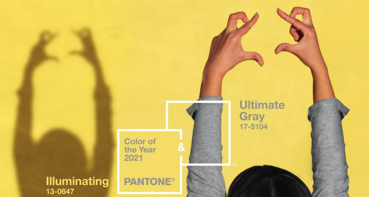
And what the heck is going on with the marketing piece above?? Those shadow puppets are downright creepy, don’t you think?
All right. You gotta tell me what you think in the comments below.
If you want to get on my schedule for paint color therapy, contact [email protected]. I can improve your outlook on 2021, or at least on your home. 😉


Those colors and that ad make me feel like I’m 6 years old again and don’t want to go back to school…fulll of nauseous dread. Is the hand shape a broken heart? I love your diagnosis and agree. The combination would give anyone a mood disorder. It feels like the colors of conceding defeat.
Yes – like the colors of conceding defeat! I think the shadow of the fingers look like monsters fighting one another – maybe they are her inner demons . . .
I think of the school dread because it’s like the color of a pencil, and a parent dressing their young kid in grey is kind of bleak! They DO look like they are fighting each other! I agree with the comments below, the colors are unifying us against a common enemy of this choice! Good thing you have the degree to diagnosis it so hilariously!
The pencils, the school buses, and the gray wool uniform skirt. Benjamin Moore gave us backpack teal, and SW added in principal’s suit brown. I’d love for school to go back to normal in 2021, but I didn’t need this kind of nostalgia. LOL
Totally agree! LOL
NOOOOOOOO! These colors are awful. The only good thing is the fabulous commentary you pasted in; thanks for the laugh!
You are quite welcome! Just had to get that off my chest . . . 😉
Epic Fail, Pantone! Unless their only goal was to finally unite everyone in agreement on something this year, which would be how awful those colors are.
Well-said, Natalie! Maybe that’s something we can unite on, haha!
Even my ten year old would have made better choices. Gross.
I may be hated for this (and I’m NOT artistic, but I LOVE color), but I absolutely LOVE the yellow. It’s bright, cheerful, and makes me smile. It does NOT, however, make me smile with the gray! I agree with that….NO MORE GRAY! But, I’ll take bright and cheerful any day!
No hate here, Melissa! 🙂 I actually really like yellow – butter yellow and golden yellow. I just don’t believe that the yellow Pantone chose is a good choice for fashion or decor. And I love a good light gray, but this one is pretty dead inside, haha!
Honestly? The yellow is pretty close to the color I painted my living room paneling to get rid of the dark and bring some light in. It makes my room warm and sunny and looks great with white sheers and dark wood furniture. Sorry, but it makes me smile every day.
I don’t believe it, Lissa! I’m sure your yellow is MUCH better than this one. One thing I know about yellow – it always goes way brighter than you think it will when it goes up on a wall. This one would give you a migraine. Do you remember the color name of your yellow?
Croissant.
Thank you for sharing the color you have in your home. SW Croissant is muted and warm! I’m sure it looks beautiful. Not at all like this particular yellow!
I evokes Provence to me.
This was a good laugh. Thank you!
Hmmmm….where is that perfect emoji – ah – there it is! 🤮
Yes, perfect!
What were they thinking! We need something uplifting! Also I am seeing more greens – blues and deep rich colors nothing like this. So done with gray. So off. Love you post though. Would love to see more.
This post was golden. I feel largely the same way. On its own the yellow would have been okay (I rarely want to paint anything the colors the experts choose anyway) but the gray was a huge mistake, and the two together is just wrong.
So far, I’ve found all of the 2021 colors depressing–some more than others. These colors are supposed to take us into the future, not keep us stuck in the year that ruined everything. Give us some life, some love, some party vibes!
SO funny Kristie. Totally needed that laugh today. Hope you are doing well!
PS But yeah on the creepy shadow puppets. Que pasa there?
Maybe those are her inner demons?? haha
PPS I SWEAR I am not the same person as Melissa O! Maybe Melissas just think (or see color) alike!
They remind me of every flip home I go in where they paint the walls gray no matter what shade the floors are. #PetPeeve Your blog is dead on! Save us, Kristie, and give us your recommendation for #ColorOfTheYear!
“Illuminating”?? More like “Urinating” – as others have pointed out. Ultimate Gray might be nice on the wall. In prison.
I am laughing so hard, Nancy! Spot on.
Hahahaha!!!
Black and white would have been better. Nonetheless, these colors are better than that hideous image of the Coronavirus.
Lord Mercy help us all. I cannot fathom why why why in the world of color why Pantone would choose not one, but two, gloomy unusable colors. Why not choose something that breathes life into us? A calming blue, a renewing green, heck even a pure, spiritual white. But obnoxious yellow? Not even a muted mustard…and the color of a mouse. A dead mouse. I can’t.
I so agree! I can’t imagine how they came up with those colors. Clearly out of touch.
I sure don’t want to breathe in a radioactive dead mouse!
Yellow and gray can be beautiful. So why did they choose these shades? I guess they thought we weren’t depressed enough.
That’s it, Kay. They needed to push us right over the edge!
Here’s two shadow puppets to express my opinion of these colors: 👎🏼👎🏼
Hahahaha, now that’s a good one, Lisa!!!
HAHAHAHA! 🙂
the yellow-gray combination is like and over-boiled egg
ewww
Oh gosh, how funny! Those colors are a regurge of 2010 or 2011. And I wasn’t excited about them at that time, either! And yes, that marketing piece looks like someone who has been working at home and maybe doing a little “day drinking” at the same time. LoL Not impressed!
Yes! Yes to all that you just said, Michelle!!
I saw their post this morning. It made me sad to think somewhere someone would make their color choices based on it. Hey out there,just pick a color that lets your soul revel in joy. Warm soft buttery yellows. Earthy golden yellows. Neon highlighter yellow…ummm NO. Another 50 shades of undertones clashing grey…NO.
Wow! I almost fell over when I saw these. The most unimaginative and uninspiring combo for this century. These colors reflect 2020, not 2021. We need hope and creativity, not insane asylum-chic.
“Insane Asylum Chic” – hottest thing going!! haha
SOOOO Completely Depressing! I’m still working on getting many of my clients to paint their yellow gold walls before Listing their house!!! And this gray is soooo ugly!
Yuck. yuckier. Yuckiest. 😂😂 Those particular colors are YUCK lol.
I love grey. It works with so much. I like a soft beautiful yellow. But those. Those do not qualify.
Spot on!
Listen up Pantone!
Thanks. Post was so funny.
LOL!!! Manic-depressive, perfect way to describe it! Ohhhh, 2020. Just leave us alone already!
Feels like Del Taco…then going to a Depressing physic ward. Figures after the year we’ve had! Bleachhkkkkkkk
Well, good thing I kept my old yellow, white & gray chevron quilt when these colors were cool in 2012… I was hoping for a beautiful dark teal, like a bluer kale. Here Pantone, I will pick it out for you, like Bayou 18-5121
While I don’t love this selection…aren’t we just coming off the grey/white with yellow accent look?? It feels old as a pair, though I get and follow the psychology basis of pharma and school…just not what I hoped for in 2021!!
I agree with you completely, Kelly! Not a new or design-forward combo.
If I still had school aged children at home I’m thinking I might have at some point resorted to shadow puppets as my sanity slowly drifted away…
Thank you for this post! I haven’t enjoyed such a good laugh in a long time.
Personally I am tired of seeing grey. It’s everywhere in remodeled homes meant for flipping and while it was attractive the first few years, now it’s just redundant. After the year of 2020 with it’s effect on families, investments, and restaurant/travel/entertainment I can’t imagine featuring grey, it can be so depressing. I am a fan of yellow, but what we could use right now is an eye popping, deep cheerful yellow!
I know I’m like the ONLY person on the earth who doesn’t like grey walls, but I’m really over the whole black and white and grey farmhouse style in every. single. house. (That’s just MY opinion – don’t hate me) The yellow above is like they were trying to cheer up a prison. With those comments above, I think the Pantone color pickers should be afraid – and maybe say “ha ha – that was a joke – 2020… and now, for the real colors…. ” If they knew what was good for them.
I’m a TAUPE person because I feel it’s warmer, and well I love the beach and the blues I love go best with TAUPE. My color choices right now are Valspar colors – 2007-10A Timber Dust (darkest), 2007-10B Clean Sweep (medium), and 2007-10C Coconut Milk (lightest.) I just painted my office Coconut Milk and my master bedroom Clean Sweep and am very happy. My accent color is deep navy and it looks great with both of those colors.
Thank you for sharing your color picks, Cheryl! You are definitely NOT the only one that isn’t into the white/black/gray trend. 🙂
They’re polarizing, that’s for sure. I guess that reflects the state of things. I’m super happy with Benjamin Moore’s color of the year for 2021, though… Aegean Teal. Ahhh… So pretty! I’ve been eyeing that color for years, though when I first saw it, I misread the name as “Oregon Trail.” Ha!
I agree with all of this. Those colors are for coloring books, not walls. Good grief, Pantone really missed the mark!
It was nice seeing you in my inbox again though. Happy Holidays!
Hi Linda! Thanks for your comment. I hope I will be more inspired to post again soon – this year has been a doozy on the psyche! I hope you are having a good holiday with those you love. 🙂
Truth is the colors of the year 2021 were picked in 2020…so that might have influenced their picks LOL. I do like neutrals and this gray is very soothing to me.
In 2021, I will NOT be fashionable.Just that simple. I hope 2022 is a better year for color.
I’m with you, Debby!!!
Not a fan of either color choice. The comments are spot on. I’m curious, what color would you chose as the 2021 color of the year? I am seeing a lot of calming neutrals. Clay (or a muted terra cotta) along with a soft grey and cream. Loving that refreshing nod to nature.
Kristie this post is spot-on…I laughed throughout and am so glad I’m not the only one that thought Pantone was sleeping behind the wheel.
Thanks, glad you’re on my side! 😉
PREACH IT! I thought I may be sick, but then that would lend too much credence to Pantone to begin with. Putrid and not in the least bit hospitable. I was decorator for 30 years ( now retired)and my first move with a client was to ask them to bring me their favorite piece of clothing that WAS NOT BLACK OR WHITE. You can tell a lot about what makes people feel good by knowing what they feel they look their best in. Anyway, this was a total disappointment. I am beginning to feel like they now try too hard to be different. Over it.
Yes, Maria! Is it all about the shock factor, or do they really think they are going to convince us this will actually look good in our home?