I often finish work with clients who come back into my life a few years down the road when they purchase a different home. C. is a client I have never met in person – I first helped her decorate and choose paint colors for her home via online consultation, then she hired me again to advise her on staging her home to sell. It sold quickly, and she hired me a third time to choose interior and exterior paint colors for a new home.

About a month ago, she emailed me to let me know they were moving again! Here’s the email:
Hi Kristie!
I never sent you pictures of the outside after we finished painting. We are however selling our house again. I’m attaching the Zillow listing for you to see along with the old pictures just so you can see the difference. Also, I used the knowledge that I got from you last time and your book to stage. I’m looking forward to taking your course in the near future.
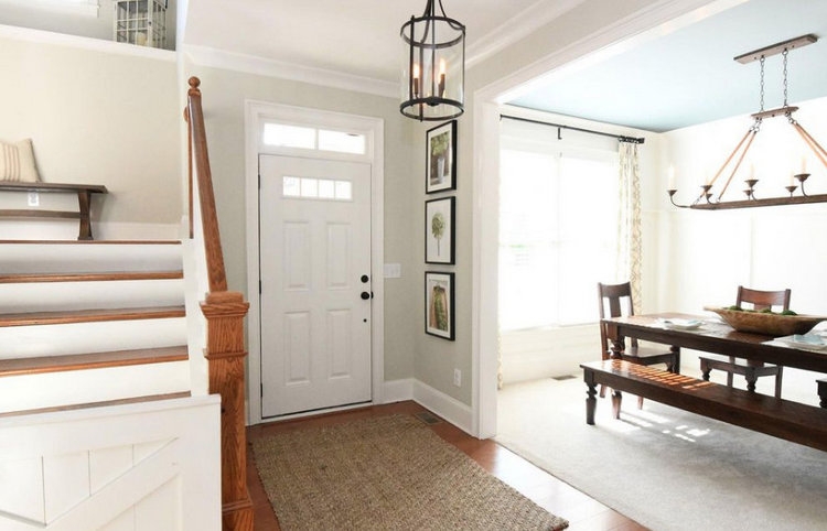
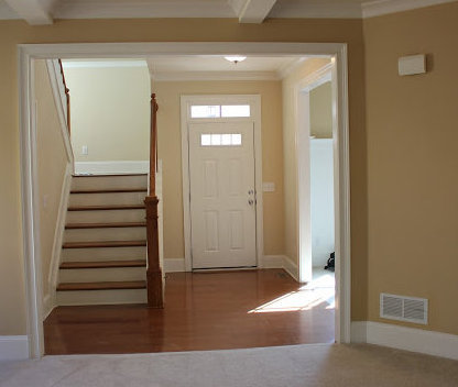 entry before
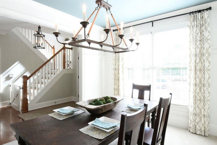
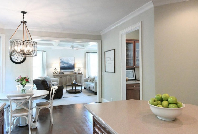
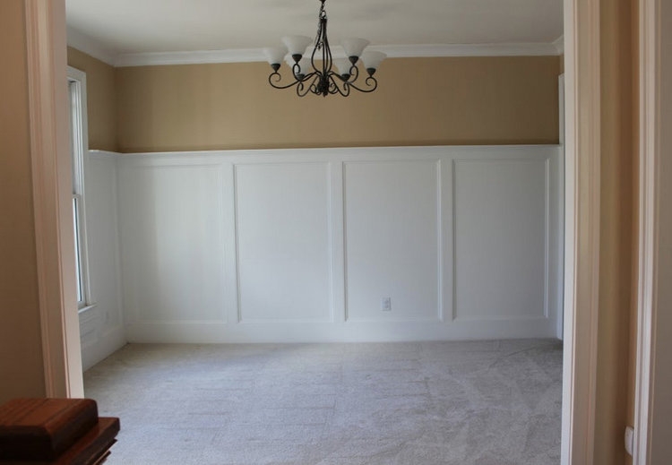 dining room before
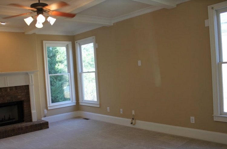
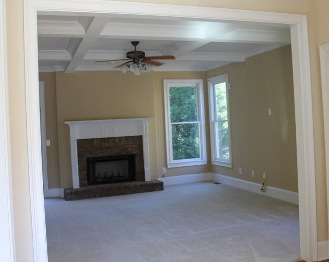 living room before
 before
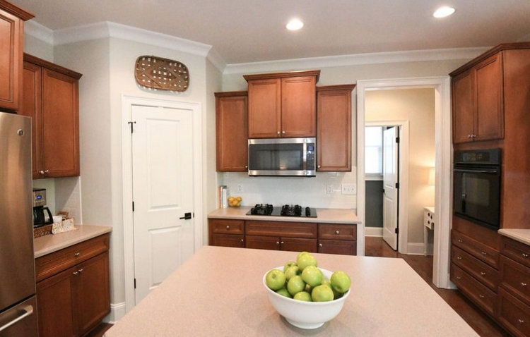
 kitchen before
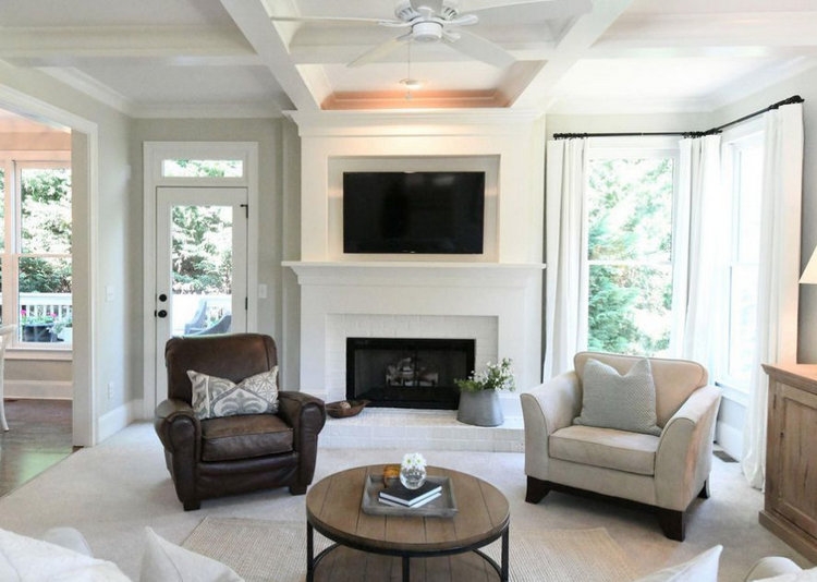
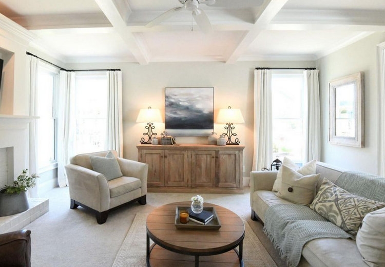
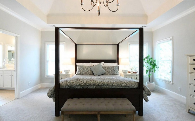
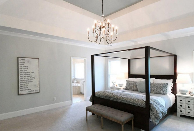
 soothing staging paint colors
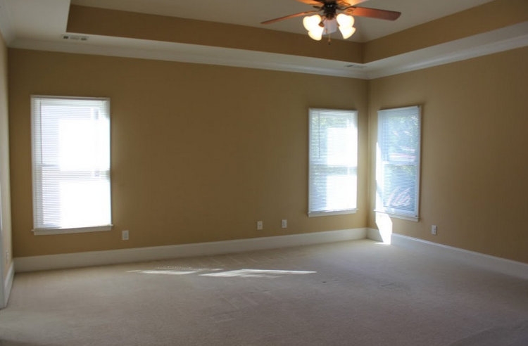 master bedroom before
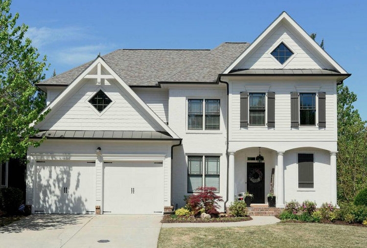
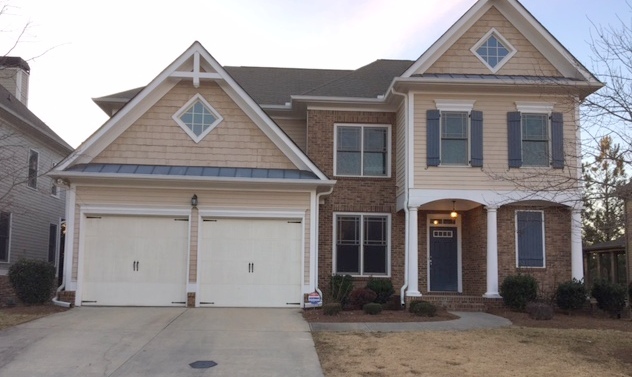 exterior before
Is it any surprise her house was under contract in 2 days???
UPDATE:
Now here’s the cool thing that happened since I originally wrote this blogpost: this client came to Nashville and attended our recent Expert Psychological Stager™ course, and now she is a professional EPS™ stager! Here’s her review of the class:
I just took The Decorologist®️ Expert Psychological Staging® course and I simply can’t put into words how great it was. Kristie is so knowledgeable and practical with her advice. Kristie helped me to pick colors for my previous home and stage it via phone consult to sell. It sold in record time. After we moved into our new home, she again helped me pick colors. We recently decided to sell again and I used the knowledge that I had acquired from her before and her book to stage again. Every agent and person that walked through our home wanted to know who staged the home. We had multiple offer and it sold in record time. I simply can’t thank Kristie enough. Upon encouragement from my friends and family to pursue something that I am truly passionate about, I took the leap and finally took the course. I am go glad that I did and I am especially grateful that Kristie has a heart for pouring into other women and helping them find their passion in life. – C. Byer
You can take my Expert Psychological Staging® course ONLINE! Find out the RESA-accredited course here:

Now I’m training people all over North America to make these kind of paint color transformations! My Psychological Color Expert™ certification is ALL ONLINE and you train at your own pace from the comfort of home. You can offer paint color specification as a stand-alone service or as a complement to design and home staging services. Find out everything you need to know about this online course here:


Voting all done! This is a beautiful, peaceful, carefully-considered color scheme. Like a breath of fresh air. Befores & afters ARE great – sp rewarding to look back & see the hard work paying off. And can’t help but notice that the lighting is so much better. Kristie, with all the rapidly changing technology, would you consider doing a refresher post on how lighting affects paint color? Maybe which types of bulbs show off the results that make it all seem worthwhile?
Thank you so much, Sunny! I will put lighting/light bulbs on my list of things to discuss in a future post. In the meantime, there are lots of LED bulbs that look like regular old incandescent bulbs, but be sure to get “soft white,” not daylight (too bright and a bit blue).
It’s the color temperature, rated in Kelvins, that indicates the coolness or warmth of a light bulb. There are plenty of LED’S available in today’s market to give the end user the proper color temperature (the trick is to look to a professional for advice, not your local big box store😉). A home should never use a light bulb any cooler than 3000K. Tip: the lower the Kelvin temperature, the warmer the bulb. The higher the Kelvin temperature, the cooler the bulb. If you use the proper Kelvin temperature, the paint colors should be rendered properly. Another factor is the CRI (color rendering index) of the bulb. You want it to be as close to 100 as possible. A rating of 100 means that color is rendered 100% properly. Very few, if any, bulbs are rated 100. A rating of 90 or greater is considered excellent.
Thank you for this great information, Susan!!! I will start paying attention to the CRI of the bulbs, for sure – 90 or greater. What would be the “ideal” Kelvin temperature to get the proper paint color rendering?
I’m glad to see you recommend soft white. I recently attended an open house with a local “stager” who told all the realtors to use the daylight bulbs. I personally hate the look of those bulbs, but everyone else there lapped up her advice.
The Daylight bulbs are too stark and cold, right??
What paint (brand and color) did you use?
What an incredible difference!! How fun for you to see this years later. 😊
Thanks, Molly – yes, it’s a happy thing to get an email full of “it worked” photos!!! 😉
Question: can you describe how the kitchen backsplash was changed? Paint? Different tile? Beautiful -all of it. ESP the exterior!!
Thanks, Nancy. The backsplash was changed out for white subway tile. They kept the existing countertops, but they removed the backsplash portion of the countertop material. It looks so much fresher, doesn’t?
This is great! Thank you for sharing ,
Thanks, Tammy!
Hi Kristie, Happy to vote for you! Hope you win.
What a wonderful transformation with paint, some new lighting, and tiles! Every room looks so fresh. I’m not surprised the house is already pending!
Voted! And I can’t believe that’s the same house – nice job!
Thanks so much, Kim!
WOW! That exterior!!
Glad you like! 😉
My vote is in! I hope you win this. You definitely deserve it. Love the before/afters!
Thanks so much, Jennifer 🙂
So what are the colors she used????
Hannah,
Because this was a custom color palette she hired me to select for her specific situation and existing finishes, I can’t share the exact colors. I hope you understand!
another incredible transformation! you ARE the most influential person in home staging in my book!
Thanks, girl!!!;)
A lot of people have that color of wood cabinets and it’s nice to see that the soft grey works so nicely! It was a beautiful house before, even nicer now! Yes, Kristi, do discuss light bulbs, lol! The selection nowadays is overwhelming. A few years ago, my husband bought a whole bunch of those horrid pinkish light curly things. I said, nope, and he happily uses them in his basement shop, thank God!
No curly light bulbs – they are the worst, right??? I was happy to see how the wall color seemed to update the cabinetry – that can be a challenging choice!
Lol, light bulbs and toilets!!! I am over stimulated and overly confused!!!!
Ok Jennifer,
I must have missed something – toilets??
Oh so sorry, I just meant I get overwhelmed with all the toilet choices on the market today (like the lightbulb situation discussed above). As I was reading the comments in regards to the confusion of all the different lightbulbs available, it reminded me that last time I was at Lowe’s looking for a new toilet, I was overwhelmed and confused as to what I should purchase. I want to replace the toilets in our home – they are 14 years old – and I could not believe all the choices available to choose from. I had the same situation when I headed to pick up specialty bulbs for a new chandelier – so confusing!! 🙂
It appears that the grid in the windows were white and now are painted black is that correct?
Yes, Holly! If I remember correctly, the windows were actually replaced in that prefinished color.
What a lovely job you did in helping your virtual client! Such a great transformation. Well done my friend.
Thank you so much, Sheri! I’m not currently doing any virtual client consultations, but have done many over the years when I needed to be home more with my kids. As tricky as they can be long distance, they have been very successful and rewarding. Do you ever do consultations virtually, Sheri?
Voted! It is amazing the transformation of this home. The magic of paint! Good luck with your nomination my super-star friend!
Thank you so very much, Kelly!!!
Lovely transformation! It is no wonder it sold so quickly. It was peaceful and very neutral, I’m sure buyers loved it.
Thanks, Susie! While it is fairly neutral, there is actual color in this home – not just beiges and grays. I think that’s what makes it so appealing 🙂
These before & after shots are fantastic Kristie!
Thanks, Amy!
Just voted! You absolutely deserve this award, Kristie! Beautiful transformation!
You are very kind, Kim – thank you, and thank you so much for voting!
Vote is in!!! You are most influential in so many ways!
Thank you so much, Cynthia!!
What was that paint colour? So pretty.