There are so many things to consider beyond “do I like this piece of furniture?” when designing a room from scratch, and most people don’t consciously consider the shape of furniture they are including in their room. But this is a very important thing to consider, especially if you are working on a small space. Like when you are considering a rectangular coffee table.
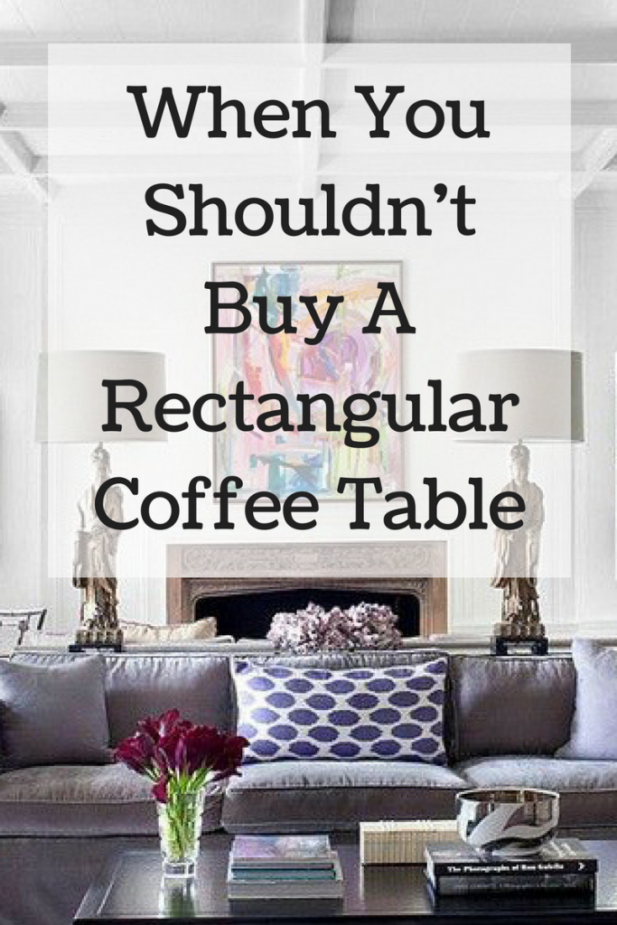
I recently began working with a single professional guy on his Nashville townhouse. While many living rooms I work in are rectangular shaped, this living room is a small square shape. It’s open to the dining room, which is a smaller square space. We have decided to do a clean-lined, mid-century inspired sofa with chaise. This will be a much better alternative to the oversized puffy sofa currently in the space! I love the longer bench seat, rather than the traditional three-cushion scenario.
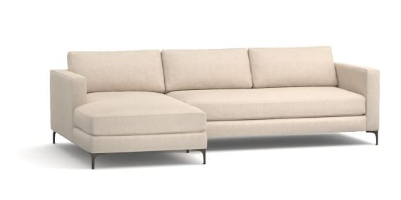
My client was initially thinking of purchasing a rectangular coffee table – one that was large, traditional, and visually heavy. This is similar to what he’s been accustomed to seeing with the puffy leather seating he currently owns:
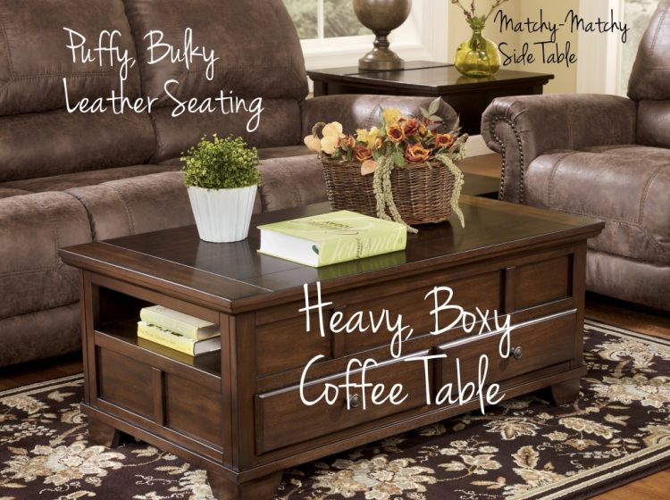
We discussed how he really needed something smaller, less boxy, and more leggy to increase the sense of space in the small room. Plus, the sofa chaise would already be covering a good deal of the fabulous new rug we were eyeing, and a piece like the one above would obscure that even more. When he saw this rectangular coffee table, he fell for it hard:
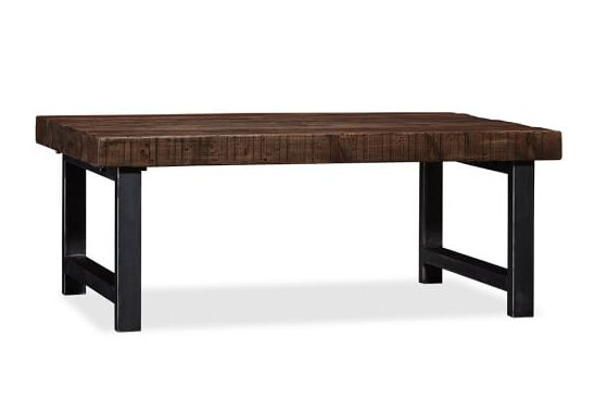
While this wood and iron table from Pottery Barn is much better than the former coffee table option, it still isn’t the best option.
First of all, when you have a sectional or even a sofa with a chaise that stretches out one end, a rectangular coffee table is really going to box you in the space. You’re going to have less leg room and it’s a bit more difficult to navigate yourself in and out of the seating area.
But there are deeper, psychological reasons why a rectangular coffee table isn’t the best option here. Did you know that time and time again, when people are asked to choose between an object that’s linear and one that’s curved, they prefer the curved object? While many people like clean, linear lines in most furnishings, rooms with too many sharp edges are seen as unattractive, uncomfortable, and unwelcoming.
Scientifically, why would this be?? The theory is that we are hard-wired to prefer curves because they signal lack of threat – in other words, curves signal safety. We subconsciously tend to avoid things that may stab us, like sharp edges! I don’t know about you other ladies out there, but I have incurred many a bruise when moving quickly through a space and not compensating for the swing of my hips – OUCH.
When we enter a room that feels “safe,” we subconsciously feel more relaxed and restful. That’s why I’m careful where I place pointy-edged furnishings in a space, especially if the room is small and square like this one. Tables against walls or out of the line of traffic can be square or rectangular, but when your conversation area is floating in the room (i.e., not up against walls), you may want to consider using curved tables – particularly when then are made of wood, iron, or glass. Because upholstered pieces are inherently softer than those materials, sofas and chairs that are fairly linear are less likely to cause any dis-ease to you or your guests.
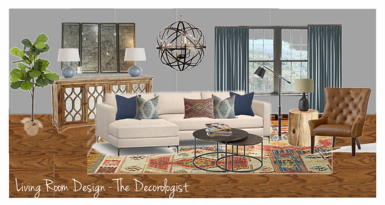
Here is a Vision Board I put together for my client to help him visualize the new space when complete. Although the overall look is modern and clean-lined, you will notice that I included several curved/rounded elements to soften the hard lines. This makes the space seem more comfortable and welcoming upon first sight, as well as minimizing the threat of shin or hip injury when passing by pointy edges! Also notice that I distributed them throughout the space in a balanced manner.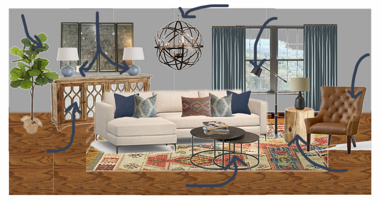
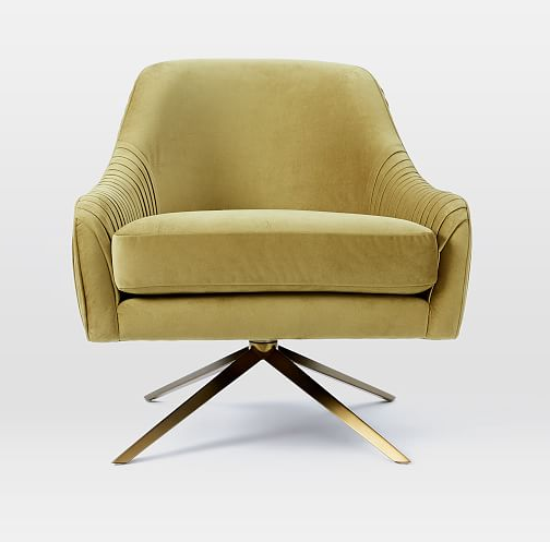
Even the chair has a curved back and curvaceous tufting. The curved items I chose still retain a masculine feel because of the materials used, like leather, wood, and metal.
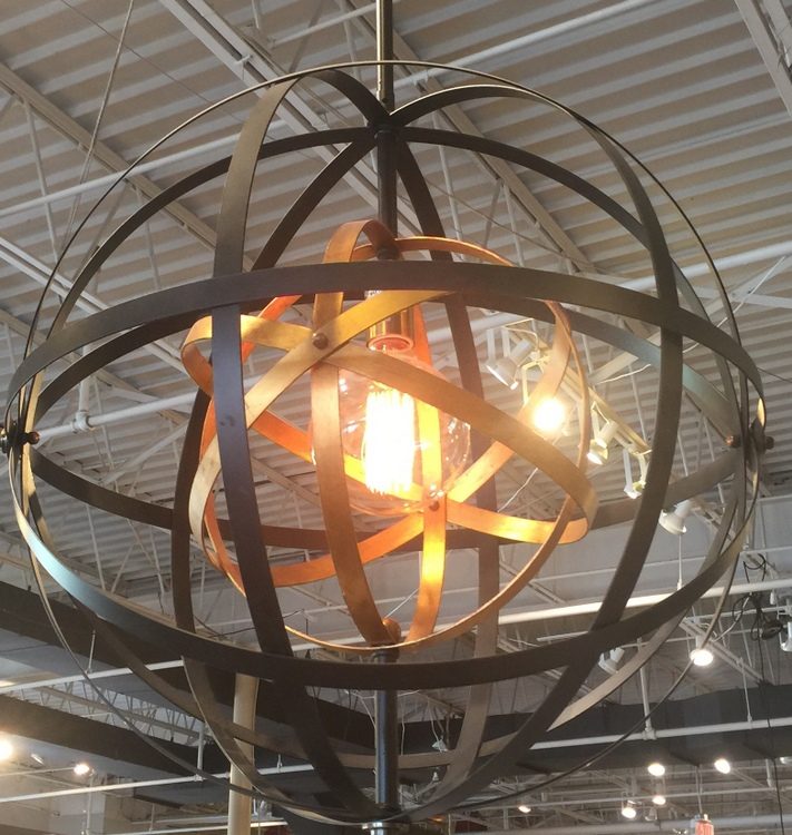
The round light fixture is plenty manly with its strappy metal and bolts:
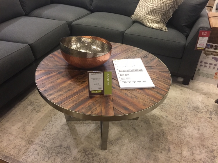
This would be a good size and option for a coffee table with the new sofa with chaise, and the interesting wood top and metal base are anything but soft:
My top choice (the one on the design board) is more functional in the space, since the smaller of the two nesting tables can be pulled out and used for the nearby chair as an ottoman. I’ve used this version with lighter tops (see below) in a couple of designs over the last year due to its versatility and low maintenance:
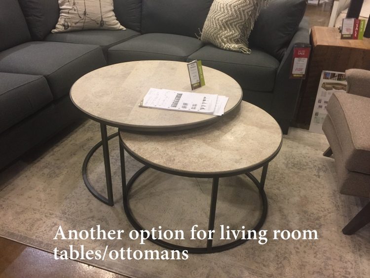
Nobody will be hitting their shins on these nesting tables! Here’s the Vision Board without all the arrows pointing to the rounded pieces. I think it’s a good combination of linear and curved pieces for a small, square room.
Hopefully, we will be moving forward with ordering some of the furnishings this week! Have you ever considered the shapes of your furniture in this way or made a mistake by not doing so?
UPDATE: See the final reveal of this space here: https://thedecorologist.com/designing-for-men-what-men-want/







Hello,
I enjoy reading your blog each week and have been meaning to ask- do you have any experience with live fiddle leaf plants like the one in this post? I have found some artificial ones but just not happy with their quality. Have you ever purchased and used a live one? If so, can you recommend a source for these? Thanks so much!
Jessyca,
I have a black thumb – I can’t even keep succulents alive, so I’m a bad person to ask about the live fiddle leaf plants! I know that Pottery Barn has the faux ones – that’s where the image in the Vision Board is from. I have purchased a small version from Home Goods that I like – I use it in staging and for photo shoots. I hope that helps!
Thank you! I will try Home Goods. I feel like the PB one is great for photos but looks a little cheap in “real” life but I usually love their quality… Thanks again.
Hi Kristie! Great post – and love the double/circular coffee tables – would you please share your source for them? I’m wondering if they would work for my daughter and son-in-law’s new great room arrangement – two long couches placed in an L-shape with one facing the fireplace, side table in between. The rectangular table they have in front of one couch looks really off balance – but thinking the round ones might be a good option to span the two couches. Thoughts?
Hi Meryll!
Bliss Home on 8th Avenue in Melrose area carries these – they have ones with hammered copper tops (that’s what I propose for my client) and ones with the marble-like tops. They are great looking and a great value – less than $500 for the set. If your daughter has two full-size couches, these may not be large enough. I believe they are only about 36 inches in diameter. A large round coffee table would be a better option for them, I’m thinking! Good to hear from you 🙂
Can you suggest another store other than Bliss Home which might carry these double tables which would be perfect for my small family room or maybe a websites? I live in MD.
Thanks so much.
This is great info! Thanks for insight into “why” my smallish den feels more welcoming since I replaced square tables with a round ottoman & round nesting tables. Also, why I kinda hate the rectangular coffee table in my daughter’s living room (shhh, don’t tell my son-in-law!)
Susan,
I’ll never tell! Sounds like you made a good decision in your smallish den 😉
love this design and the combo of color/ pattern- and such good info on the coffee table shape and it’s relation to the room and furniture!
Thanks, Elizabeth!
I’ve always preferred coffee tables with rounded edges, especially in the not-so-large living room. I looked for the right oval table for mine for a while. Seems there are not that many of them out there compared to square and rectangular ones. Reminds me of Capri pants which are all over the stores in the warmer months and yet most women don’t look good in them.
You are so right – a good oval is hard to find!
Hi Kristie, Great post! I’m sure your client will love the round nesting tables. I have an oval, glass top/ metal base coffee table that I bought from Ethan Allen in 1986 and just love it! The shape was great for raising kids….no sharp corners…and the design is so classic that I could have purchased it yesterday! Two more thngs I like about it: glass is very forgiving when entertaining so no worries about wet glasses leaving marks, and this table has always had a hand knotted Oriental rug beneath it so the beauty shows through the glass. I like the tables on your vision board for the shape, open bottom for visual lightness, and the durability of the tops of the tables. They look very versatile!
Great advice as always Kristie! I too recommend a round table in a square room to help soften the edges.
I broke my little toe, in the middle of night ,on one of those huge heavy tables !love the round choices. I’m looking for one and you gave me even more reasons for my choice!
I’m wondering about that beautiful rug and where to get it (unless it’s a one of a kind…)
Though a (straight) woman, I tend to have somewhat masculine tastes, and I’m liking the recliner sofas, which let everyone stretch out but don’t take up chaise space. I also like longer oval coffee tables, which stretch the length of the sofa without being squared off; though you’d have to be careful about placement with recliner sofas, or forego the coffee table altogether, opting for end table instead.
I’m also wondering if getting two reclining loveseats and angling them, with small end tables on either end, and a larger end table, perhaps wedge shaped, in between, would work for some rooms. This isn’t a design I’ve seen a lot, and I think it should be given consideration.
Thanks for your blog!
Allyn
Allyn,
The problem with recliner sofas are two-fold. One is that it requires clearance in both directions (in front and behind). The other is that I’ve yet to see an attractive option in recliner sofas. They tend to be really large with tall backs, which can really dominate a space when the sofa must by design sit out in the middle of a room. Maybe you know of a brand that makes nicer-looking ones? I’d love to check those out. As for the living room set-up you describe, are you suggesting angling them in a V-formation to the television? Or at a 90 degree angle to the television, facing each other?