| I have an old French Provincial dresser in my younger daughter’s room. The walls in her room are yellow and the dresser was a slightly lighter shade of yellow with gold accents. It’s been in there for several years, and it’s been ok. But not fabulous. Awhile back, I picked out a vivid shade of green for it – Benjamin Moore’s Waterbury Green HC-136. I wanted it to pop out against the walls, kinda be a statement piece for her room. Here’s a picture of it in the background of my daughter’s tea party. I don’t have a true “before” picture of the room, because I didn’t know what the painting of the dresser was going to lead to . . . | 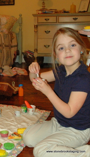 |
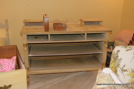
So last week we had a heavy snow that kept us trapped, I mean at home with our loved ones, for 4+ days. That kind of situation often prompts me to crazily start cleaning out drawers and rearranging furniture. Time to finally paint that dresser! I basically took the drawers out and sanded it lightly with a hand sander. Then I cleaned off the dust with a lint-free cloth.
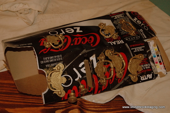
The handles were a kind of ugly dirty brass, but I didn’t want to spend the money to replace them. So I unscrewed them, mounted them on a piece of cardboard (well really, a Coke Zero box) and painted them with Ralph Lauren’s Regent Metallic paint in Golden Candlesticks. That paint is my new obsession!
 |
 |
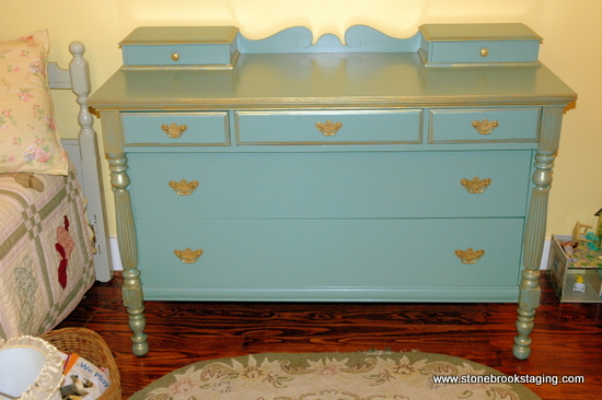
I painted the entire dresser and drawers with my Waterbury Green color. It looked great, but a little too flat for me. The next day I took the metallic paint and brushed it over selected areas – pretty much where ever there were edges or grooves. I painted in small areas, waited a minute, and then took a clean old t-shirt and wiped off the gold paint lightly. I really love the effect!
But, it just wasn’t enough. The room has unusual dimensions and has always been difficult to arrange. My older daughter used to be in this room with a double poster bed. The bed was too big for the space and the slanted ceilings really limited where I could place the bed. So I decided to use a twin bed for my younger daughter, but everything still seemed off-kilter. Painting this dresser really inspired me to try, try again to make the furniture arrangement really work this time. There is an exposed chimney on one side of the room, which I had tried to ignore. On this day, I realized that it was SCREAMING to be the focal point of the room, which meant I had to try to center the bed on it and use it as a headboard. So that is what I did first.
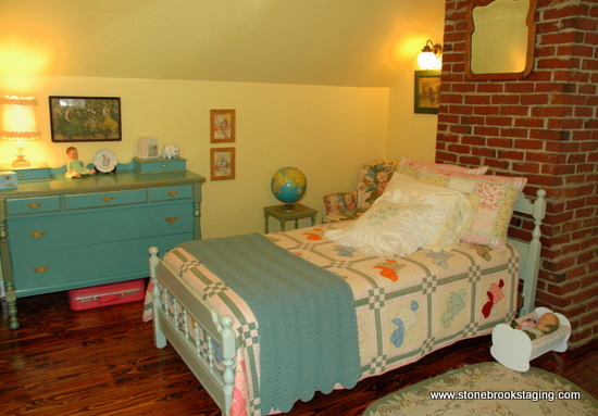
The bed placement dictated the rest of the furniture’s placement. The dresser had to sit on the left to counter-balance the weight of the bed and chimney. A comfy reading chair was tucked into the awkward nook to the left of the chimney. A little artwork on the walls and toys-as-decoration, and the room started to finally make sense. The use of several different shades of green is intentional. “Matchy-matchy” is cookie-cutter. When you incorporate different shades of the same color, the room has more dimension and character.
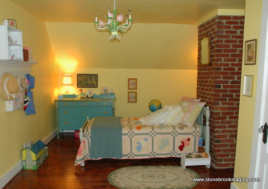
The shot below is from a little farther back. The entrance to this room is to the left, the closet is the door you see on the right. Sorry, I have no real “before” pic, but the bed was formerly in the current position of the dresser coming out from the wall. The dresser was to the right of the bed, and a slipcovered rocking chair (now on the opposite side of the room) was against the chimney.
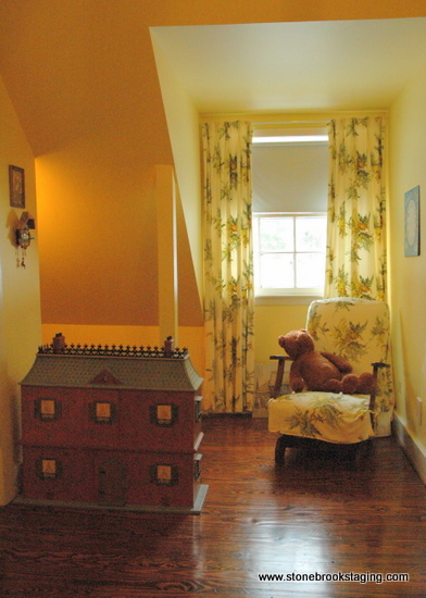 |
This a view from the opposite side of the room facing the dormer window. There’s that rocking chair, which looks really peaceful in front of the matching vintage draperies. Everything got moved around here, and I took out two big boxes of things to be thrown out or given away. |
| The dollhouse hides a little nook for more toys and pretend play. You can tell I love sconces and stick them anywhere I can come up with! | 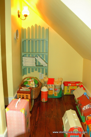 |
So that’s it. One little improvement inspires another. And most importantly, my little girl thinks it’s the most beautiful room in the world. Ahhh, the true joy of decorating!
.







I love all the changes..and LOVE the paint colors and treatments. This also what “snow days” does to me…my hubby does not like change so he gets a little crazy with me.
very impressive. looks great. i love this color combo. hey, you wanna come work with me and be my furniture painter! lol!
ahhh it’s gorgeous!
That dresser turned out beautifully. I have an old dresser I have been meaning to paint for years. You’ve inspired me. I especially like the way the blue is repeated in that gorgeous globe.
Looks great!!!
May I call you Martha, or pardon me, that just doesn’t do your work justice. Picasso anyone?
Love it! The dresser turned out great!
You did a fabulous job! Your daughter’s room is a dream. That dresser is just gorgeous! I am painting my daughter’s childhood french provencial dressers to be used in her newborn’s nursery. Thanks for the wonderful ideas.
Wow! Love it! The new arrangement is perfect, like it was always supposed to be like that.
The dresser is such a fun pop of color in the room now! I really like your color choice. Thanks for joining the Paint Party! Hope you’re enjoying your weekend…
Hi there,
You’ve done a great paint job and rearranging of the furniture. Could I just make a couple suggestions that I believe would improve the look of your room. Paint the mirror to coordinate with the dresser and place it over the dresser so your daughter can use it as a vanity. Then move the large picture over her bed but down lower than the mirror was. Even add more pictures here. Is the dormer window to the right of the bed and is that another chair on the left? If so why not swap places with that chair and the doll house? Then when she has visitors they could both sit together.
Hope your not offended by my suggestions because I really think you have done a fabulous job.