- Visual space can expand or contract – depending on how you style it. Here are some great ideas to increase the potential of your small space:
- Try to direct seated furniture to face windows and views to open up visual horizons.
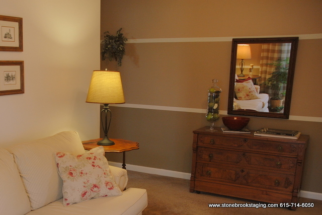
- Horizontal stripes expand a room. If you don’t have crown moldings, paint a band of color across the top edge of your room.
- Hang a very large painting on the far end of a room that helps you feel like you are stepping into another space just by looking at it.
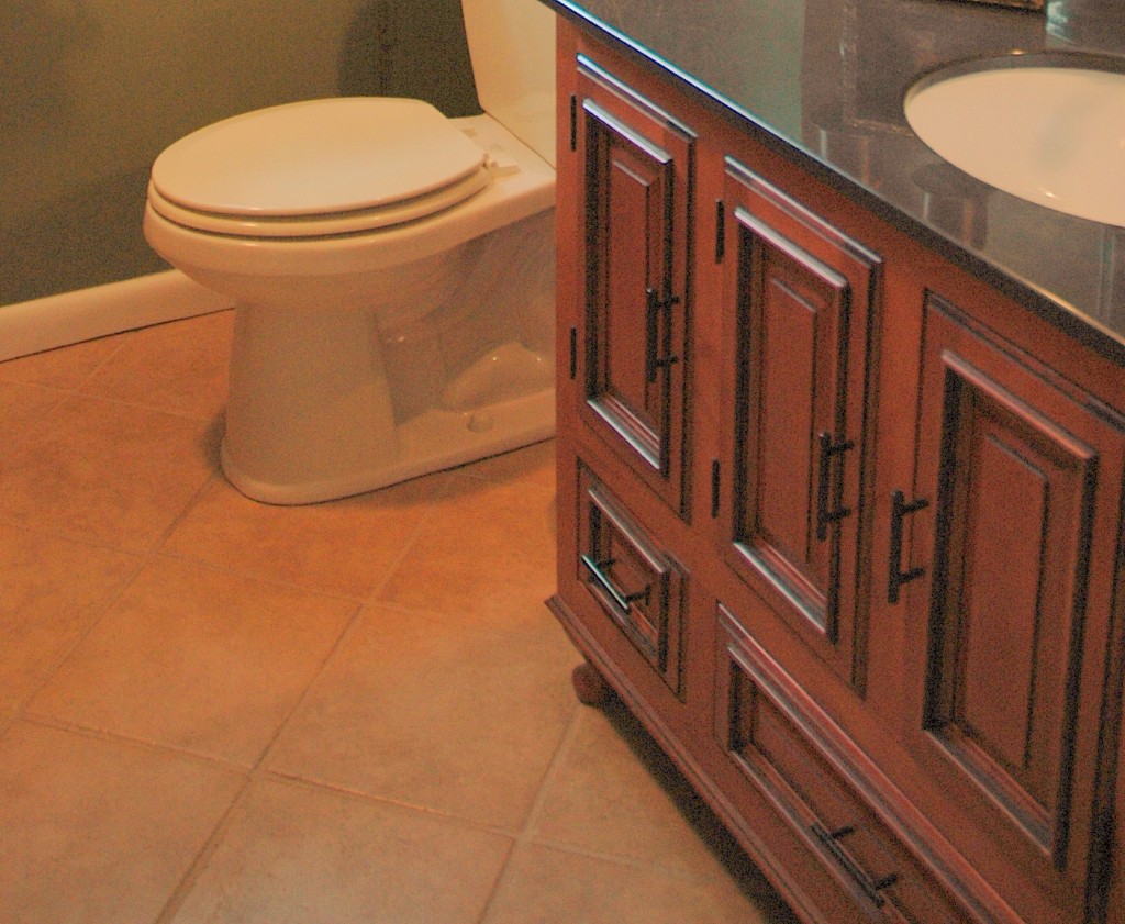
- Set floor tiles on a diagonal to increase the perception of space. This really works great, you just have to make a few extra tile cuts to make it work out. Great trick to use in a small bathroom or kitchen.
-
When one pattern is used on walls, windows, and upholstery, furniture recedes rather than advances in space.
-
Use lots of leggy and glass-topped furniture. The more floor that can be seen, the larger the room will appear. This is a visual trick I use in staging all the time. That usually means clearing the room of all rugs (take out all those 5 small bath mats in your master bath!)
-
Along the same line as the previous suggestion, keep flooring consistent throughout your space. In a small space, it will appear larger if the flooring is all the same from room to room. The eye flows throughout the space, instead of being broken up by disparate flooring.
-
Use vertical stripes to make the room appear taller. A vertical stripe always lifts the eye. Another great way to make ceilings appear higher is to hang your curtains higher than windows, as close to the ceiling as possible. I always hang curtains outside of and above the window to allow more light and make the window seem more grand and important.
-
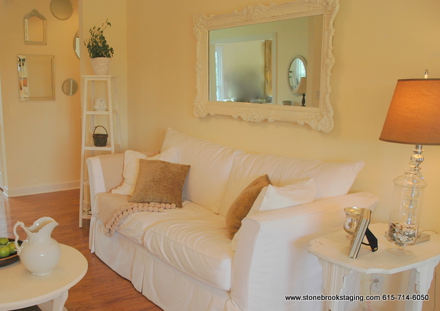
Use whites to increase the space. But not just one white. Use various shades of white on walls, trim, furniture, etc. so that you create depth and interest. Add lots of texture, as well. Just keep it tone-on-tone.
- Use mirrors. Lots of them. Create a grouping of multiple framed mirrors on one wall that will reflect light and/or an exterior view. Mirror an entire wall to either or both sides of a fireplace to double the apparent space in a room. Lean tall mirrors against a wall to expand space and reflect light.
- OK, let’s go edgy now. Surprisingly, in a room with black or almost black walls, it is impossible to determine its true size. The corners and edges vanish, and the room loses its sense of boundary. The room then belongs to the furniture, which seems to float in space. To further increase the illusion, also paint the ceiling dark. This may seem risky to try in your home, but it is so dramatic and edgy!!! You will obviously need to have plenty of good lighting so you don’t feel as though you are in a cave.






Okay, I am very intimidated by black paint — but love it at the same time. I think the best is a midnight blue that is almost black. And I mean Mid.Night. Very dark. It’s somehow more glamorous than flat black.
Do you think black is mainly for modern homes? I cannot see it working for my house. I mean, it was bold that the bachelor who lived here before us painted the brown/mustard-tiled very vintage and tiny bath black (we are talking ceiling and all…but I didn’t want to bathe in a cave. It was awful. It was the first thing I re-painted after we moved in.
Andrea, midnight blue is definitely a good choice – as is dark plum, aubergine, raisin, burgundy, charcoal, or very dark olive. When using such dark colors, I suggest using a high gloss to get some reflectivity out of it. Very dramatic. And, for the most part, very modern. You can get away with it in an old home, but I would only try it a library or dramatic dining room. I do think that an old house decked out in black trim paint and black doors looks fabulous.
Okay. VERY helpful, KB. Dark olive — oooooooohhh, now we’re talking. Wow.