I have a recurring client who has grown daughters and grandchildren who live in Memphis. When they come to Nashville, she wants them to have a nice room to stay in at her newly-built home here. Trouble is, her guest rooms were filled with leftover furniture and accessories. She wasn’t in a position to buy new furniture, but wanted me to spruce up the rooms with things she already had. This is where we started with the first guest room:
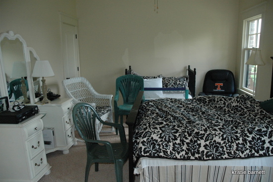
This room had to include the bed, dresser, and a baby crib/toddler bed. There’s a balcony off this room, and the green plastic chairs had been brought inside for some reason. We obviously needed to pull those out, as well as that black chair with the UT emblem.
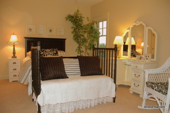
The first thing I had to do was to reorient the bed so that it would be the focal point of the room. Feng Shui says that you should never face the foot of your bed towards to door, something about that being the “coffin” position. Hmm. That’s why I DON’T do Feng Shui. I believe the best position for a bed is exactly that – facing the door! I switched the dresser to where the bed was before, a much better position visually for a tall piece. The placement of lamps is also important in warming up a room and making it feel inviting. Go back to the first picture and notice the difference in regards to the lighting alone – lamplight changes the whole mood of the room.
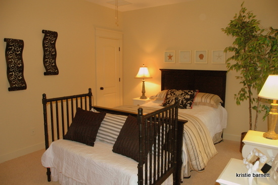
The trickiest thing about this room was finding a place for the crib/toddler bed. If I had placed it on the left wall, it would have been very cramped walking between it and the bed. I decided the foot of the bed was the best place for it, especially by styling it out like a daybed/bench. Another thing I did to change the mood of this room was flip the duvet over to the striped side and fold it down at the end of the bed. That black floral pattern was a little overwhelming on the whole bed, but just right for an accent pillow. A few accessories and wall art from the attic round out the new look. I think my client’s daughters will be happy to spend the night in this lovely room, and they won’t even have to step around those green plastic chairs!
This weekend I’ll post the before and after of the grandchildren’s guest room. Happy Friday!
Photo Credits: Kristie Barnett









WHAT GREAT ideas you have…
Kristie that room looks amazing! you did a great job on it, I’m sure your client was really happy:)
Great post! These are my favorite kind – will be looking forward to the next one!
Kristie, what a transformation! Amazing what a gifted mind can do with materials at hand. I wish I could beam you in to fix my overcrowded bedroom!
Thanks for the encouragement, girls! This one was pretty straight-forward, really. The right furniture arrangement can make all the difference.
MAGIC WOMAN!! Simply magic!!
Kristie, is the ficus tree real or silk? I have a couple of really nice silk ones, but I’ve heard artificial plants are “out.” I don’t love mine, but they definitely fill a space. What do you think?
So funny you should ask that question, Michelle! I’m not a fan of ficus – real ones are difficult to keep up, shed leaves, and often look scrawny. Fake ones are . . . well, they are fake. This client has several in her house (fake), and frankly, I was looking for something with a bit of color for this completely black and cream room! Also, I thought the plant might filter the light from the corner window nicely, since the window is right next to the bed. Here’s my take: if you’re gonna fake it, fake it well. Put the ficus near a window, seemingly the most natural place for it to be. If you stick it in a dark corner, it seems more obviously fake because without natural light it’s going to die. Does that make sense? I’m all about using what you’ve got, but I wouldn’t recommend going out and buying one if you don’t have one. Oh, and keep them well-dusted! 🙂
The best think you did for the room was get rid of the UT emblem. That should always be removed! Now, crimson is perfect for any setting.
lezlie, you are CRACKING ME UP!!!!!
nicely done!! It’s a MUCH more inviting space now.
KRISTIE,
GREAT JOB!!!! I’m SURE she and the girls love it!!
Looks beautiful. 🙂 I love looking at the room makeovers on your blog!