When the design board website, Olioboard, asked me to participate in a bloghop with nine other home staging experts, I said heck yeah! As a Nashville-based home stager, I’m ALL ABOUT befores-and-afters (in case you haven’t noticed). I pulled an actual “before” photo of a vacant room that I staged a few years ago. At the time I actually staged it, I had to rent a houseful of furnishings. I was limited to what was available from this particular rental company, but I’m not limited as to how I can stage it virtually on Olioboard! It’s such a great tool to use with clients when trying to visualize a design plan. So here’s a shot of the “before” of this neutral living room.
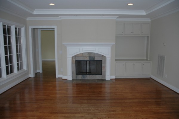
Vacant Property Before
Some of the questions in the mind of a buyer viewing this home might be, “How do I arrange my furniture in this room?” “Will my living room furniture fit?” “Where will I put the television?” It’s very difficult for most people to accurately estimate the size of a room without the point of reference that furniture provides, or to visualize how to arrange furniture in a room like this. When staging a property it’s important to answer those questions to minimize any objections the buyer might have to this home. In regards to furniture arrangement, my floorplan for this room would look something like this:
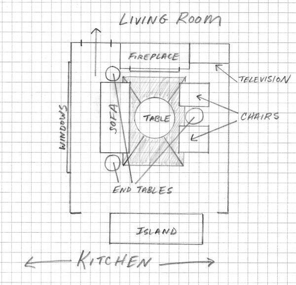
Furniture Floorplan
The next thing I decide is what color palette to use in a given space. The walls here are already a light sandy tan and the tiles on the fireplace surround are gray and tan. When staging, I keep my color design simple and on-trend. I want to appeal to the most buyers possible, so dark and dated just won’t do. The target demographic for this home and neighborhood are professional couples, 35-50 years old, with 2.3 children likely attending private schools. Knowing this, I tailor my design plan to meet the desires and dreams (not necessarily the reality) of that target audience. As I teach in my upcoming book on the psychological aspects of home staging: you aren’t just marketing a home, you are marketing a lifestyle.
Here is the staging design board I created for this living room:

Staged Living Room on Olioboard by The Decorologist
When I stage most homes, I am working with what the homeowner already has rather than working from scratch. This design illustrates how to work towards a few important goals that are specific to home staging:
1) Draw attention to the architectural detail.
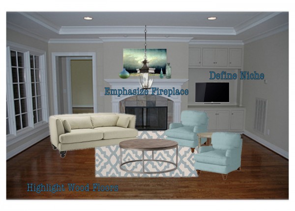
- Fireplace: I centered the seating arrangement on the fireplace (architectural detail), accenting it with attractive art (that is not personalized or taste-specific) of the proper scale for the area above the mantel, and hanging an on-trend, carriage-style light fixture in front of it.
- Architectural niche: The niche beside the fireplace is outfitted with a television to define what that area is for.
- Wood floors: Finally, using a small rug to define the conversation area again draws attention to the fireplace, but also to the beautiful wood floors – most of which remain exposed.
2) Make the space appear larger.
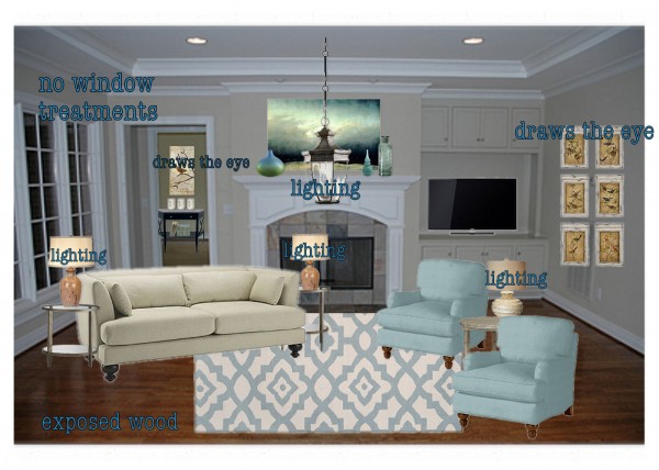
- I made sure there is as much natural and artificial light as possible. You’ll notice I didn’t add window treatments – they can block natural light. Multiple sources of light around the room illuminates all the features in the room.
- The wood floors are exposed, with the exception of the seating area, to increase the sense of space.
- I also strategically placed color and accessories to draw the buyer’s eye around the room, which will help them remember the space later. See how I centered a table and art in the door of the adjoining room? This teases you into the next space by drawing your eye in that direction.
3) Make the space look high-end and updated.
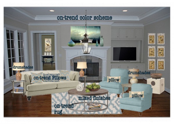
- I used a fresh color scheme, on-trend pillows and rug, and a mix of wood finishes.
- I like to imagine that I traded out the triangular, pleated lampshades on my client’s lamps with the drumshades I keep in my arsenal of staging props to make old lamps look fresh and new.
- Most existing neutral sofas will work fine for staging, provided you bring in new accent pillows in updated fabrics.
- The contemporary rug looks fresh and youthful, but the indoor/outdoor polypropylene version is child/pet friendly and won’t break the bank.
When I staged this room (in reality), I actually made a faux television by painting a horizontal art canvas black and hung it in the bookcase so the buyers would have no questions about where to put their television.
So what do you think? Did the virtual staging help you better visualize how you might live in this space? Make sure you visit the other 9 bloggers participated in the Olioboard Blog Hop to see how they staged their rooms with Olioboard!
http://lisamendedesign.blogspot.com
http://asyoulikeitredesign.com
http://design-magnifique.com
http://nyclq-focalpoint.blogspot.com
http://chameleon-interiors.blogspot.com
http://stagetecture.com
http://www.wsidesignermarketplace.com
You can find out more about Olioboard:
And, finally, make sure you sign up for my free advice and inspiration delivered to your email three times a week!






Hi Kristie,
Great use of colors and definition to make this empty room more inviting and purposeful. Love the idea of defining the niche with the television but still keeping a warm space to enjoy conversation 🙂 Great job on your Olioboard ideas!
Nice explanation on all of this Kristie. It’s been interesting to me to see how much of a service we actually do provide with the space planning alone. I’ve been in business just over a year, and I’ve already had several people comment about how they never would have thought of that particular layout that I came up with. It’s all about an inviting layout that the homeowner can relate to and that works well for them. And nice job mocking this up too on Olioboard.
Thanks, Holly! I know I used to assume that anybody could come up with great furniture placement, but it’s really difficult for most people to do on their own. That alone can make a huge difference, can’t it?
Pretty color palette Krisite. I’d love to see some soft treatment on the window though, maybe something super sheer just to add softness but not make the room feel closed in? Love the wood floors and angled furniture. Really pretty!
Thank you, Donna! I often use simple panels hung above and outside the windows in staged homes, but I NEVER use sheers unless there is an awful view. I want as much natural light as possible, as well as an expansive view to make the whole space feel bigger than it is.
You can’t beat natural light – smart 🙂
Hi Kristie, I know you’re the staging expert, NO DOUBT about that. I have learned though, in my reading and experimenting in real time that sheers or semi-sheers at the outside edges of windows actually do multiply light reflection back into the room. They sort of act like clouds on an overcast day–(you can actually get a sunburn more so on an overcast day because of the multiplied light.) Plus they have softening effect on the edges of a glaring window.
Ok, I’ll stop……Paula.
Haha! Thank you for your thoughts and good input, as always! I get what you are saying, but seeing the outside vista clearly always makes an interior space appear larger, which is one of my #1 goals when staging. Staging is different than decorating, a different psychology is involved . . .
And no, you don’t need to stop, Paula! 🙂
I see your point! On second thought, when staging I'll bet the budget is always a consideration, plus not putting holes in the wall is always nicer. 😉
Hello Kristie, nice to meet you and OlioHop with you. I’m reading your post and you remind me so much of fellow OlioHopper, NYCQ (Lynda) – plan, plan, plan and execute. I love how you point out the reason for using certain things – makes it so clear to the average person looking to get their home staged. Excellent Post!!
Cool…I use mostly SketchUp and Polyvore, but this looks like fun! Can you change the angle of things? Great Post…thanks!!
Michelle,
You can “flip” images and rotate them, but you can’t change the angle (at least not that I know of yet!) which is why the sofa is situated differently than the floorplan indicates. If someone else knows how to change the angle, let me know –
Hi Kristie – loved seeing an actual space that you had staged and all the detail and information about the decisions you made. And congrats on your forthcoming book!
Love this! Fantastic explanation and walk-through with your boards Kristie! I, too, try to use a lot of buyer psychology in my stagings and can’t wait to read your upcoming book. I like your emphasis on new color trends, as well, for pillow accents and decor… as the neutrals can only take you so far in making a space memorable. Way to go!
I couldn’t help but consider that with all the lamps in the middle of the room, does the homeowner have lots of floor plugs and what if they didn’t?
Love the layout and fabric advice as well as the TV placement and drawing the eye into the other room…good advice.
Thought I would also mention that the iPad app, Interior Design is pretty good at layouts, even 2D & 3D.
Kristie,
Love the detail in this post. Your comment “you aren’t just marketing a home, you are marketing a lifestyle” is so true. Buying is an emotional process and they have to see their lifestyle when they walk in the door. Great post!
What a well planned layout! Your board is beautiful and really shows how Olioboard helps with the process! So happy to meet you!!!
What a lovely blog and such a wonderful result from the space you had to work with. Love your advice about staging, great work. From Sammiibubbles of the Olioboard Fan Room on Facebook
Kristie,
Love how you pulled the room together. The faux TV idea you came up with in reality sounds like something I might have to try. Looking forward to your book.
Lisa
Added Charm Home Staging
wow – what a great room and great process!! i can aspire to be as detailed as you are! hope to get the chance to meet you one day- have a great time at RESA!
Thank you so much, Roslyn! I hope to meet you someday, as well 🙂
Amazing transformation!! Very informative for a new comer like me, definitely!
Wow Kristie – really nice and really smart staging!
Sorry, but this layout is just not practical. Anyone wanting to watch TV will have to look behind them! The fireplace is no longer the focal point with a lamp and table blocking its view and all the seating is facing away from the fireplace–so not only can no one watch TV, they can’t enjoy the fire either. It might be boring, but since this appears to be a family/TV room, I would place the couch facing the fireplace, with swivel chairs facing each other on each side of the couch. Everyone can see the TV, enjoy the fire and the art work. If TV is off, chairs can swivel towards the couch for conversation.
Joan,
If you look at the furniture placement floorplan, you will see that the lamp and table DO NOT block the fireplace and the sofa faces towards the direction of the television, which can pivot at a angle for sofa viewing. Those chairs could swivel as well to face the television. I can see that if you weren’t looking at the floorplan before you viewed the design board, you might be confused – with this program, I can’t rotate the furnishings to the exact spot I want them to face.
If I was decorating this home to LIVE IN, I would likely place the television on a console opposite the sofa or I would have the sofa face the fireplace as you suggested. But since this is STAGING, not decorating, I focus on orienting the room on the main focal point – the fireplace. And I have the problem of having to answer the question – what goes in that big niche? For staging, the best answer is the television. For living, I might outfit that area with more shelving and simply put the television on the adjacent wall on a long console.
Dear Kristie ~
As the representative of Olioboard, we all want to say thank you for brining your time, energy and talent for staging into your first OlioHop blog hop! You did an outstanding job on this post and we appreciate it!
As myself, Leslie, I want to say, first of all -good luck with your upcoming book. That’s huge! Secondly, I want to say that I really like the way you labeled everything. A picture is one thing, but a picture with small labels to poin out the points of what you’ve done is another and it’s really effective in helping people to see at a glance what might be added.
One thing that’s important to note, I think, is that people might thing they can DIY on staging, but it’s much harder than it looks – online – to get the flow, spacing, proportion and scale just right for discriminating buyers.
I personally believe hiring a stager is a great investment.
Also, Kristie, good luck at the RESA national convention next weekend where you have been nominated for a national staging award. Whether you win it or not, just being nominated is an honor but, of course, I am rooting for you as we all are over at Olioboard!
Thanks again,
Leslie / @tkpleslie
Leslie,
Thank you so much! I had a great time participating in the bloghop and connecting with other stagers and Olioboard members. Look forward to future collaborations with you!
I’m a wouldbe consumer, not a decorator, but this post is one reason why I’m hesitant to employ a decorator. Why put to a TV– which presumably is intended to be watched, in a corner where none of the seating faces it? I don’t get it.
Jeanine,
Please see the response I left for Joan – it might make more sense to you what I did with the furniture arrangement in this room.
At times, it's challenging to explain a vision for a space for a person to understand – That's why I'm thankful for online roomboard sites like Olioboard. It's a perfect resource of creating that visualization – especially paired with a floor plan layout. Although the rooms may not always be set as EXACT in roomboard (bc of furniture images offered from retailers), it is explained in your floor plan as you created in your well organized post. Love that you used a real room for a project for your Olioboard demonstration. Lovely layout & great color scheme!
So happy to be introduced to you and your blog Kristie! That's what is so wonderful about these collaborations – we all get to expand our social circles, share, learn, and grow. I shared your Houzz post on the difference between Decorating and Staging I dicovered while visiting your site 🙂
OlioLove and Happy to Hop with you!
xo Lynda
Spot on home staging advice…Great job Kristie!
Elizabeth Carrasco
Kristie, congratulations on your #OlioHop it's wonderful! Your explanations of what and why you strategically placed specific items is brilliant. Such a joy to read and see your work, thank you for sharing!
Jane Gianarelli xo
That was truly innovative and the color palette was so well-thought of that I can't really appreciate it enough! The furniture and the rest of the decor did actually add, what you said "a point of reference" which I bet would make the buyers visualize the room as their own.
That was truly innovative and the color palette was so well-thought of that I can't really appreciate it enough! The furniture and the rest of the decor did actually add, what you said "a point of reference" which I bet would make the buyers visualize the room as their own.
<a href="http://fasthomebuyersinc.com/">express home buying service</a>
Kristie:
Beautiful colors.
I love the furniture floorplan as laid out on the graph paper; what is confusing is that the decorating software does make the sofa appear as though its back is to the fireplace and television, and also makes the chairs appear as though they, too, are facing in the opposite direction. In this a limitation of the design software?
Yes, it is a limitation, Terry – which is why the furniture floorplan is so important.
I simply can’t believe how some little touches, such as drawing the eye towards the other room – by the use of art- makes such an impact. Great ideas Kristie!!
I’m looking for a coffee table just like that! Does it exist in real life?
Hi Kristie, First of all thanks for sharing your experience in detail with other people in this article. I am completely agree that we must draw buyer’s attention to the architectural detail & architectural detail makes the biggest impact. I think with virtual staging, you can easily draw attention to your favorite aspects and highlight the details that you love most.
bravo, i agree
I agree. very nice advices