I’m really excited to share this makeover with you today! The homeowner is a prolific artist who has lots of beautiful paintings and amazing antiques gathered from many of the different countries she and her husband have lived in over the last 40+ years.
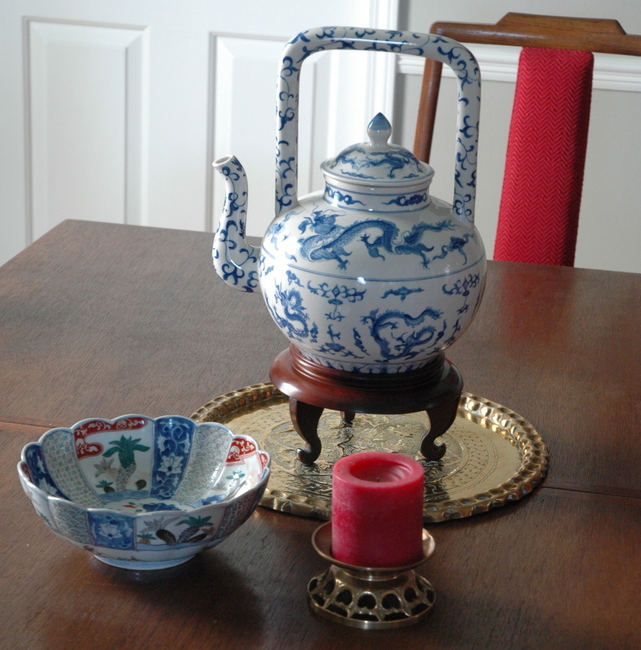
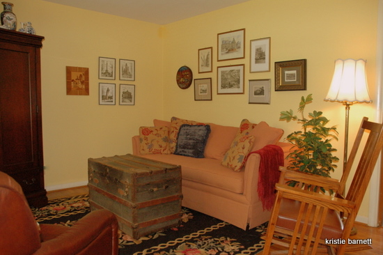
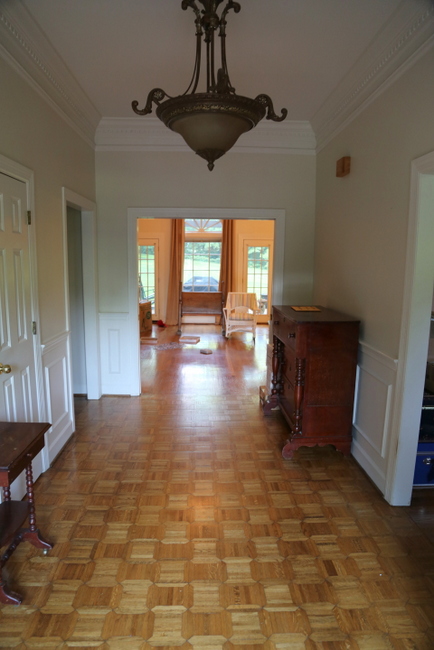
However, she had grown tired of the look of her living room/dining room combination and needed a fresh perspective. The walls were a goldy-yellow color and the accent colors were primarily red and off-white. Here’s the way the space looked when I arrived for the consultation.

Before
The sectional seemed awkward in the space, and the homeowner was ready to let it go for something new. During the consultation, we decided on that new paint and a new sofa were the most important changes to be made. Because she had so many interesting and history-laden pieces, I wanted to use most of what she already had so that the room would still feel familiar, only better. I must tell you, she wasn’t sold on the paint scheme right away. In fact, she contacted me a couple of weeks later concerned that it wouldn’t work with what she had and might read too cold and gray. Fortunately, she bit the bullet and went with my recommendations afterall.
Ok, here’s the conversation area before the makeover. Notice the bookcase on the left – I’m going to repurpose that, as you will see.
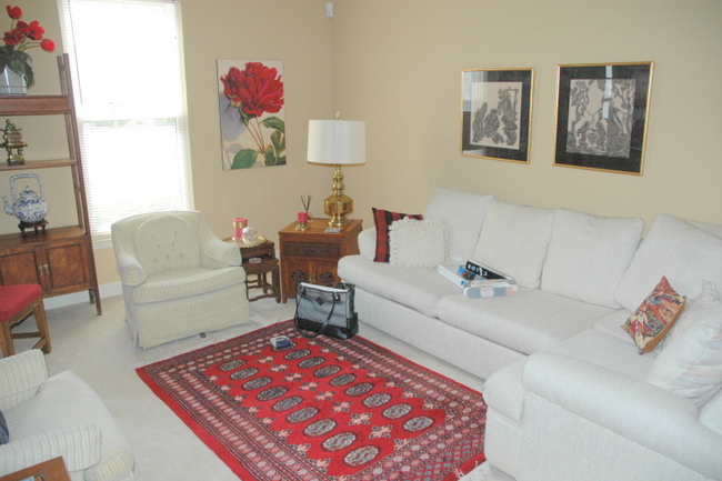
Living Room Before
We didn’t want a completely neutral wall color and wanted to keep things light, so I chose a gray-green for the walls and a darker greeny-blue on the ceiling. I knew this backdrop would make the wood tones richer and the off-whites and red punch out.
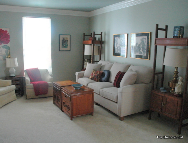
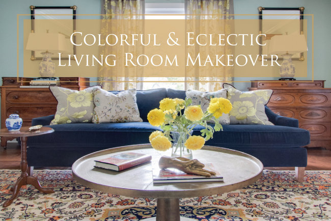
Living Room After
The new sofa is a better size for the space. One of the basic tenets of my design is symmetry. The homeowner has several matching bookcase/shelf units, previously used side-by-side in this room. I pulled out a few shelves and used them to bookend the sofa and hold these fabulous vintage brass lamps. I then pulled the pair of end tables to take the place of the predictable rectangular coffee table, and I LOVE the way it looks!
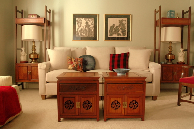
Living Room by The Decorologist
Let’s check out the “before” again from the other side of the room.
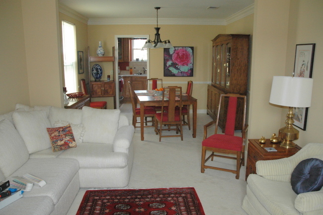
Living Room/Dining Room Before
The finished room looks pulled-together, sophisticated, and inviting. I think the new colors really help the beautiful wood sing. See if you agree:
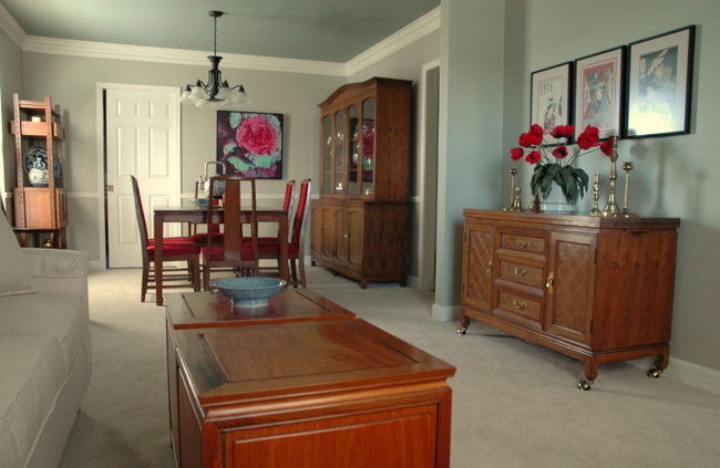
Living Room/Dining Room After
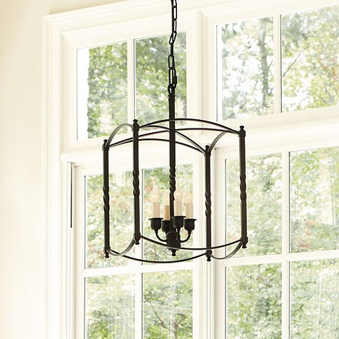
The one thing that still needs to change is the light fixture – it does nothing for this room! This is what I am suggesting to replace it:
The Asian art was begging to be grouped rather than be scattered on the wall.
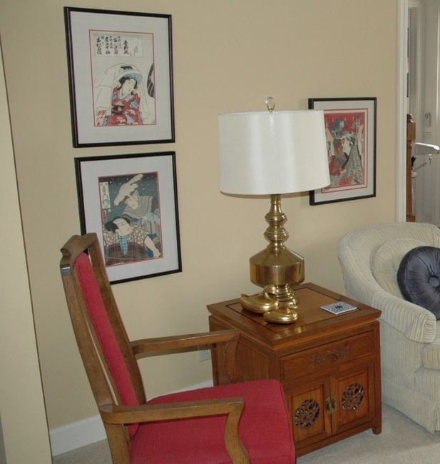
Before
I guess it’s the symmetry-junkie in me. I just had to line them up – I think they make a bolder statement when grouped tightly together.
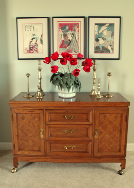
Here’s the best part: my client and her husband both love the results! And I love how my client’s art stands out against the new wall color.
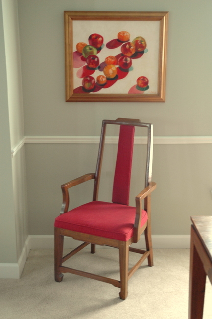
There is NOTHING I love more than giving new life to tired interiors. Sometimes it just takes some paint and a fresh perspective on how to put it all together!
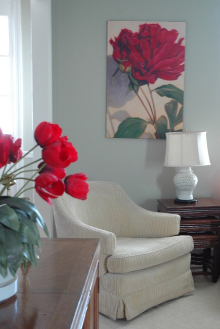







Looks awesome. I love it when a client tries something new like a totally different wall color. Genius with the bookcases. Well done.
You worked your magic again! Really looks great. Love how you put the art together to make more of a statement. I am sure the homeowners are so excited and happy! Great job!
Thank you, Kelly! This was a fun one 🙂
Looks great! I liked the way you bunched and reordered…awesome job!
Wow Kristie it looks great!
I really love the contrast between the wall and ceiling colours. Is there a rule of thumb on how the colours relate or is it just intuitive? Also would you still do it if the moldings weren’t there? I am very interested in this idea and would love to know more.
Thanks Kristie!
Gorgeous! What is the name of the wall color? I love it!
LOVE how the paint color makes her furnishings look fabulous!! What paint colors did you use?
Kristie, this transformation is nothing short of amazing! Don’t you love it when a client has beautiful things for you breath new life into? The paint color is perfect and painted ceiling gives it a rich depth and added dimension. I’m sure the homeowners are simply thrilled with your genius.
You nailed it! What a difference!
What an amazing before and after! Thanks for sharing. I love your blog, it’s such an inspiration. Every post you do opens up a world of possibilities for my own place.
Hi Kristie, it looks great. I have been reading your blog for a while. This is my first time to comment. The colors you chose made the red more vibrant. The new paint colors also made the wood pieces look new. Great job!
Greate post. Keep posting such kind of info on your blog.
Im really impressed by it.
Hi there, You have done a great job. I will definitely digg it and in my view recommend to my friends.
I am confident they’ll be benefited from this website.
Hi Kristie: I have been following your blog for quite a while. I absolutely love all your “transformations” and have been inspired by them all. Also wondering if you would kindly share the paint colour since I have lots of orangey brown wood trim in my heritage home and have struggled with the “right” paint colour for my double parlour living room. I think this colour might be the ticket!
Wow, that is an amazing makeover! The new paint colors definitely bring out the beauty of those wood pieces. Everything in this room feels purposeful now, and I love that!
As I was scrolling down on this post I thought: This is so ingenius…the only thing I would’ve changed is the chandelier….then I saw your comment & picture! Voila! Great minds…. You have made her space so sophisticated! Just a quick question…do you paint a large sample(s) before deciding??
Or had you used this color combo before with success? You are truly gifted, Kristie!! Thanks for the abundance of photos on this also.
Paula,
I have used similar color combos before, but not this exact combo. I always bring my BIG painted samples to my Color Consultations so that we can move them around the room on different walls and different lighting conditions. I carry around my favorite 150+ Ben Moore colors everywhere I go! If you are only going by tiny printed samples and fandecks, you are only guessing how it’s going to look all over the walls!
I so totally agree! I am a huge fan of end tables pulled together for a coffee table – there’s something about it that feels more interesting and carefree rather than predictable and safe! This is a really pretty makeover 🙂
It looks great, Kristie. You are worth your weight in gold. Thanks so much for linking up on Fabulous Friday at Faith, Trust & Pixie Dust. {Sorry I’m running late, I’ve been on vacation.}
Warmly, Michelle