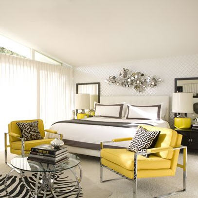
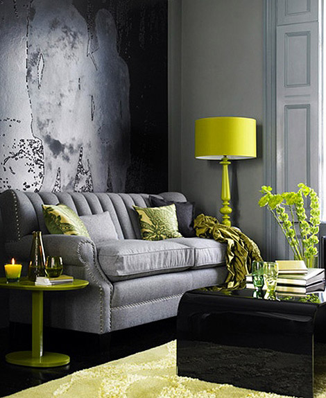
Bright, citrusy yellow is a great way to brighten your rooms – but you don’t have to douse the room in it. Use yellow to make a bold statement by using it to *pop* in your space. Here’s a few ways how: Take a neutral room like this one, and simply add a couple of bold yellow chairs or lamps.
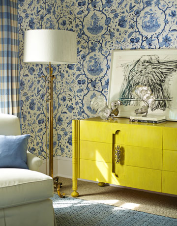
Find a piece of furniture that needs an update and paint it bright yellow. Look how great bright yellow pairs with blues – what a great way to make a traditional room look instantly current.
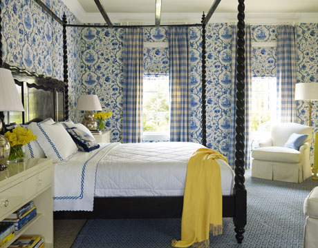
I’m not talking butter yellow, folks. To make this combo current you have to think vivid, saturated, caution- light yellow. Here’s the other side of the same room:
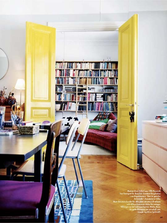
Wowza. Painting these interior doors sunny yellow was a ba-rilliant move.
Saturated yellow looks especially current with all the grays that are dominating the decor scene.
source
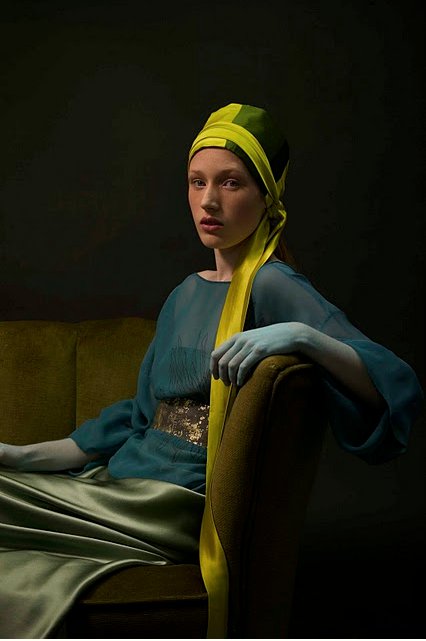
Sometimes just a fabulous piece of art can give you that pop of color you are looking for. This lovely portrait is actually what inspired me to write this post (thanks, Jean!).
Not sure why her hand is blue, but these colors are FABULOUS. What do you think of this take on yellow?




Definitely a favourite colour of mine right now…I just made a yellow cushion with a contrast panel of grey! I love grey and orange too…and I love that exact shade of yellow you show too…perfect for each of those rooms.
I am so glad we added yellow to my bedroom!
dianne, i think we all need some sunshine yellow in middle tennessee right now!!!
I LOVE it!!
You should post old “before” pictures of my house as a great example of the yellow you are NOT talking about! ha! Seriously, I have always loved blue and yellow together and this helps me see how to take that classic combo and make it very hip and current.
well . . . if i did that, i might offend many people as that yellow you speak of was very popular when many new homes were built in the 1990s – franklin tn appears to be bathed in it . . . 🙂
but seriously, you are right – blue and yellow are a classic combo, but now we are looking at updated versions. i blogged about another way to do blues and yellows here: https://thedecorologist.com/color-therapy-a-fresh-take-on-yellow-and-blue-decorating
I don’t remember seeing that post, but looks like it was in the midst of our move so I probably missed it. LOVE LOVE that beautiful blue though! Very nice! I really like that pale blue with the popping yellow.
Its interesting to me how we have strayed away from gold or butter yellow walls as much from 5-10 years ago and new interiors are using this more acidic hue for special pops. I love that glossy yellow buffet and I love how it looks but don’t know if I could ever do it for myself. I am really loving the color scheme of the painting though.
well, vintage usually means faded – so bright citrus colors usually look a little out of place in homes like yours and mine!!! but i think that portrait would fit right in, don’t you?
The yellow doors are particularly stunning. It would be fun to do something like that!
Warmly, Michelle
it would take some guts, but it would be fabulous!
Forgot to mention, your blog is beautiful! I followed you on Networked blogs. Would love for you to follow back. 🙂
Lisa xoxo
thanks, lisa! will do 🙂
LOVE THE YELLOW DOOR! may just have todo that in one of my rooms:) Would be fun as a play room door color!
LOVE the yellow. 🙂 I started collecting it for my daughter’s room when I stumbled across a beautiful gold vintage chair this past summer.
I would guess she is dyes fabric. Lovin’ all the splashes of yellow…a very cheerful color indeed!