Many people think they are stuck with what they’ve got. You know, your house is what it is. Sometimes that is certainly true, and you have to stay within certain parameters to make things work. But, if you have the vision and the budget – sometimes you can really CHANGE your home to fit your style, your particular vibe. I’m currently working on a local project where the homeowners were willing to make significant changes in order to get the look and feel they were truly wanting in their home. The living room architecture was initially very formal and traditional, featuring EXCESSIVE trim:
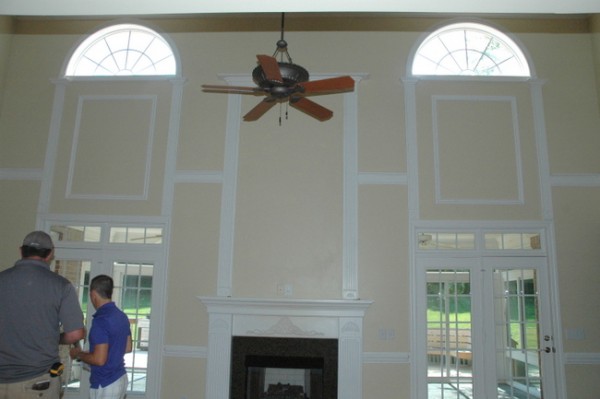 fireplace wall before
This look was SO NOT THEM. While they love the space and the floorplan, my clients want a home that is warmer and less formal than this house initially presented. So what are the options? Well, we decided to remove a good deal of that fancy trim molding and install a rustic stone two-story fireplace. This is how it was progressing earlier this week:
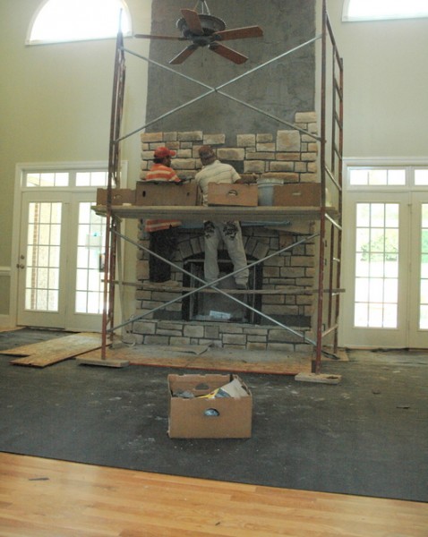
stone fireplace in progress
Here’s another shot of this family room in the “before” state. You can see how ornate and detailed the trim molding was throughout the space. That might have been seen as a plus for many homebuyers, but it was a hindrance in creating the look this family really wanted.
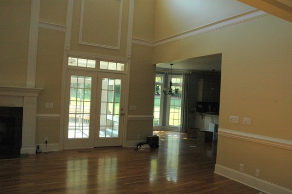
architectural trim molding before
Hopefully, you can see what a difference removing the trim did for this space. Although many people need to ADD trim to make a positive difference, the opposite is true in this particular space.
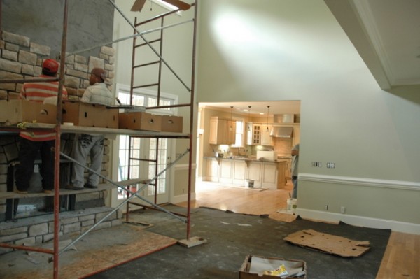
in progress
And what if you are stuck with a very taste-specific kitchen? Can you see beyond what is there to re-envision what it would look like if you changed just one or two things?
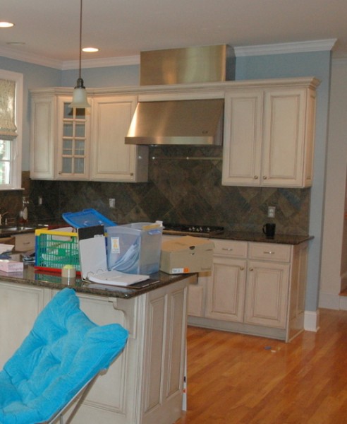
before
In this kitchen, I believed that by changing the wall color and the backsplash tile, the entire kitchen could be transformed. The cabinets and the granite could be salvaged, if only paired with the “right” paint color and backsplash. Let’s see if you agree.
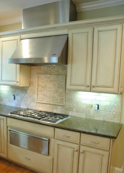
Updated Kitchen in Progress
The entry sets the tone for the entire look and feel of your home. This entry and staircase can be transformed if a homeowner is able to see beyond what is currently apparent.
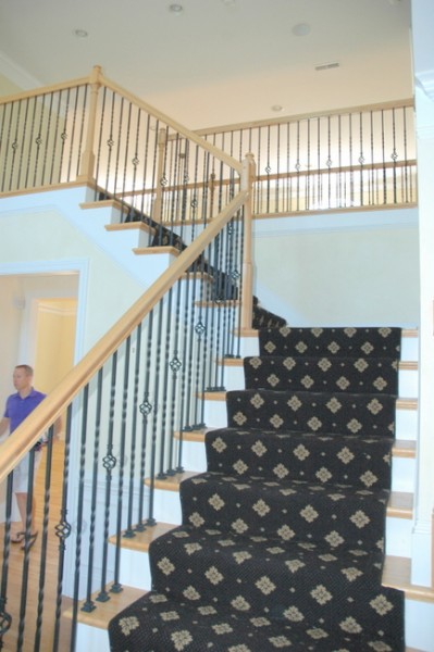
before
It’s all in progress, but things are moving in the RIGHT direction in this home. The handrail is being re-stained in ebony and I recommended that the hardwood should be refinished in a dark walnut stain. You can already see an improvement with the new wall color and the removal of the dated stair runner, but just wait until the fabulous new entry lighting goes in!
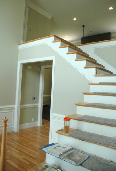
staircase in process
It’s all about vision, right? The most important thing I do as a designer is to help clients cast a vision for something better than what was there before. Something that feels more like them. And nothing makes me happier than seeing that come to fruition, step by step.








All I need to say is WOW in the positive for the transformation 🙂 I especially love the kitchen ‘after’.
Thank you, Connie! It’s coming along 🙂
Oh yes, it’s going to be great! Keep us posted!
The transformation is incredible. The paint alone helps the house look newer. What is the name of the paint color? Are all the rooms painted the same color? Sometimes the paint looks gray and sometimes it looks tan. Thanks, Teresa
Teresa,
I love how lighting and surrounding colors change the way a color looks from space to space! Yes, in these 3 spaces, the color is the same. However, I created an entire paint color scheme for the house which includes 10+ colors. I can tell you, it’s truly tricky to choose paint colors that work well with a huge stone element like this. We took samples of our top 3 paint color picks to the stone retailer to make sure we chose the right stone and the right wall color. I think it’s going to come together beautifully! I’m sorry, but I can’t tell you the specific paint color as this info was purchased by these clients. If you are interested in learning more about how to choose paint colors for your home, you might want to check out my Color Workshop Video (see sidebar for more info).
What a fabulous demonstration of changing the entire feeling of their home. So many homeowners think by painting out the excess trim it will disappear and not be so bossy. NOT TRUE! The stone fireplace and the new tile in the kitchen have completely transformed this home. I’m glad you are making the point about choosing colour that is right for this home, in this home. It isn’t about a paint chip and what colour it is. To truly understand how to choose colour for your own home I highly recommend purchasing Krisites Colour Workshop Video, she will teach you how to see colour in a whole new light! Loved the video!!
Wow, Brenda! Thank you for that testimonial 🙂 Here’s a link to my Color Workshop Video: https://thedecorologist.com/color-workshop
I love the changes and color selections! Very dramatic and beautiful results! This house is very 1997 (espcially the runner) and the trim was a costly addition when they built it I’m sure. I have one suggestion though if I might. I think the entry from the family room to the kitchen is bare looking. Could they use some of the trim they took down to frame it out and not just have sheetrock? It looks a little cheap compared to the restbofnthe home.
Great idea, Rebecca!!! Thanks!
Great job, Kristie! The afters look amazing, of course. My favorite is that living room w/o all the busy lines on the walls. You do have a talent for vision.
I hope we get to see this house when everything is complete cause even the progress shots are an amazing change in style (and quite attractive). I have a taste-specific / bossy kitchen with several elements similar to the “before” kitchen here. ** Sigh, ugh, I’ll be alright 😉 ** Just wondering if you know what the granite you worked your magic around is … mine is Baltic Brown and if this kitchen has similar it would be a great inspiration photo to share with my hubs. Thanks, Robin
It may be? It has black, browns, and green in it.
Are cabinets pickled oak with a brown glaze? I think I see something similar to my cabinets and backsplash. I got excited to see the green paint.
They aren’t pickled oak, just a paint finish with glazing. But, maybe a dark glaze could enhance the look of the pickled cabinets?? Let me check with my faux finisher!
With a vision, time and money (and a talented Designer) you can do just about anything.
Kristie, you have a terrific talent for surveying what is currently in a room and “seeing beyond” to what it can become. That said, please, please, please post photos when this home’s transformation is complete! Thanks!!!
Hi Kristie,
Do you have any updated photos of this project? Not sure if you remember me from our e-color consult last summer but I’m excited to see how this project turned out. There are several similarities between our homes and I’m curious how it turned out. Hope you are doing well!!
Sorry that’s Pepper B from MO. Typos, ugh!
This is my problem in a nut shell. I have a modest, 1960’s rancher and I am more of a Craftsman sort of gal. While I appreciate the aesthetic of mid century modern, I much prefer the intricate moldings and charm of the Craftsman period. My dream is to convert my home into something more Craftsman-like.