Is choosing paint colors for staging homes to sell different than choosing them for a home you plan to continue living in? Yes and no.

While I guide all my clients towards colors that update their home while taking their existing finishes into account, I want the homeowner’s personality and personal preferences to shine through if the color consultation is for the home they are continuing to live in indefinitely. Not so much if they are planning on selling soon or we are choosing paint color for staging to sell.
My Tips for Choosing Paint Colors for Staging:
1. Use painted sample boards to test colors.
When I am doing a full-on personal paint color consultation, I’m considering LOTS of different options. And I carry around two bags of about 250 large painted color samples. I am in love with Small Wall paint board samples that are available exclusively at Sherwin-Williams stores across the country. The inventor of SmallWall actually lives outside of Nashville, and I’ve even specified colors for her own home! They are the most sturdy, true-to-life representation of how paint looks on drywall that is on the market. Paint up color samples you are considering after purchasing pints of those colors from your paint store.
2. Place samples directly on the wall opposite the windows/light source.
Why? Because your sample will look lighter or darker depending on which wall you place it. You can see this if you look around the room you are currently in. Notice which wall is darker than the others and which wall is lighter. This is one of the reasons not to test a color by painting it directly on the wall – because it will read lighter or darker on different walls. By moving around your sample boards, you can see how it will look on different walls of the room. There’s this thing called metamerism, which means that color perception changes with the lighting conditions. The wall opposite windows is where the color will read lighter, while the window walls are the darkest. If you only test on the window wall, you may choose a color that is way too light for the entire space.
3. Test samples next to flooring, trim, fireplace, cabinetry, countertops, and major upholstery.
You should test paint colors next to the immovable features of the home – those things that won’t be changing. This includes tile, granite, carpet, hardwood, and sometimes even furnishings that are remaining or trim that you don’t want to have to repaint.
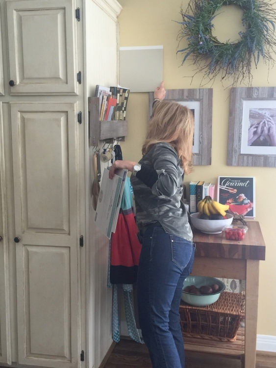 Expert Psychological Staging® grad testing paint samples against cabinetry
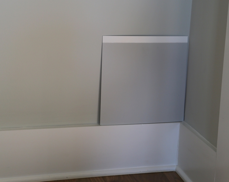 testing color against trim and flooring
NEVER, EVER test paint color by painting a swatch in the middle of a wall. This won’t give you an accurate read as to what the new color will look like because your visual impression is skewed by the existing wall color. When you look at a paint color, your brain determines its color in the context of the surrounding colors. That means that the same color can look different when placed on a yellow wall vs. a blue wall, for example. I had my daughter hold up a sample in the middle of two different colored walls in our home to show you how HUGE a difference the background color can make.
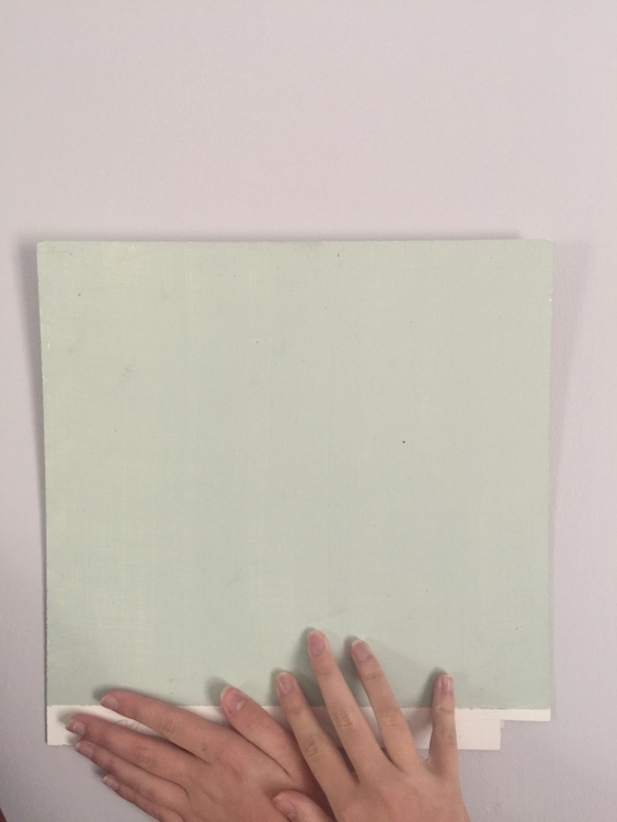
The color on the wall that surrounds the sample is a lavender. What would you call the color sample placed here? It looks mint green to me.
Now let’s take a look at this example:
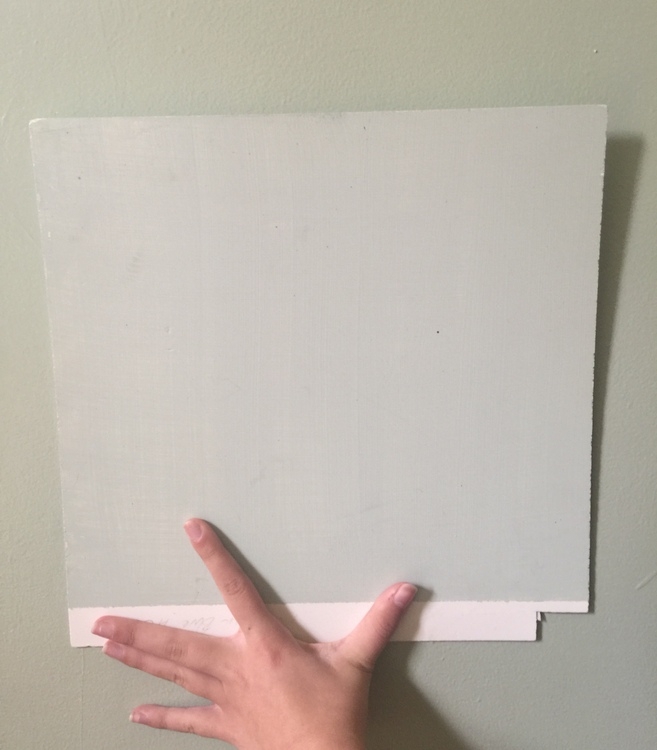
The background color here is a minty blue-green color. What color does the sample look to you? I’d say dusty gray-blue.
Now for the shocking truth: the paint sample color is the same in both photos and the natural lighting is almost identical. Don’t believe me? Check out the notch in the bottom right corner of the sample board – same boards. I did absolutely no photo editing or lightening of either of these photos, I swear. There are lots of examples of color illusions you can find online that illustrate similar confusing effects. The color is Benjamin Moore Palladian Blue, by the way.
To lessen this effect, you need to test the color against the trim and perhaps put a white board behind the sample board. A trick I use is to stand back across the room, close one eye, and use my hands in front of me to block my vision of the existing wall color (like I’m framing a photo):

This helps me block out the wall color that will no longer be there when the new color goes up. I’m telling you, it’s really hard to see past that existing color, especially if it’s gold-yellow or muddy peanut butter.
4. Leave a white strip down one side of your painted sample.
Not only does this help you visually separate the existing wall color from the new color, it also helps you see how light or dark the new color is compared to white. I have used samples without the white strip (like the larger paper sheets you can get from the paint company), and even I have a difficult time deciding whether or not they are too light or dark. Believe me, the white strip really helps – I simply put a strip of painter’s tape down one side before painting my sample, then pull it off when the paint is dry.
5. If the current wall color works with the finishes but is too bold or dark for staging, choose a more neutral version of that color.
This kitchen was bright yellow with creamy glazed kitchen cabinetry and beige backsplash, and it needed a more staging-friendly paint color for the walls. Because of the yellow undertones of the cabinetry and tile, a lighter and more neutral version of the existing color might even cover in one good coat of paint. This was the existing wall color after staging:
If we had been able to do an initial staging consultation in this home, this is the color we would have chosen: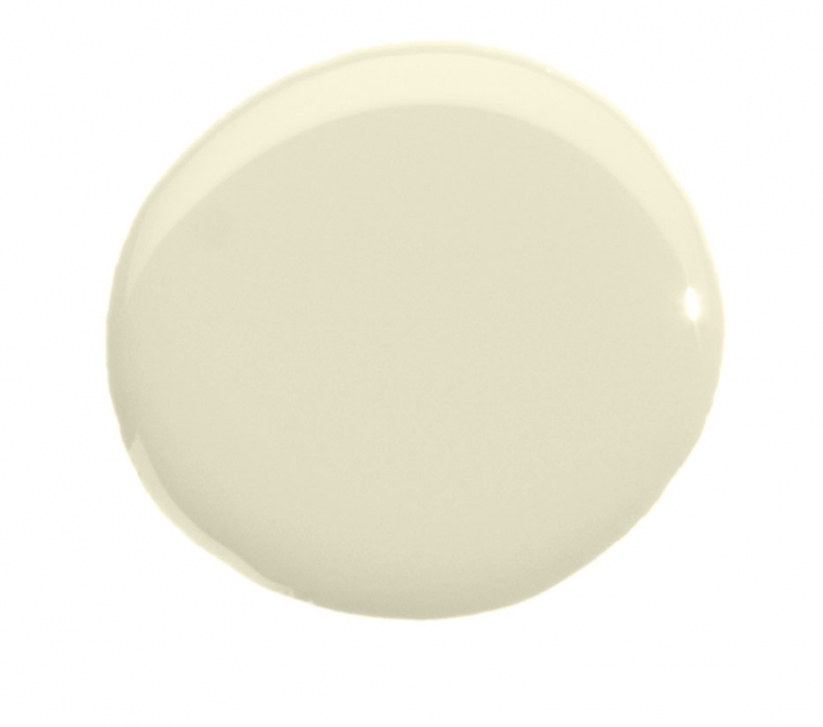 I developed a system to make it easy for the stagers I train to choose amazing paint colors for staging homes in less than twenty minutes during a staging consultation. I teach this in my Expert Psychological Staging® course, and there isn’t a dated finish out there that one of my staging colors can’t update!
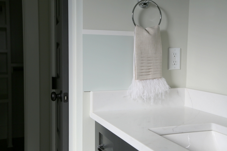
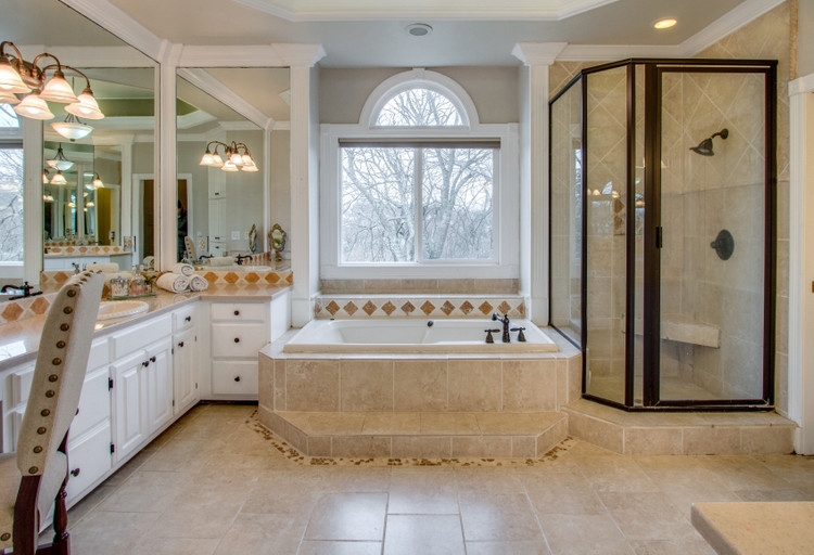
Take this bathroom:
 before
While ripping it out might not be an option, the right Psychological Staging™ paint color along with some staging can get it to where it needs to be to sell.
I hope my tips for testing paint colors for staging were helpful! To learn more about becoming a professional home stager or taking your home staging business to the next level, find out what I can offer you in my RESA®-accredited Expert Psychological Staging® course:


As always, love your insights. Understanding how light effects the final color selection is a great discussion to have with your client. I’l be painting up some sample boards soon!
Thank you so much, Bobbie! Happy Staging!
Great tips! So imperative to try before you buy. Many mfr paint chips are digital and don’t provide an accurate color representation..Thank you for sharing Small Wall® with your readers!
You are so right, Julie. Not only does the paint chip from the store look different the real thing (actual paint), we are also unduly influenced by the colors sitting next to it on the strip on in a fandeck. You have to look at them separately to begin to know how they will actually read on a wall!
Absolutely ! Adjacent wall, floor color, fireplace bricks/trim – all pull color – so essential to have a sample you can reposition around your room vs a static sample of paint directly on your wall.
Thanks for sharing your tips for choosing paint color for staging homes. Nice post.
My wife and I are struggling with paint color. We purchased a new home and need to update the turquoise tile… we are really set on a traditional Versailles pattern but are struggling if we should paint first then select tile color or lay the tile that we found and like and find a paint color that matches….
In times past, I lathered paint on the wall in the middle of the room to decide on a color. Once the entire room was painted it didn’t meet my expectations. This method you practice makes so much sense!
I wish you were in Michigan!
What is the color of the light yellow dollop of paint below the yellow kitchen?