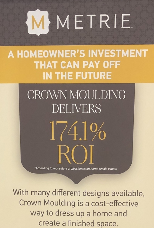
I spent last week at the 2018 Kitchen & Bath Industry Show (KBIS) in Orlando, Florida, scouring the huge convention complex for the latest and greatest products and innovations to share with my readers and clients. One of my favorite vendors at the show was the maker of a product that not only gives a home more character and sophistication, but also offers a huge return on investment!
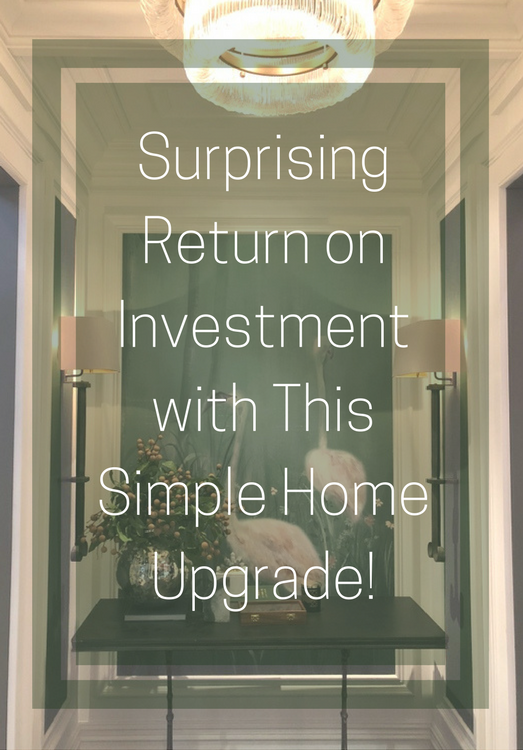
Would you believe it’s TRIM MOLDING? Just to be clear, “moulding” is the British/Canadian spelling and “molding” is the American spelling of the trim/framing pieces that I will be referring to. This is so timely, because I recently reported that applied molding (on furniture, walls, and ceilings) is a huge break-out trend for 2018.
It actually pays to beef up your trim. So you think trim moldings are boring? Just take a gander at some of the designer wainscot molding collections that Metrie featured at KBIS this year:
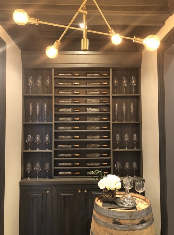
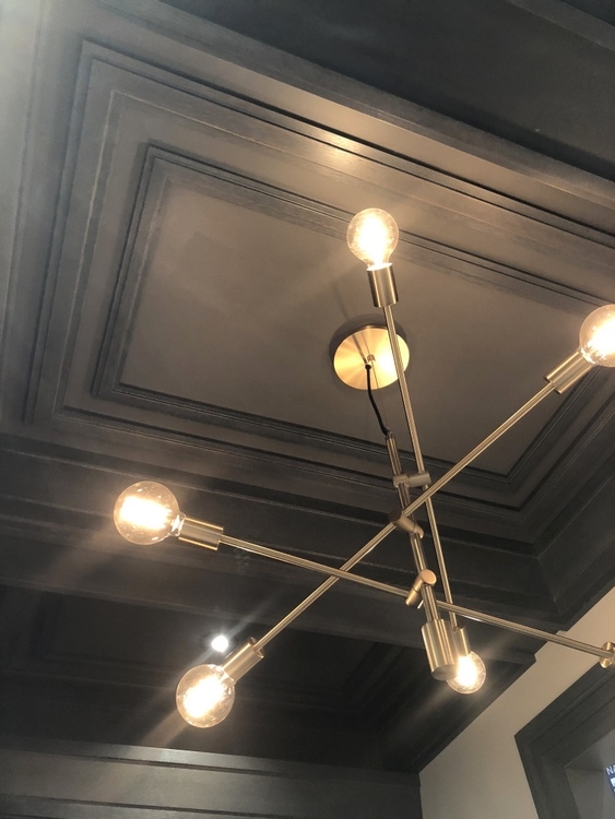
Look what they did with the panel molding to create DRAMA! The black trim against the white walls is so sophisticated.
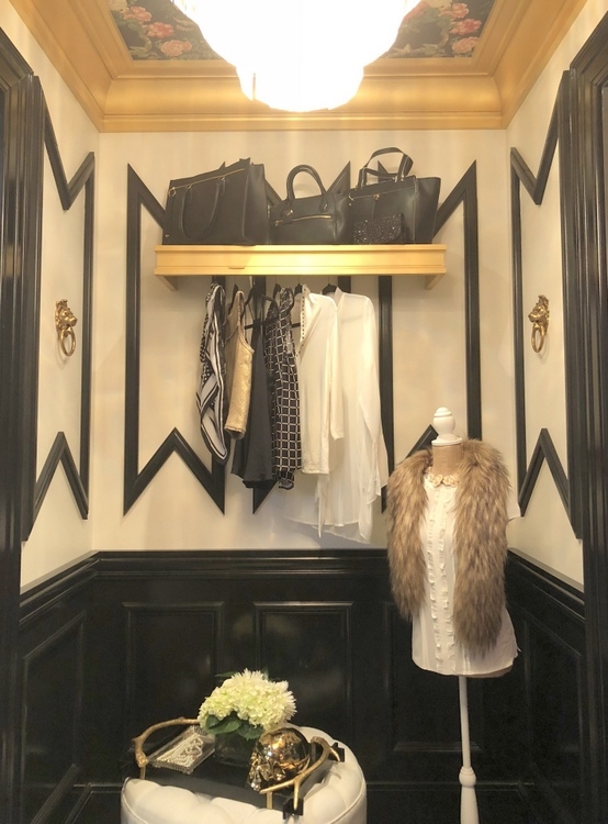
And the ceiling – I was seriously swooning. I desperately want to do a fabulous wallpapered ceiling!!!
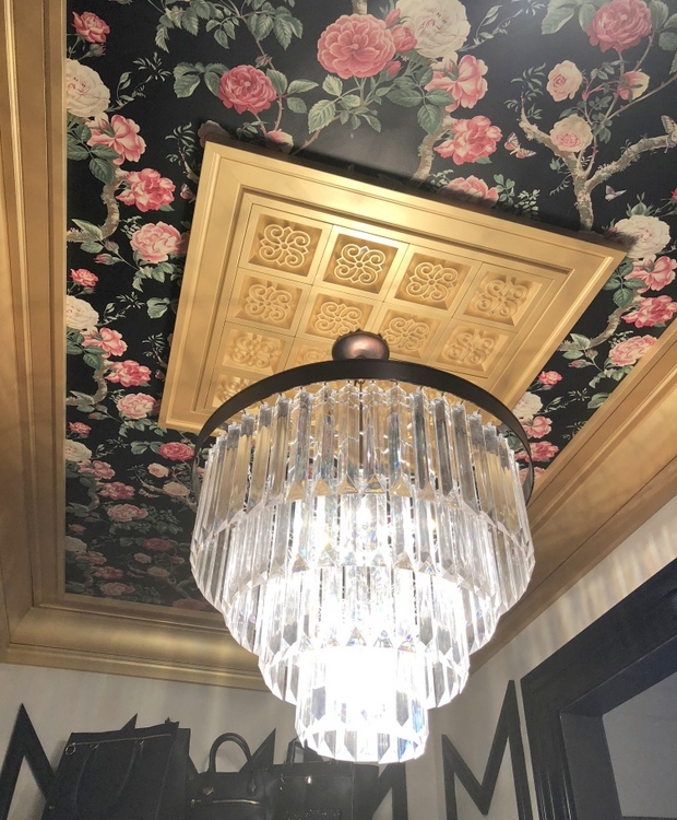
Here’s another sophisticated trim molding collection Metrie featured:
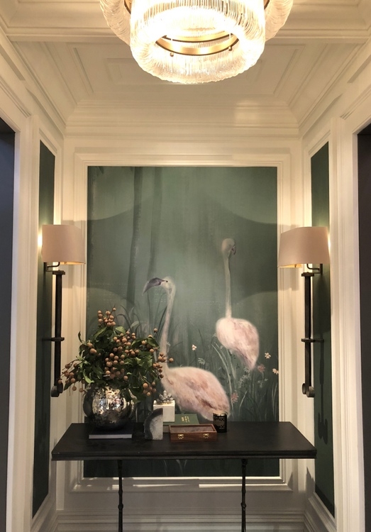
Beams and coffers aren’t the only ceiling upgrade options you have. It truly is the fifth wall!
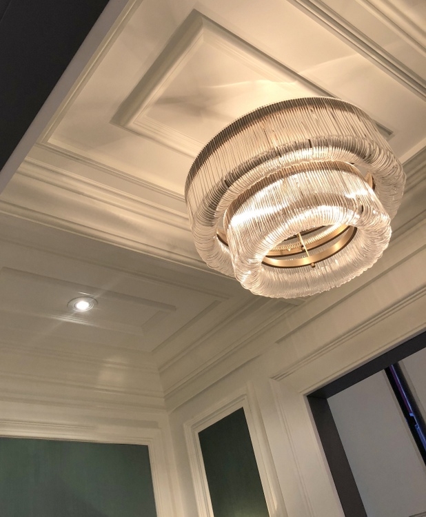
The photos above are from Metrie’s Very Square, French Curves, and Fashion Forward collections. They have a total of 5 coordinated wainscot molding collections:
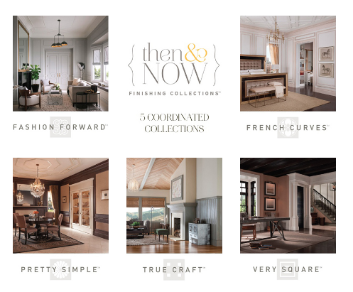
But that’s not all. Metrie also has something called Option M, which is curated trim molding collections based on your personal decorating style. Just take a little style quiz and find out which one is best for you (I’m New Traditional). If you’ve ever tried to pick out trim moldings for your home, it can be very confusing and overwhelming figuring out which window molding goes with which base molding and which crown molding – but Metrie makes it easy for you.
Here are some of the examples of the Option M Collections featured in their booth at KBIS:
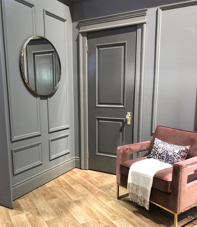 New Traditional
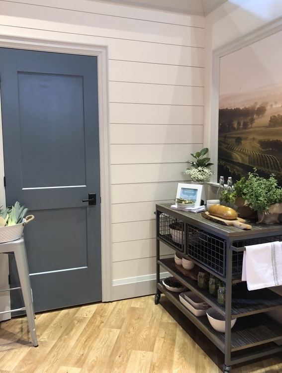 Modern Farmhouse
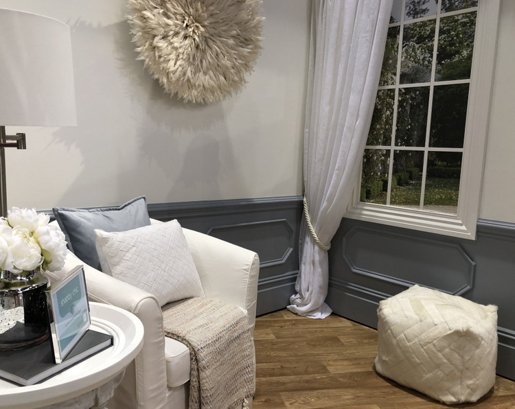 Shabby Chic
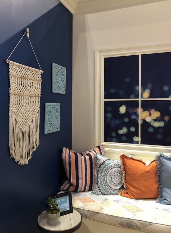 Bohemian
I was fortunate enough to be chosen as part of the Modenus 2018 BlogTourKBIS, and Metrie was one of our sponsors. Not many building products are so design-forward, but Metrie certainly is!
Can you see how the right trim molding can make a huge improvement in your interior? Especially if you live in a builder’s basic with little trim at all. Which collection was your favorite?






you beat me to it!! this was my very favorite vendor that we met with and I can’t wait to write about them!! and I always tell me remodeling/ new build clients that mill work is the best money you can spend!
Metrie was one of my top 3 favorites too!
AWESOME post and pics also!! as usual:)
Thank you, Elizabeth! I just loved their little entry set-ups. So much inspiration in teeny-tiny spaces! I need gold crown molding and a wallpapered ceiling now! 😉
Welcome back, Kristie! Hope you had a great time at the show. Love the mouldings! I think I’m a New Traditional/French Curves type. Love that flamingo mural in your photo above, and that gorgeous green you’ve shown in earlier posts! I am going to check out Metrie; would love to see if mouldings would work in my new FL home. I’m looking forward to reading more about your trip!
I love the French Curves line, for sure! That green looks like the color of my office – love it. Their displays were soooo cool!
So beautiful! When trim and walls were painted same color, were they done in two different finishes? I saw Elizabeth’s job on the stage and love being able to see the two finishes being done.
The walls that were drywall were a different finish than the trim – the entire areas below the chair rails and on the ceiling were the same higher finish. So pretty, right?
Love it! Thank you for sharing.
I am the modern traditional like you. What are the paint colors on the walls in the modern traditional pic…they are very rich looking.
Thank you,
Lorene Bastulli
If you live in a builder basic, then a style quiz might be appropriate for moldings and mill work, but for a historic home, it should fit the period. These are quite durable changes, unlike paint and accessories and should be considered carefully before going whole hog. With vintage homes, scale and proportion as well as detailing are important considerations, and mitered corners are relatively rare before WWII.
Kathy,
You are absolutely right. It’s not typically the historic homes that need this kind of upgrade – they already have amazing millwork, which gives them so much character and soul!
Oh I just love Metrie, and their website showing all the options they have.
Thanks so much for sharing, such a great and important post!
Their booth was so full of inspiration! Thanks for commenting, Jil 🙂
What a great and thorough post! I will be referring to this when I talk about Metrie ? so nice getting to know you better at the show! Xo
Thank you, Maria! I loved the Metrie products featured at KBIS. Enjoyed talking with you last week 🙂
Molding is so important! It’s what makes a house, in my opinion. I do prefer the British spelling, though… “molding” makes me think of moldy bread. Ha. 🙂 Of course, maybe they would spell it, “mouldy bread.” In which case, they, too, could think of bread gone bad? I’m cracking myself up. Anyway… My favorite is the modern farmhouse, although, I’m not convinced the door casings they chose are truly modern farmhouse. I would prefer something flatter. I love the wall treatment and the blue door, though! 🙂
Jenny,
Wow, you and I have brains on the same track. For years, I used the spelling “moulding” because it just seemed better than “molding” for the same reason you mention, haha! AND, I agree with your assessment of the door casings in the Modern Farmhouse vignette. I typically choose simpler casings, like a 1×4 for that style home. Thanks for sharing your thoughts, Jenny! xo
Does anyone know the source of that flamingo mural? I’m in love with it!
I don’t know, Michelle – but it’s fabulous!
Everything about this I love, especially the black trim on the white walls – such an interesting shape they created. It makes all the difference to how the visual bones of a space work. Here in the UK so many developers rip out period features to create a “contemporary” feel that it makes me sad.
I can’t tell you what a joy it was to meet you on blogtour and I definitely enjoyed your joie de vivre. I feel I could learn absolutely oodles from you. I really hope we meet again in the future.
Mary x