As a paint color consultant, one of the things I always explain to my clients is that paint colors appear lighter on the ceiling than they do on the wall. I’m not sure they always believe me.
The reason this is true has to do with the way in which lighting hits the ceiling vs. the wall, and we all know that lighting greatly affects the way we perceive paint colors, right?
source
So when I recommend they “wrap” their entire room in the same color, I explain that the ceiling color will actually appear lighter than the wall color. I don’t always make this recommendation, but there are specific times (subject for a future blogpost) when it is absolutely the best thing you can do for your space.
Need proof, oh ye of little faith? Here’s a photo I snapped last week of the completed paint job at one of my client’s homes in Franklin, Tennessee. If you didn’t know this was coming, would you think the color on the ceiling was the same as the wall color? Well, it is!
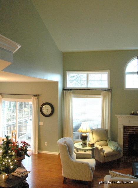
Here’s a shot from the stairs looking down into the vaulted living room – same effect. The ceiling looks like it’s a shade lighter than the wall color. But the result is that the boundary between wall and ceiling is softer and less harsh than if the ceiling were the stark white it was previously.
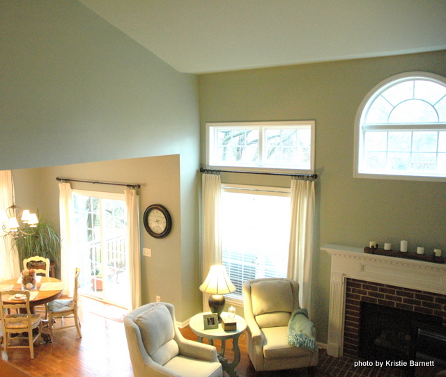
The walls and ceilings were painted Sherwin Williams Austere Gray SW 6184. And there was no need to add white to the ceiling paint to make it lighter – it appears lighter anyway. Now do you believe?








I believe…I believe!
Who knew?! This is such an inspired idea!
thats so cool. showed hubby after explaining… so he says how do they do the lighter colour.. doh lol
that’s hilarious, sophie 🙂
Interesting subject Kristie – and good demo pictures also.
So many designers and painters always do ‘one shade lighter than wall color…(often more than one ‘shade’ lighter”, thinking this will be a good thing. Of course, sticking with colors on the same printed strip often takes one away from the actual color (hue, in this case), also…regardless of lightness or depth. Adding white to wall color? Another mistake, that can Really change the actual color into a different dimension all together.
I always enjoy your informative posts!
Barbara, you are right – many designers suggest using the wall color mixed with 50% or 30% white. In my experience, that can send the color in a whole different direction. And most people don’t understand that the next lighter color on a paint strip is often not actually a true even shade lighter. For example, on a strip of “blue” colors – the darker of the two colors may contain more or less yellow than the lighter one (or vice versa) resulting in one of the colors reading more “blue” and the other reading more “green.” If I am choosing a significantly lighter color for a ceiling, I often skip over to a paint strip one or two pages away from the wall color to find one that truly seems a shade lighter than the one I started with.
I’m in art school, and in my oil painting classes we’ve learned that adding white to a color not only lightens it, but cools and desaturates it as well. Interesting to hear that it works the same way with wall paint.
kelley, thank you for that info. it totally makes sense, based on what i’ve seen when a paint color is mixed with white. 12 years ago, i painted my living room green and did a green+white mix on the ceiling. the ceiling looked cold and sickly. i finally repainted the ceiling white and then had a new and intense love for the green on the walls that I used to think was a mistake when the ceiling was the green+white mix. i won’t make that mistake again – it’s a crapshoot! (you don’t know what you’re gonna get)
Well, I’ve gotta say I didn’t know that. Now, I have 2 questions.
On the 4th and 5th photos , it looks like the 2 rooms are painted different colours? or is this an optical illusion too? I’m assuming it’s just one colour? If not, Is the celing the colour of the wall colour on the left or the right?
I noticed both examples show rooms with abundant natural light, how does this concept work in a limited lighting situation?
Great questions, Jil – but you are going to be surprised at the answers! Ok, Austere Gray is on all the living room walls and ceiling, and Oyster Bay is in the breakfast room/kitchen. We liked the Austere Gray better for the living room, but the Oyster Bay worked better with the kitchen cabinetry and granite. You can see that in the living room, the fireplace wall looks more green and the wall to the left looks more blue – but they are the same color (as is the ceiling, which reads lighter than both). But the breakfast room wall (the one with the clock on it) is Oyster Bay, but it looks like the same color as the living room wall on the left (Austere Gray)! When I use blue-greens or green-blues, the color appears more blue in natural sunlight and more green in artificial lighting (usually in the evening). The wall with windows is going to read darker in natural sunlight, but the wall with the natural light hitting it (the left-hand wall in this case) is going to read more blue.
Very interesting…and I’m curious now about your future post and when you recommend wrapping the room.
I will post better photos of the room I featured when the design is completed!
Well now, isn’t that interesting! Can’t wait to see the completed rooms!
Thanks Kristie, that does make sense and yes, I am surprised! I could have sworn that liv rm had 3 diff. colours in it! Color is fascinating isn’t it? Yes would love to see more pics! thanks for the speedy answer!
Seeing is definitely believing!
You are absolutely right Kristie. Ceilings will appear lighter which is why many people have a hard time picking colors. The default white almost always looks clinical on the ceiling even if it looked good in sample. This is a great photo example of how deceiving color can be!. Your colors are also beautiful as usual my color friend!
Hi, Kristie!
Interesting post, and it certainly made me reexamine what I knew about color. As a specialty painter (what we used to call “faux finisher” before that term started to connote bad sponge painting) and “ad hoc” color consultant, I too usually recommend that my clients wrap a room in the same color (usually, not always). But I often warn them that the ceiling will look a shade darker, even though the overall effect will be perfect for the space! So I went around and stared at all the walls and ceilings in my own house just now. The constant thread – in my house, at least, which is wrapped in Sherwin Williams “Agreeable Gray” – is that where the ceiling butts up against a window wall, the ceiling color appears lighter. I think that’s because a) it’s getting direct light from the windows, and b) the window wall itself appears darker in contrast to the brightly lit windows. But on the other side of the room, if there are no windows, the walls (which still get some window light from across the room) look lighter and the ceiling (which is too far from the windows to benefit) looks darker. The seems to hold true for most of the rooms in my house, but now I’m curious — I’ll be craning my neck and checking out ceilings everywhere! 😀
Thanks for a great post, I love your insights!! Have a great New Year!!
Lisa
Very interesting, Lisa! Color isn’t static, which makes it all the more interesting. Lighting has so much to do with how we perceive color – it also makes a difference if you have some kind of overhead fixture and how your whole lighting scheme is arranged. Thank you for sharing your experience – I know we will all be paying more attention to our ceilings now!
Love this post!!! We are also in the faux finishing business and are not professional color consultants, although we do offer color advice on almost every job. I have often recommended wrapping the room in the same color, because it just “looked right”. Your thoughtful explanation of “why it looks right” really makes so much sense. After reading your blog for several months I feel like I am getting so much useful color information that will help me with our business. Thanks so much for sharing your “color knowledge” with us! Happy New Year Kristie!
Wow! Thanks for sharing. I believe you now. I have one question though. Does crown molding change this? We have triple crown molding , 12ft walls, and tons of natural light in our living room. I’m wondering if that much crown molding lessons this effect?
Rose,
Good question! It does lessen the effect – in fact, I would advise you NOT paint the ceiling the same color if you have crown moulding. I’d go several shades darker for the ceiling. Not just 1 shade lighter – you will barely be able to tell the difference, and color reads lighter on the ceiling! Go 3 shades darker, and not necessarily on the same paint chip (look at chips nearby to see what works best with your lighter wall color).
Would you paint the crown moulding to match the ceiling or a contrasting color? What if the ceiling and the wall are 2 completely different colors?
Ruth,
The crown moulding should be TRIM color, whatever that is – I wouldn’t paint it the wall color or the ceiling color, unless the ceiling color is white.
I’ve just happened upon your blog, when looking for muted paint colors. (We’re re-doing our kitchen.) I have known for a while that, the next time I (or somebody else!) paints, I want the ceiling painted the same color. The problem is that I’m not ready to paint EVERY room, yet — Won’t it look odd if I paint the kitchen ceiling the same color as the kitchen walls, and that’s the only room in the house that doesn’t have an off-white ceiling?!? (I should mention that the kitchen is open-ended into the family room, which has the off-white ceiling and grasscloth-papered walls. (I know; that’s apparently very outdated … but we lived in Africa, and the family room is largely our “African” room, so it looks quite “in keeping” with the decor.)
I haven’t read all the comments here, so I hope I’m not asking about something that’s already been addressed!
I love what you’ve done, from what I see here … and I plan to “stop in” more often! Thank you for any advice you might have for my “dilemma!”
just because you paint one ceiling a color, doesn’t mean you have to paint all of them. the only issue would be where the ceiling adjoins another space. if the kitchen is open to the family room, but is separated by trim or something – it’s still fine to paint the ceiling in the kitchen. but there does need to be trim or a dropped opening (like an arch or something) to separate the ceilings in adjoining rooms. hope that helps!
Tara…I believe EVERYTHING you say! You always back it up, too, so keep inspiring.
Thanks for sharing. I believe you now totaly looking at the posted pictures. However, I am still hestiate to do that for a room in which the wall is Benjamin Moore conventry gray because the room has low ceiling (around 7.5-8ft); I am afraid it will feel lower in height and pressed down. Currently it’s painted white and for some reason it looks yellow with the gray wall and do not look right. Soo I am trying to figure how what to paint it; any suggestions? should I go for the same color of Benjamin Moore Conventry Gray or try a differnt (stronger) white?
Becky,
I think I’d pair it with a slightly grayed white, like Classic Gray. It will still read white. I hate the standard “ceiling whites.” They, too, can have naughty undertones!
Very interesting, so hard to tell with swatches and even the pieces of drywall we’ve gathered.
We are painting most of our home ethereal gray (sw), planning on painting the ceiling the same.
The kids bathroom will be kids stuff (sw) a nice orange, planning to go on all walls. Do I put that on the ceiling too or go with they gray?
Downstairs bathroom will be hazel (sw) and is smaller, paint the ceiling hazel or gray?
Still deciding on master bath but maybe coral (sw) or something along those lines, same question.
Thank you.
I don’t have a SW paint deck in front of me right now, but if it’s a relatively light color and you have no crown moulding, I’d wrap the color around the ceiling, too. If you have crown moulding, I’d do the ceiling a different color than the wall, or the same white as the trim but in flat. Hope that helps!
Oh, and there is molding, which will be in the trim color (white)
A picture of the crown (and walls primed) https://www.dropbox.com/s/240kw1k94zdedmx/photo%203-1b.JPG
Thanks. It’s a gray, I wouldn’t say light but not very dark either. Though the entry will be a bit darker gray.
Our trim is white, so you’d suggest a white ceiling? That would definitely be quite the contrast. We were going with the white trim to keep it fresh, but the gray ceiling to bring some warmth/cozy balance (and I’m not a big fan of white ceilings).
Definitely getting me to rethink a few things.
And kids stuff is bright orange to bring some fun to the jack and Jill bath. Again, you’d suggest white ceilings to march the crown molding?
Hi! I’m a little late to the party here but I’m having a dilemma about how to paint my hallway which has a similar angled vaulted wall over the stairway as the photo you show. My dilemma is that the only natural light in that area is actually a skylight rather than windows. I’m afraid this will make the angled wall (where the skylight is) actually appear darker. It does when I hold up the little swatch…but of course that may just be that one area and as a whole it will still appear to be the same color. Since my house is Cape style the angle wall comes way down to about 5 feet. So, that is why I dont think I want it to appear much darker than the wall and have it appear low. Now I’m just getting complicated here! I’d appreciate your thoughts! My color of choice is Oyster Bar SW7565.
Love this post and love the paint color! This home looks like the same floor plan as mine and I cannot decide what color to paint. I love SW Comfort Gray and Austere Gray. So in this house above did you paint Austere Gray in the foyer, family room, hallways, and kitchen? I too have an orange toned wood I am looking to update but never thought of using a color other than beige in my open concept floor plan. So, is it fine to use a blue/green gray everywhere on a house that has two story foyer and family rooms like this?
Yes, Austere Gray – although some adjoining rooms (office, powder room, bedrooms) are complementing colors. I think Austere Gray is a “super-neutral” and can work throughout open space. Let me know how it comes out!
Thanks! While I like cool colors it still scares me to put austere gray all over the open areas of my house since I’m so used to warm beige or tan. I’m worried the house will feel cold. Did you use warm complementing colors in the other rooms or should I stick with cool colors with austere gray?
Hi Kristie,
I am so glad I stumbled upon your post. I wonder if you can help answer my question. I am doing a new build home and want to use BM Revere Pewter HC-172 on all the walls and ceiling. My trim color would be BM White Dove. I also would like to contrast the formal dining room ceiling with Rockport Gray HC105. There would be crown molding also in white dove in the formal dining room. My ceilings in the formal dining, entry, and living room are 13 feet. The kitchen and all other rooms are 9 feet. Have you seen Revere Pewter on all walls and ceiling before? How about the rockport gray on the ceiling in contrast to revere pewter? Thanks so much for you opinion!
I have the same color painted on my walls and my ceiling and my ceiling looks much darker 🙁 do you know why this might be?
It must an issue with the natural light source/sources in the space. Or perhaps the bucket of ceiling paint was mixed slightly wrong?
Katie I am trying to paint my walls and ceiling the same color but after multiple tries and ensuring correct paint mix with the paint store my ceiling still looks white compared to my walls. Noone has any idea what to do about this. It is not a lighting issue. Any suggestions would be welcomed!!!!
I don’t know who Katie is, but the article explains your experience fairly well. When you paint the same color on a wall or ceiling, it will go lighter on the ceiling due to the difference in the way light (both natural and artificial) hits and the way you visually perceive horizontal and vertical surfaces. And if the paint color is light, the ceiling with the same color will appear even lighter (maybe even almost white).
Thank you so.much for posting and this picture! ❤
You are so welcome, Lou!
No, because I just did my ceiling and walls the same color, and the ceiling looks way darker than the walls. 🙁
Lighter colors have this effect. It also depends on the amount of natural light in the space. What color did you use?