The bulk of what I do is Paint Color Consultations. Something just hit me the other day and made me kinda laugh out loud (sitting by myself like a psycho). As many neutral paint colors that I specify for clients’ homes, I have NEVER used a neutral paint color in my own homes.
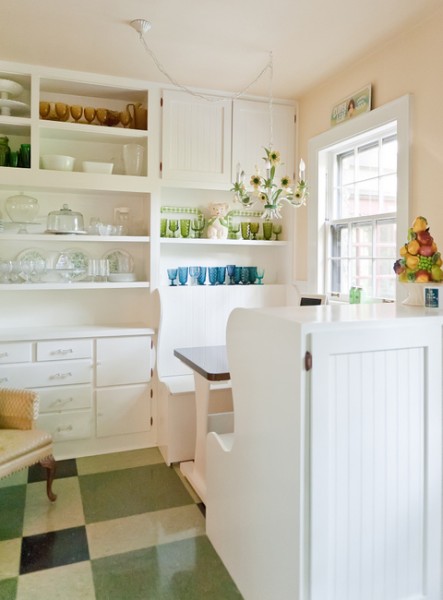
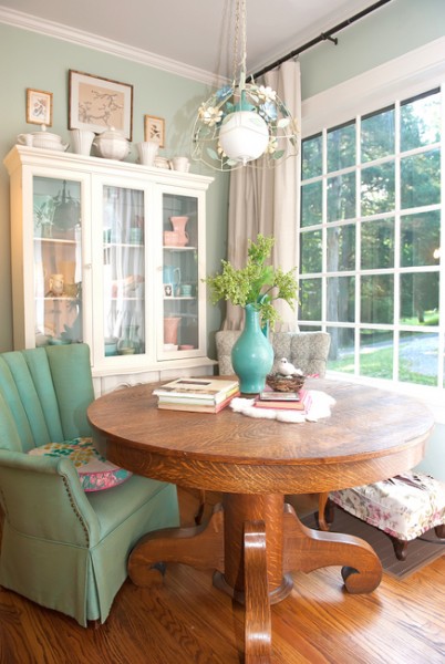
My Breakfast Nook
Ok, I did just paint my 13-year-old’s bedroom Benjamin Moore Gray Owl (she begged me for gray!), but the focal point wall is Benjamin Moore Hawthorne Yellow to liven it up. The paint colors in my home are REAL colors, but I don’t often specify the kind of colors I have in my home to my clients. So I’ve been thinking about that.
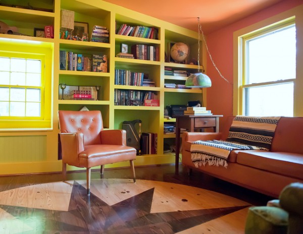
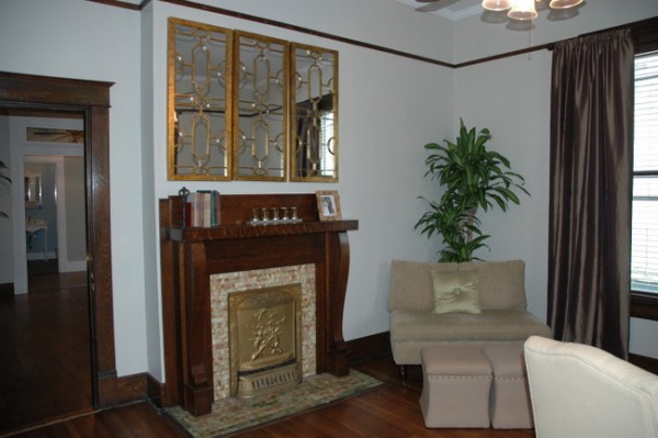
Mr. Man’s Office
I think it may have something to do with the kind of homes where I typically do Paint Color Consultations. Way more often that not, my Color Consultations are done in homes that were built within the last 30-40 years. And there are certain fixed elements that are common to the last 30-40 years. To a great degree, these finishes dictate which paint colors feel “right” in a given space. They often call for a beige- or gray-based neutral or a “dirtier” color.
 New Build That Will Require Neutral Paint Colors
My home was built in 1939. In the period homes I specify paint colors for, I choose cleaner, REAL colors. Because they work with the complexion of the home. They work well with dark wood, white tile and trim, and black accents. What gets tricky is when a 1920’s home has a 1990’s kitchen. Or you add a beige sofa or some kind of natural stone that isn’t marble. That’s like putting brown eyeshadow on a pale blond with blue eyes. And that’s when it’s hard to establish a good color flow throughout the rooms.
Hawthorne Yellow, Waterbury Green, Prescott Green
Homes built in the last 30-40 years tend to have a warmer complexion. The fixed elements are warmer – beige and tan carpeting, gold and orange in the granite countertops, yellow or pink in the tile. Thus the warm neutral paint colors. But what DOESN’T work is applying those neutral paint colors in a historic home. That’s when things feel “wrong.”
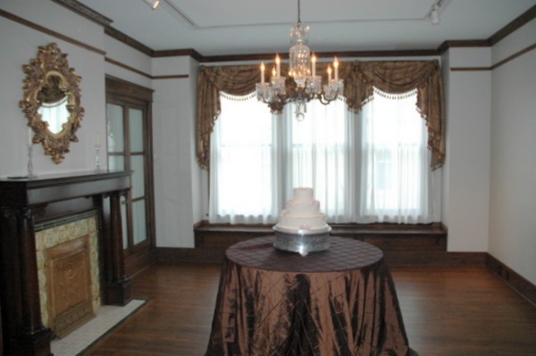 Historic Wedding Venue with Neutral Wall Colors
I recently specified paint colors for a wedding venue set in an historic home from the 1920’s. The venue had been painted out in all neutral colors in an effort to provide a “neutral” background for whatever the brides’ color scheme might be. But the result felt wrong, in my professional opinion. It needs vivid, cleaner, REAL colors.
Historic Home Before Color Consultation
I specified them – we’ll see if the owner follows through. I’m really hoping she does. Because when you ignore the natural complexion of a home, it only results in a finished product that feels wrong.
The wall color in the above photo is the main paint color in my house. This paint color would NEVER work with a granite countertop or beige carpeting. So, what’s the complexion of your home? Are you fighting it, or embracing it?


Fantastic post Kristie! So true about a home’s natural complextion – great analogy!
I could not agree with you more. I have a 1960’s brick rancher and there is just a certain ‘vibe’ that is dictated by the ‘must stay’ elements of my home. You have a wonderful outlook on your profession and I truly enjoy reading your blog.
Thanks, Christine – sometimes I wonder if my ramblings are making any sense!
Hi Kristie,
Interesting article. I really like your kitchen and I really like your color choice, in fact, I used a quite similar color in my kitchen and I have two different kinds of granite; My kitchen is part of a great room area, lots of windows and light and it works in this situation. I get compliments all the time. I have used this color for clients in similar situations as well. There are photos of my home on my site that you can look at if interested. The one granite is a baltic brown and the other is black galaxy (black with copper flecks. I also have two cabinet woods, cherry and maple!
Charisse,
It looks like your kitchen walls are a grayed-green, is that right? It’s just a little dirty – not too clean – which is why it works so nicely with your cabinets. Very pretty!
Kristie, Yes, it is a grayed green, but it is a fascinating color in and by itself. I live in the woods and depending on the season and the natural or artificial light in the rooms, it sometimes appears much more blue, other times a silver green. I love this color a lot, and color matched it to the color in the pillows that belong to my sofas that I am using in this room. I am tired of the sofas, but not the wall color! lol. This color works so well with the black accents I love.
Yes! Greens tend to be very metameristic – they read differently in different lighting, on different walls, with different surrounding colors. I think that’s what keeps them interesting, and keeps you from tiring of them too quickly!
I totally agree with your post! We had a 1955 home that I struggled with for quite awhile trying to find ways to warm it up (to go with the wood trim color) and yet keep it light (I love light rooms!) Finally settled on a very soft yellow that worked and warm off whites. I think a visitor to our home said it best “Your house just glows!”
I also agree with you about the 1920’s home pictured. The neutrals just aren’t giving it a nice vibe that works with it. I always say when I see an historic home (and I’m sort of an historic home afficiando so I’m always looking at historic homes) “Hmmm….what color are you telling me to use?” 😉 Because the home will have to work with any wedding colors used, I’m thinking a shade of warm, but not too saturated/dark, green to go with the color of the trim. You didn’t say what color you specified.Can’t wait to see if your client does the switch. Hope you can post pics!
By the way, the complexion in our new house is pale gray in the main living area that opens to a clean white kitchen. We have windows e.v.e.r.y.w.h.e.r.e so the complexion is light-light-light! We love it! Apparently at one point the rooms were all painted dark browns and deep reds. I cannot imagine this house in dark colors. It just begs for light. Thankfully it was repainted before it was put on the market because the current colors are pretty much what we would have chosen. That was a big bonus! 🙂
I love the color you used in your home. My home is actually only 10 years old and I used several of the same colors you did. The reason it works….I guess…is we ripped out the carpeting installed wide plank flooring lots of woodwork and beadboard…still working on that and used marble and a grey granite that has the same shades as marble. We moved here after living in a historical home. When we first bought that home I painted every room downstairs white until I had a feel for the place during all the seasons. You’re right! The safe color had to go fast. I notice in magazines it works but, for me, in real life it was dreadful. My daughter has a 1930 house. She wanted granite counters and her husband vetoed it. He said it would be putting lipstick on a pig. All the imperfections that now seem like character would look awful. He was absolutely right. By the way I love your charming home.
Thank you for sharing, Karhy. You obviously have a good innate understanding of what colors work with what finishes – it sounds like you chose finishes that work much better with “real” paint color. Your son-in-law is a smart dude!! Most men would be all over that granite thing!
Hmm,interesting. But I must say I love the neutral wedding venue. Light neutrals with wood trim looks great to me.
Elizabeth,
Light neutrals tend to wash out woodtones. More vivid colors can make the wood richer and literally come alive.
I think you have hit the nail on the head, for me anyway. I live in a new construction house. Shades of taupe throughout with dark wood floors and light trim. I love color and chose a bright turquoise and green area rug for the main room. Just couldn’t figure out why it didn’t go. Now I know why it’s just not quite right. Luckily this isn’t my forever house (even though I’m 63!). Thanks for an illuminating article. I enjoy your blog.
Great insightful post. So what would you recommend for someone who loves historical homes, and also wants all white walls? Painted trim? I feel like there are a lot of historic&neutral on my pinterest board…
http://pinterest.com/christenelaine/home-style/
Christen,
You could do colored trim – or even a colored ceiling paired with white walls and white trim!
ooh, great idea:)
Kristi, You are absolutely right about that historic wedding venue – it looks drab and depressing with the colors they have now. I certainly wouldn’t want to have my wedding reception there the way it is. I hope they take your advice. BTW, another great article!
Kristie, this makes so much sense! I just attended a free design seminar (am on the Gulf Coast) and the presenter talked about “are you warm or cool?” She showed photos of very similar great rooms and one was painted gray with white slip covered furniture, black and white artwork, white porcelain accessories, black wrought iron chandelier. Then she showed pictures of a similarly built space painted in greige with linen/khaki furniture. There was muted color in the room in the rugs, art and throw pillows. I was stumped because I LOVED them both – but my own home is the exact kind of “warm” she showed and I think I might fret about keeping all that white clean. Maybe you could do a post about how people’s personalities come ino play in similar spaces!
Such a great post – and definitely making me think about my imminent plan to paint most walls in my 1900 cottage a light gray. As you said – the trouble is that it’s been renovated so it has a bit of the new millenium running through it as well. I need to noodle on it some more. Maybe I’ll stick with the gray but add some cleaner colors as accents (art, pillow, etc) throughout. Then again, that might make the gray walls look yucky. Oy this stuff makes my head spin! Anyway – thanks for such great posts – I love learning about this stuff!
Oh, This is such a fascinating subject Kristie, and in your area I’ll bet there is the gamut of home types!
You are so correct about Historic homes and real color. I think of the homes built in the 20’s and how classic and enduring they always feel. Wonder if there will ever be a trend back to that kind of enduring interior design. I believe it would be refreshing.
My newer (5yr old) home was built intentionally with historic window profiles and coffering in the main space. We started with taupe walls, linen window trim and dark wood windows. It looked ok, but we needed more light. I had the walls painted in BM Linen (Aura) to blend with the trim. Shazam! What a wonderful difference. My ceiling planks (between the linen colored coffers) are a gray/green stain with a copper glaze. (As you mentioned above–it works with the white walls.)
Now the ceiling is the star, not all the lines of the trim.
I cannot wait to see a transformation of that wedding venue. It looks so sad now. They need more appropriately traditional furniture also to complete the right look. Gosh, I would think Nashville consignment shops would be full of traditional furniture….maybe you can take them shopping @ Meridian too!
O–I’m bad! 🙂
Kristi-
I have a house from about the same era as yours. Is your kitchen floor original? I have faux wood laminate tiles and am looking for a change.
Thanks. I love your work!
No, it’s not! I designed that pattern out of 3 colors of VCT (vinyl composite tile) to get an old-school look at a great price. It’s incredibly durable and so much easier on the legs than ceramic tile. The amazing thing is: when we were doing some rehab on those built-ins (and we added the breakfast nook thing), I found the original flooring beneath and it was the lighter green and black lino tiles. Dead-on to what we chose! I love that 🙂
I love color and am very partial to blues in all hues. We have recently moved into a house built in 1972, in California. It has a wood exterior and the interior doors are white and some are plantation style. We will be remodeling soon and gutting the kitchen and opening it up to the dining living and foyer areas. The cabinets will be white shaker. The granite off white and creamy with steaks of blue grey and small splashes of black. We will have wood floors in a walnut (non reddish) stain. The living room ceiling is peaked with and has white beams. We want to paint all the walls a blue, but what blue, greyed, greened, light or dark. Do you have any color suggestions for me? And, do you have any warnings? Is there a blue that I should avoid, so as not to have our space look like it belongs in the bedroom? Also, what would your accent color be for drapes/furniture. Any suggestions would be appreciated.
Susan,
Your house sounds beautiful! Blue sounds like a good choice, but here are my warnings: use a light to mid-tone blue (the third or fourth down on the paint swatch) and one that is heavily dosed with gray. If you don’t, you could have a baby blue nursery there. Also, just a smidge of green in your blue will keep it from looking powder or colonial blue (if you know what I mean). I can’t recommend specific colors, as I’d need to see all the finishes you are working with. I do offer online color consultations, if you need help with the whole color palette of your home: https://thedecorologist.com/services/paint-color-selection-interior-design-decorating
Thank you, Kristie. I hope that my house will be beautiful. You were very helpful with your blue color suggestions. Choosing to paint the walls any color but white, is a big step for me.
Interesting take on this Kristie. I never thought of color with age of the home but it’s true. The walls have to speak to the fixed elements or things look and feel “off”.
Linda, although it can seem it’s about the age of the home (and maybe it is, to some degree), but I think it’s more about those pesky fixed elements and when they were installed. They can really dictate color direction, which I know you certainly can relate to!
I subscribe to several decorating blogs but yours, honest to goodness, is the only one I read EVERY SINGLE TIME IT COMES OUT. Looking forward to that book you keep talking about 😉 This entry was as informative as all the rest and I thank you for that. However, I am stuck on a comment you made just as a metaphor: Why oh why shouldn’t a fair-skinned, blue eyed blonde wear brown eye shadow? So I know this has nothing to do with home color theory but I need to know! When I bother with eye shadow, it’s my go-to! Yikes!
The timing of this post is incredible!! My house was built in 1989 by a person fanatical about the 1880s. He selected all the trim, colors, etc. He found wallpaper that was a reproduction of the period. I’ve moved in and use similar colors but not period colors (mine is a Cape Cod house – I used the colors from Sherwin William’s Coastal Cool collection).
But now we’re planning to redo the kitchen. Eek, you’ve scared me. Will my 2013 kitchen stand out against my 1880s house? Suggestions? I’m open to advice!!
Libby –
Ok, my advice for your kitchen? White subway tile, white cabinetry, black accents, iron fixtures, dark hardwood flooring or VCT flooring in period-appropriate colors, marble countertops or white/black quartz or soapstone. Stay away from gold/brown granite!
Fantastic! That’s exactly what I was thinking! I’m not a fan of granite anyway…. Thanks!!
People and some designers, need to have this tattooed onto their forehead – such great advice, absolutely brilliant!
ahh, thank you dear jil!
I’m with you, Kristie! A neutral on the walls where I live would be an exception, rather than the rule. My idea of neutral is a light yellow-green or a mid-tone green-blue :). I am more in the gray than the beige camp when it comes to neutrals, but there’s a time and place for just about everything. Fun post 😉
Kristi,
It was only recently that I found your blog and have found it interesting as well as educational. The articles are an easy read filled with enciteful details. I find myself looking forward to each new addition. Thank you for sharing your expertise with others.
Joan,
Thank you for your comment, Joan! Glad to have you here 🙂
You should do a fan’s post, like ask people who have been inspired by your blog to send a photo and see what pops up. I have been making those christmas decorations from books I saw on this website and I get great compliments about it every year 🙂
Great way of looking at dirty vs. clean colours! Love it, Maria
Hi again, Kristie, I talked so much of that wedding venue, I neglected to say that I love your home!
Wish I could sit & talk with you in that wonderful breakfast booth….
Your children are blessed!
Paula.
This was very insightful. I’m having a home built. The house has an open floor plan. Upon entering the house from he entry foyer you can actually see the open dinning room, open sitting room and the open family room. The family room is also open to the kitchen. We have a triple window in the dinning room, not window in the sitting room and 4 large floor to ceiling windows in the family room. We have chosen 5″ hand scraped hickory plank flooring through out with tan tile in the kitchen and a golden color granite counter. When choosing paint colors I tend to go for the same color throughout the house and gravitate towards a light tan color that has more yellow then brown and green. Do you think that will work for us here too? Thanks
Pam, sounds like a tan-based neutral with a slightly yellow undertone should work with what you describe, but you might need one with a drop of green so that your wood contrasts a bit better with the wall color. Greens and blues as a backdrop makes wood appear richer. Good luck with your new home!
Yes, yes, yes! I agree the wood tones work with the darker blues and greens. So much better with that style and date of home. Embrace the stained woddwork and work with it! Have a good weekend Kristie!
I couldn’t believe the colors I saw in “Mr. Man’s Office”!! Just yesterday I asked my son what colors he would like to paint his bedroom–and these are the exact colors he chose!! I didn’t think it would work; but it looks good together! The only problem is …his bedroom is in the basement. Not sure if it would look quite as good.
You know, it’s not a bad idea to paint “dark” colors in a basement, so long as you have lots of good artificial light there. Light colors in dark rooms are kinda blah anyway!
Hi Kristie! My husband and I just purchased a 1931 Tudor that has horrible metallic blue paint in the living room and wallpaper all thru out the house that is suppost to look like a stone wall. This lady even wallpapered the dishwasher! I stumbled on your site and fell in love with the colors in your home. I have picked out BM antique jade as a starting point and I think it is alot like your prescott green. We haven’t moved into our new home yet and I would like to strip all that wallpaper off before we do so the complexion will be more visable. As it is now I feel like Alice in Wonderland on LSD! Do you have any Tudor’s in your portfolio? I would love to see your work on this style.