Some rooms are just tricky. My daughter’s bedroom was converted from an attic space many decades ago, so the ceilings are slanted down both sides and the only light enters through a small window on the east end wall. There’s no true closet in this room, just a small storage area accessed through a mini-door. My girls have always referred to it as the “monster closet” (you know, because of the monsters in there!). For her 13th birthday, my daughter asked for a more grown-up room – no pink and no vintage.
This room was often dark and always a bit crowded before, I have found that there are at least five things that can affect how you perceive the size of an interior space: lighting (natural and/or artificial), color, color placement, ceiling height, and furniture arrangement. I considered all of those things when redesigning this space. Popping in a new window dormer on the side wall would have been a great solution, but that was NOT in the budget. Here’s the room before:
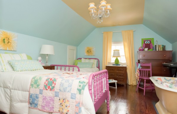
Daughter’s Bedroom: Little Girl Version, Melanie G Photography
I know the room looks light and bright in the photo above, but that was shot by a professional photographer. You can see the window is quite small, so believe me when I tell you the room was typically quite dark. The yellow previously on the ceiling only made the long, narrow room feel more long and narrow. Hanging the window panels well above the window helped “enlarge” the small window to some extent. In this makeover, I had Mr. Man install the window treatments waaayyyy outside the windows, as you’ll see below where he mounted the brackets. Just shocking, no?
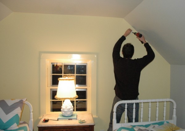
hanging curtains way outside the window isn’t as crazy as it initially appears . . .
The new colors and color placement were chosen to 1) appeal to my daughter’s maturing taste, 2) make the room feel larger and wider, and 3) help bring more light into the space. The only color that can really light up a dark room is yellow – and it’s notorious for being a difficult color to get just right. It can easily go too watery, lemony, or flourescent. I decided to use Benjamin Moore’s Hawthorne Yellow HC-1, which has proven to be a good go-to yellow for darker spaces. I decided to put the yellow on the end wall, as well as all the trim in the room, while the rest of the paint color in the room would be Benjamin Moore’s Gray Owl OC-52. This would create a focal wall and a symmetrial base on which to place the twin beds. You may remember the Inspiration Board I created for the room. And here’s the real-life result:
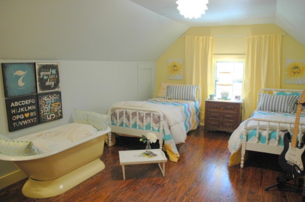
Teen Girl’s Bedroom After
Notice the placement of paint color – gray wraps the wall and ceilings (eggshell), with yellow on the end window wall (eggshell) and most of the trim (gloss). The “monster closet” is painted the same as the wall color. Why? Becaused I wanted it to fade into the wall so it wouldn’t be as distracting.
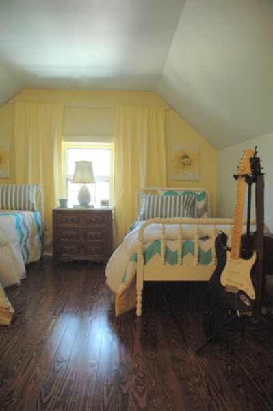
Painting the window trim in glossy yellow reflects and maximizes the natural light coming through. The window panels match the walls to avoid choppiness and expand the width of that short wall. Hanging them up and out really gives the window a feeling of importance and allows every bit of light to come unhindered into the room. They’re black-out panels, so they block all light when closed at night.
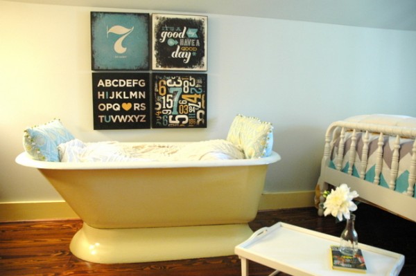
The tub that was original to the upstairs of our home was painted in a gloss yellow like the trim. My daughter is the only one of her friends that has their own “reading tub” in her room, and she’s always loved that. The graphic art above it is from Target.
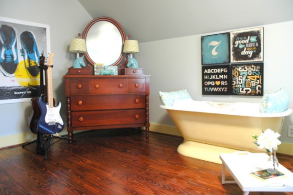
The antique dressers remain unpainted, but are enlivened by fresh accessories. The Happy, TX graphic poster was created by artist Marcus Melton, a friend of our family. That piece was really the basis for the color scheme in the room.
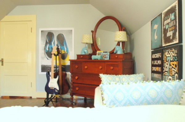
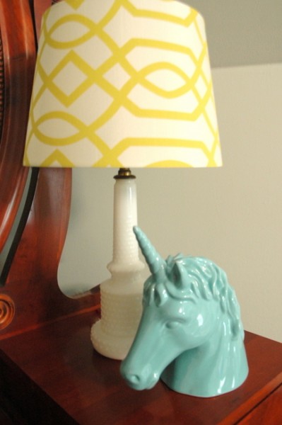
Most of the new accessories are from Target, such as the patterned lampshades and aqua unicorn heads.
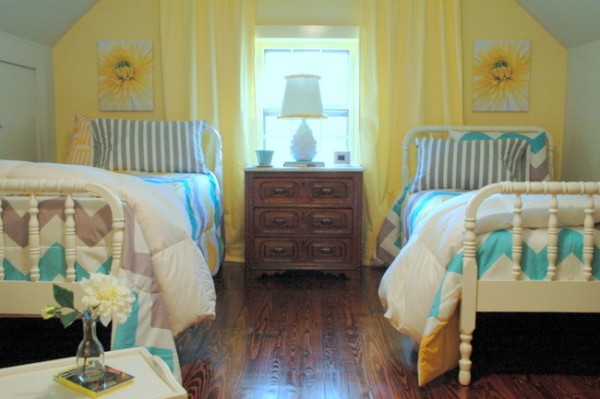
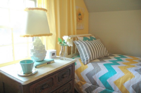
The chevron bedding in gray, yellow, aqua, and white is also from Target.
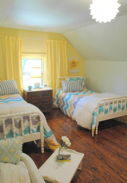
The art above the beds are from IKEA, and the Possini Euro light fixture is from LampsPlus (although there is a similar one at IKEA). The new overhead lighting provides much more light than the previous one that sported lampshades on its chandelier bulbs.
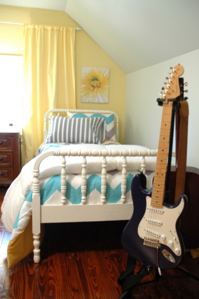
I painted the antique spool beds hot pink a few years ago, but now they’re coated in Benjamin Moore’s White Dove. I actually won the wall paint as part of my prize package in the recent 2013 Color Trends Design Contest sponsored by Benjamin Moore, Olioboard, and Tobi Fairley.
Here’s what we did in this room:
Painted walls, ceiling, trim
Painted beds, lampbase, vintage tub
Rearranged furniture layout
Rehung window treatments
New bedding, hanging light fixture, art, lampshades, and accessories
And here’s what we got to show for it:
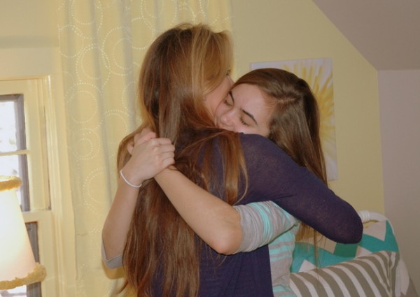
One Happy 13-Year-Old Girl: PRICELESS
There’s nothing like a dramatic “big reveal.” She really appreciate that I heard her – heard how she wanted her room to look and feel, and then made it happen. Which is what I strive to do with all my clients.

And she’s the most important client I have ever had, naturally.
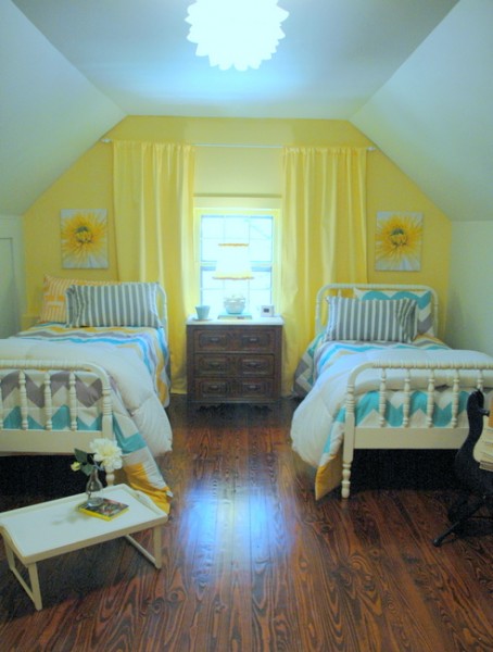
After being banned from even going in her bedroom for five days, now she won’t hardly come out of it! She keeps asking me how I made it look so much bigger. Let’s just hope she will be inspired to keep it clean . . .
Make sure to subscribe to my emails for more great before-and-afters and insider design tricks. If you want to learn how to choose just the right paint colors, check out my new Online Color Workshop today!






It looks so great, Kristie! I would have absolutely loved a room like that when I was younger -still would, actually- and I can certainly believe that your daughter is spending all her time in there! What a wonderful birthday present! ~Melissa
Thank you so much, Melissa!
Beautiful job, love the reading tub!
Aww! Beautiful Room! A happy 13 year old girl is a very good thing! That hug pic brought a tear, daggit!
Love it! What a perfect transformation. It does look so much bigger! I'm sure it is hard to get her to leave it!
Great job, Kristie! I love the reading tub.
Love it! Can't wait to show my daughter, who is 12 1/2. I have told her (and she keeps repeating to friends), we will redo her room for her 13th birthday in November. I've already got 2 accessories from Home Goods waiting in the garage! My daughter has a similar room, slanted ceilings, former attic space, etc., and it's gonna be tricky. Thanks for sharing! The picture of y'all hugging gave me chills!!!!
I love that you created such a great look on a budget! Just proves you don't have to spend a lot to get great design. I love the fact that you use what is readily available.
Wow, what a difference the furniture placement makes. Love the reading tub and the ceiling and Walls painted the same colour.
Just one question Kristie. You have placed a large lamp with shade in front of the window. Does this not block out more light? Or does the profile of the lamp against the light make such an impact that the light lost is less important?
Thanks
Anne
Anne – Unless I hung lighting from the ceiling by the bedsides, it was my best option. It may block a little, but I like it centered under the window. Good question!
So beautiful! The "hug" picture made me cry. Sweet girl, precious family.
Beautiful! Love everything about it…the paint colors, the layout, and especially the glossy trim around the window. Question: did you consider painting the nightstand? I could see it being a med gray like in the bedding..or a tad darker. Just curious 🙂 I appreciate reading about the thought and decision process as there are so many decisions along the way. Your blog is one of my all time favorites. 🙂 Your emails of the only ones I will open read beginning to end every single time, no matter what.
Thank you so much, Patricia, for your kind comments and for reading the blog! I didn’t consider painting the antique pieces – although they would look great painted, I decided to mix painted with wood pieces in case I want to use that piece in another room of my home someday. I’m known to move things around often . . . 😉
Love all the shiny floor space, which also expands the room. Very nice! (And plenty of room for a jam session.;) )
Love it, love her mom and LOVE that girl!!!! Colors just jump off the screen!!! We MUST get the girls together!!!! Your blog is such an inspiration!!! Thanks for sharing your indredible talents!
Thanks Kristie! I didnt even think about moving it around, makes total sense. 🙂 You are such an inspiration and I love your unique style. Thanks for giving us fresh and different designs. <3.
Her room looks great!! I know she is thrilled with it!
Lauren
Mr. Man here…
Thanks for all the hard work you put into this room for A! Love is shown through the way we share our talents with and on each other. We are all truly loved by you!
Also, cheers to the touch up on the "bald spot" as well 🙂
Love ya!
How could you tell?? You can't see yourself from the back! 😉 love u xoxo
Oh, it's SO pretty!
http://www.ndoorsonline.net/nancys-blog.html
What a wonderful birthday present Mom! Such pretty colors and looks like a grown up room. Just beautiful!!
Is that Mr. Man? 🙂
Thanks, Kelly! And yes, that’s Mr. Man himself 🙂
It looks amazing. I love what you do with painted furniture. I'm wondering if you could direct me toward a good resource (or if you could describe your process) for painting wooden furniture. Does it need to be sanded and primed first? I have had trouble getting a smooth finish and have also had trouble with the paint remaining a bit sticky.
Thanks!
Love, love, love the makeover! Looks amazing!!! I know Marcus from my college days…grew up in Canyon, TX so I LOVE the Happy, TX artwork…just 20 minutes or so from my parents' old house!
What a beautiful room! My sister and I shared an "attic" room with the slanted ceilings and while it looked great (thanks, Mom), it never looked this good. She's a very lucky little girl! Ooops, young lady.
Kristie, love your daughters room, what I love about you as a designer is your not too fancy ( I wanted to say high faluting, but wasnt sure how to spell it correctly) and you don't over design-haha You go to Target, Ikea,Homegoods (my personal favorite) and create something beautiful with budget friendly materials-the one designer I had come over years ago, wanted me to buy $500 lamps,$1,000 rugs, $80 a roll wallpaper-we live in a really nice house and its my fault for not telling her my budget-but I will be honest-she intimidated the heck out of me-as much as I love furniture and design, I love spending more money on traveling and helping my kids out (just bought a new washer and dryer for my sons condo last week-it makes me happy ,even if he is in his 20's and could make payments on them) thats why I enjoy your blog so much, it gives loads of inspiration to everyone- especially me- so thanx alot!!!
You did a wonderful job and I love the reading tub.
Priceless and so memorable is right. It's beautiful and that photo of you and your daughter says it all.
Hi Kristie,
I had to laugh when you said your daughter said "no vintage". I also have a 13 year old daughter who has been BEGGING me for 3 years to make over her room, and she has also said no to vintage. Problem is, she keeps changing the wall color choice. It's currently light pink and VERY shabby chic/vintagy. She has gone from aqua, to bright pink to a medium purple and round and round and round. Now it is lavendar (I am going to suggest the beautiful color you used in your bedroom). And she wants black and white damask bedding from Target. But she can't part with some of her shabby accessories, like the pink antique victorian drapery tie backs, robin's egg blue shelving from Marshall's, ivory cast iron birds, and some of the other things she "borrowed" from other areas of the house (She's considering interior design as a career, just like I did at her age). I promised her we would paint next month for her 14th birthday. In the meantime I am trying to figure out a plan to make it all work together…. Wish me luck!
Good luck, Mary! Sounds like you’re gonna need it 😉
PS: I do love your daughter's room – showing it to my daughter tonight.
A reading tub. Too cute! I would have never thought to use a tub for that reason. I love the dark wood floor in that room. Very good job. You really did brighten the room up quite a bit. She looks very happy!
Thanks,
Lynn
Kristie, This is so inspiring! I love the relationship you have with your daughter! And…Mr. Man is the HERO! I am going to forward this to my (36 yr old) daughter! The drapery trick works every time, right? I too want a tub I can curl up in—you're going to start a trend there! Love the beds painted white…I would add just one thing—one of those sheep skin rugs from Costco between the beds 🙂 They feel sooo soft on bare feet. Way to go— to keep your daughter & her friends at YOUR house. Happy celebrating that Birthday Week! …Paula.
ooh, i love the idea of a sheepskin between the beds, paula! THANK YOU!
What a beautiful update for a teen. I love the pic with her and your husband.
Wow, this is so sweet! The room looks much, much bigger. What a cool mom you are.
I never like accent walls, never, ever. you have however, changed my mind with the gorgeous job you did for your daughter. the hawthorne looks gorgeous and the same color curtains look so fab. the illusion with color is of a more dramatic space and a very grown up young woman.
Great job! Lots of Love in the planning!
Lynne,
You gotta know I am NOT an accent wall kinda girl!!! I think they are so seldom used appropriately. In this case, I think the accent wall had a purpose and it worked really well. Thank you for your compliment – it means a lot coming from a color queen like you! 🙂
Great job, Kristie!
The best thing is you made happy your girl!
Congratulations!
I, like everyone else, love the reading tub! I’d like to throw a bunch of pillows in our tub, but then Mike would turn the shower on them in the morning and that would be the end of THAT. You have such a knack of making a “VOILA” out of a “ho-hum” with what seems to be so little effort!
We have two similar upstairs rooms, but I am guessing ours are smaller rooms or shorter ceilings. Either way, do you think it would be too much to do the yellow on all walls and ceiling, but maybe a shade lighter? My girls weren’t bedazzled by the combination of yellow/grey, despite me telling the about it brightening the room. Possibly just the sound of “grey” to 10 and 12 year old girls!
Actually, gray would not have been my first choice in this space – but that’s what my daughter insisted on. I think yellow throughout would have been a better choice because of the lack of natural light, so I’d go for it if your girls like it!
Wow it looks great. I have a very dark living room, although it has a bay window it is not east or west facing so it doesn’t get much light – trying to brighten up that room is the bain of my existence.
You gotta love IKEA for some cute decorations! I absolutely love the wood flooring in the bedroom. Like the reading tub as well. Very nice job Kristie!