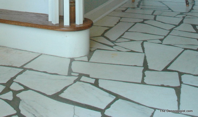
Here in Nashville, there are many houses that were built in the 1960s and 1970s. I see a lot of entry floors from that era that look exactly like this:
Existing Entry Floor
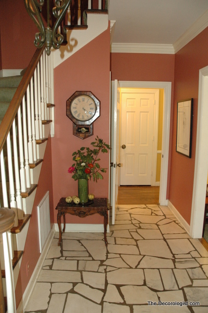
This client had grown weary of her dark, dated entry but wasn’t sure she wanted to completely redo the floor.
Entry Before
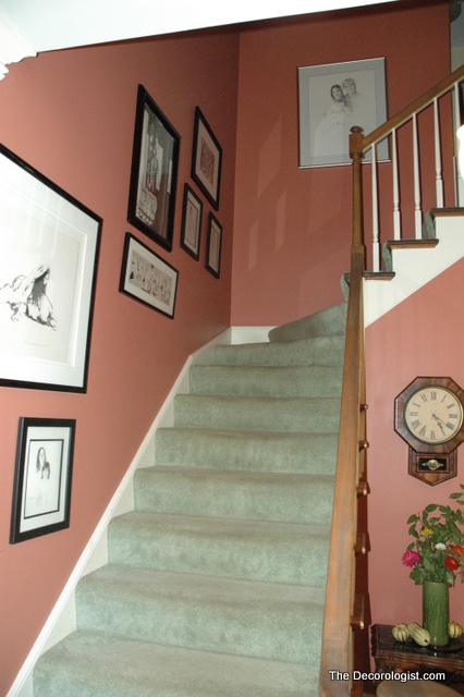
I knew I could work with this floor (and jackhammering it up would be NO FUN). But the green carpet on the stairs had to go.
Stairwell Before
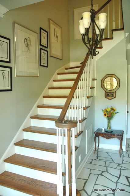
I recommended removing the carpet to reveal the hardwood beneath and painting an airy gray-blue Benjamin Moore paint color to lighten the space and to complement the existing entry flooring.
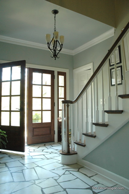
Fresh, Updated Entry
I think the floor looks fabulous now – I wouldn’t remove it if I could!
Fab Floors
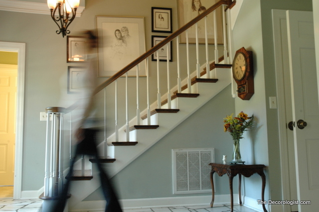
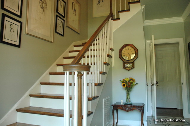
I rearranged the art grouping that climbs the wall going up the stairs. Those black and white sketches are perfect for this space and very significant to the family who lives here.
Updated Stairwell and Entry Hall
Isn’t it amazing what a difference the right choice of paint color can make?
Entry by The Decorologist
Some designers encourage their clients to rip out all the existing finishes and furnishings and start all over. Here we were able to use the existing entry floor, art, and accessories and still managed to make a huge positive change by uncovering the beauty beneath that carpet and choosing the right paint color. Sometimes, wisdom is knowing what to change and what NOT to change.
If you’re ready for a positive change in your homelife, contact The Decorologist for your Decoration Consultation today!







I’ll admit when I saw the first picture I sheepishly thought, “I actually kinda LIKE that floor.” So glad you kept it – it looks awesome!
It’s all about context, right? My client disliked it to the point that she had a big rug covering up as much of it as possible the first time I saw her house. The previous wall color made the flooring scream a little, while the new color scheme makes the floor quieten down a bit and appear more sophisticated.
Kristie, I too love that floor. What you did with that entry is amazing. The new wall colour is perfect for that space. Just beautiful.
Like everyone else, I liked the floor, too. But, now it’s absolutely gorgeous!
I love the floor too, and it looks SO much better after your makeover!
Kristie!
I am so impressed with your post….what a transformation!! It’s amazing what the RIGHT design advice can do for a space. Keep them coming!!
Love it! What a great before and after! I must say though I have never seen a floor that looks anything like that…must be a Southern thing.
Smart! I think your choices where right on. Why waste money when you can make it work?
Warmly, Michelle
Bravo! Your client must think you “walk on water”! Great job!
So true, Kristie! Sometimes we just have to take the time to *see* something’s potential. So often we completely dismiss something that seems to be the problem but really isn’t. The after looks amazing. Great job. I’m sure your clients are thrilled.
The floor, which I had never seen before (that type of tile), does look a lot better with the changes.
That was a beautiful transformation. Visiting from MelDreamOften… liked ya on facebook : )
yikes! i panicked when i thought your were going to tear out that floor—i love it! but, phew, you saved the floor and their foyer! well done!
amy (visiting from somewhat simple)
Sorry Kristie – I’m working hard to catch up on my favorite blogs, and yours is one of them! So here I am almost a week later with a comment on this fabulous transformation. I LOVE what you did with this space, and the colours you chose are perfect. The stairs are stunning – good call. Awesome work… again 🙂
xo Sheila
Love love love! What a gorgeous color… and those STAIRS! Sometimes it is best to just go with the flow, eh?
Hi Kristie, It’s my pleasure to feature you again in my “FAB FRIDAY FAVORITES” post tonight. Thanks so much for linking up to my party – I know my readers love to see what you’ve been up to!
Warmly, Michelle
Wow! So fresh and bright, I love it and I am glad you didn’t change the floor. I like it!
This is my first time I posted a comment on your blog. I came across your blog when I was looking for ship chandelier (some say its so 2008, I know I know ) but me and my husband loved it so I decided to browse some that still available, too bad beachdwelling.com closed down already. Anyways, I like your simplicity approach and the finished result doesnt scream ” I hire a decorator” . It will not make people nervous because it so perfect and spotless. No ! It just still the same room but BETTER, which I love. Thank you for the blog. This is actually one blog that I am eager to read every morning. Keep a good job Kristie !
Btw, about your post, the 1st step is to choose color, so after decide on wall color is it possible to decide the color of furniture before you actually buy and have arrangement for them? thanks a lot.
BRILLIANT!!!!
Wow, that looks really fantastic! Great job. As someone who loves vintage things, I really appreciate your not only finding a way to keep that original floor, but to make it look really fab. Wonderful!
My mother had the grout in her entry painted a medium beige. It lighten up the whole entry and now looks updated and fabulous!