Often your architecture will give you clues to the right furniture placement if you will only listen. I’m going to tell you about a simple decision we made in Allison’s kitchen dining area that made a big difference visually and functionally.
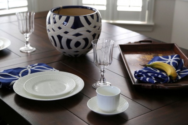
dining table from World Market
Here’s a shot of the dining area pre-makeover. The architecture to listen to include a bay window bumpout, the tray ceiling shape, and the hanging light fixture. Previously, Allison had a round table here. It was really too small for her family, and the shape wasn’t right for the space. The architecture called for a rectangular or oval dining table. My favorite dining tables are pedestal or trestle tables – they afford more space for pulling in extra chairs when needed, and you won’t bump into those pesky legs at four corners.
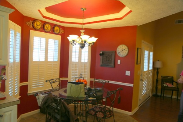
Allison’s dining area before
We initially placed the table in the bay window nook the way you see below. While this arrangement follows the shape of the bay window bumpout, it was kinda difficult to squeeze in behind the table to the back chairs and impossible to put a chair on both ends.
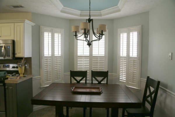
first dining arrangement
Then I looked up and noticed that the trey ceiling cut out doesn’t run in the same direction of the bay window – rather than being parallel like I’d expect, they run perpendicular to each other.
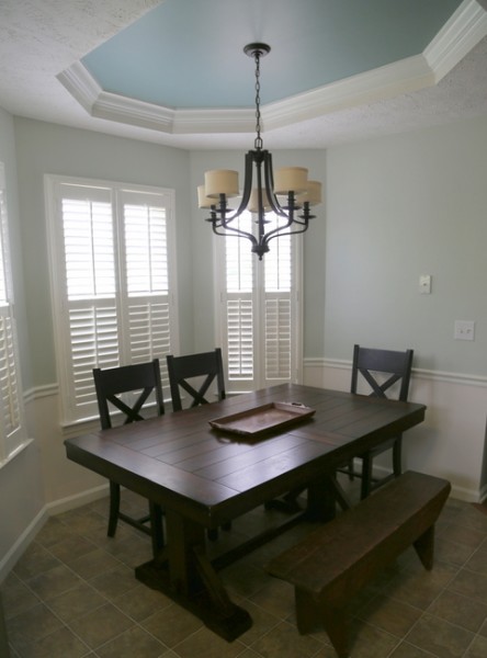
first dining area arrangement
So I decided to listen to the tray ceiling and position the table in a way that mirrors the tray above, like this:
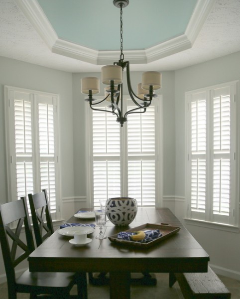
new breakfast room arrangement
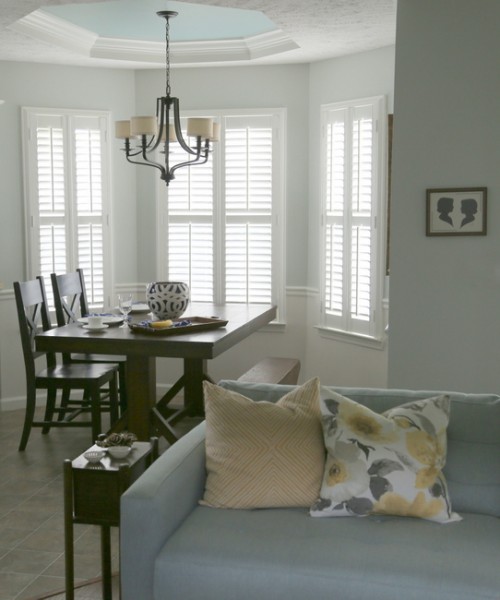
I butted the trestle table right up to the window – there’s much more room on either side of the table, and the additional chair can sit at the open end.
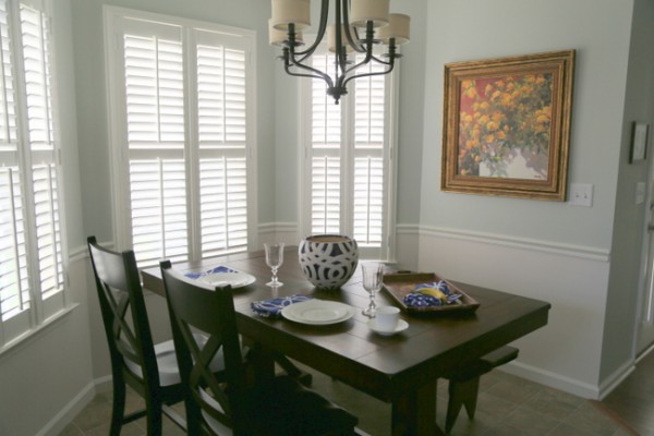
dining nook after
Here’s the bonus – there are two additional leaves for this table. When company comes, Allison can extend the table into the open space in the kitchen and accommodate 8-10 guests.
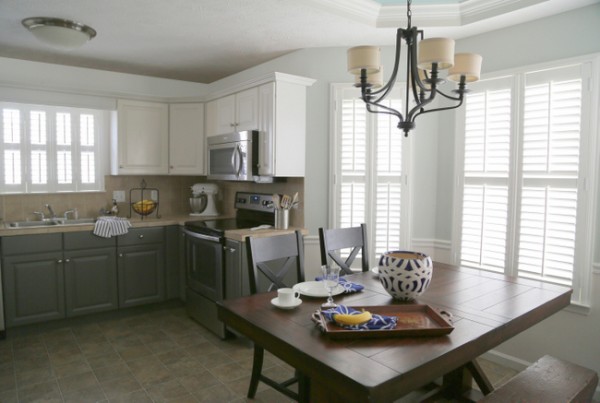
Allison’s kitchen after
Ok, one other little thing to share. There was a phone jack on the only wall available in the kitchen to hang art. It was plopped randomly on the wall, and you can see that Allison had to work around it when hanging things on this wall. The most frustrating thing? Allison doesn’t have a home phone, so she doesn’t even need this outlet!
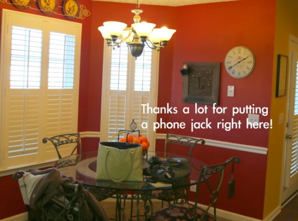
pesky phone jack
Since she doesn’t need it there, we decided to take the cover off so that we could hang art over it.
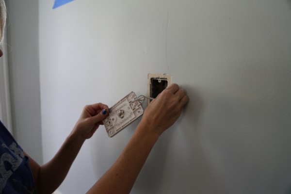
We had to remove a bunch of little screws and disconnect the wires inside to get the plate off.
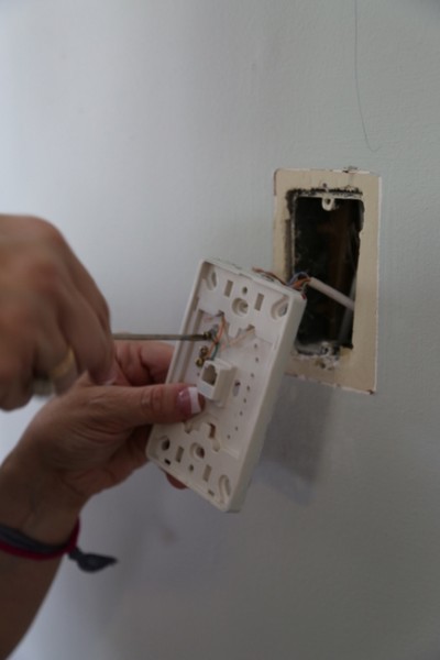
We covered the exposed ends of the wires so they won’t touch when shoved into the wall cavity. Electrical tape is recommended, but we used painter’s tape we had on hand. We were able to do this ourselves because telephone and cable wiring is low voltage. Caution: if you want to remove an electrical outlet, you should hire an electrician to do so.
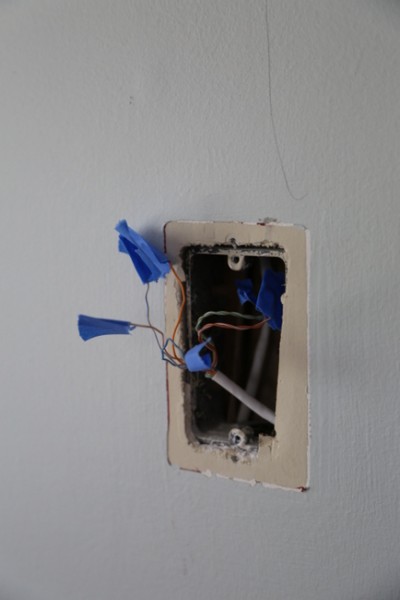
tape off the wires so they don’t touch
Once that was done, we could hang art where we wanted to – right in the middle of this wall. So much better!
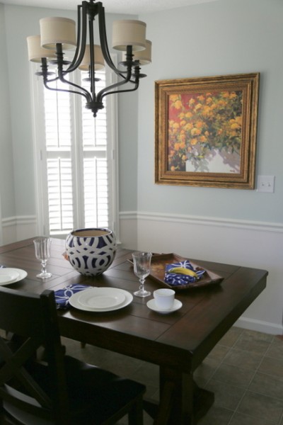
breakfast nook after
I hope you all have a great weekend. I’m looking forward to some downtime before I gear up to start writing my training manual next week for my upcoming Psychological Staging course that I will offer this fall right here in Nashville!
Drop Allison an email ([email protected]) if you are interested in getting on a waiting list for earning your certification in Psychological Staging with me as your instructor. It will be a 3-day, in-person course that will get you ready to launch your own career in the field of home staging!







Great job! I love what you’ve done in her kitchen and you’re so right about “listening to the architecture”. Allison must be so pleased with her “new”, lovely home!
Thank you, Maria! Have a great weekend 🙂
Smart choice! I confess–I would probably have gravitated to a round table, also. What is the big cue that a round table is the wrong shape for the space, Kristie? Is it the oval tray ceiling? In what kind of space do you like to use a round table?
I really like your final placement of the trestle table: It is functional and beautiful!
Thanks for the education!!
Another good question. Look at the shape of the floorspace beneath as a cue, as well as the shape of the ceiling above. Neither are round – more like rectangular shapes. I like round tables in square rooms!
Ahhhh! Thank you, Kristie! I will remember that!
Lovely! We have a phone jack in our kitchen, and I’ve been thinking about doing away with it if and when we install a tile backsplash. Do you think that’s a good move, or will potential future buyers be looking for a kitchen phone jack?
Good question. With less and less people with cordless phones, I’m not sure people feel that it’s necessary anymore – as long as there’s a jack in the living room, so you could bring a cordless phone into the kitchen.
Wow – my brain literally felt the difference just looking at your pics. Love the important mirroring concept. It’s real and great job!
Thanks Kristie—such a basic premise, but, yes, we forget to take the whole into account frequently….
This is just silly, but, I would change the chairs to the right side & the bench to the left, to make a “psychological” barrier to the living room and a more inviting entrance from the kitchen side. (Sorry,
I’m just crazy that way.)
I’m signing up for your course—NOW!!!
Paula,
The reason why I always put a bench on the entry side of the room is because when you put it on the other side, it looks as if it isn’t there, as if there is no seating on the other side of the table. That’s why I don’t like a bench on the backside of table – it disappears and looks as though you are missing seating. I hope to see you in the fall! 🙂
Oh–that makes perfect sense…. Thanks!
Hi, is the wall under the trim in the kitchen painted white like woodwork? I was thinking that it might break up a large expanse of wall in my kitchen. It looks great! Thanks!
Yes, we had it painted the same color and finish as the trim to make it look more architectural like wainscotting. The sheen of the finish is also easier to clean up with a wet rag!
What a huge difference you made in that room, without spending a whole lot of money. It looks like a totally different space! This gives me hope in my own home- I often think of all I want to do and feel completely overwhelmed. 🙂
I would love to know the paint color of the room, is it possible to share?