I started out in this field as a Home Stager before I became an Interior Decorator, Color Consultant, and Design Blogger. I guess I just don’t know when to stop! I actually don’t do as much staging as I used to – that’s because I am typically booked out too far to be ready to “stop-drop-and stage”, which is what is typically needed when time is of the essence.
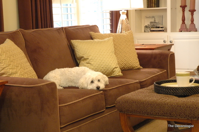
Cutest Doggie Ever
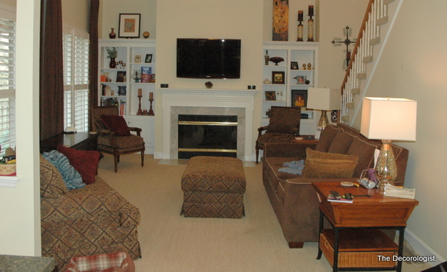
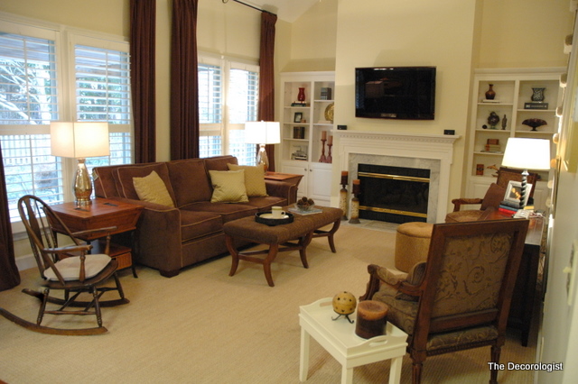
But I love a good stage – it’s definitely a wham-bam, thank-you-mam kind of deal. Instant gratification for a design addict like me. I’m sharing my latest home staging in this post, as well as the #1 secret to getting your house sold. See if you can figure it out as we go along. Let’s start with the “before” photographs of this house. The homeowner has nice furnishings and accessories. Don’t you just love that pair of lamps?
Living Room Before Staging
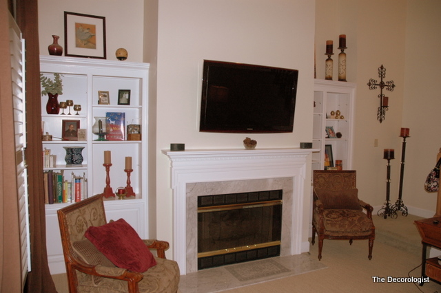
The fireplace and bookcases are great architectural features, as are the huge windows. But I’m not sure I’m in love with it yet, are you?
Fireplace and Bookcases Before Staging
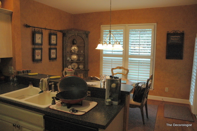
The kitchen is faux-painted and leans towards a Tuscan look. Only a limited number of perspective buyers are going to love this style. The cabinets are a pinky oak and the countertops are not granite – but they really kinda look like it, which is a good thing. I really loved the corner hutch and the Frenchy table and chairs in the breakfast room.
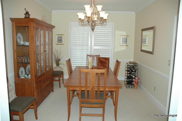
The dining room is functional and a good size. Again, nice furnishings and updated light fixture.
Dining Room Before Staging
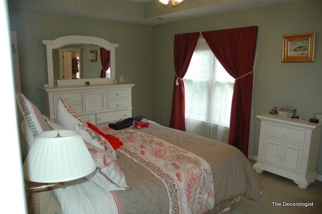
Here’s the master bedroom. It’s definitely a little crowded and a little dated. The windows/window treatment definitely need some help. If you saw this photo on MLS or RealTracs, would you be dying to go view this home?
Master Bedroom Before Staging
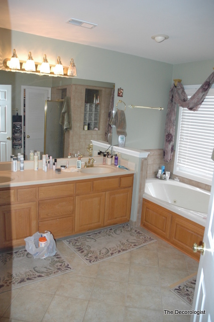
This is the master bathroom. Large with separate shower and tub.
Master Bathroom Before Staging
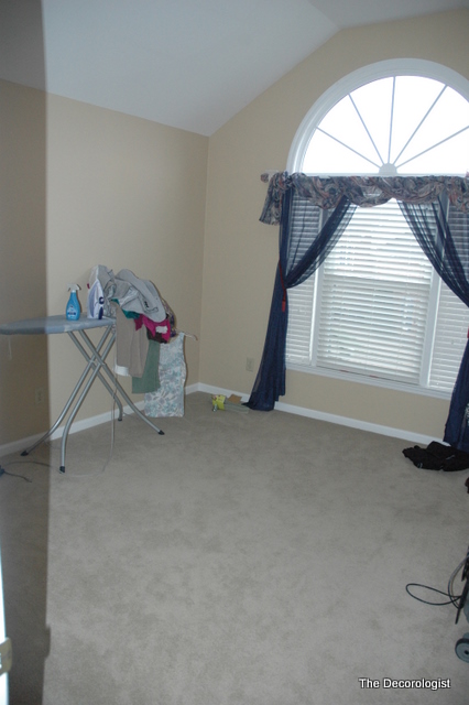
Here’s another bedroom. No furnishings, really. Just a place to iron, I guess!
Guest Bedroom Before Staging
Now – if you were on RealTracs looking for a new homes to buy, what would have been your reaction to the house I just showed you? It’s a perfectly nice house and well-maintained. In fact, it’s a great house. But would you be able to tell that from those photographs? Would you be calling your Realtor immediately to schedule a showing? Or would you keep right on clicking your mouse to find the next available house? Now, what if you found a listing that featured photographs that looked like this:
Living Room After Staging
Fireplace and Bookcases After Staging
Kitchen After Painting and Staging
Master Bedroom After Staging
Bathroom After Staging
Guest Bedroom After Staging
Have you figured out the secret? I bet you think I’m going to say “staging your house.” Well, not exactly. The #1 secret to selling your house is getting great photographs on MLS and RealTracs. With so many tech-savy buyers, gone are the days when the Realtor picks out all the houses she/he thinks you’ll like and drives you around to view them without you even knowing where you’re going.
Staged Master Bedroom
Today’s buyers are checking out RealTracs long before they even contact a Realtor, and often don’t even call a Realtor until they’ve found something they fall in love with online. So, the real secret to selling your house is getting great pictures that draw in potential buyers. Without that, you have zero traffic through the house – no matter how great it may be.
Staged Living Room
And yes, ultimately, a well-staged house photographs best and will bring in more potential buyers to view your home than anything else will. When a professional photographer (which I am NOT) comes in this week and takes pro photographs of this house, it’s gonna show even better online. If you’re in the Greater Nashville area and need a Home Stager that knows how to get your home camera-ready, contact me today at [email protected].

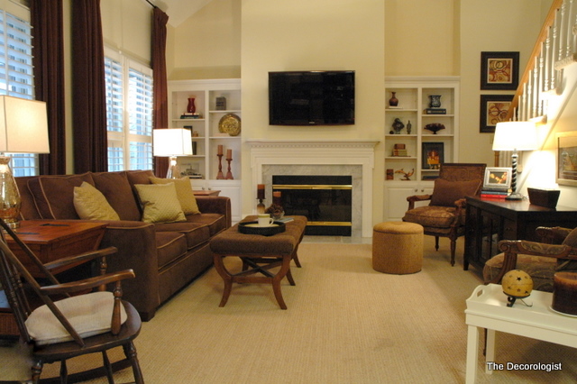
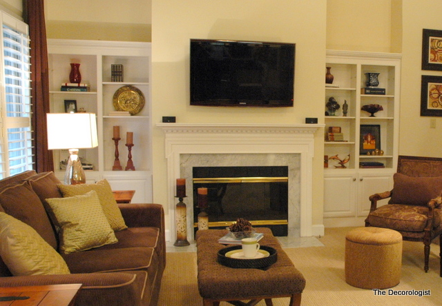
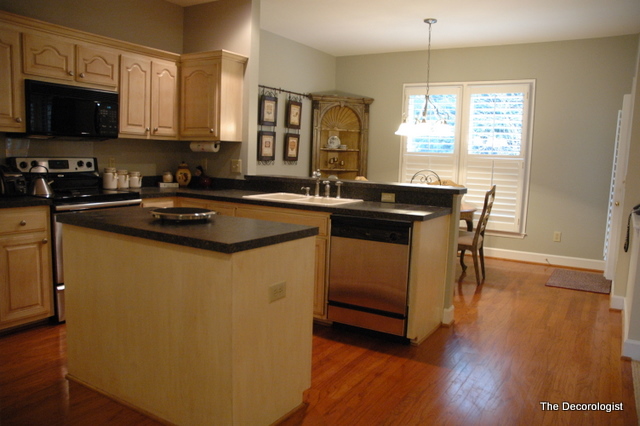
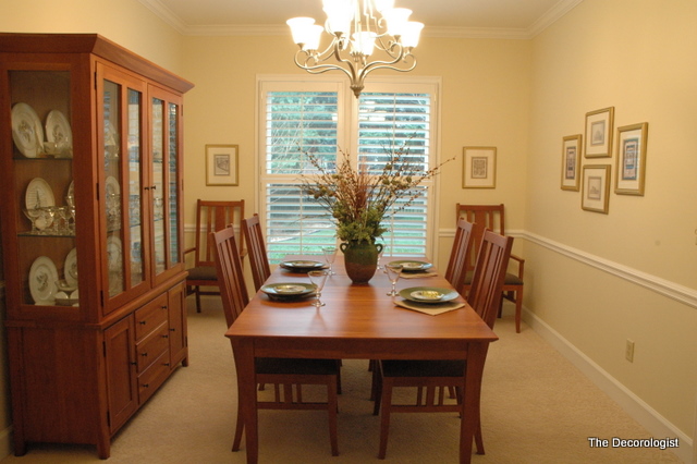
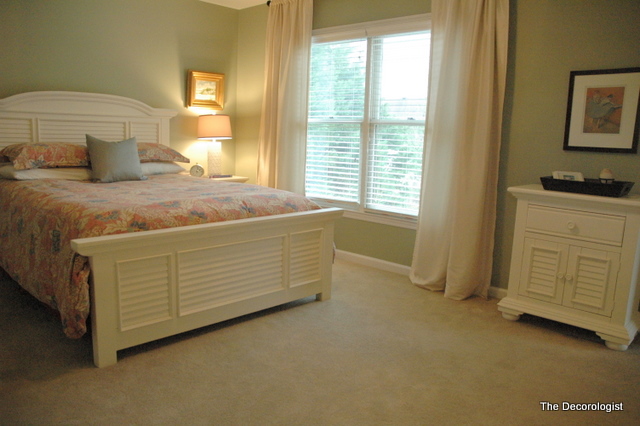
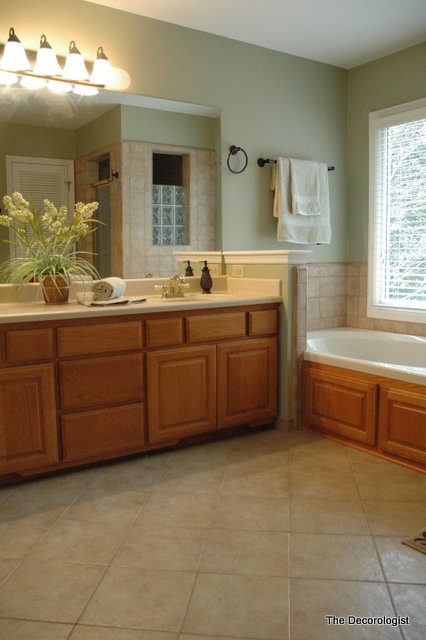
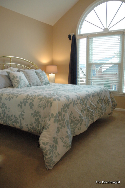
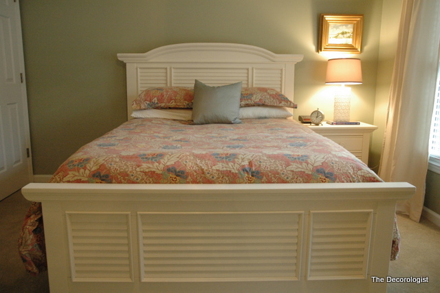





I think the bedrooms and the bathroom were the biggest change and soooo much better! Painting the kitchen was huge too. Pics do sell a house.
Love what you did here to transform this home via staging. I would definitely want to view this home after seeing the photos online that magnify your talent and I especially love “the cutest doggie ever” accessory =)!
I was even more delighted to read your #1 secret! We sold our house last year. We spent a lot of time getting it ready with lots of inspiration and suggestions from a ton of blogs. The real estate market was horrible–I don’t think there was a worse time to sell. We called our Real Estate Agent. She came with camera in hand. She thanked us for giving her something to photograph and she didn’t disappoint. Her photos were perfect! We didn’t even have time to put up a for sale sign. The day she published the photos online we had a written offer for the full asking price–before they even physically viewed the home! Then more offers came in–we had a bidding war going on and we wound up with forty thousand dollars above the asking price. Even after we closed our agent said she was still getting calls from prospective buyers wanting to know if the sale had somehow fallen through and could they make an offer. I was stunned–I was actually hunkering down, thinking it would take at least a year to sell or even longer. I really think it was because of our agents determination and truly understanding how to get a buyer’s attention by her online photos. A whole year later and I’m still in awe of what happened!
Sindy =)
Wow, that’s an awesome testimonial! When you are in a buyer’s market and there is a lot of competition, you need to set yourself above the rest – you obviously did that!
What a difference Kristie! That first photo before the living room had gotten staged made me really anxious. There was too much stuff on the built-ins and it didn’t look like it had been properly edited, if you know what I mean. The difference is really something – the change in the paint in the kitchen, actually putting a bed in the bedroom instead of an ironing board, and updating the draperies in the master. Really big changes that will allow this home to show much better – thanks for this post it is interesting!
Agree completely about the photographs. We sold my MIL’s house this past July. An older home with older furnishings. I staged it and followed the realtor’s suggestions and where money would best be spent in upgrades/paint, etc. And the house showed beautifully. But it was the photographer that she uses that made the difference. He took what we did and made it sing and when people came to view they were less concerned about the age of the house and more taken with it’s potential. They had seen it online and they had a colour brochure to take away. Well worth the money spent for what we made on the sale.
And why don’t so many out there get this? And that’s including realtors… honestly. I am still blown away by the photos I see on line. If every potential seller would engage a stager first, BEFORE engaging a realtor, even for a walk-through consultation, they would be so much ahead of the game before the pressure to ‘get the listing up’ was felt.
I believe if you’re planning to sell, you should have a stager through your property at least 2 months before you ever think about listing. This gives you time to actually do the work, in realistic time, because let’s face it, sometimes there’s a lifetime of purging to do before ever getting to the presentation piece.
Great post, as always!
thanks, sheila! if buyers would hire a stager to do a consult ahead of time, they’d save themselves from making costly mistakes like bad granite or carpet choices, which they often do!
That looks soooooooooooooo much better. I love seeing your before-and-afters.
Before and after pics are the BEST Kristie!! I love this post…you made a huge difference in this house. Hope it sells for them soon!!
xxoo
Jennifer
It looks like it just came out of magazine, really beautiful! I love the Master bedroom. It went from looking like a teens room to a room that adults stay in – perfect, awesome job! Please come do mine now!
Thank you so much, Donna! That’s quite a compliment coming from Charlotte’s best Color Specialist!!!! 🙂
Great Job Kristie. SO glad they listened to you and I won’t be surprised if your next blog mentions how it sold within the week.
Another amazing transformation Kristie. Do you ever sleep?
thanks, heidi. i do sleep occasionally 😉
wanted to share this email i got from a professional photographer:
“That is too funny! The whole time I kept saying to myself, “Well, I wonder what she is going to say, because the photographs make such a huge difference….” I am going to go tweet your post now.
Thanks for doing such a great job demonstrating the difference professionals make (stagers and photographers!).”
Rachel Lando
Lando Images Event and Portrait Photography
http://www.landoimages.com
pictures are indeed worth a thousand words! i can SEE the difference in the before and afters but am still curious about some of your thought processes. for example, what prompted you to move the couch (bulky furniture) in front of the living room windows? i would have fallen into the same trap the owners did in the “before” thinking i should expose the windows as much as possible. and, is it realistically possible for people who are not planning to sell to live in such a decluttered home? case in point, the bathroom in the “before” picture looks like mine and i’m wondering if i can figure out how to organize my everydays so that they are out of sight by the time i am dressed so that it looks like the “after” when i walk away. what do you think??
you bring up an interesting point about the sofa in front of the windows. the homeowner and i had the same conversation. as you walk into the room from the front entry, the window wall is the first thing you see. formerly, the chair-and-a half, the low table, and another chair were in front of the window. the sofa sat awkwardly on the slanted wall of the staircase on the left and lacked symmetry. symmetry makes a room feel “right.” when i moved the sofa in front/center of the windows, it really blocked no more of the windows than the previous furniture there. and now when you walk into the room, your eye is drawn to the most attractive piece of furniture (the sofa) and beyond to that great window view. and now we’ve got great symmetry and a feeling of openness and welcome. as for the bathroom, it’s all about organization. all that cabinet area below was under-utilized before. you just have to make it a habit to put it all away in its place when you are done in the morning. it’s not easy, but it’s a good habit to get into.
Ha ha ha! Great tip, indeed!
Even in the humblest city apartment, good photos (and maximum possible amount of light) will make any place look larger, more inviting, more peaceful. A place to really enjoy.
PS: The new placement of the bed in great, and the modern lines of the kitchen are a good selling point.
Okay, I’m piping in late, but as a Realtor, and in this market — STAGING is a MUST!!!! Kristie’s magic always gets the job done. Continually amazed by her transformations!!
Having staged homes for a few years, I’m still amazed that so many people, INCLUDING realtors, don’t understand the huge value of staging! Great job, Kristie!
Hey! I just wanted to post that I believe this is very true! I’m a photo major, done in a couple months actually, and I took photos of my Inlaws house when they put it up, it was under contract in 2 weeks! Its a great house, but photos definitely encouraged interest!
When showing before and afters it is easier to have the after pictures coming right below or to the side of a before picture so we dont have to be scrolling up and down to appreciate the makeover
So, yes! A lot of times less is more. Less color, more neutrals, less personalization, but also less ‘vacant’ use – I always try to think Potterybarn.
But I also have to comment- a BIG big big part of the before pictures that were lackluster… were the actual pictures themselves!
Had those same pictures been taken with the same photographic skills as the after one were, they would have been 10 times better (albeit still lacking because of the clutter issue and vacancy feel, etc).
So I would also have to comment- if you are going to take pictures of your property to sell or rent out- ditch the built in flash! It bounces light off of everything making it look cold, and cheap, and cluttered. If you can- take pictures during daylight hours and if you have dark corners, use a directional lamp (think $5 desk clip lamp?) to help shines some light there! You can even bounce light into corners using a dollar store white foam board!
Thanks for the photo tips, Jyn. Thankfully, I have a much better camera than the one I had when I staged this house two years ago! I do want to point out, however, that both the before and after photography was taken with the same camera in similar lighting conditions. You are absolutely correct about the built-in flash – I never use it anymore to take interior shots. But like I said, I have a much better camera now!
Yes it looks nice, you did a great job, but please but before/after pics side by side. Too hard to see the changes if I have to scroll up and down. Thanks!