Color lovers, the Pantone 2017 Color Trend Predictions are out, and here is the palette:
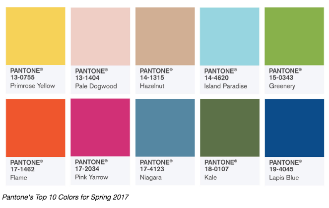
Keep in mind that the Pantone 2017 color trend report relates to fashion mostly, but there is always trickle down into the land of decor and paint colors. You’ll notice these are pretty saturated colors, and I’m betting looks nothing like the interior of most homes you’ve seen lately. Keep in mind these will likely be seen in small doses in patterns of fabrics, wallcoverings, and decor items.
My favorite picks for interiors include Pale Dogwood, Niagara, Kale, Lapis Blue.
My favorites for fashion include Pale Dogwood, Hazelnut, Niagara, and Kale.
Below is a run-down of the top Pantone 2017 color choices. I’ve included a few notes of my own in italics at the end of each Pantone description, so you’ll know my take on these:
PANTONE 17-4123 Niagara
Comfortable and dependable, Niagara leads the PANTONE Fashion Color Report as the most prevalent color for spring 2017. Niagara is a classic denim-like blue that speaks to our desire for ease and relaxation. (yes, this is a highly flexible color and will be prominent in both fashion and decor)
PANTONE 13-0755 Primrose Yellow
By contrast, Primrose Yellow sparkles with heat and vitality. Inviting us into its instant warmth, this joyful yellow shade takes us to a destination marked by enthusiasm, good cheer and sunny days. (as accent colors in fashion and decor, small doses – no way you will see this on walls)
PANTONE 19-4045 Lapis Blue
Conveying even more energy is Lapis Blue. Strong and confident, this intense blue shade is imbued with an inner radiance. (yes, this is a great darker accent color for decor and a mainstay for fashion)
PANTONE 17-1462 Flame
A red-based orange, Flame, is gregarious and fun loving. Flamboyant and vivacious, this wonderfully theatrical shade adds fiery heat to the spring 2017 palette. (I don’t think so – orange has seen it’s heyday over the last few years and I think we’ll see more corals and peaches, just not this strong of an orange)
PANTONE 14-4620 Island Paradise
Island Paradise is a refreshing aqua that calls to mind a change of scenery. A cool blue green shade that speaks to our dream of the great escape, Island Paradise is emblematic of tropical settings and our desire to unwind. (sure, more spa blue – sky and sea, all that jazz – this one continues on)
PANTONE 13-1404 Pale Dogwood
Continuing the tranquil mood, Pale Dogwood is a quiet and peaceful pink shade that engenders an aura of innocence and purity. The unobtrusive Pale Dogwood is a subtle pink whose soft touch infuses a healthy glow. (absolutely, blush pink is all over fashion and decor, we’ll have another year of it – great for wall color if you dare)
PANTONE 15-0343 Greenery
Bringing forth a refreshing take, Greenery is a tangy yellow-green that speaks to our need to explore, experiment and reinvent. Illustrative of flourishing foliage, the fertile attributes of Greenery signals one to take a deep breath, oxygenate and reinvigorate. (yes, in small doses in decor, pairs great with lots of other colors including Pantone’s other green, Kale)
PANTONE 17-2034 Pink Yarrow
Tropical and festive, Pink Yarrow is a whimsical, unignorable hue that tempts and tantalizes. Bold, attention getting and tempestuous, the lively Pink Yarrow is a captivating and stimulating color that lifts spirits and gets the adrenaline going. (not really seeing this, difficult color to wear and I don’t expect to see much of this in decor unless it’s a 6-year-old girl’s room)
PANTONE 18-0107 Kale
Evocative of the great outdoors and a healthy lifestyle, Kale is another foliage-based green that conjures up our desire to connect to nature, similar to the more vivacious Greenery. And, just as we see in nature, this lush and fertile natural green shade provides the perfect complementary background to the more vibrant tones in the palette. (yes, great nature-based color, more towards spinach or emerald than hunter green, it’s gonna be everywhere)
PANTONE 14-1315 Hazelnut
Rounding out the spring 2017 colors is Hazelnut, a key neutral for spring. This shade brings to mind a natural earthiness. Unpretentious and with an inherent warmth, Hazelnut is a transitional color that effortlessly connects the seasons. (great color for fashion, but no-no-no on the walls of your home, please)
What do you think about the Pantone 2017 Color Trends?
Need help with your paint colors? Here are tools to help!


Is there a reason you do not comment on Niagara?
Yes, the reason was because I accidently missed it! Thanks for catching that – I added in it now 😉
A question….Why not hazelnut on walls? What would you use instead?
Julie,
It’s too fleshy – looks like a bandaid. This was really popular in the 1990s, but I’m still called in all the time to choose colors to REPLACE this one in interiors!
I’m surprised there is no purple! That’s what every other paint company is going with. I have always loved jeweled tone colors- so bright and happy. Loving the blues the best and of course pink yarrow as raspberry peonies for accents.
My house was mostly a color similar to Hazelnut (maybe slightly more gray) when we moved in. It feels very dark in our Cape Cod home. I have repainted most of it, but it is still in my entryway and master bedroom. Why is it that the master bedroom always seems to be the last place we pay attention to?
Anyway, great comments on these colors, Kristie! A Victorian house in our neighborhood just re-did their exterior trim with accents that look like Greenery and Lapis Blue along with a fairly bright white. It certainly caught our attention. 😉
Judy,
You are certainly right about the fact that the master bedroom often is left for last . . . it’s a shame. I’m looking to give my own a lift soon! If I were to apply any of these Pantone colors to interiors or exteriors, they would require a bit of muting down. Sounds like the Victorian you mention might have needed that, right?
Wow. I don’t like any of them! Not sure what that says about me, but just… no.
I’m sure it just means that you know what you like! 😉
It’s cool
Thank you