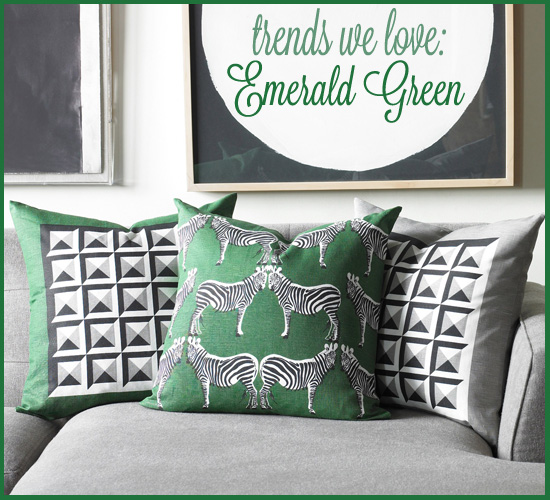
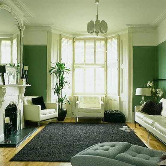
Pantone just announced the 2013 Color of the Year, and it’s Emerald Green. It may be a bit confusing, as many paint companies now put out their “Color of the Year.” But just know that Pantone is the BIG DOG, and they have a lot of influence on what we’ll be seeing in the stores in 2013.
You may want to learn more about Benjamin Moore’s 2013 Color of the Year or Sherwin Williams’ 2013 Color of the Year. If you need help choosing just the right paint color for your home, schedule your Color Consultation with me today.
So what do you think about Pantone’s pick? Don’t hold back!
(Update: Check out my post about how you can rock the 2013 Color of the Year in smaller doses!)







pff, I knew it! (and I love it) : http://homeofbambou.blogspot.be/2012/09/color-week-pantone-predictions.html
I don’t know. I absolutely love green….but I’m so over it. We bought our house in 1995 and just about everything was green….right down to our shutters. I’ve been slowly moving away from it. UGH! Maybe I won’t have to paint after all!!
I think the rooms with emerald green and white look great. Having said that, this color is not for me. I love green, but the more muted neutral greens work much better in a decor situation. That emerald green is a statement color in a big way!
I like all shades of green. So I find this Emerald Green very interesting.
Thanks for sharing this information and pictures.
I am beyond thrilled! This is my favorite color, and this means not only lots of sumptuous things for the home, but also fashion will include this color. As a redhead, it doesn’t get much better than this! My second favorite color is indigo/midnight blue. Pairing the emerald green with that as my two accent colors against a soft greige, throw in a little warm wood and gold metallic pops here and there… Oh heart be still!
I love this color. Now I just need to figure out how to incorporate it into my house. Does emerald have black in it to creat the color?
I find this color only great in moderation. It just doesn’t seem to harmonize too well with other colors….it just wants too much attention. Although I must admit it looks great with yellow.