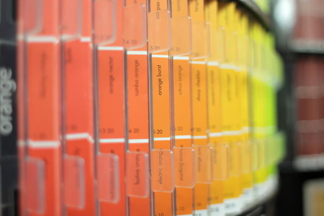
Sherwin-Williams has really been ramping things up this year, appealing more to designers, bloggers, and homeowners alike. Most recently, they acquired the largest paint company in Mexico. They really seem to be taking over the world of paint. Yesterday they announced their 2013 Color of the Year, Aloe 6464:

It’s very similar to Pantone’s Grayed Jade, which showed up in Pantone’s top 4 Fashion Colors for 2013. Grayed Jade is a color in the running for Pantone 2013 Color of the Year, but that remains to be seen.

Here’s what Sherwin-Williams’ Jackie Jordan says:
“This is no ordinary pastel – Aloe is funky and glamorous, demure and free-spirited.While Aloe’s vibe can verge on retro, when paired with caviar blacks, crisp whites or soft grays, suddenly Aloe has a new soul and attitude. And Aloe is highly adaptable, making it a perfect pick for everyday spaces such as a breezy sunroom or a well-dressed living room,” says Jackie Jordan, Sherwin–Williams director of color marketing.”
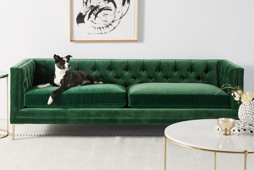
So here’s the problem: the color is cute, but it’s a bit too saturated and clean. Therefore, not very livable. I couldn’t even find any images of it on the walls of a room – not on Pinterest, Google, or other color websites/blogs. A dose of gray would make the color pretty close to Benjamin Moore’s Prescott Green, which I have in many rooms of my home. Obviously, I love Prescott Green – but Sherwin-Williams Aloe is cleaner and more saturated than the color you see below, and would be too vivid and playful to work in many places besides a child’s room.

Benjamin Moore Prescott Green, Melanie G Photography
Before you think I’m just knocking Sherwin-Williams, I felt the same way about Benjamin Moore’s 2013 Color of the Year, Lemon Sherbet. Both of these companies are paint giants. Shouldn’t they be interested in the opinions of Color Consultants, Specialists, and Experts (whatever you want to call us) that spend every day specifying their paint colors in the homes of REAL people?
Sherwin-Williams has some great colors in their palette – some great neutrals (Useful Gray, Relaxed Khaki) and some great blue-greens (Comfort Gray, Austere Gray, Rainwashed, etc.) that I often specify for clients.

Color by The Decorologist
But if they really want to cover the world in paint, they need to step it up a notch and expand their color selection, perhaps with the help of a group of tried-and-true paint color experts in the field. Just sayin’.


Nicely done, Kristie! Been saying this for years! Maybe you can reach them with your fabulously honest and true post. 😉
With that said, I do like the color on my monitor. Funny, but it’s nearly the exact shade of the background of my new website (coming soon!)
Happy Thanksgiving!
Thanks, Kelly – I like it on the monitor, too. But when I looked at in the fandeck, all I could think of was how it needed some tweaking before it could go up on a wall! Can’t wait to see your new website – no doubt it’ll be fabulous!
I actually wouldn’t mind the paint color in the right application, but I imagine it will read more “tropical” than most would expect once applied to an actual living space. A few years ago I painted my bedroom Fleeting Green (one strip over, two shades up) and it surprisingly had much more “color” than I would have guessed. (http://www.houzz.com/photos/171192/Turquoise-and-Green-Bedroom-eclectic-bedroom-san-francisco)
I think your Prescott Green rooms are lovely – and probably what many people will be expecting when they reach for Aloe.
Again – nice post.
You know, even though I love Prescott Green in my home, I don’t think I’ve spec’ed for any client’s home. Even it’s too clean and minty for most people and most situations. And you’re right about Aloe reading “tropical.” It’d probably be really cute on some furniture pieces.
Totally agree about both the colors being too clean…of course they look so pretty on the computer monitor and in their promotional materials but we know what really happens when you get it on the walls!
Often times these selected colors are more of a jumping off point for consumers and come with a whole pallette to choose from. There are several other colors in the Vintage Moxie pallette that may appeal to you and even more muted and less saturated choices in their Honed Vitality pallette. See more on their website here
http://www.sherwin-williams.com/architects-specifiers-designers/inspiration/color-forecast/2013-color-forecast/
Although Aloe may not work for everyone when painting an entire room, it can start the process and set the color scheme when used in accents and paired with other colors from their pallette.
To me it looks very similar to Benjamin Moore’s wythe blue? (but slightly more green)?
Cara,
Aloe is cleaner and more turquoise green when compared to Wythe Blue.
I totally agree. I might be able to use that in a bedroom but that’s it. Can’t get on board SW!
I was going to say, “This is your kind of color, Kristie,” until I read your post. I haven’t checked my SW fan deck yet, but it reminded me so much of both the walls and the objects in your beautiful home . . . .
I think in determining the “Color of the Year,” paint companies and Pantone are working in a predictive capacity, trying to be a little edgy and trend-setting. I don’t know that they necessarily mean for us to all paint our walls the exact hue. I happen to love Benjamin Moore’s Lemon Sorbet and have used it for kitchens and even a Victorian house exterior, but I take that choice as a sign that yellows are getting more lemon-y now, as opposed to buttery. And, for sure, acid yellows are a more edgy look here in the New York area.
All comments appreciated! Thanks, and have a great Thanksgiving!
Debra,
Thank you so much for your thoughts and input! Yes, paint companies are likely going for a “feeling” of a color or a color direction when they name these “colors of the year.” I do believe, though, that the typical consumer sometimes mistakenly grabs those colors in hopes of choosing the hottest on-trend color for their walls and believing that the paint company wouldn’t steer them wrong! Guess that’s why they need us to help them make the right decisions for their unique space 🙂 Happy Thanksgiving!
I know what you mean, Kristie. It’s like architects designing homes/floor plans without ever asking homeowners what is it that REALLY works. About the most logical & practical designer I’ve ever seen on that subject is Sarah Susanka–a lady architect, who advocates designing just the space you actually use. Color of the year is so subjective that if they only hire one designer to tell them what to pick, the choice will inevitably be prejudiced. Your point is accurately on target: ask those who do it every day!!!
Blessings in abundance for you and your family….thanks for great work, Kristie, on the blog and your homes.
Hugs across the miles, Paula
Hi Kristie. I just recently found your website and I just love it. I read about a product today that you may be interested in. It is called Annie Sloan Chalk Paint. It was developed in England by decorative paint expert Annie Sloan. It is easy to use and can be applied to furniture and walls and even floors. Google the product and you will see some very beautiful pieces of furniture that have been painted.
Thank you, Jan. Yes, I am familiar with Annie Sloan Chalk Paint and have used it in many projects. Here are a few I’ve written about:
https://thedecorologist.com/my-closet-makeover-reveal
https://thedecorologist.com/all-the-rage-annie-sloans-chalk-paint
I am so glad I did not go with the bland yellow the consultant suggested and instead painted My kitchen SW Aloe, we love it. I do live in Florida, so perhaps the sun has affected my ability to see colors properly 🙂
.
I’d love to see a photo of your kitchen in SW’s Aloe, Melissa!
Have you tried Benjamin Moore’s Oil Cloth yet? I’d be interested in your opinion. Also, B-Moore’s Doily is becoming my new bathroom color. What does the decorator say? 🙂
My husband and I just bought this color to paint my sons room which will become my son and my daughters room in a few Botha when baby number three is born! My son is 5 and daughter is 3. Anyway, we totally bought it because we saw that it was SW cor of the year. Hahaha! But also because we liked it and it seemed like it would work for a shared boy/girl bedroom. If anyone has any other suggestions tho I would love to hear them! Otherwise, we will let you know how it turns out.
Lilly,
I think Sherwin-Williams Aloe would be a great color for a baby’s room! Congratulations 🙂
Kristie, what color did you use for your ceiling with the Prescott Green?
When I first painted it a decade ago, I did 30% on the ceiling. Never liked it. Repainted 4 years ago, and painted the ceiling out White Dove, like the trim. I have LOVED it ever since.
So is it White Dove on the above picture? It looks gray-ish–is that just because of the light?
It looks pretty real-to-life in the photo. It is a warm white, slightly gray-white.
Okay. I really like it and might do a copy-cat in my dining room. 🙂
How would this color look on the lower half of kitchen cabinets with a brown glaze?