Readers frequently ask me to tell them the names of the paint colors in various rooms of my home. I decided to share them all in one place in case you were wondering, too! So settle in for the grand tour and all the coordinating paint color names. All the photos in this post were taken by Melanie G Photography.
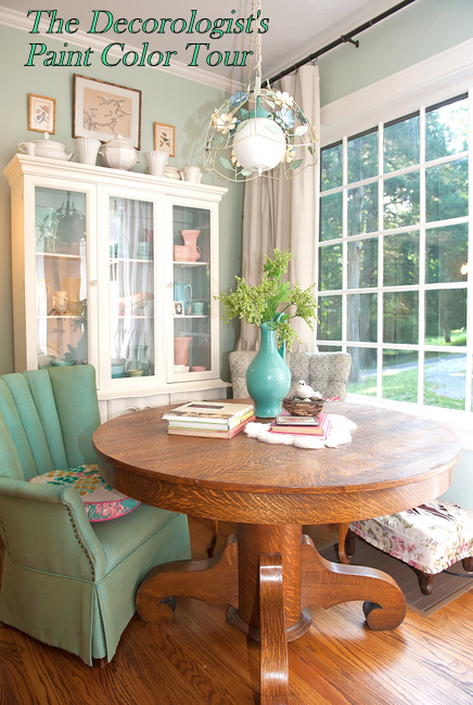
Benjamin Moore’s Prescott Green HC-140
Benjamin Moore Prescott Green HC-140 is the color that runs through many of the rooms on the main level of our home. It’s certainly not for everyone, but it works as the perfect super-neutral for my specific spaces. It’s a lot like one of Pantone’s current top color picks, Grayed Jade. It’s an icy green with quite a bit of blue in it.
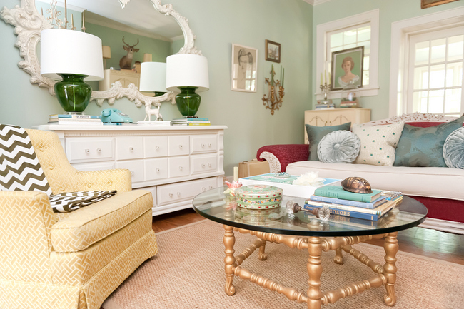
Walls – Benjamin Moore’s Prescott Green HC-140
Table Base – Ralph Lauren’s Golden Candlesticks Metallic
While Prescott Green is the wall color in the entry, living room, and hallway, it is the trim and ceiling color in a couple of other rooms. In the dining room it’s paired with a buttery yellow.
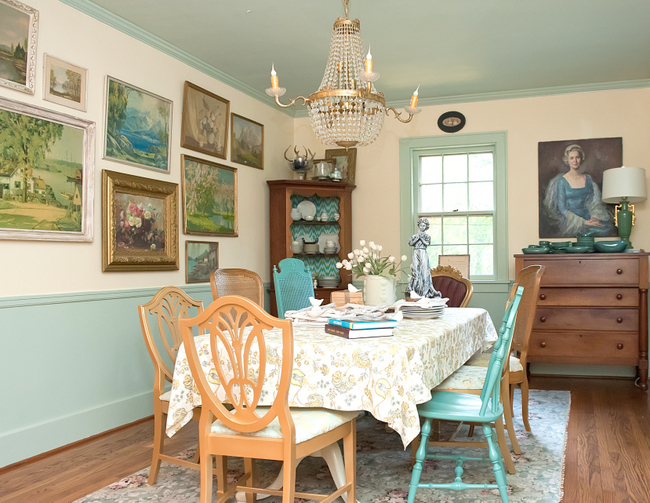
Upper Walls – Benjamin Moore Weston Flax HC-5
Trim/Ceiling/Below Chair Rail – Prescott Green HC-140
That buttery yellow is on the walls and ceiling of the adjoining kitchen, paired with white trim on all the cabinetry and beadboard wainscotting. The floor is VCT (vinyl composite tile), which we installed in this pattern I came up with 12 years ago. Notice the light and dark greens with the black:
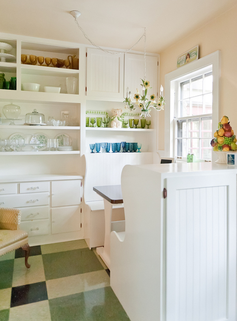
Walls and Ceiling – Benjamin Moore Weston Flax HC-5, Trim – White Heron OC57
The kitchen floor colors echo the original tile in the main floor bathroom, see?
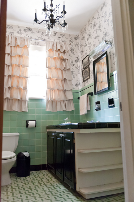
Chandelier, Mirror, and Cabinets – Benjamin Moore INT/EXT Black
And here’s the Prescott Green on the trim and ceiling of my office, paired with the neutral Feather Down on the walls:
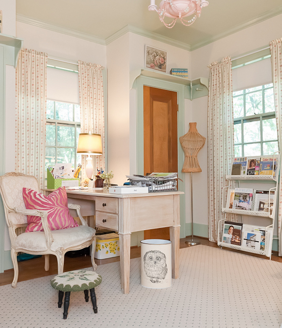
Walls – Benjamin Moore Feather Down OC-6, Ceiling – Prescott Green HC-140
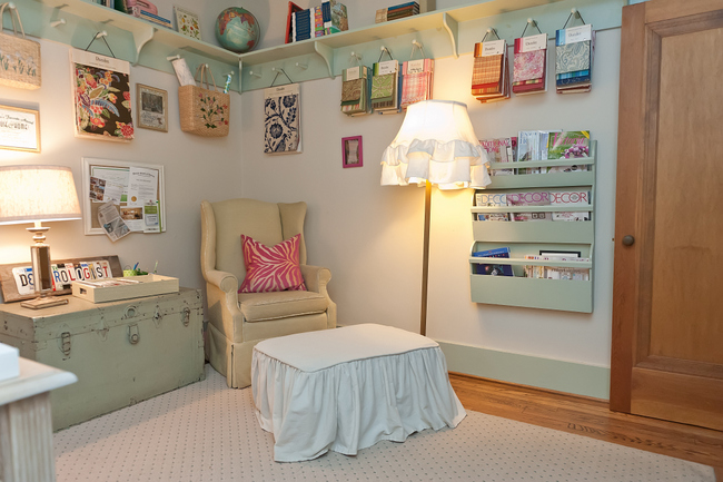
Trim – Benjamin Moore Prescott Green HC-140
We painted our master bedroom in a color of similar intensity as the other colors throughout the main floor of the house.
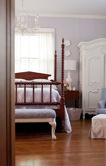
Walls – Benjamin Moore’s Violet Mist, Ceiling – Whisper Violet 2070-70
The enclosed porch off the living room is the same warm white as the living room trim, while the ceiling is classic light blue beadboard.
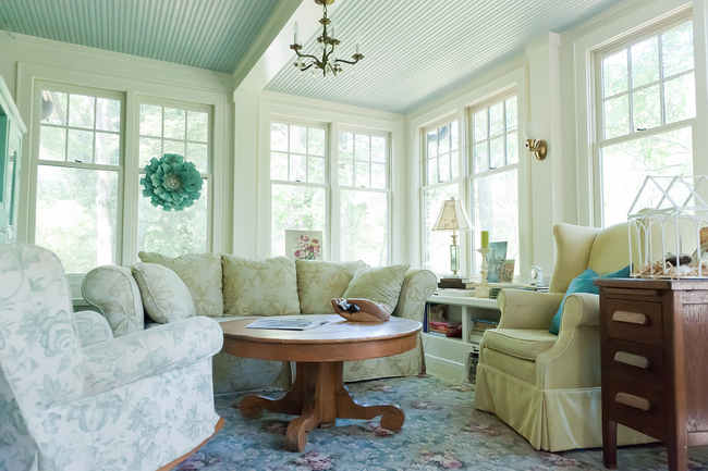
Trim and Walls – Dove Wing 960, Benjamin Moore, Ceiling – Winter Solstice 1605
Even though there is a combination of color placement, the main floor maintains a consistent color flow. The upstairs is separated with a closed door staircase. That means you can’t see the upstairs and downstairs at the same time, so the upstairs is a bit more playful in regard to color. Our daughters’ rooms are adjoining and you can see through one into the other:
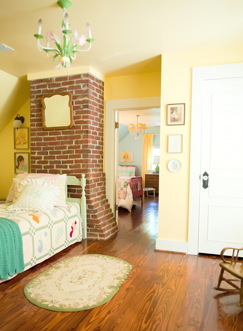
Walls and Ceiling – Benjamin Moore Hawthorne Yellow HC-4, Bed – Prescott Green HC-140
The yellow ceiling and accents in the 2nd bedroom are the same yellow from the 1st bedrooms walls and ceiling, while similar green accents are peppered throughout both rooms. Even though the color schemes are related, each room has its own personality.
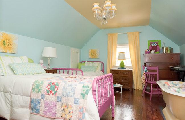
Walls – Crystal Springs 764, Ceiling and Tub – Hawthorne Yellow HC-4,
Beds/Chair – Fashion Rose
We wallpapered the upstairs bathroom in a sapphire blue toile.
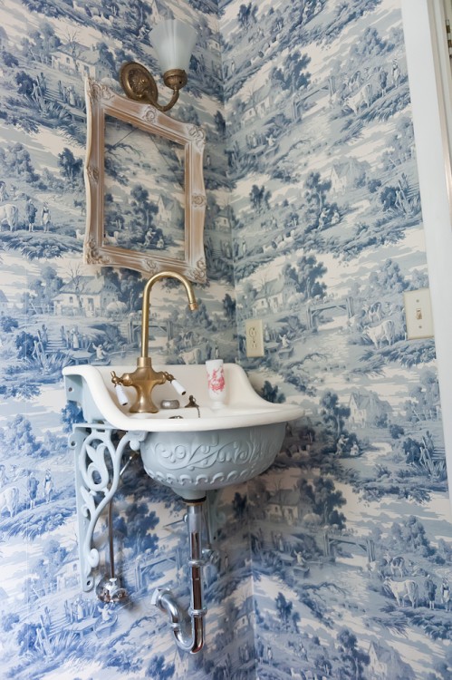
Sink Base – Silver Lake 1598
On the other end of the upstairs hallway is my husband’s mancave office. The unexpected color combination is masculine and a warm surprise, I think!
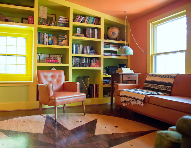
Walls – Pumpkin Pie 2167-20, Trim & Bookcase -Yellow Tone 370,
Backs of Bookcase – Stem Green 2029-40
Except for the kid’s bedrooms, these are the colors I chose 12 years ago. While the bedroom colors have and will change as years go by, the palette for the rest of the house really suits the style and furnishings we have. Having a well-thought out plan for a home’s color palette pays off in the long run, and I don’t expect to change wall colors anytime soon!










Do you have any favorite floor paint colors? Benjamin Moore used to show a turquoise floor paint in their porch floor brochure and I don’t remember the color. Do you know if it is Covington Blue?
I’m not sure I’ve seen that specific brochure. But I have to tell you, most of the suggestions in those kind of brochures are ridiculously bad. I’ve never specified any interior/exterior based on the color combos they suggest in those things – they are just awful. As for floor paint colors, it would all depend on the other colors in the room of course. Is this for a porch or an interior room?
I would like to hear you talk more about painted floors, Kristie. You know my home – a log cabin, and I really like some of the painted floors I see in some photos but wonder about how well they hold up to wear and tear.
I have that exact bed!! And I love the colors, that Violet oh my word..I have a color like that in my living room!
We have same design asthetic…
It is for an interior room, a bedroom. I’m thinking a cream or light gray on the walls, white trim and orange or hot pink bed accents. I love color. I actually found your blog while looking for a painted floor examples. The doors are natural color fir (orange) and the antique bedroom set is cherry; the dressers have white marble tops. What I have in mind is very close to your color scheme which is outstanding. Your home is gorgeous and very inspiring. 🙂
Love your house. I feel honored to have seen it in person. Pinned every color to my Pinterest paint color boards. You are a magician 🙂
Awww, thank you so much Dana!!!
Wow, Kristie! Your home looks amazing. I can truly appreciate how much went into getting these photos. Not only have you created a beautiful home, but your styling is impeccable. 🙂
(Oh- and I noticed we have the same metal magazine racks in our offices. Love those things!)
Kelly,
Thank you so much! Yes, found that rack at a yard sale for $3.
Thank you so much for the tour. As I need to paint my kitchen and entryway, and I love your colors, I think I will follow in your footsteps and use those colors. Are the wooden floors new or old. I would really like to replace the carpet in my dining room and love your wood floor in yours. If new, what brand and type are they….thanks again, Brenda
The floors are old – the house was built in 1939. If you are staining hardwoods, I’d recommend the Provencial or Dark Walnut colors of MinWax stain.
Thank you for doing this – it helps to have a visual example for room planning! In your office you have a great shelf/peg system – where did you find that? Is it one piece or a bunch of pieces? I need something like that in an area at church where I am in charge of some organizational aspects.
Lee,
Mr. Man made the the shelves and pegboard beneath it from a design I drew up for him years ago. This used to be the nursery, so it was fun to decorate the shelves/pegs with vintage children’s goodies and I didn’t have to worry about the baby reaching it!
Lee, Mr. Man here making a cameo appearance!
The shelves are made from a bunch of custom pieces. I cut and routed the shelf supports then plate joined them to the vertical pieces, which then are mounted to the wall. The wall fasteners are hid under the pegs (which can be purchased from any woodworking supply magazine). The horizontal shelf was then laid on top of the support system. It was a fun project!
Wow, Mr. Man really reads my posts . . .
🙂 How sweet!
thanks Mr. Man! 🙂
Kristie! Thanks for showing us your home. Beautiful colors! What a great idea to show us inside the home of a Designer. You know everyone wants to see what colors we choose for our own homes. I want to do that to! That’ll be my next project 🙂
Great! I look forward to seeing your home, Donna 🙂
Beautiful! There are too many things to list that I really love. Your home has a very happy feel. That’s such a lovely home for children to grow up in.
I do have one question regarding the faucet in the upstairs bathroom. I also have a wallpapered bathroom that I think an antique brass faucet would blend the best. Do you happen to remember who made your faucet?
Thank you for sharing.
Kathy
Karhy,
That faucet came with the house, so I have no idea! One resource I love is http://rejuvenation.com
Thanks for that lovely tour….your home looks very inviting and peaceful!
I absolutely love it! Beyond just the general feel of the spaces, I think what I love the most is that your home is unique. So often, it seems like everything looks like it came from the same Pottery Barn catalogue.
Your office is just gorgeous, I love the sunny eating nook in the first photo, the light fixtures in your girls’ rooms are to-do-for, and the curtains in the main floor bath are so sassy and fun!
Thanks for the tour!
Eileen,
Thank you so much! And no, no Pottery Barn in this house, except for maybe some kids’ sheet sets. Most everything is “found” and repurposed furniture and accessories from estate sales, flea markets, antique malls, yard sales, and relatives. Just a few things are retail: the desk in my office is from Merridian (http://merridian.com) and the sunporch sofa is from Storehouse (no longer in business).
Your home is gorgeous. Our last home was a 1935 cape cod in Nashville and now I really miss it! I know this post is about your paint colors, but the rooms are styled so wonderfully. Love the mismatched chairs and the gallery wall in your dining area. And your light fixtures are great. Thanks for sharing your home with us! ~ Angie
What a warm and fun home! I am loving the ruffled curtains in the black and white bathroom! Do you have a source for those by any chance?
Thanks so much!
Kemerie,
I have a great seamstress who made those for me.
Thanks for the tour, Kristie. Your home is lovely, inviting and cozy. I love how everything flows. That shall be my word for the day. “Flow.” Very important! 😉 …and the photographer did such a great job, too!
xx, Julie
Thank you, Julie. And yes, the photographer is fabulous – she does portraits, too 🙂
Wow, Kristie! Thank you for showing us your home (and your colors)! I really love your style, which is mainly why I keep subscribing to your blog. Thanks for the inspiration!
Love. Love! LOVE!!!!!
kristie, thank you s for show off you wonderful home. i love that we see so much personality in it.
i love that you paint the ceilings.
jeannie casey
Wow! Kristie, you did an amazing job. It’s absolutely gorgeous. I love the way you paint and repurpose everything, it looks like easy and natural. I sure wish I had floors to paint. Your family is ver lucky indeed!
Just beautiful Kristie! Thanks for sharing. I too love your peg boards- great for hanging those fabric books. Great idea!! So lad you found a good photographer too! Very important.
Hi Kristie, You are right, in that readers want to know what colors are used. Many people love color but are afraid of making a mistake. While paint is not all that costly (certainly not compared to nice wallpaper), the labor sure is! A good design professional like yourself eliminates those expensive mistakes.
Kristie, I love your home! (and I continue to pin…) I noticed the green glassware in your kitchen. Where could I find those? I am having a rough time finding green stemware and barware.
Patti,
I have collected green, amber, and blue glassware from yard sales and estate sales over the last several years. These were popular in the 1960s and 1970s, so I usually find them in neighborhoods with mid-century homes with older residents. You might also try looking at antique malls and shops – they’re really inexpensive!
Hi Kristie. Thank you so much for your hospitality. It was a pleasure to tour your home, allowing us to get up close and personal. It’s as if we are so much better acquainted. It’s lovely and great to see an actual illustration of how you have incorporated the 3 color theory into your world. Oh, and I would have an extremely hard time leaving ever leaving your enclosed porch. Love it!
Thanks for sharing your home. I am curious. Did you plan you color palette, and the use of the Prescott Green, (which I love!) around the tile in your bathroom? I love that you kept the original tile in the bathroom! Your home is very cozy, charming and beautiful.
Jill,
That tile was definitely influential in the color palette, particularly in the choices we made in the kitchen flooring. But I had used that color in the bedroom of our previous home and loved it, so that played into the color plan as well.
Kristi-What a beautiful tour. I love that you’ve used the same colors downstairs so that is visually flows, but that each room has it’s own identity. I would feel very calm if I were in your house.
Thank you, Lisa!
I LOVE all of your house Kristi
Love your home… specially your office 🙂
I think I should say… especially your office.
Also If you could tell me who made that awesome painting of the lady on your dinning room wall? Or what is the story behind it?
Thanks
Our house burnt-down and I am just now picking a new paint palette for the re-build. I love all your posts! I see a lot of pale pinks in your home…could you recommend one that isn’t too girly? Also, if I paint the outside of a bookcase black, could I paint the inside in a pastel? I so appreciate your suggestions!
Gorgeous home. How cozy and lived in! Re: the white trim color used in your daughter’s bedroom. I am painting my home BM HC-4 and need a white trim that won’t muddy the HC-4. Could you share the trim color with me? Thank you.
Julie,
The trim in my daughter’s room is Ben Moore’s Chantilly Lace.
I just found this post because I googled “Benjamin Moore Prescott Green.” I had decided on that color for our living room, but I couldn’t decide on a color for the adjoining kitchen. I had a blue picked out, but after a few days of the paint chip on the wall, I knew I would hate it. Thank you for this post! I think the Weston Flax will be perfect!
Great! I hope it works out well for you, Melissa.
Hi Kristie,
I’m happy to have come across your blog! I live in a small, but very open condo and am re-painting the entire unit. I want to stick with cool tone colors throughout the space. I have Wythe Blue for the bedroom, Prescott Green for the bathroom and for the main space, which is a very open living room and kitchen, I may go with a neutral gray such as Balboa Mist. (These are all Benjamin Moore colors). For the main space, what could I do to break up the color? Would you suggest an accent wall or perhaps adding some shelving? The style of the condo is very minimalistic, but I’d like to add some traditional flare in there as my favorite type of homes are the older, historical homes. Any tips would be welcomed.
Thank you!
How do you transition your trim color from room to room? We have an open kitchen, living dining room and hall. I would really like the trim painted navy for the living room but leave it white for the dining room and hall. The way the stairs are situated the trim would not meet each other at any point. It would be visible though from both areas. Do you think this would look strange?
Look for points where you can transition – outside corners are the least noticeable. View the space from the entry point – that’s where you don’t want to see blunt transitions. If you are saying the trim doesn’t meet from the living room into other spaces, you don’t have a problem!
Thanks so much. I will give it a try. I guess the worst that can happen is repainting some trim!
Greens you see trending now? Warm? Cool? Clean/Dirty? Thanks.
Hello! Would you mind sharing where you got the toile wallpaper from the bathroom from?
Thank you so much!
Marie