Unless you are living under a rock (no pun intended), you’ve heard that Pantone announced the 2013 Color of the Year. I’m thrilled that Emerald was chosen, and as a paint color consultant I love all the possibilities for integrating that color into the home. I’ve talked about my crush on Emerald, and I’ve been injecting this color in my own home for the past few months, like these pillows that are on my living room sofa.
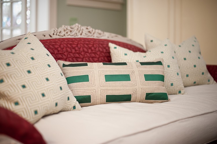
emerald green accents/Melanie G Photography
Most people won’t be clamoring to paint their living room walls in Emerald Green, as it’s a pretty dark and intense color. That doesn’t mean you can use it to glam up a room, if you are judicious in how you apply it and other jewel tones. During a Nashville Color Consultation a few months ago, I chose a color scheme for a client’s dining room that shows how to add a color like this without it overwhelming a room.
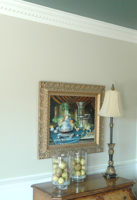
emerald green on the ceiling
Emerald green, in the form of Benjamin Moore’s Silver Pine, makes a beautiful and surprisingly subtle accent color for this dining room.
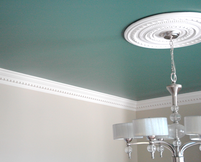
Benjamin Moore Silver Pine
I also did a beautiful master bedroom with emerald walls this year, but I don’t have a photo of it. A dark jewel-like green looks fabulous in a small powder room, like this one I chose for my client Annessa:
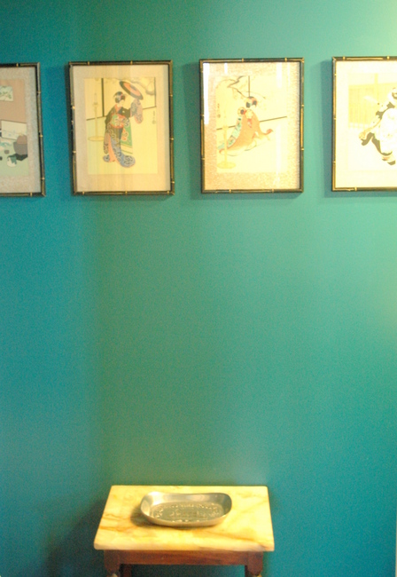
Emerald green or any other great jewel tone would look amazing in a cozy library or man’s den, like this one Jamie Drake did at the Kipps Bay Showhouse earlier this year.
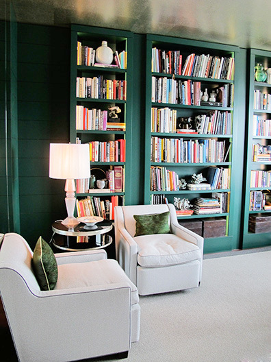
Jamie Drake
If you are integrating it into your color design, consider using a layering approach I like to often use when constructing a color palette with my clients. This idea is illustrated in this Inspiration Board I recently created for a 2013 Color Trends contest sponsored by Benjamin Moore and designer Tobi Fairley.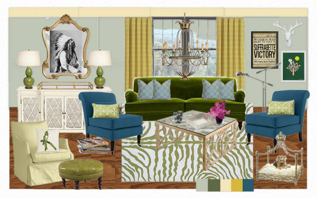
The Decorologist’s 2013 Color Trends Contest Entry
If you check out the color chips at the bottom on the design, you’ll see I used both lighter and darker versions of green (Benjamin Moore Prescott Green and Avon Green), as well as yellow (Windham Cream and Citrus Burst), plus the jewel blue (Blue Danube). This kind of color layering makes a vibrant color scheme feel more cohesive and livable, but not so matchy-matchy.
So you see, Pantone’s 2013 Color of the Year may not be the choice for your wall color, but there are lots of fun ways to integrate it into your color palette if you love it like I do. If you have an Olioboard account, I’d love to have your vote for my entry every day for the next week. I’m currently in the Top 8, so I am keeping my fingers crossed that Tobi Fairley will choose me to be one of the attendees of her MBA Design Camp in January. Thanks for your support – I couldn’t keep blogging without you guys!









Thanks for another great post. I particularly like your suggestion for use in a library, as I am trying to decide what color to painty library wall unit as we speak. My wall color is a soft greige (just slightly darker than oyster), and we have a beautiful reddish brown bar and barstools in the room as well so this might be a wonderful shot of color. My only question: the room is north facing and small but has two large windows, so do I need to tweak the tone or shade of green I use?
If you concerned, you may want to choose a muted version of the green. Ben Moore’s Silver Pines is a bit easier to live with that the more vibrant Sherwin Williams Lagoon (I showed both in this post). Good luck and let us know how it turns out!
Hi Kristie! I’ve been following your blog for a while and enjoying your posts a great deal. 🙂 It so happens I’m moving to a new flat, and I actually painted my bedroom green (BM’s Vertigris, to be exact). With a white ceiling, off-white closet doors, and dark hardwood floors, it’s actually quite nice! I’ve been living in places with stark white walls all these years and I took the chance to do whatever I liked with colours in my new place. 🙂
I first realized how calming green is after painting a vibrant forest scene for a friend. It was quite surprising to me how relaxed my eyes felt compared to working with different palettes. So, not a bad choice for a bedroom at all!
Thanks for sharing your thoughts on the green bedroom you painted – I wish I had a photo of the one I had painted for a client this summer. It’s really calming and relaxing in that room – and the green makes the wood furnishings look richer.
I have a question about light walls with dark ceilings: how does it market heroism feel? Like a cave? Or does it just warm up the room? Thanks
Maxine,
I don’t understand the first question: “how does it market heroism feel?” But if you pair a dark ceiling with a neutral wall, it actually doesn’t feel like a cave at all. It warms the room obviously, but it also recedes, actually making the ceiling feel a bit taller. This works best in a smallish room, like a dining room. I wouldn’t recommend a dark ceiling for a large living room.
Thanks you answered my question. Auto correct makes me unintelligible sometimes!
It appears that your Inspiration Board has both emerald greens and olive/yellow greens (or maybe that’s just the way it appears on my computer screen). And I think I remember you doing a post about all greens working together. I’m in the process of changing my kitchen/family room from minty greens to more yellow greens. (I’m apparently behind the times! haha!) I’ve almost finished painting out my beautiful, vibrant border — background dark forest green with lovely fruits. Three decorators told me to lose it, so I am, much to my dismay! But I can really use both tones of green together? That would be nice, since I have a number of accent pieces in various tones of green. (But my eye is unsure — maybe because I’m not used to it.)
I love the emerald color, and am really excited to see it come back into vogue. Our master bedroom and bath are done in those colors, and I need new window treatment! I think I should be able to find some suitable fabrics in the near future!
Rhonda,
I think a mix of greens is better than just one! Mix away 🙂
lol! Thanks! I’ll do it!