In my years as a home stager and design consultant, my goal has been that every project I undertake results in a happy client. But if I’m really honest, there’s also the secret hope that I can get the *perfect* finished photo! Staging or decorating a room is one thing, but photo styling is quite another.
When I can, I love to sit down and peruse a stack of design magazines or retail furniture catalogs. While I’m doing this to take a break from work, I find myself focusing on analyzing the photo styling that makes the photographs most appealing. Yesterday, I hunkered down with the latest Pottery Barn Bed & Bath catalog. Their photo stylists must be freakin’ geniuses.
What I’ve learned is that staging or designing a room is VERY DIFFERENT from photo styling. You see, what looks good in the room may look not-so-good in a photo. Things have to be shifted to fit within the frame of the photo, color has to be evenly distributed, etc. A poorly executed photo can make the room look duller than it does in person, or it can make one thing stick out like a sore thumb. Often it’s difficult to tell which will happen until you actually take the shot.
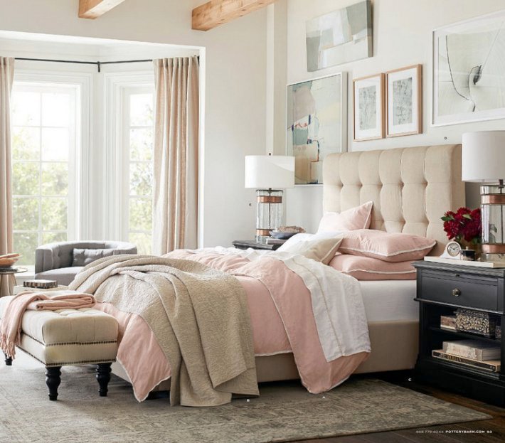
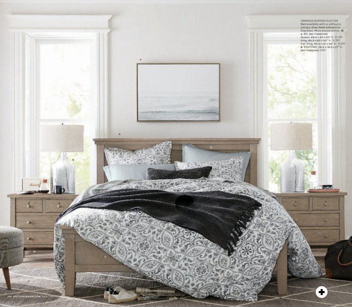
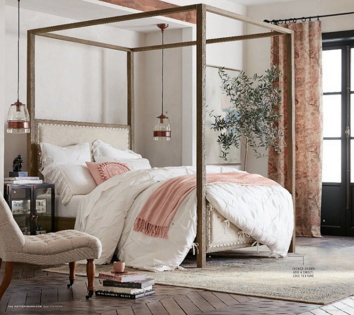
So let’s see if we can analyze what makes Pottery Barn’s photo styling so awesome. All of the photos in this post are from Pottery Barn. There’s always a lot of symmetry, which I find so important for interior photography.
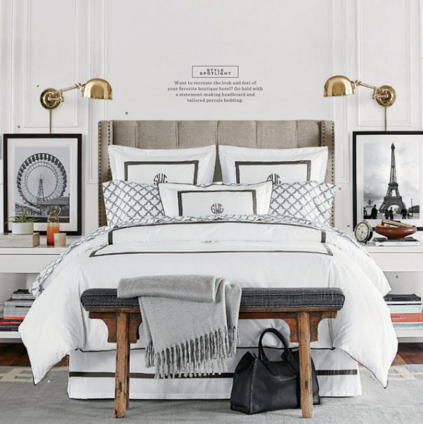
That doesn’t mean EVERYTHING is symmetrical, though. The base is usually symmetrical, then some asymmetrical stuff is very artfully added in after that.
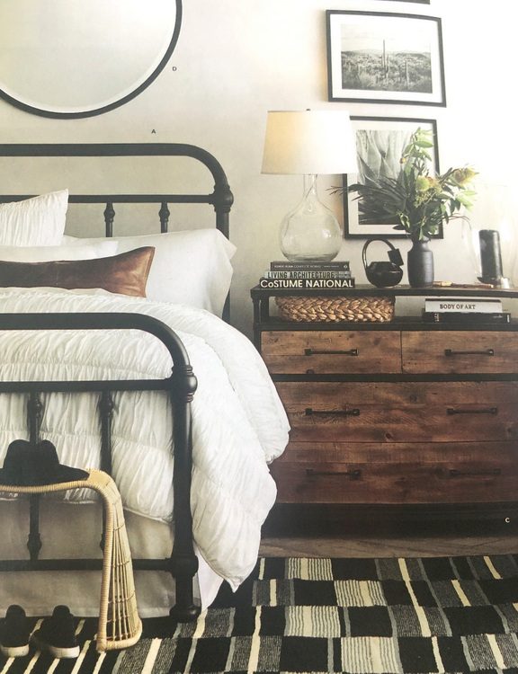
 You’ll notice there is almost always something on the floor in every photo:
There’s some thing or things to draw your eye down, and perhaps to make it feel more casual?
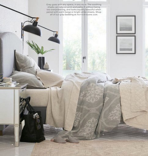
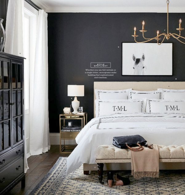
It’s usually something that contrasts the floor, so that it stands out enough to pull your eye down. I’ve read before that it’s good to create a C-shape in a photo, so that your eye lingers longer and is drawn throughout the entire photo. You can see how the placement of black objects kinda forms a C in the photo above (from black frames to wall sconces, to vases, to bag on the floor). But that certainly isn’t the case in most of the photos, so it’s not as formulaic as that.
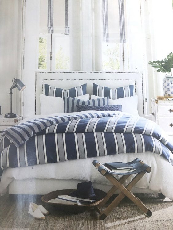
It’s certainly a thing to have a blanket draping down to connect with the floor.
Pottery Barn has the art of the “perfectly messy bed” down to a science. I’ve tried this many times, and it NEVER looks as good as this:
Did you notice that you can see a stack of magazines beneath the bed in the photo above? Actually, that’s the case in many of their photos.
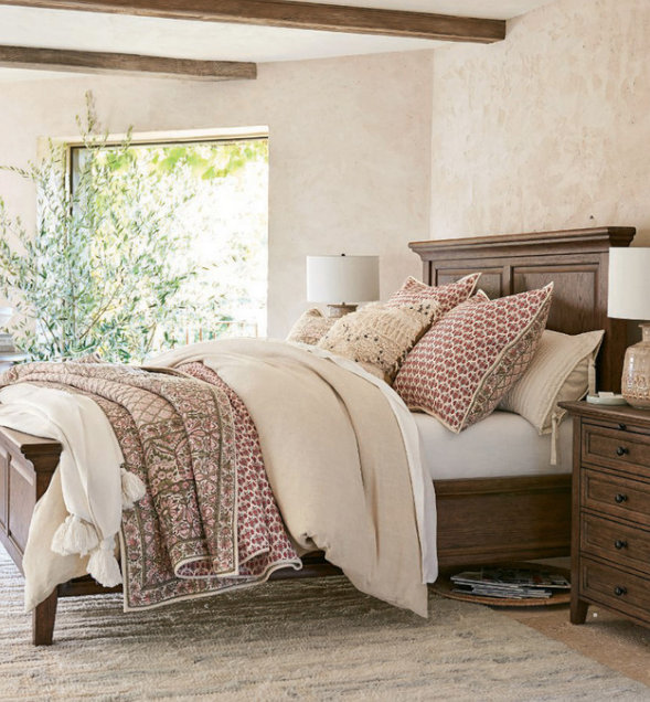
And shoes. There’s often a pair of carefully placed shoes in their photo styling. Also to notice in the next photo is how they pepper black across the photo – the art frame, the coffee cup, bed pillow, throw, heels of sneakers, and finally the black tote.
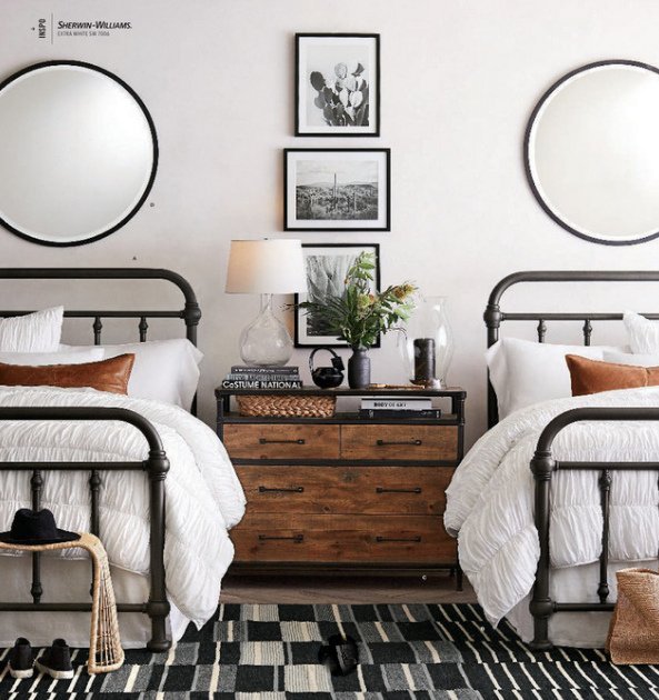
 shoes AND magazines beneath the bed!
Hats also tend to be a popular photo styling prop for Pottery Barn. I actually try to incorporate a hat into my own photography when my client has one, but really, how often do we see hats lying around anymore? I wonder what it is about hats used in this way? Does it symbolize adventure or connote social status?
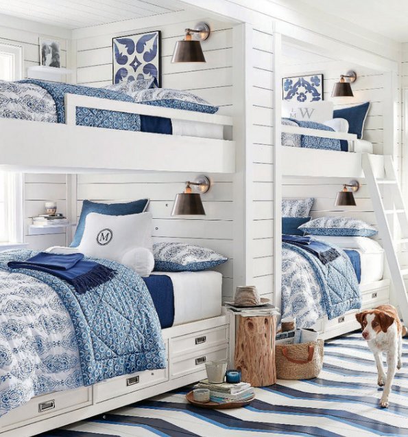
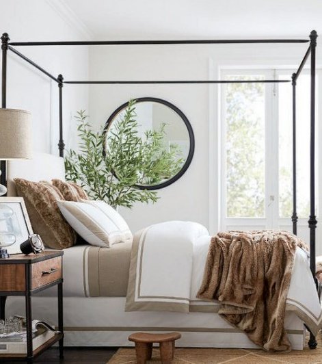
This one has a hat, throw blanket, and yet another black bag. Are you also noticing that most the photos include a green plant?
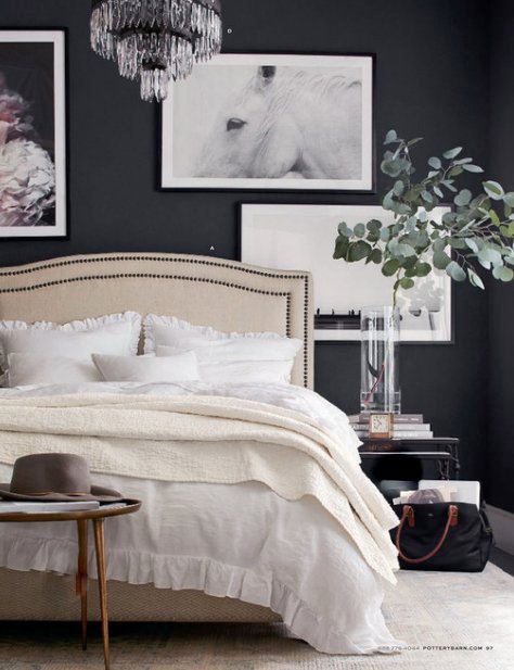
In most interior design spreads, florals are used to draw the eye and add color, but Pottery Barn is only using certain kinds of greens. Looks like eucalyptus, monstera leaves, and palm fronds are now trending (sorry, fiddle fig leaf and succulents)!
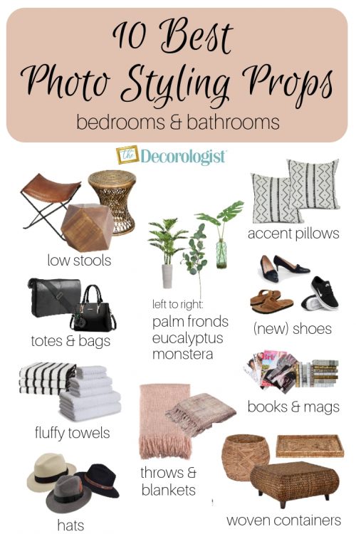
You’re probably noticing all the photo styling props now, right? A couple I haven’t mentioned yet include a variety of low stools and woven baskets and containers.
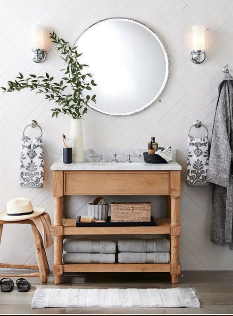
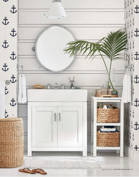
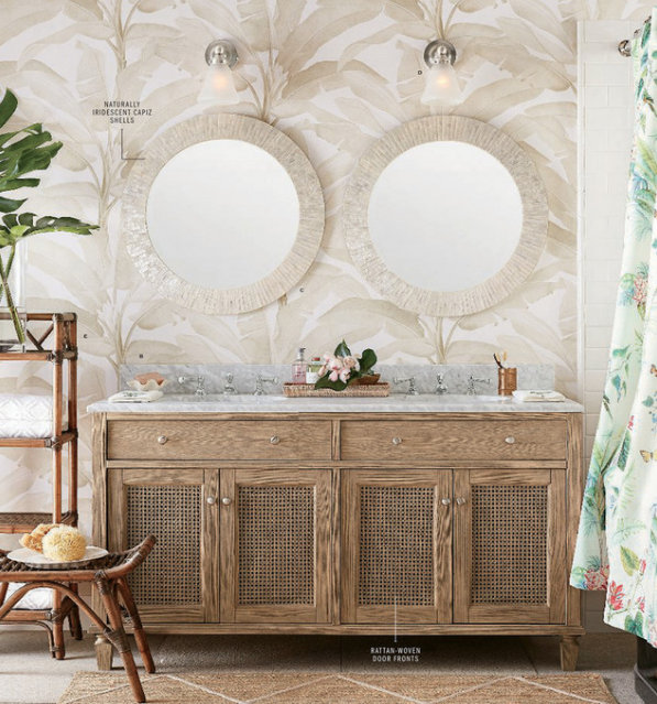
I find that the most difficult room to photograph well is a bathroom. Mainly because they are typically small spaces and it’s really hard to get far enough away from the vanity to get a head-on photo like this one:
So what can we take a way from this exercise in visual analysis?
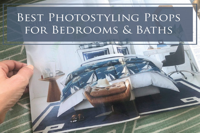
Here’s my roundup of the best photo styling props you need for photographing bedrooms and baths, which you should definitely PIN (because it took forever to make this graphic!):
That was kinda fun, right? Check out the post I wrote about the best photo styling props for kitchens and dining rooms!
Do you have anything to add to my round-up of props for bedrooms and baths?
Our LIVE, in-person, Expert Psychological Stager™ course is March 5-7, 2020, and we would love to have you! Find out more by clicking here.


What I love about your posts is your discernible eye, and how you call attention to things that most never notice. And that’s what makes the difference. Thanks for sharing such great info- and I’m definitely pinning that awesome graphic!
Thank you, Elizabeth! And thanks for pinning the graphic – my ninth grader helped me with that one, if you can believe it!!! 😉
I agree! Comments drawing our attention to what your discernible eye notices educates us in ways that supports what we do. Thank you for that.
I thought this was a SUPER interesting post. I’m always looking at photos and trying to pick apart and analyze what makes the room work, and I have often noticed that things in photos look ridiculous in real life, even in the most beautiful rooms. Like photos of fruit that’s semi-cut along with a knife on a cutting board. Looks great in pictures but in real life if you walked away and left it like that, it would look like you didn’t finish or didn’t clean up lol. I also loved the PB photos you chose – I just recently saw that light fixture in the last one and I am OBSESSED with it and trying to figure out how to work it into my house! Thanks for another great post.
Thank you, Lisa. I’m glad it was interesting to you, and that I’m not the only one who analyzes this stuff! When I first began experimenting with photo styling, I would copy something exactly like I had seen someone do it – but the result for me was NOT as good. I have a few props, like a hard woven bag with handles that I like to use beside a bed, a bench or a sofa, that actually work really well. But the shoe thing? Not so much 😉
Hey Kristie
Love your blog! Very interesting. Just a thought. Maybe those messy beds actually don’t look that good in real, but they photograph well . I too have tried to do that with my own bed and it looks terrible in real.
I’ve done the intentionally messy bed thing a few times. It takes a lot of time and redoing to get it to look *just right* in photos. It’s not at all easy to pull off! 😉
I like your comments on hats and totes. The photos with these items in PB and West Elm and other catalogs make me feel like there is an interesting story behind the picture. Surely the person is going somewhere interesting or just returned from an awesome trip? Buy this stuff and you’ll be living the life! Certainly makes some nice bedtime catalog viewing.
Deb,
Definitely marketing a lifestyle, right? That’s what we strive to do in home staging – live here and you’ll be living the life! Thank you for that insight!
Yes! Great point about the interesting story about the imagined people who might live in the space. I agree. Makes us wannabes!
Such a wonderful post! Yours always are but I loved this because I’ve been working on more stylized photos and this was so helpful and interesting! I love getting the Pottery Barn catalogs but never noticed the hats or shoes. Now I’ll never miss them again.
Thank you, Roxanne! xo
This is a great post, Kristie. All of the things you discuss above I take for granted and don’t really pay that much attention to. Thank you for bringing it to light. I can’t wait to read the follow-up post on kitchens and dining rooms!
Thanks so much, Sheri!!
Great article and inspiring home décor!
I really love how these designs really give importance to vases: here in Murano we have a long tradition of glass vases, so whenever I see these object valued in home décor I feel very happy.
Thanks!
This is a brilliant post, Kristie. You are so right… What we use for staging or decorating is quite different than Photo styling. Thanks for pointing out the not so obvious details.
Thank you, Beth – I am working on a follow-up blog right this minute about photo styling for kitchens! 🙂
That was an interesting read! The specific details shared in the analysis along with the photos provided an excellent course of study in a short space. I really appreciate it.
Another AWESOME POST!! I love your natural ability to take a complicated topic and not only make it understandable, but also concise! Love it!!!!
Oh, thank you so much, Jennifer!
Hello!
I’ve often wondered why homes that look to be staged very well don’t always translate to amazing photos. Well, here’s my answer! Thank you for this post, it’s great to have a resource with so many examples as well as very intuitive styling insight! I would have loved more detail on the bathroom decor but as it is, still an awesome post, so thank you!
The hat is a man’s hat. It represents a romantic interest.
Ooh, that’s nice!!
The casual shoes and magazines help you feel like you are inside the photo through your own imagination.