You know who you are! Pinky beige was quite on-trend a decade and a half ago, but now there are better neutral paint colors you could be choosing for your home.

Don’t feel bad – it’s hard to stay on top of all the latest trends in decor and paint colors. That’s what I’m here for! Here’s a “before” shot of a recent color and design consultation that started out with a wall color that looked like a band-aid:

Before Consultation
The flesh-tone paint color did nothing for this room. These are the paint colors that I helped my client choose to update her beautiful home:
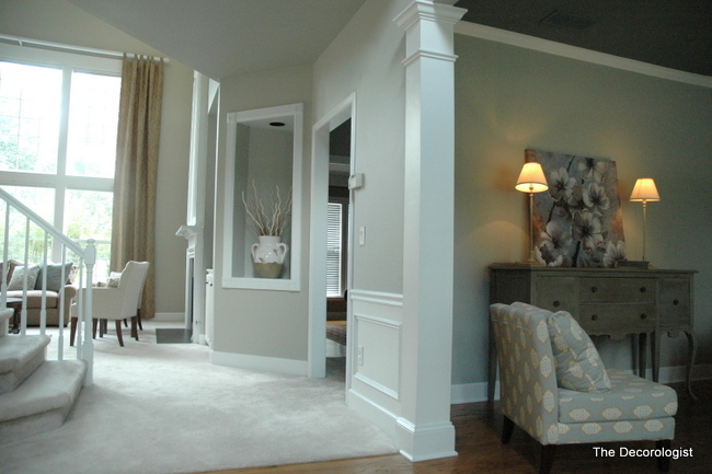
After
What a difference the RIGHT colors make! If you want to learn how to make the right choices for paint colors in your own home, register today for my class at the Cool Springs Kirkland’s Floor to Ceiling store in the Greater Nashville area on June 26th at 6:30 pm. You will learn The Decorologist’s Top 12 Neutrals and how to add the right colors in all the right places. Bring a friend and save $25 each- there couldn’t be a better Girls’ Night Out! Click on the button below my logo to reserve your seat:










Your blog reaches far beyond the Nashville area so there is no way I can come. I love your blog especially when you share the details. Please do tell the “after” colors for this great redo. Thanks.
…or for that matter, just straight-up PEACH. Which, I might add, made it onto a whole page of This Old House with their reveal of their Grand Prize Remodel winner (p. 80 July 2012 issue). Don’t get me wrong, it is an AMAZING story, and an even lovelier remodel – worthy of re-reading and high marks for tenacity and pluck. Still, I cannot explain that choice, and my first thought was, “Don’t tell the Decorologist!”
You are so funny, Sunny! I need to go look at that article. Some designers are touting peach again, but I’m not feeling it!
This is great. I have a hard time explaining to clients what I mean by pinky beige when they are not able to see the undertones. Bandaid colour sums it up perfectly:)
Carol,
Describing it as the color of a band-aid or “like flesh” seems to get the message across!
Love it. I had an art teacher in college who often wondered aloud why we used band aid color for skin (meaning when you do a person painting that’s not really what color people’s skin is so stop painting it that way) and walls. Sometimes he also called it putty color.
Looks really nice Kristie! A band-aid- love that!
Looks like a great update. (It’s a little hard to tell the color choice, because of lighting.) Looks like a great rearrangement of furnishings as well.
And, I’m guessing you also get credit for persuading your client to paint that sideboard. It really caught my eye in the second photo and I started to wonder where she had purchased it, then I realized it was the same one as in the first photo! I am constantly astonished by the magic powers of PAINT!
Kristie, I call pinky-beige “Old Ladies Underwear”….right??
Did you also do the living room colors on the left? That, I assume, is the view from the entryway.
WOW, it’s stunning! I would add that photo to your portfolio. Outstanding.
PS: OK, WHAT IS THE NEW COLOR?—-And new ceiling color???
Thanks, Paula.
Yes, Paula – I did all the paint colors and suggested the new treatment on the sideboard! Glad you like 🙂
P.P.S: Did you spec the new treatment on the sideboard?? Super-D Duper as well!
Oops. Alright, I have to confess. I am just starting to expand my love of color, from my sewing craft to all other areas of my life, like a room and its walls. My husband wants red in MB and I want calm blue/grey, but then I can’t quite picture it in my head red and blue going well together. So, I thought of this, (Oh no I’m going to confess) pink beige … Alright, I’ll say it, band aid color of some sort, three walls band aid and wall behind us red (so that I wouldn’t look at the red)…
So, I will start my search again for a good pair, red and something. Thank you for making it clear.
I love your work!!
Mayda,
Have you ever considered a red/turquoise combo? Here’s a post on that particular combination: https://thedecorologist.com/color-therapy-turquoise-red
Oh, the lasting legacy of pinky beige… eeeewww! It just never seems to quit! Love the colour you replaced it with.
Waiting patiently (not) for you to name the new colors. Absolutely lovely!
I’ve been guilty of using pinkie-beige in a previous life. But I seriously love the transformation you did , Kristie. I’m left wanting to see the rest of the room! Won’t you pretty please, post more pix in the future?
Pinky beige has never sat well with me. Not only is it the color of band-aids and tensor bandages (yes I was an RN forever) it’s also the color of base makeup that I will never be able to wear because my undertone is golden. Therefore I can spot it a mile away. “Old Lady Underwear” cracked me up, and maybe paint companies should choose paint colors after everyday, relatable things 🙂 Well, perhaps “Nude” may be more politically correct! Anyway call it what you will, pinky beige just has a horrid effect on the whole scheme when used in conjunction with other neutrals and hues that have undertones other than pink.